


一、介绍
使用场景:登录
思路:整体分为三层结构,最下层容器引入背景图片,中间一层继承容器引入的图片并设置模糊效果,最上层继承容器的背景图片并覆盖。
二、具体效果

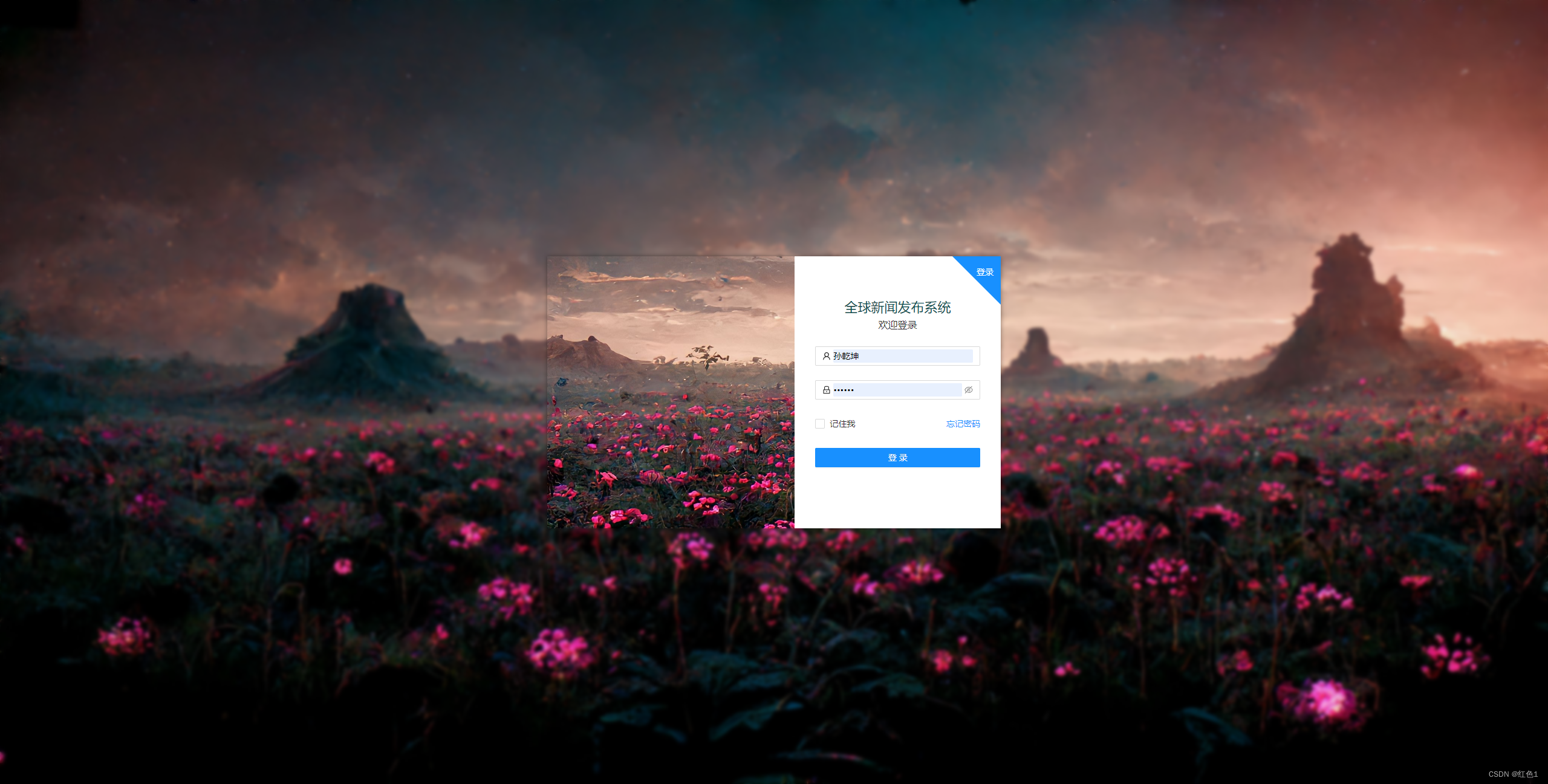
三、代码
// html
    <div className='loginBox'>
      <div className="frostedGlass">
      </div>
      <div className='context'>
      </div>
    </div>
// css
.loginBox {
  height: 100%;
  width: 100%;
  background: url(../../static/login.jpg) no-repeat fixed;
  background-size: 100%;
  position: relative;
  .frostedGlass {
    width: 100%;
    height: 100vh;
    // 继承背景
    background: inherit;
    // 模糊背景
    -webkit-filter: blur(3px);
    -moz-filter: blur(3px);
    -ms-filter: blur(3px);
    -o-filter: blur(3px);
    filter: blur(3px);
    filter: progid:DXImageTransform.Microsoft.Blur(PixelRadius=3, MakeShadow=false);
  }
  .context {
    position: absolute;
    width: 750px;
    height: 450px;
    left: 0;
    right: 0;
    top: 0;
    bottom: 0;
    margin: auto;
    // 继承父元素背景
    background: inherit;
    // 四周阴影, xoffset和yoffset偏移为0即可。
    box-shadow: 0px 0px 8px rgba(0,0,0,0.4);
  }
}


 2455
2455


 被折叠的 条评论
为什么被折叠?
被折叠的 条评论
为什么被折叠?
 到【灌水乐园】发言


