


6.书城首页、搜索页、列表页和详情页开发
6-1 书架搜索框布局实现
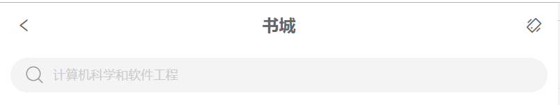
效果如图所示
组件代码
<template>
    <div class="search-bar">
        <div class="search-bar-title-wrapper">
            <div class="title-icon-back-wrapper"><span class="icon-back icon"></span></div>
            <div class="title-text-wrapper"><span class="title-text title">{{$t('home.title')}}</span></div>
            <div class="title-icon-shake-wrapper"><span class="icon-shake icon"></span></div>
        </div>
        <div class="search-bar-input-wrapper">
            <div class="search-bar-input">
                <span class="icon-search icon"></span>
                <input type="text"
                       class="input"
                       :placeholder="$t('home.hint')"
                       v-model="searchText"
                >
            </div>
        </div>
    </div>
</template>

<script>
    export default {
        name: "SearchBar",
        data(){
            return{
                searchText:''
            }
        }
    }
</script>

<style scoped lang="scss">
    @import "./../../assets/styles/global";
    .search-bar{
        position: relative;
        width: 100%;
        .search-bar-title-wrapper{
            position: relative;
            top: 0;
            left: 0;
            width: 100%;
            height: px2rem(42);
            .title-icon-back-wrapper{
                position: absolute;
                left: px2rem(15);
                top: 0;
                height: px2rem(42);
                @include center
            }
            .title-text-wrapper{
                width: 100%;
                height: px2rem(42);
                @include center;
            }
            .title-icon-shake-wrapper{
                position: absolute;
                right: px2rem(15);
                top: 0;
                height: px2rem(42);
                @include center
            }
        }
        .search-bar-input-wrapper{
            width: 100%;
            height: px2rem(52);
            padding: px2rem(10);
            box-sizing: border-box;
            .search-bar-input{
                width: 100%;
                background: #f4f4f4;
                border-radius: px2rem(20);
                padding: px2rem(5) px2rem(15);
                box-sizing: border-box;
                @include left;
                .icon-search{
                    color: #999;
                }
                .input{
                    width: 100%;
                    height: px2rem(22);
                    border: none;
                    background: transparent;
                    margin-left: px2rem(10);
                    font-size: px2rem(12);
                    color: #666;
                    &:focus{
                        outline: none;
                    }
                    &::-webkit-input-placeholder{
                        color: #ccc;
                    }
                }
            }

        }
    }
</style>
6-2.书架搜索框交互实现(上)
向下滑动屏幕时的交互细节分析
- 标题和推荐图标向下渐渐隐藏。
- 搜索框向上移动到标题位置。
- 搜索框逐渐变窄以适应屏幕。
- 返回按钮向下居中。
- 标题下方显示阴影。
用titleVisible来控制标题的显示


 478
478


 被折叠的 条评论
为什么被折叠?
被折叠的 条评论
为什么被折叠?
 到【灌水乐园】发言


