


碎碎念:知识点梳理归纳,如果有什么不对的感谢大家指正一起学习!
1. background-repeat
- 设置背景图片重复
- 可设置水平轴、垂直轴、两个轴或者不重复
语法
background-repeat: repeat || repeat-x || repeat-y || no-repeat || inherit || space || round
| 值 | 说明 |
|---|---|
| repeat | 背景图在垂直和水平方向重复。(默认值) |
| repeat-x | 只有水平方向会重复背景图像 |
| repeat-y | 只有垂直方向会重复背景图像 |
| no-repeat | 图片不重复 |
| inherit | background-repeat属性设置从父元素继承 |
| space | 充分重复图片,多余的用间距填充 。图片不会被缩放 |
| round | 重复图片填满容器大小,图片会被缩放 |
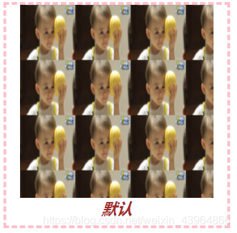
1.1 repeat (默认值)
背景图水平垂直方向重复
 .box{
        width: 350px;
        height: 350px;
        background: url(香瓜.jpg);
        background-size: 100px 100px;
        margin: 0 auto;
        background-repeat: repeat
     }
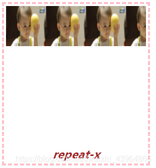
1.2 repeat-x
背景图水平方向重复
 .box{
	     width: 350px;
	     height: 350px;
	     background: url(香瓜.jpg);
	     background-size: 100px 100px;
	     margin: 0 auto;
	     background-repeat: repeat-x
	  }
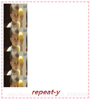
1.3 repeat-y
背景图垂直方向重复
 .box{
	     width: 350px;
	     height: 350px;
	     background: url(香瓜.jpg);
	     background-size: 100px 100px;
	     margin: 0 auto;
	     background-repeat: repeat-y
	  }
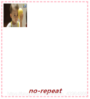
1.4 no-repeat
背景图片只显示一次,不重复
 .box{
	     width: 350px;
	     height: 350px;
	     background: url(香瓜.jpg);
	     background-size: 100px 100px;
	     margin: 0 auto;
	     background-repeat: no-repeat
	  }
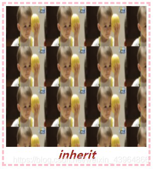
1.4 inherit
从父元素继承该属性
/* 父元素设置为repeat */
.box {
        display: flex;
          flex-direction: column;
          width: max-content;
          height: max-content;
          border: 5px dashed pink;
          padding: 5px;
          background-repeat: repeat;
      }

/* 子元素设置为inherit */
 .img {
       width: 350px;
       height: 350px;
       background:香瓜.jpg);
       background-size: 100px 100px;
       margin: 0 auto;
       background-repeat: inherit
      }
1.5 space
背景图完整的平铺在容器中,多余的地方用空隙填满
.box{
      width: 350px;
        height: 350px;
        background: url(香瓜.jpg);
        background-size: 100px 100px;
        margin: 0 auto;
        background-repeat: space
    }
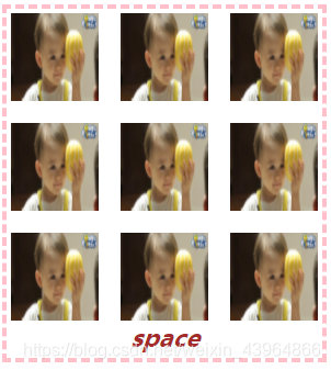
说明:
- 容器大小为350px350px,图片大小为100px100px
- 此时填满容器只能用3张完整的图片,多余的地方用缝隙填满
1.6 round
背景图被缩放后完整的填满在容器中
.box{
      width: 350px;
        height: 350px;
        background: url(香瓜.jpg);
        background-size: 100px 100px;
        margin: 0 auto;
        background-repeat: round
    }
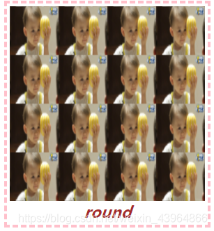
说明:
- 容器大小为350px350px,图片大小为100px100px
- 按照图片原尺寸,填满容器只能用3张完整的图片。round会缩放图片让其整数填充
1.7 space 与 round 对比图

2. background-position
- 背景图定位,控制背景图显示的位置(默认从padding区域左上角)
- 初始位置是相对于background-origin设置的位置图层
- 如果只提供一个值,则第二个值为 center
语法:
/* 水平偏移 || 垂直偏移 */
background-position:x || y
衍生属性:
background-position-x、background-position-y
| x轴 | y轴 | |
|---|---|---|
| 方向值 | left、right、center | top、bottom、center |
| 百分比 | x% | x% |
| 数值 | xpx/xrem | xpx/xrem |
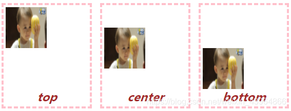
2.1 关键字定位
- 关键字定位,应用的是对其规则,不是坐标规则
2.1.1 水平方向 left | center | right
| 关键字 | 说明 |
|---|---|
| letf | 图像的左边和容器的左边对齐,水平位置的0% |
| center | 图像在水平方向的中心,水平位置的50% |
| right | 图像的右边和容器的右边对齐,水平位置的100% |
background-position-x: left | center | right;
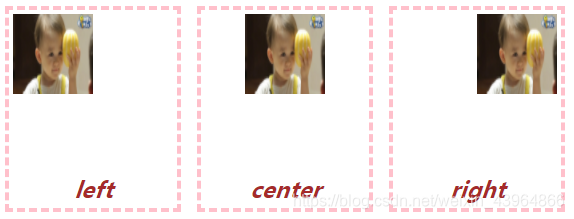
2.1.2 垂直方向 top | center | bottom
| 关键字 | 说明 |
|---|---|
| top | 图像的上边和容器的上边对齐 ,垂直位置的0% |
| center | 图像在垂直方向的中心 ,垂直位置的50% |
| bottom | 图像的下边距离容器顶边100%,垂直位置的100% |
background-position-y: top| center | bottom;
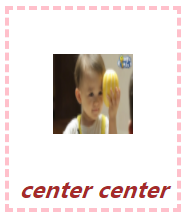
2.1.3 水平垂直居中
background-position: center center;
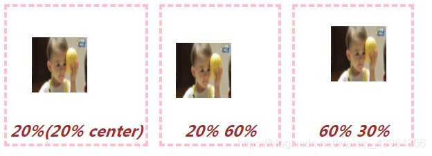
2.2 百分比
- 百分比定位,是将图片的相对位置(x%,y%)与容器的相对位置(x%,y%)重合。
- 当指定百分比的时候是按下计算公式的。
- x轴计算公式: (容器的宽度 - 图像的宽度) * x%
- y轴计算公式: (容器的高度 - 图像的高度) * x%
.one {
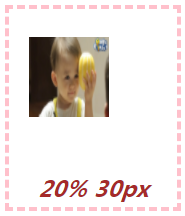
background-position: 20%;
}
.two {
background-position: 20% 60%;
}
.three {
background-position: 60% 30%;
}
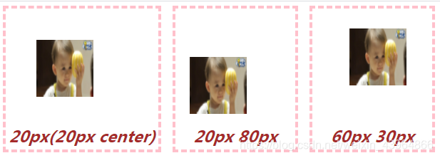
2.3 数值
 .one {
       background-position: 20px;
      }

.two {
       background-position: 20px 60px;
	}

.three {
       background-position: 60px 30px;
	}
2.4 position属性值混合使用
2.4.1 方向值和数值
position属性支持4个参数值,前两个用于横坐标,后两个用于纵坐标
background-position: left 10px top 15px;
等价于
background-position: 10px 15px;
background-position: left top;
等价于
background-position: 0 0;
2. 4.2 数值和百分比
 .box{
        background-position: 20% 30px;
     }
2.4 雪碧图
- 雪碧图,即CSS Sprites ,也被成为css精灵。将小图标和背景图像合并到一张图像上,然后利用background-position 来显示需要显示的图片部分
- 页面渲染时,可以减少请求次数,在一定程度上能够加快网页加载速度
图例:
(图片源于链接中的:background-position1)
详情可查看相关链接 background-position1
相关链接:
background-repeat
background-position1
background-position2


 扫一扫
扫一扫


 1万+
1万+

 被折叠的 条评论
为什么被折叠?
被折叠的 条评论
为什么被折叠?
 到【灌水乐园】发言


