


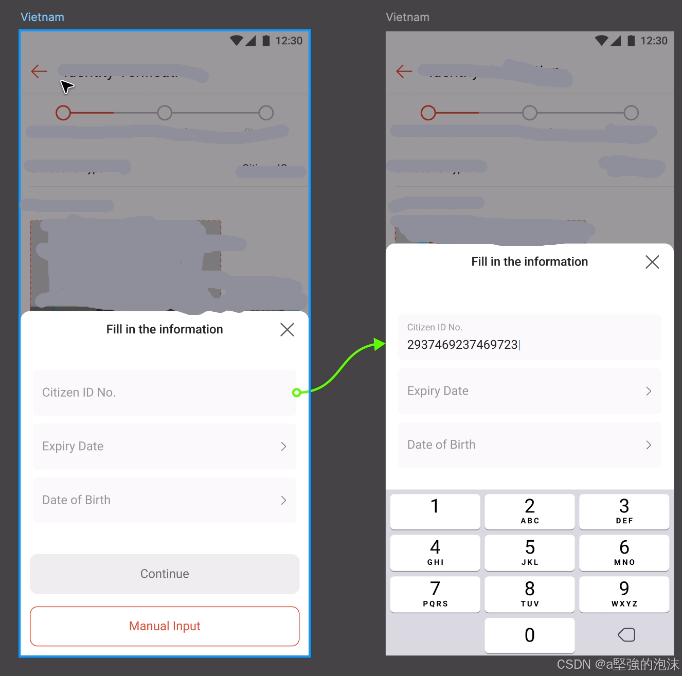
需求
- 键盘弹起来的时候,弹窗的底部Confirm按钮需要隐藏
- 键盘弹起来的时候,弹窗内容需要被顶起来
组件
onFocus:当文本框获得焦点的时候调用此回调函数onBlur:当文本框失去焦点的时候调用此回调函数
- Android只支持
keyboardDidShow和keyboardDidHide事件 - 通过监听事件,可以获取键盘的高度。
- 通过 e.endCoordinates.height 获取,非常适合用于计算并调整页面布局,例如将 TextInput 滚动到键盘上方可见区域。
事件触发顺序:onFocus > keyboardDidShow, onBlur > keyboardDidHide
实现
方式一
方式一:监听keyboardDidShow和keyboardDidHide事件后,隐藏掉底部按钮,并且重新设置弹窗到顶部的top值。
上述两个event是发生在键盘弹起/关闭后,所以会导致底部按钮先被弹起来,然后再被隐藏的视觉效果,弹窗高度会存在抖动的情况。
方式二
方式二:使用TextInput组件的onFocus和onBlur事件,再触发focus事件后,直接隐藏掉按钮。
触发focus事件 > 隐藏按钮 > 键盘弹起触发keyboardDidShow
上述效果针对ios是比较好的,但在android上面似乎按钮的隐藏和keyboardDidShow是同时发生的,也会导致弹窗高度会存在抖动的情况。
<TextInput
  targetType={targetType}
  ref={textInputRef}
  shopeeTestID="textInputMessage"
  style={[
    style.textInputHorizontal,
    isTitleless ? style.textInputHorizontalTitleless : null,
    placeholderUptoTitle &&
      (Boolean(value) || isInputFocus) &&
      style.placeholderUptoTitleFocusInput,
    inputStyle,
    inputStyle,
  ]}
  onTextInput={e => {
    onTextInput && onTextInput(e);
  }}
  onChangeText={text => {
    onChangeText && onChangeText(text);
  }}
  onSelectionChange={e => {
    onSelectionChange && onSelectionChange(e);
  }}
  onEndEditing={event => {
    onEndEditing && onEndEditing(event.nativeEvent.text);
  }}
  onFocus={event => {
    beforeKeyboardOpen?.(); // here
    onFocus && onFocus(event);
    setIsInputFocus(true);
  }}
  onBlur={() => {
    setIsInputFocus(false); // here
    postKeyboardClose?.();
  }}
  placeholder={
    placeholderUptoTitle && (Boolean(value) || isInputFocus)
      ? ''
      : placeholder
  }
  placeholderTextColor={placeholderTextColor}
  maxLength={maxLength}
  keyboardType={keyboardType}
  value={mask && editable === false ? maskSentence(value) : value} // use 'editable === false' not '!editable',because editable may be undefined
  autoCapitalize={autoCapitalize || 'sentences'}
  underlineColorAndroid="rgba(0,0,0,0)"
  autoCorrect={autoCorrect}
  editable={editable}
  secureTextEntry={secureTextEntry}
  multiline={multiline}
/>
方式三
方式三:给输入框TextInput加一个遮罩层,点击TextInput上方的遮罩层 > 隐藏按钮 > 延迟手动触发focus事件 > 弹起键盘。
// 增加三个props参数
// 键盘弹起前/收起后执行操作
// beforeKeyboardOpen?: () => void;
// postKeyboardClose?: () => void;
// keyboardRespondDelay?: number;

const needDelayKeyboard = !!keyboardRespondDelay && keyboardRespondDelay > 0;
const [showInputMask, setShowInputMask] = useState(needDelayKeyboard);

<TextInput
  targetType={targetType}
  ref={textInputRef}
  shopeeTestID="textInputMessage"
  style={[
    style.textInputHorizontal,
    isTitleless ? style.textInputHorizontalTitleless : null,
    placeholderUptoTitle &&
      (Boolean(value) || isInputFocus) &&
      style.placeholderUptoTitleFocusInput,
    inputStyle,
    inputStyle,
  ]}
  onTextInput={e => {
    onTextInput && onTextInput(e);
  }}
  onChangeText={text => {
    onChangeText && onChangeText(text);
  }}
  onSelectionChange={e => {
    onSelectionChange && onSelectionChange(e);
  }}
  onEndEditing={event => {
    onEndEditing && onEndEditing(event.nativeEvent.text);
  }}
  onFocus={event => {
    onFocus && onFocus(event);
    setIsInputFocus(true);
  }}
  onBlur={() => {
    setIsInputFocus(false);
    if (needDelayKeyboard) {
      // here,失去焦点后,恢复showInputMask的值,继续显示一个遮罩层
      setShowInputMask(true);
      setTimeout(() => {
        // here,失去焦点后,先等待键盘收起,然后再显示底部按钮
        postKeyboardClose?.();
      }, keyboardRespondDelay);
    } else {
      setShowInputMask(false);
    }
  }}
  placeholder={
    placeholderUptoTitle && (Boolean(value) || isInputFocus)
      ? ''
      : placeholder
  }
  placeholderTextColor={placeholderTextColor}
  maxLength={maxLength}
  keyboardType={keyboardType}
  value={mask && editable === false ? maskSentence(value) : value} // use 'editable === false' not '!editable',because editable may be undefined
  autoCapitalize={autoCapitalize || 'sentences'}
  underlineColorAndroid="rgba(0,0,0,0)"
  autoCorrect={autoCorrect}
  editable={editable}
  secureTextEntry={secureTextEntry}
  multiline={multiline}
/>
// here,遮罩层
{showInputMask && needDelayKeyboard && editable ? (
  <TouchableWithoutFeedback
    onPress={() => {
      beforeKeyboardOpen?.();
      setTimeout(() => {
        // here,隐藏掉遮罩层
        setShowInputMask(false);
        // here,使用透明层延迟触发focus事件,这里需要手动触发
        textInputRef?.current?.focus();
      }, keyboardRespondDelay);
    }}
  >
    <View style={style.inputMask} />
  </TouchableWithoutFeedback>
) : null}

inputMask: {
  position: 'absolute',
  top: 0,
  right: 0,
  bottom: 0,
  left: 0,
},
使用:
<MyTextInput
  // ...
  beforeKeyboardOpen={() => setIsShowButtons(false)}
  postKeyboardClose={() => setIsShowButtons(true)}
  keyboardRespondDelay={100}
/>
键盘顶起弹窗
React.useEffect(() => {
  const listeners: EmitterSubscription[] = [];
  listeners.push(
    Keyboard.addListener('keyboardDidShow', e => {
      const keyboardHeight = e?.endCoordinates?.height || 0;
      setScreenHeight(WINDOW_HEIGHT - keyboardHeight); // 计算除去键盘高度后的屏幕高度
    })
  );
  listeners.push(
    Keyboard.addListener('keyboardDidHide', () => {
      setScreenHeight(0);
    })
  );

  // 清除事件监听器
  return () => listeners.forEach(listener => listener.remove());
}, []);

<BottomDrawer
  shouldShow
  backdropColor={Colors.black40}
  onDismiss={() => dismissPopup?.()}
  containerStyle={styles.drawerContainer}
  screenHeight={screenHeight} // here
>
// children render
</BottomDrawer>
import { Colors } from '@shopee-rn/nebula';
import React, { useState, useRef, useEffect, ReactNode } from 'react';
import {
  View,
  StyleSheet,
  TouchableWithoutFeedback,
  Animated,
  Dimensions,
  LayoutChangeEvent,
  StyleProp,
  ViewStyle,
} from 'react-native';

type Props = {
  /**
   * Decide if bottom drawer is displayed
   */
  shouldShow: boolean;
  /**
   * The custom drop color
   */
  backdropColor?: string;
  /**
   * Trigger when click backdrop area
   */
  onDismiss: () => void;
  /**
   * Trigger when `shouldShow` status come to `false`
   */
  onDrawerClosed?: () => void;
  /**
   * The Drawer Content
   */
  children: ReactNode | (() => ReactNode);
  /**
   * container style
   */
  containerStyle?: StyleProp<ViewStyle>;
  /**
   * 除去键盘剩余的屏幕高度,用于设置弹窗到顶部的top值
   */
  screenHeight?: number;
};

/**
 * @name BottomDrawer
 * @param {Object} props
 * @param {boolean} props.shouldShow
 * @param {string} [props.backdropColor=Colors.utility.pressed]
 * @param {function} props.onDismiss
 * @param {function} props.onDrawerClosed A callback after drawer closing animation finishes
 * @param {function} props.children A function to render a React.Node
 */
export const BottomDrawer = ({
  children,
  backdropColor = Colors.utility.pressed,
  shouldShow,
  onDismiss,
  onDrawerClosed,
  containerStyle,
  screenHeight,
}: Props) => {
  const [shouldRender, setShouldRender] = useState(shouldShow);
  const bottomAnimation = useRef(new Animated.Value(0));
  const [containerHeight, setContainerHeight] = useState(0);
  const [contentHeight, setContentHeight] = useState(0);

  const onContainerLayout = (e: LayoutChangeEvent) => {
    setContainerHeight(e.nativeEvent.layout.height);
  };

  const onContentLayout = (e: LayoutChangeEvent) => {
    const ch = e.nativeEvent.layout.height;
    // Sometimes ch and contentHeight differs very slightly due to floating point error
    // E.g. 197.00006103515625 vs 197
    // Need to treat them as equal otherwise it might oscillate between the two values and keep re-rendering
    if (Math.abs(ch - contentHeight) >= 0.01) {
      setContentHeight(ch);
    }
  };

  // Handle changes in shouldShow
  useEffect(() => {
    let isValid = true;
    if (shouldShow) {
      setShouldRender(true);
    } else if (shouldRender) {
      Animated.spring(bottomAnimation.current, {
        toValue: 0,
        useNativeDriver: true,
        overshootClamping: true,
      }).start(() => {
        if (isValid) {
          setShouldRender(false);
        }
        if (onDrawerClosed) {
          onDrawerClosed();
        }
      });
    }

    return () => {
      isValid = false;
    };
    // shouldRender shouldn't trigger it, it's just used as sanity check
  }, [shouldShow]);

  // Trigger animation when shouldRender is updated
  useEffect(() => {
    if (shouldRender && shouldShow && contentHeight > 0) {
      Animated.spring(bottomAnimation.current, {
        toValue: -contentHeight,
        useNativeDriver: true,
        overshootClamping: true,
      }).start();
    }
  }, [shouldShow, shouldRender, contentHeight]);

  return shouldRender ? (
    <View style={[styles.root, containerStyle]} onLayout={onContainerLayout}>
      <TouchableWithoutFeedback onPress={onDismiss}>
        <View style={[styles.backdrop, { backgroundColor: backdropColor }]} />
      </TouchableWithoutFeedback>
      <Animated.View
        // eslint-disable-next-line react-native/no-inline-styles
        style={{
          position: 'absolute',
          left: 0,
          top:
            screenHeight || // here,手动设置top的值
            (containerHeight > 0
              ? containerHeight
              : Dimensions.get('window').height),
          right: 0,
          transform: [{ translateY: bottomAnimation.current }],
        }}
        onLayout={onContentLayout}
      >
        {typeof children === 'function' ? children() : children}
      </Animated.View>
    </View>
  ) : null;
};

const styles = StyleSheet.create({
  hidden: {
    display: 'none',
    position: 'relative',
  },
  root: {
    position: 'absolute',
    top: 0,
    left: 0,
    right: 0,
    bottom: 0,
    justifyContent: 'center',
    alignItems: 'center',
  },
  backdrop: {
    position: 'absolute',
    top: 0,
    left: 0,
    right: 0,
    bottom: 0,
    justifyContent: 'center',
    alignItems: 'center',
  },
});

export default BottomDrawer;


 扫一扫
扫一扫


 1349
1349

 被折叠的 条评论
为什么被折叠?
被折叠的 条评论
为什么被折叠?
 到【灌水乐园】发言


