


Awesome Flutter snippets插件。可帮忙我们快速生成常用的Flutter代码片段。
TextAlign属性
文本的对齐方式
center: 文本以居中形式对齐,这个也算比较常用的了。
left:左对齐,经常使用,让文本居左进行对齐,效果和start一样。
right :右对齐,使用频率也不算高。
start:以开始位置进行对齐,类似于左对齐。
end: 以为本结尾处进行对齐,不常用。有点类似右对齐.
如下图 如果text文本长度过少, 设置是没有效果的
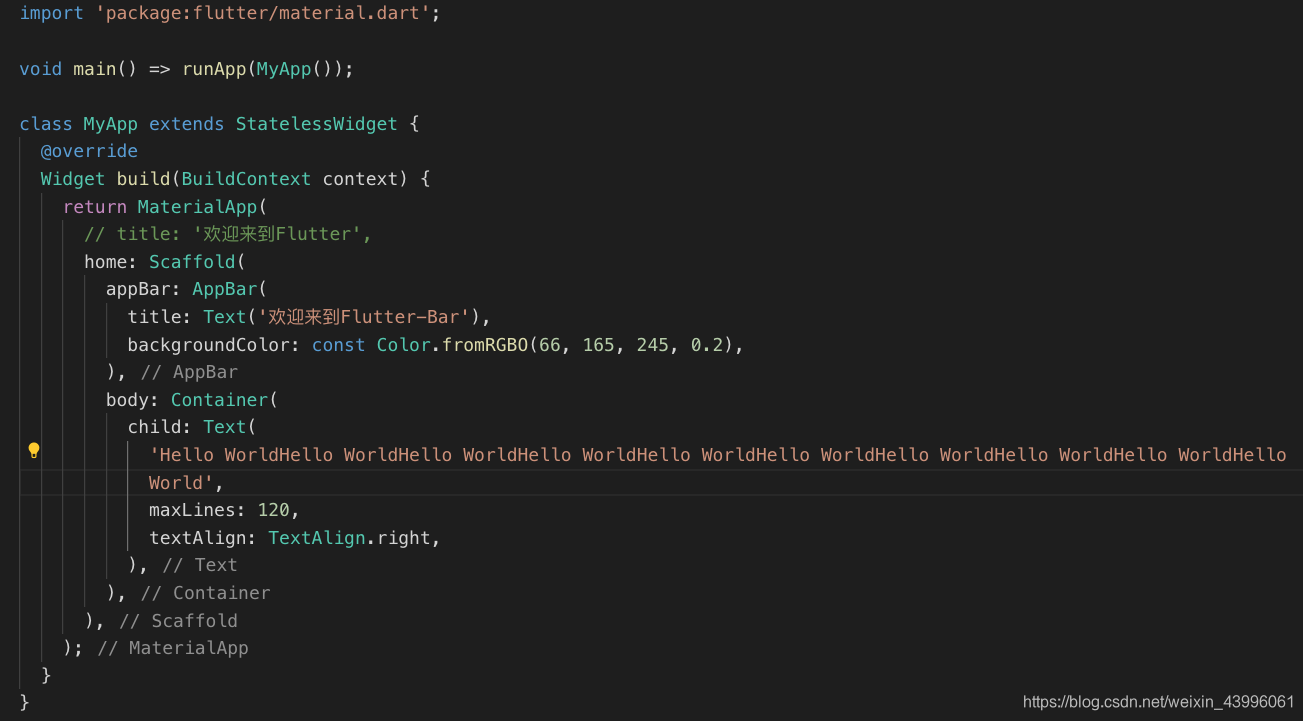
maxLines:
设置最多显示的行数,比如我们现在只显示1行,代码如下:
child:Text(
  'Hello maxLines 设置最多显示的行数 设置最多显示的行数 设置最多显示的行数 设置最多显示的行数',
  textAlign:TextAlign.left,
  maxLines: 1,
)
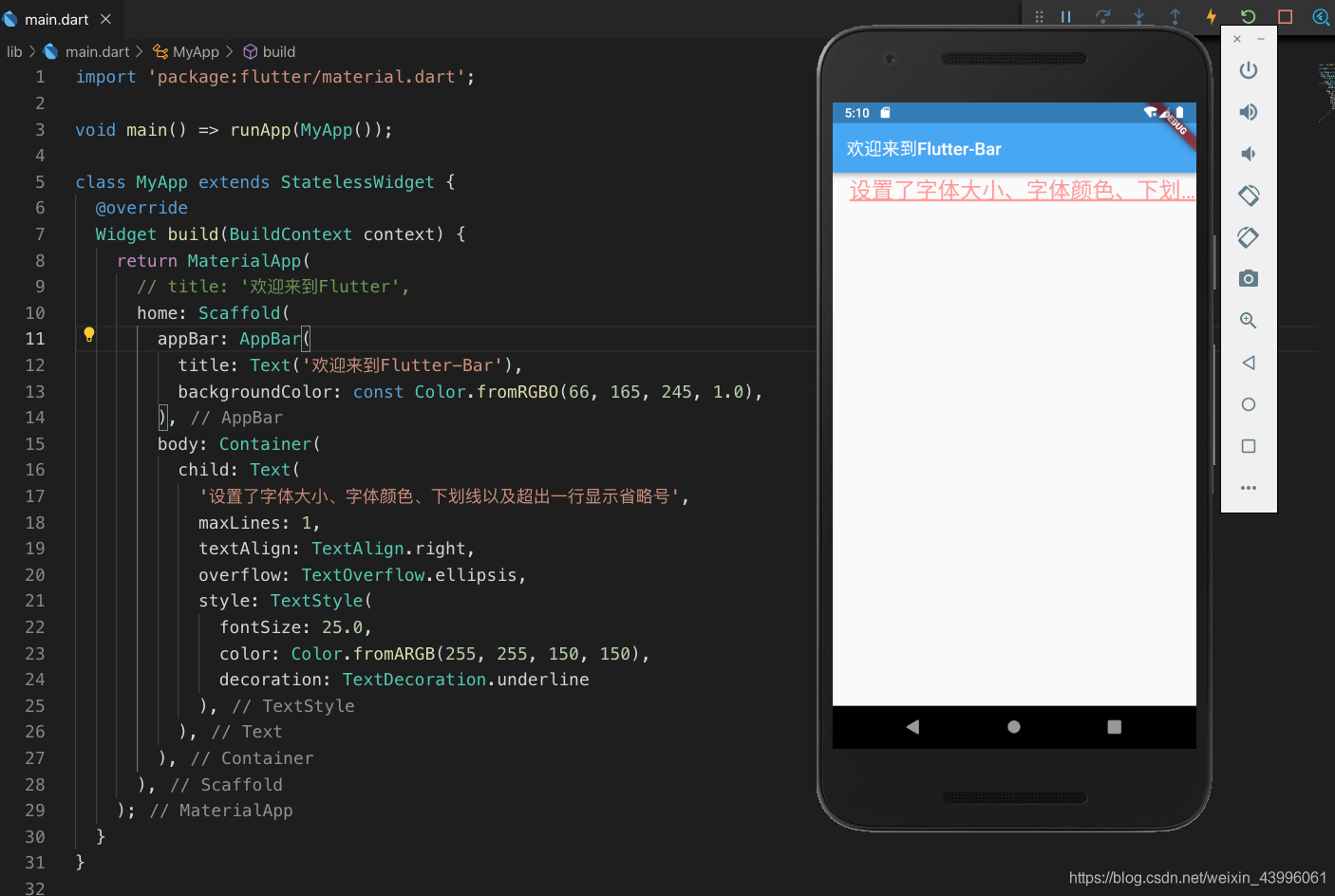
overflow
属性是用来设置文本溢出时, 用法如下:
clip:直接切断,剩下的文字就没有了,感觉不太友好,体验性不好。
ellipsis:在后边显示省略号,体验性较好,这个在工作中经常使用。
fade: 溢出的部分会进行一个渐变消失的效果,当然是上线的渐变,不是左右的哦。
如设置后边显示省略号: overflow: TextOverflow.ellipsis,
如下图部分样式展示:
属性资料网址:https://docs.flutter.io/flutter/painting/TextStyle-class.html
container 中
Alignment属性
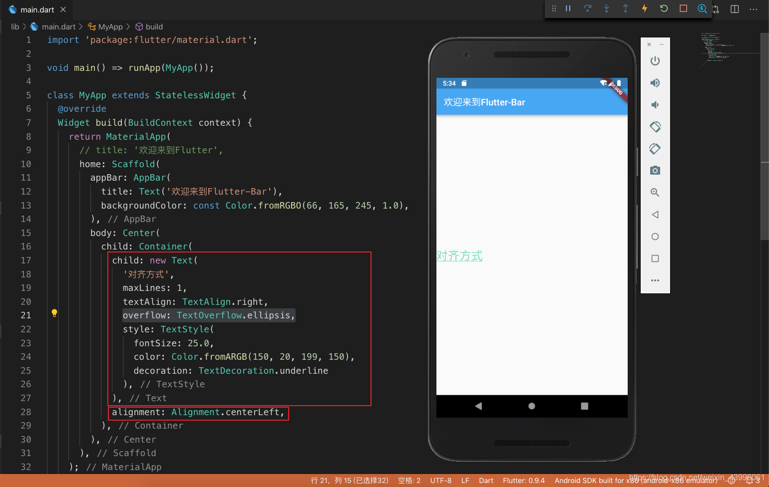
Alignment 的对齐方式有:
- bottomCenter:下部居中对齐。
- botomLeft: 下部左对齐。
- bottomRight:下部右对齐。
- center:纵横双向居中对齐。
- centerLeft:纵向居中横向居左对齐。
- centerRight:纵向居中横向居右对齐。
- topLeft:顶部左侧对齐。
- topCenter:顶部居中对齐。
- topRight: 顶部居左对齐。
宽、高和颜色属性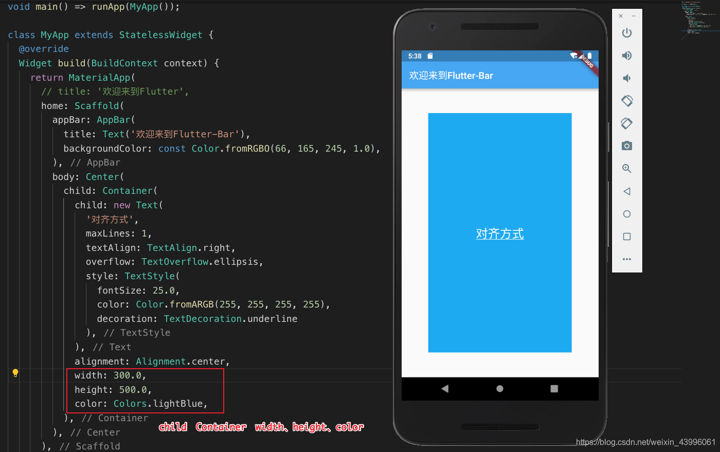
padding margin 属性
padding: const EdgeInsets.all(10.0),
padding: const EdgeInsets.fromLTRB(10.0, 20.0, 0.0, 0.0),
margin: const EdgeInsets.all(10.0),
margin: const EdgeInsets.fromLTRB(10.0, 20.0, 0.0, 0.0),
如果所设置的一样: const EdgeInsets.all(value)
如果所设置的不一样: const EdgeInsets.fromLTRB(left, top, right, bottom)
decoration属性 设置边框
decoration是 container 的修饰器,主要的功能是设置背景和边框。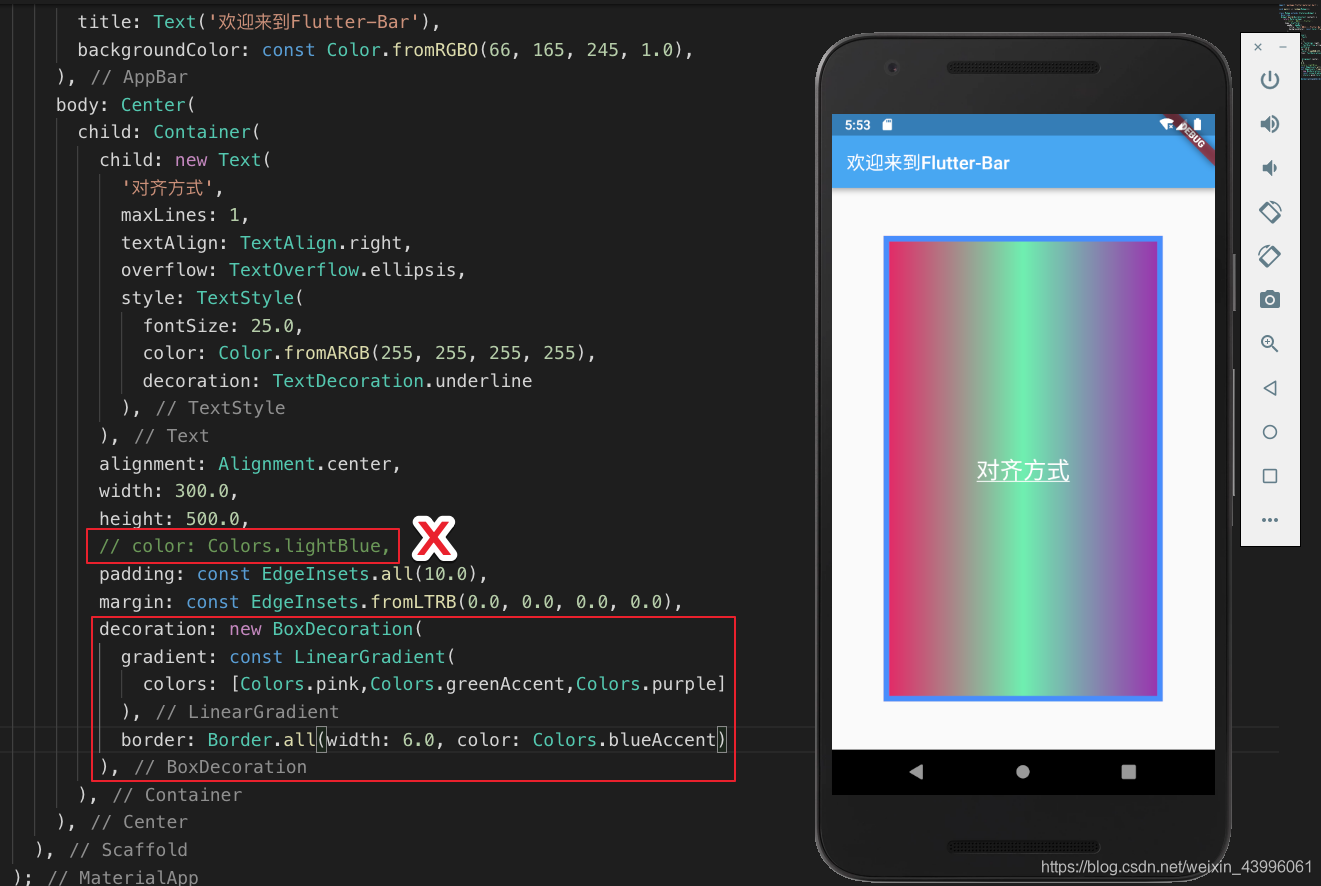
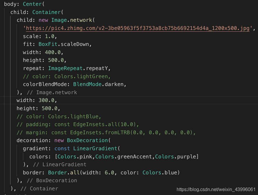
Image图片组件的使用
- Image.asset: 加载资源图片,就是加载项目资源目录中的图片,加入图片后会增大打包的包体体积,用的是相对路径。
- Image.network: 网络资源图片,意思就是你需要加入一段http://xxxx.xxx的这样的网络路径地址。
- Image.file: 加载本地图片,就是加载本地文件中的图片,这个是一个绝对路径,跟包体无关
- Image.memory: 加载Uint8List资源图片,这个我目前用的不是很多,所以没什么发言权。
fit属性的设置
fit属性可以控制图片的拉伸和挤压,这些都是根据图片的父级容器来的。
- BoxFit.fill: 全图显示,图片会被拉伸,并充满父容器。
- BoxFit.contain: 全图显示,显示原比例,可能会有空隙。
- BoxFit.cover:显示可能拉伸,可能裁切,充满(图片要充满整个容器,还不变形)。
- BoxFit.fitWidth:宽度充满(横向充满),显示可能拉伸,可能裁切。
- BoxFit.fitHeight:高度充满(竖向充满),显示可能拉伸,可能裁切。
- BoxFit.scaleDown:效果和contain差不多,但是此属性不允许显示超过源图片大小,可小不可大。
图片的混合模式
例如: 图片混合模式(colorBlendMode)和color属性配合使用,能让图片改变颜色
child:new Image.network(
  'xxx.jpg',
    color: Colors.greenAccent,
    colorBlendMode: BlendMode.darken,
),
color: 是要混合的颜色,如果你只设置color是没有意义的。
colorBlendMode: 是混合模式,相当于我们如何混合。
repeat图片重复
- ImageRepeat.repeat : 横向和纵向都进行重复,直到铺满整个画布。
- ImageRepeat.repeatX: 横向重复,纵向不重复。
- ImageRepeat.repeatY:纵向重复,横向不重复。
child:new Image.network(
  'xxx.jpg',
   repeat: ImageRepeat.repeat,
),
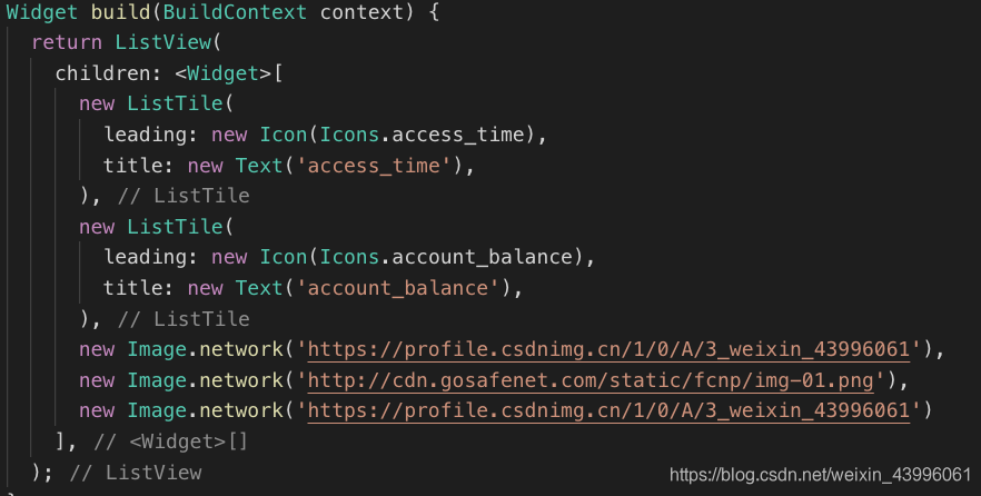
列表组件
例如: 图片列表
例如: 容器列表
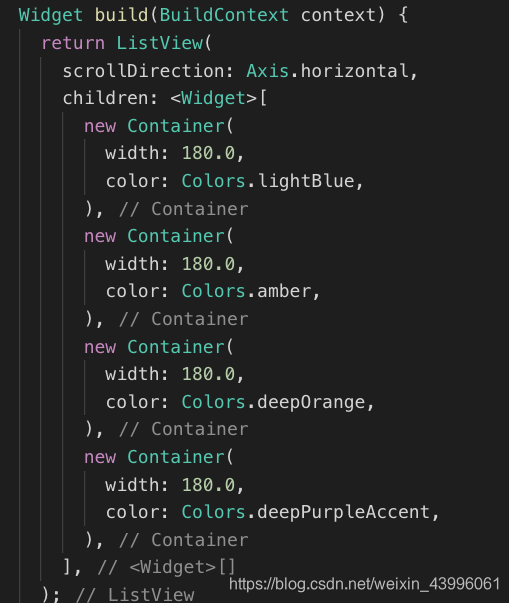
scrollDirection属性
ListView组件的scrollDirection属性只有两个值,一个是横向滚动,一个是纵向滚动。默认的就是垂直滚动,所以如果是垂直滚动,我们一般都不进行设置。
Axis.horizontal: 横向滚动或者叫水平方向滚动。
Axis.vertical: 纵向滚动或者叫垂直方向滚动。
代码优化:
可将内容组件提取出来, 然后在父组件渲染
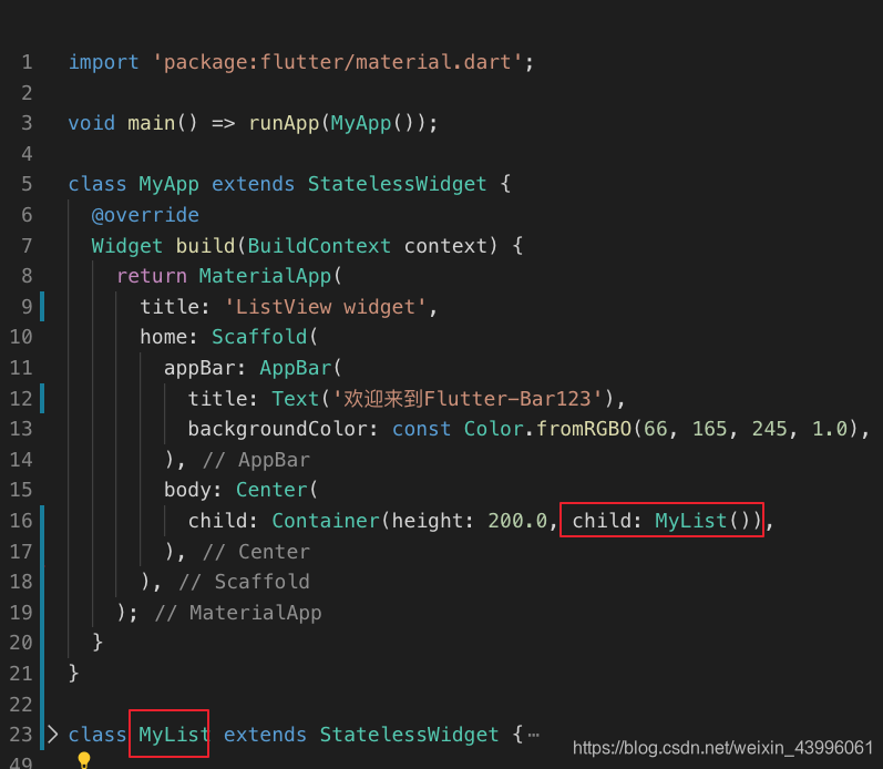
动态列表 ListView.builder()
import 'package:flutter/material.dart';
void main () => runApp(MyApp(
  items: new List<String>.generate(6, (i)=> "Item $i")
));

class MyApp extends StatelessWidget{
  final List<String> items;
  MyApp({Key key, @required this.items}):super(key:key);
  @override
  Widget build(BuildContext context ){
      return MaterialApp(
        title:'ListView widget',
        home:Scaffold(
          body:new ListView.builder(
            itemCount:items.length,
            itemBuilder:(context,index){
              return new ListTile(
                title:new Text('${items[index]}'),
              );
            }
          )
        ),
      );
  }
}
GridView网格列表组件
void main() => runApp(MyApp());

class MyApp extends StatelessWidget {
  @override
  Widget build(BuildContext context) {
    return MaterialApp(
      title: 'ListView widget',
      home: Scaffold(
          body: GridView.count(
        padding: const EdgeInsets.all(20.0),
        crossAxisSpacing: 10.0,
        crossAxisCount: 3,
        children: <Widget>[
          const Text('NO 1'),
          const Text('NO 2'),
          const Text('NO 3'),
          const Text('NO 4'),
          const Text('NO 5'),
          const Text('NO 6')
        ],
      )),
    );
  }
}
- CrossAxisAlignment.star:居左对齐。
- CrossAxisAlignment.end:居右对齐。
- CrossAxisAlignment.center:居中对齐。
Expanded属性的使用
灵活布局。比如我们想让中间区域变大,而头部区域和底部根据文字所占空间进行显示。
CircleAvatar组件的使用
常用来作头像的,组件里边有个radius的值可以设置图片的弧度。
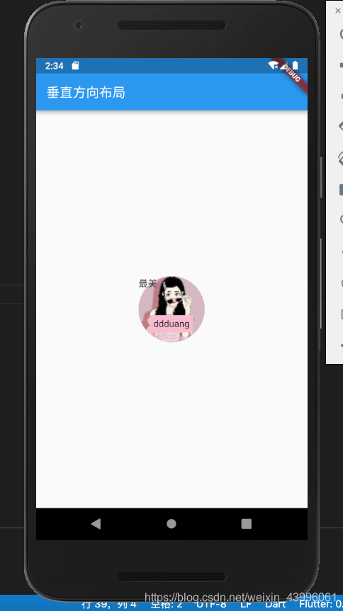
层叠布局
- Positioned组件的属性
- bottom: 距离层叠组件下边的距离
- left:距离层叠组件左边的距离
- top:距离层叠组件上边的距离
- right:距离层叠组件右边的距离
- width: 层叠定位组件的宽度
- height: 层叠定位组件的高度
import 'package:flutter/material.dart';

void main() => runApp(MyApp());

class MyApp extends StatelessWidget{
  @override
  Widget build(BuildContext context) {
    var stack = new Stack(
      alignment: const FractionalOffset(0.5, 0.8),
      children: <Widget>[
        new CircleAvatar(
          backgroundImage: new NetworkImage('https://profile.csdnimg.cn/1/0/A/3_weixin_43996061'),
          radius: 50.0,
        ),
        new Container(
          decoration: new BoxDecoration(
            color: Colors.pink[100]
          ),
          padding: EdgeInsets.all(5.0),
          child: new Text('ddduang'),
        ),
        new Positioned(
          top: 0.0,
          left: 0.0,
          child: new Text('最美'),
        )
      ],
    );

    return MaterialApp(
      title: 'ListView widget',
      home: Scaffold(
        appBar: new AppBar(
          title: new Text('垂直方向布局'),
        ),
        body: Center(child: stack),
      ),
    );
  }
}
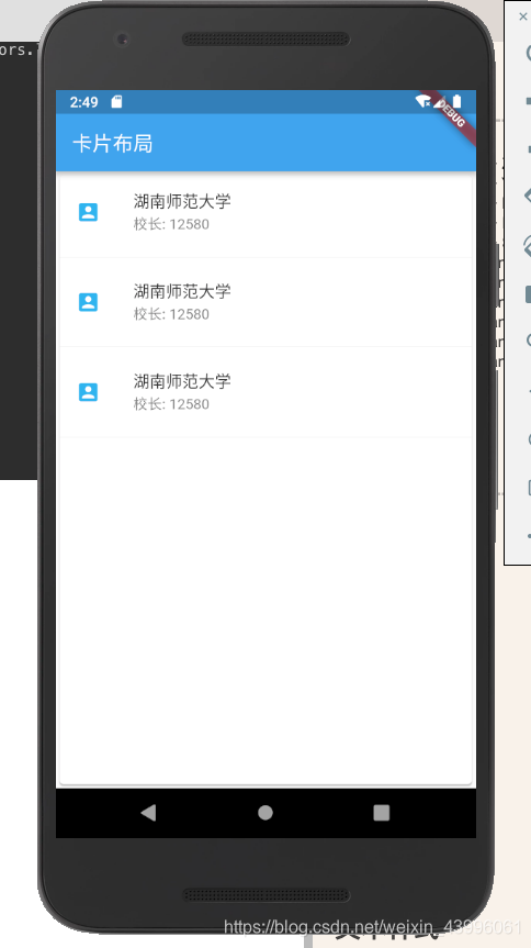
卡片布局
import 'package:flutter/material.dart';

void main() => runApp(MyApp());

class MyApp extends StatelessWidget{
  @override
  Widget build(BuildContext context) {
    var card = new Card(
      child: Column(
        children: <Widget>[
          ListTile(
            title: new Text('湖南师范大学', style: TextStyle(fontWeight: FontWeight.w500)),
            subtitle: new Text('校长: 12580'),
            leading: new Icon(Icons.account_box, color: Colors.lightBlue),
          ),
          new Divider(),
          ListTile(
            title: new Text('湖南师范大学', style: TextStyle(fontWeight: FontWeight.w500)),
            subtitle: new Text('校长: 12580'),
            leading: new Icon(Icons.account_box, color: Colors.lightBlue),
          ),
          new Divider(),
          ListTile(
            title: new Text('湖南师范大学', style: TextStyle(fontWeight: FontWeight.w500)),
            subtitle: new Text('校长: 12580'),
            leading: new Icon(Icons.account_box, color: Colors.lightBlue),
          ),
          new Divider(),
        ],
      ),
    );

    return MaterialApp(
      title: 'ListView widget',
      home: Scaffold(
        appBar: new AppBar(
          title: new Text('卡片布局'),
        ),
        body: Center(child: card),
      ),
    );
  }
}
页面的导航和返回
import 'package:flutter/material.dart';

void main() {
  runApp(MaterialApp(title: '导航展示', home: new FirstScreen()));
}

class FirstScreen extends StatelessWidget {
  @override
  Widget build(BuildContext context) {
    return new Scaffold(
      appBar: AppBar(title: Text('导航页面')),
      body: Center(child: RaisedButton(child: Text('查看商品详情页面'),
      onPressed: (){
        Navigator.push(context, new MaterialPageRoute(
          builder: (context) => new SecondScreen()
        ));
      })),
    );
  }
}

class SecondScreen extends StatelessWidget {
  @override
  Widget build(BuildContext context) {
    return Scaffold(
      appBar: AppBar(title: Text('详情页')),
      body: Center(child: RaisedButton(
        child: RaisedButton(
          child: Text('返回'),
          onPressed: () {
            Navigator.pop(context);
          },
        ),
      )),
    );
  }
}


 695
695


 被折叠的 条评论
为什么被折叠?
被折叠的 条评论
为什么被折叠?
 到【灌水乐园】发言


