


Vue3+Vite 自定义svg图标组件实现
- 安装插件
npm i vite-plugin-svg-icons -D
- 配置插件
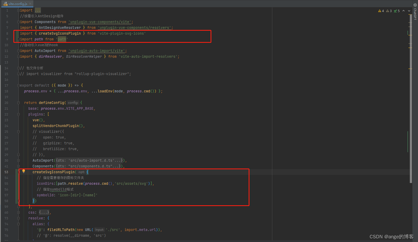
	  createSvgIconsPlugin({
        // 指定需要缓存的图标文件夹
        iconDirs:[path.resolve(process.cwd(),'src/assets/svg')],
        // 指定symbolld格式
        symbolId: 'icon-[dir]-[name]'
      })
- main.js文件引用svg注册工具
import 'virtual:svg-icons-register'
- 创建vue组件
<template>
  <svg aria-hidden="true" :class="svgClass">
    <use :xlink:href="symbolId" :fill="props.color" />
  </svg>
</template>

<script lang="ts" setup>
import { computed } from 'vue'
const props = defineProps({
  prefix: {
    type: String,
    default: 'icon'
  },
  name: {
    type: String,
    required: true
  },
  color: {
    type: String,
    default: '#333'
  },
  className: {
    type: String,
    default: ''
  }
})
const symbolId = computed(() => `#${props.prefix}-${props.name}`)
const svgClass = computed(() => {
    return props.className ? `svg-icon ${props.className}` : 'svg-icon'
})

</script>

<style>
.svg-icon {
  width: 1em;
  height: 1em;
  vertical-align: -0.1em;
  /* 因icon大小被设置为和字体大小一致,而span等标签的下边缘会和字体的基线对齐,故需设置一个往下的偏移比例,来纠正视觉上的未对齐效果 */
  fill: currentColor;
  /* 定义元素的颜色,currentColor是一个变量,这个变量的值就表示当前元素的color值,如果当前元素未设置color值,则从父元素继承 */
  overflow: hidden;
}
</style>
- 使用
<svg-icon name="location" />
该项目有自动引入组件,如没有自行引入


 165
165


 被折叠的 条评论
为什么被折叠?
被折叠的 条评论
为什么被折叠?
 到【灌水乐园】发言


