


 本文介绍了WPF中的用户控件(UserControl)和自定义控件(CustomControl)的区别和使用。用户控件主要用于复合控件,支持绑定但不支持模板重写,而自定义控件则可以完全自定义并支持模板重写,常用于功能扩展。示例展示了如何定义和使用这两种控件,包括依赖属性的设置和模板的编写。此外,还提到了自定义控件中的TemplatePart特性和视觉状态管理。
WPF中用户控件和自定义控件
无论是在WPF中还是WinForm中,都有用户控件(UserControl)和自定义控件(CustomControl),这两种控件都是对已有控件的封装,实现功能重用。但是两者还是有一些区别,本文对这两种控件进行讲解。
- 用户控件
- 注重复合控件的使用,也就是多个现有控件组成一个可复用的控件组
- XAML和后台代码组成,绑定紧密
- 不支持模板重写
- 继承自UserControl
- 自定义控件
- 完全自己实现一个控件,如继承现有控件进行功能扩展,并添加新功能
- 后台代码和Generic.xaml进行组合
- 在使用时支持模板重写
- 继承自Control
用户控件
用户控件比较容易理解,与常见的WPF窗体类似,值得注意一点的地方是内部在使用绑定的时候,需要使用RelativeSource的方式来绑定,以实现良好的封装。一个简单的案例:
- 定义用户控件
<UserControl
    x:Class="WpfApp19.UserControl1"
    xmlns="http://schemas.microsoft.com/winfx/2006/xaml/presentation"
    xmlns:x="http://schemas.microsoft.com/winfx/2006/xaml"
    xmlns:d="http://schemas.microsoft.com/expression/blend/2008"
    xmlns:local="clr-namespace:WpfApp19"
    xmlns:mc="http://schemas.openxmlformats.org/markup-compatibility/2006"
    d:DesignHeight="450"
    d:DesignWidth="800"
    mc:Ignorable="d">
    <Grid>
        <!--下面绑定都要用RelativeSource作为源-->
        <StackPanel>
            <TextBox
                Width="100"
                BorderThickness="2"
                Text="{Binding value, RelativeSource={RelativeSource AncestorType=UserControl}}" />
            <Button
                Width="100"
                Command="{Binding Command, RelativeSource={RelativeSource AncestorType=UserControl}}"
                Content="Ok" />
        </StackPanel>
    </Grid>
</UserControl>
后台代码
//根据需要定义依赖属性
//所需要绑定的值
 public int value
 {
     get { return (int)GetValue(valueProperty); }
     set { SetValue(valueProperty, value); }
 }
 public static readonly DependencyProperty valueProperty =
     DependencyProperty.Register("value", typeof(int), typeof(UserControl1), new PropertyMetadata(0));

 //所需要绑定的命令
 public ICommand Command
 {
     get { return (ICommand)GetValue(CommandProperty); }
     set { SetValue(CommandProperty, value); }
 }
 public static readonly DependencyProperty CommandProperty =
     DependencyProperty.Register("Command", typeof(ICommand), typeof(UserControl1), new PropertyMetadata(default(ICommand)));


 //所需要绑定的命令参数
 public object CommandParemeter
 {
     get { return (object)GetValue(CommandParemeterProperty); }
     set { SetValue(CommandParemeterProperty, value); }
 }
 public static readonly DependencyProperty CommandParemeterProperty =
     DependencyProperty.Register("CommandParemeter", typeof(object), typeof(UserControl1), new PropertyMetadata(0));
- 使用用户控件
<Window x:Class="WpfApp19.MainWindow"
        ...
        xmlns:local="clr-namespace:WpfApp19"
        Title="MainWindow" Height="450" Width="800">
    <Grid>
        <local:UserControl1 value="{Binding }" Command="{Binding }"/>
    </Grid>
</Window>
自定义控件
点击添加自定义控件后,会增加一个CustomControl1.cs文件以及一个Themes目录,在该目录下有一个Generic.xaml文件,该文件就是自定义控件的style。我们经常针对某些控件进行编辑模板-创建副本的操作而产生的style,其实就是Generic.xaml中定义的style。另外,有时我们可能遇到一种情况,也就是相同的软件在不同的Windows版本下运行,表现形式可能会不同,甚至某些系统下运行不了,这就是和不同系统下的默认的Theme不同。其实wpf控件找不到自定义的样式时,会从系统获取样式,查找顺序是,先查找所在的程序集,如果程序集定义了ThemeInfo特性,那么会查看ThemeInfoDictionaryLocation的属性值,该属性如果是None则说明没有特定的主题资源,值为SourceAssembly,说明特定资源定义在程序集内部,值为ExternalAssembly则说明在外部,如果还是没有找到,则程序会在自身的themes/generic.xaml中获取,在generic.xaml中获取的其实就和系统默认样式相关。
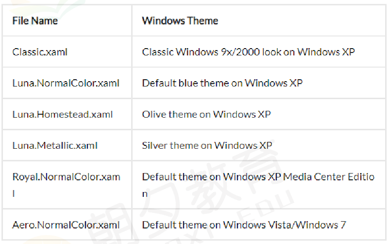
不同xaml所对应的系统主题
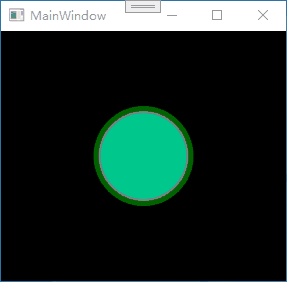
按钮案例
C#文件
public class Switch : ToggleButton
{
    static Switch()
    {
        //通过重写Metadata,控件就会通过程序集themes文件夹下的generic.xaml来寻找系统默认样式
        DefaultStyleKeyProperty.OverrideMetadata(typeof(Switch), new FrameworkPropertyMetadata(typeof(Switch)));
    }
}
Themes文件夹下的Generic.xaml文件
注意在该文件中不能有中文,注释也不行
<Style TargetType="{x:Type local:Switch}">
    <Setter Property="Template">
        <Setter.Value>
            <ControlTemplate TargetType="{x:Type local:Switch}">
                <Grid>
                    <Border
                        Name="dropdown"
                        Width="{Binding RelativeSource={RelativeSource Self}, Path=ActualHeight}"
                        Margin="-23"
                        CornerRadius="{Binding RelativeSource={RelativeSource Self}, Path=ActualHeight}"
                        Visibility="Collapsed">
                        <Border.Background>
                            <RadialGradientBrush>
                                <GradientStop Offset="1" Color="Transparent" />
                                <GradientStop Offset="0.7" Color="#5500D787" />
                                <GradientStop Offset="0.59" Color="Transparent" />
                            </RadialGradientBrush>
                        </Border.Background>
                    </Border>
                    <Border
                        Name="bor"
                        Width="{Binding RelativeSource={RelativeSource Self}, Path=ActualHeight}"
                        Background="Gray"
                        BorderBrush="DarkGreen"
                        BorderThickness="5"
                        CornerRadius="{Binding RelativeSource={RelativeSource Self}, Path=ActualHeight}">
                        <Border
                            Name="bor1"
                            Width="{Binding RelativeSource={RelativeSource Self}, Path=ActualHeight}"
                            Margin="2"
                            Background="#FF00C88C"
                            CornerRadius="{Binding RelativeSource={RelativeSource Self}, Path=ActualHeight}" />
                    </Border>
                </Grid>
                <ControlTemplate.Triggers>
                    <Trigger Property="IsChecked" Value="True">
                        <Trigger.EnterActions>
                            <BeginStoryboard>
                                <Storyboard>
                                    <ColorAnimation
                                        Storyboard.TargetName="bor1"
                                        Storyboard.TargetProperty="Background.Color"
                                        To="White"
                                        Duration="0:0:0.5" />
                                    <ColorAnimation
                                        Storyboard.TargetName="bor"
                                        Storyboard.TargetProperty="BorderBrush.Color"
                                        To="#FF32FAC8"
                                        Duration="0:0:0.5" />
                                    <ObjectAnimationUsingKeyFrames Storyboard.TargetName="dropdown" Storyboard.TargetProperty="Visibil
                                        <DiscreteObjectKeyFrame KeyTime="0:0:0.3">
                                            <DiscreteObjectKeyFrame.Value>
                                                <Visibility>Visible</Visibility>
                                            </DiscreteObjectKeyFrame.Value>
                                        </DiscreteObjectKeyFrame>
                                    </ObjectAnimationUsingKeyFrames>
                                </Storyboard>
                            </BeginStoryboard>
                        </Trigger.EnterActions>
                        <Trigger.ExitActions>
                            <BeginStoryboard>
                                <Storyboard>
                                    <ColorAnimation Storyboard.TargetName="bor1" Storyboard.TargetProperty="Background.Color" />
                                    <ColorAnimation Storyboard.TargetName="bor" Storyboard.TargetProperty="BorderBrush.Color" />
                                    <ObjectAnimationUsingKeyFrames Storyboard.TargetName="dropdown" Storyboard.TargetProperty="Visibil
                                        <DiscreteObjectKeyFrame KeyTime="0:0:0.3">
                                            <DiscreteObjectKeyFrame.Value>
                                                <Visibility>Collapsed</Visibility>
                                            </DiscreteObjectKeyFrame.Value>
                                        </DiscreteObjectKeyFrame>
                                    </ObjectAnimationUsingKeyFrames>
                                </Storyboard>
                            </BeginStoryboard>
                        </Trigger.ExitActions>
                    </Trigger>
                </ControlTemplate.Triggers>
            </ControlTemplate>
        </Setter.Value>
    </Setter>
</Style>
使用自定控件
<Grid>
    <local:Switch Width="100" Height="100" />
</Grid>
自定义控件中常用的知识点
- TemplatePart特性
在自定义控件中,有些控件是需要有名称的以便于调用,如在重写的OnApplyTemplate()方法中得到指定的button。这就要求用户在使用控件时,不能够修改模板中的名称。
//应用该控件时调用
public override void OnApplyTemplate()
{
    UpButtonElement = GetTemplateChild("UpButton") as RepeatButton;
    DownButtonElement = GetTemplateChild("DownButton") as RepeatButton;
}
所以在类前面使用特性进行标注
[TemplatePart(Name = "UpButton", Type = typeof(RepeatButton))]
[TemplatePart(Name = "DownButton", Type = typeof(RepeatButton))]
public class Numeric : Control{}
- 视觉状态的定义与调用
自定义控件中可以定义视觉状态来呈现不同状态下的效果。
在xml中定义视觉状态,不同组下的视觉状态是互斥的
<VisualStateManager.VisualStateGroups>
    <VisualStateGroup Name="FocusStates">
        <VisualState Name="Focused">
            <Storyboard>
                <ObjectAnimationUsingKeyFrames Storyboard.TargetName="FocusVisual"
                           Storyboard.TargetProperty="Visibility" Duration="0">
                    <DiscreteObjectKeyFrame KeyTime="0">
                        <DiscreteObjectKeyFrame.Value>
                            <Visibility>Visible</Visibility>
                        </DiscreteObjectKeyFrame.Value>
                    </DiscreteObjectKeyFrame>
                </ObjectAnimationUsingKeyFrames>
            </Storyboard>
        </VisualState>
        <VisualState Name="Unfocused"/>
    </VisualStateGroup>
</VisualStateManager.VisualStateGroups>
在C#中对应视觉状态的切换
private void UpdateStates(bool useTransitions)
{
    if (IsFocused)
    {
        VisualStateManager.GoToState(this, "Focused", false);
    }
    else
    {
        VisualStateManager.GoToState(this, "Unfocused", false);
    }
}
同时可以在后台类中使用特性来标注
[TemplateVisualState(Name = "Focused", GroupName = "FocusedStates")]
[TemplateVisualState(Name = "Unfocused", GroupName = "FocusedStates")]
public class Numeric : Control{}
其实完全可以使用Trigger来实现该功能
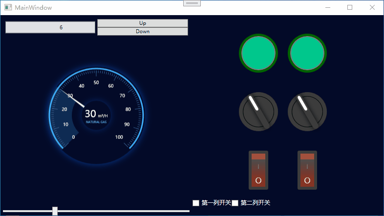
案例学习源码下载
分享几个用户控件和自定义控件的案例,效果如下:


 扫一扫
扫一扫


 被折叠的 条评论
为什么被折叠?
被折叠的 条评论
为什么被折叠?
 到【灌水乐园】发言


