


一、项目中引入ColorUI
ColorUI其实是一套小程序的CSS框架,最近使用的比较多,刚好在自定义底部导航栏遇到一些坑,特有以此推文。
微信小程序自定义底部导航条tabBar,有两种主流方式,一种是将TabBar页面和底部导航条作为组件,进行模拟切换,但是严格来说这种方式不太适用于复杂场景,很多页面级的生命周期等属性无法使用。另外一种就是通过微信小程序自定义TabBar接口,来实现接管系统TabBar,这也是本文的实现方法,能够完美复刻默认系统TabBar,更可增加自定义的功能实现。
二、 通过文件复制引入
-
进入ColorUI 的GitHub,拉下所有代码,项目中有三个目录,一个是ColorUI-UniApp这个是uni-app版本,一个是demo完整的案例版本,一个是template初始开发版本,复制demo或者template文件夹中的ColorUI文件夹至项目根目录。
-
app.wxss 引入关键css main.wxss和icon.wxss 即可。
	@import "/colorui/main.wxss";
	@import "/colorui/icon.wxss";
三、app.json中配置系统tabBar
虽然是自定义tabBar,但是tabBar的配置还是要有。
	"tabBar": {
    "custom": true,	//app.json系统tabBar设置 "custom": true
    "list": [
      {
        "text": "首页",
        "pagePath": "pages/shouye/shouye",
        "iconPath": "/img/tabbar/home.png",
        "selectedIconPath": "/img/tabbar/home_cur.png"
      },
      {
        "text": "我的",
        "pagePath": "pages/mine/mine",
        "iconPath": "/img/tabbar/my.png",
        "selectedIconPath": "/img/tabbar/my_cur.png"
      }
    ],
    "usingComponents":{}
  },
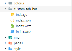
四、在项目根目录新建custom-tab-bar组件
在pages文件夹同级目录下,新建一个文件夹,文件夹名称为 “custom-tab-bar” ,就跟自定义组件一样创建,然后自己写基本样式
五、引入ColorUI样式至custom-tab-bar组件
- 因为组件内需要使用ColorUI的样式,但是在app.wxss中引入是作用不到custom-tab-bar组件的,所以需要在custom-tab-bar组件中index.wxss引入ColorUI样式文件。
- 虽然引入ColorUI的样式,但是由于微信小程序的自定义组件只支持class选择器,所以底部tabBar样式无法完整的显示出来,样式上会有差别,需要自行调整样式。
	@import "/colorui/main.wxss";
	@import "/colorui/icon.wxss";
六、选取ColorUI底部导航栏并引入
用微信小程序导入ColorUI的dome在操作条>底部操作条中选取相应的导航条,复制到custom-tab-bar组件的index.wxml
<!--index.wxml代码-->
<view class="cu-bar tabbar bg-white shadow">
	<view class="action" wx:for="{{list}}" wx:key="index" data-isSpecial="{{item.isSpecial}}" data-path="{{item.pagePath}}" data-selected="{{selected}}" data-index="{{index}}" bindtap="switchTab">

		<view wx:if="{{item.isSpecial}}" class="action text-gray add-action">
			<button class='cu-btn cuIcon-add bg-green shadow'></button>
			<view class='{{selected === index ? "text-green" : "text-gray"}}'>
				{{item.text}}
			</view>
		</view>

		<block wx:else>
			<view class='cuIcon-cu-image'>
				<image src='{{selected === index ? item.selectedIconPath : item.iconPath}}' class='{{selected === index ? "animation" : "animation"}}'></image>
			</view>
			<view class='{{selected === index ? "text-green" : "text-gray"}}'>{{item.text}}</view>
		</block>

	</view>
</view>
// index.js代码
Component({
  options: {
    addGlobalClass: true,
  },
  lifetimes: {

  },

  pageLifetimes: {

  },

  data: {
    selected: null, //设置底部切换高亮,并进行页面切换
    modalStatus: false,
    authorizeModal: false,
    "list": [{
        pagePath: "/pages/shouye/shouye",
        iconPath: "/img/tabbar/home.png",
        selectedIconPath: "/img/tabbar/home_cur.png",
        text: "首页"
      },
      {
        text: "发布",
        isSpecial: true
      },
      {
        pagePath: "/pages/mine/mine",
        iconPath: "/img/tabbar/my.png",
        selectedIconPath: "/img/tabbar/my_cur.png",
        text: "我的"
      }
    ]
  },

  methods: {
    switchTab(e) {
      console.log( e.currentTarget.dataset)
      const url = e.currentTarget.dataset.path
      this.setData({
        selected: e.currentTarget.dataset.index
      })
  }
})
到这里,自定义导航基本能在页面展示出来了,需要注意的是,每个tab页面,都要开启“usingComponents ”项,或者直接在app.json中全局设置。
虽然能展示出来了,但你试着切换导航,会发现一个问题,样式总是对应不上,比如 0 1 2 有这三个导航,你点了1之后,选中的样式是2,点2后,选中的样式是1,解决方法是:在每一个tab页面,在周期函数onShow里添加如下代码:
  // shouye.js部分代码
  /**
   * 生命周期函数--监听页面显示
   */
  onShow: function () {
	if (typeof this.getTabBar === 'function' &&
      this.getTabBar()) {
      console.log('设置选中项 0')
      this.getTabBar().setData({
        selected: 0
      })
    }
  },

  // fabu.js部分代码
  /**
   * 生命周期函数--监听页面显示
   */
  onShow: function () {
    if (typeof this.getTabBar === 'function' &&
     this.getTabBar()) {
     console.log('设置选中项 1')
     this.getTabBar().setData({
      selected: 1
     })
   }
  },

  // mine.js部分代码
  /**
   * 生命周期函数--监听页面显示
   */
  onShow: function () {
    if (typeof this.getTabBar === 'function' &&
      this.getTabBar()) {
      console.log('设置选中项 2')
      this.getTabBar().setData({
        selected: 2
      })
    }
  },
注意每个tab页面的selected值不同,对应“custom-tab-bar”中data的list数组中的下标,this.getTabBar()其实返回的就是自定义的那个导航组件“custom-tab-bar” (可自行打印查看),然后执行setData去修改selected的值,从而让样式正常显示。。
以上就是本文的全部内容,希望对大家的学习有所帮助


 7426
7426


 被折叠的 条评论
为什么被折叠?
被折叠的 条评论
为什么被折叠?
 到【灌水乐园】发言


