


使用bootstrap需要的文件
css文件
<link rel="stylesheet" href="https://cdn.jsdelivr.net/npm/bootstrap@4.4.1/dist/css/bootstrap.min.css" integrity="sha384-Vkoo8x4CGsO3+Hhxv8T/Q5PaXtkKtu6ug5TOeNV6gBiFeWPGFN9MuhOf23Q9Ifjh" crossorigin="anonymous">js文件
<script src="https://cdn.jsdelivr.net/npm/jquery@3.4.1/dist/jquery.slim.min.js" integrity="sha384-J6qa4849blE2+poT4WnyKhv5vZF5SrPo0iEjwBvKU7imGFAV0wwj1yYfoRSJoZ+n" crossorigin="anonymous"></script>
<script src="https://cdn.jsdelivr.net/npm/popper.js@1.16.0/dist/umd/popper.min.js" integrity="sha384-Q6E9RHvbIyZFJoft+2mJbHaEWldlvI9IOYy5n3zV9zzTtmI3UksdQRVvoxMfooAo" crossorigin="anonymous"></script>
<script src="https://cdn.jsdelivr.net/npm/bootstrap@4.4.1/dist/js/bootstrap.min.js" integrity="sha384-wfSDF2E50Y2D1uUdj0O3uMBJnjuUD4Ih7YwaYd1iqfktj0Uod8GCExl3Og8ifwB6" crossorigin="anonymous"></script>
bootstrap官网传送门:https://v4.bootcss.com/docs/getting-started/introduction/
组件传送门:https://v4.bootcss.com/docs/components/alerts/
更多轮播图推荐传送门:https://www.swiper.com.cn/
容器和网格系统
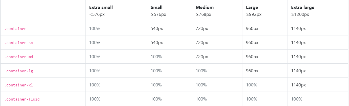
容器
- container 是固定宽度
- container-fluid 是100%宽度 (踩坑:有内边距,如需去除加上px-0即可)
栅格系统
- col-?<576px
- col-sm-?>=576px
- col-md-?>=768px
- col-lg-?>=992px
- col-xl-?>=1200px
字体颜色及背景颜色
字体
- text-muted 柔和
- text-primary 重要
- text-success 成功
- text-info 提示
- text-warning 警告
- text-danger 危险
- text-secondary 副标题
- text-dark 黑色文字
- text-light 浅灰色
- text-white 白色
背景
- bg-primary 重要
- bg-secondary 次要
- bg-success 成功
- bg-danger 危险
- bg-warning 警告
- bg-info 提示
- bg-light 浅灰色
- bg-dark 黑色
- bg-white 白色
表格
- table 默认样式
- table-striped 条纹表格
- table-bordered 边框表格
- table-hover 鼠标悬停
- table-dark 黑色背景表格
- table-responsive 响应式表格
边框
添加边框
- border 默认
- border-top 上边框
- border-left 左边框
- border-right 右边框
- border-bottom 下边框
删除边框
- border-0 默认
- border-top-0 上边框为0
- border-left-0 左边框为0
- border-right-0 右边框为0
- border-bottom-0 下边框为0
边框颜色
- border-primary 重要
- border-secondary 次要
- border-success 成功
- border-danger 危险
- border-warning 警告
- border-info 提示
- border-light 浅灰色
- border-dark 黑色
- border-white 白色
圆角边框
- rounded 默认
- rounded-top 顶部两边圆角
- rounded-right 右边两边圆角
- rounded-bottom 下边两边圆角
- rounded-left 左边两边圆角
- rounded-circle 椭圆效果
- rounded-0 没有圆角
- img-thumbnail 图片缩略图效果
- img-fluid 图片响应式效果
超大屏幕
- jumbotron 屏幕
- jumbotron-fluid 没有圆角的全屏幕
内边距(pading)外边距(margin)
- m 代表 margin
- p 代表 padding
内边距
- p-1 padding: 25rem!important;
- p-2 padding: 5rem!important;
- p-3 padding: 1rem!important;
- p-4 padding: 1.5rem!important;
- p-5 padding: 3rem!important;
单边
- pt-0 上内边距为0
- pl-0 左内边距为0
- pr-0 右内边距为0
- pb-0 下内边距为0
- px-2 padding-right: 0.5rem !important;margin-left: 0.5rem !important
- py-2 padding-top: 0.5rem !important;margin-bottom: 0.5rem !important
- px-0 取消边距
外边距
- m-1 margin: .25rem!important;
- m-2 margin: .5rem!important;
- m-3 margin: 1rem!important;
- m-4 margin: 1.5rem!important;
- m-5 margin: 3rem!important;
单边
- mt-0 上外边距为0
- ml-0 左外边距为0
- mr-0 右外边距为0
- mb-0 下外边距为0
- mx-auto 居中显示
单边大小
- mt-1 margin-top: 0.25rem !important
- mt-2 margin-top: 0.5rem !important
- mt-3 margin-top: 1rem !important
- mt-4 margin-top: 1.5rem !important
- mt-5 margin-top: 3rem !important
- m-auto margin:auto!important
- margin: 0 auto
- ml-auto margin-left: auto!important;
- mr-auto margin-right: auto!important;
- mt-auto margin-top: auto!important;
- mb-auto margin-bottom: auto!important;
display
- d-? 任何尺寸使用
- d- sm、 md、 lg、 xl 对应尺寸加载
- d-none 不显示
- d-inline 显示为内联元素
- d-inline-block 行内块元素
- d-block 块级元素
- d-table 块级表格来显示
- d-table-cell 表格单元格显示(类似 <td> 和 <th>)
- d-table-row 表格行显示(类似 <tr>)
打印样式 使用较少,了解即可
- d-print-none
- d-print-inline
- d-print-inline-block
- d-print-block
- d-print-table
- d-print-table-row
- d-print-table-cell
- d-print-flex
- d-print-inline-flex
导航栏
- navbar
- navbar-expand-sm
- bg-light
- ul:navbar-nav
- li:nav-item
表单
- form-group
- label for email
- input class form-control
按钮组
- btn-group 按钮组
- btn-group-lg|sm|xs 控制按钮组大小
- btn-group-vertical 垂直按钮组
弹性布局
- d-flex 弹性伸缩盒显示
- d-inline-flex 内联块级弹性伸缩盒显示
- d-sm-flex 对应尺寸加载
- d-sm-inline-flex
- d-md-flex
- d-md-inline-flex
- d-lg-flex
- d-lg-inline-flex
- d-xl-flex
- d-xl-inline-flex
方向 水平
- flex-row
- flex-row-reverse 相反方向
垂直
- flex-column
- flex-column-reverse
同样的不同尺寸适配样式
- flex-row
- flex-row-reverse
- flex-column
- flex-column-reverse
- flex-sm-row
- flex-sm-row-reverse
- flex-sm-column
- flex-sm-column-reverse
- flex-md-row
- flex-md-row-reverse
- flex-md-column
- flex-md-column-reverse
- flex-lg-row
- flex-lg-row-reverse
- flex-lg-column
- flex-lg-column-reverse
- flex-xl-row
- flex-xl-row-reverse
- flex-xl-column
- flex-xl-column-reverse
- justify content 可匹配到不同尺寸
- justify-content-start 位于容器的开头
- justify-content-end 位于容器的结尾
- justify-content-center 位于容器的中心
- justify-content-between 位于各行之间留有空白的容器内
- justify-content-around 位于各行之前、之间、之后都留有空白的容器内
浮动
- float-left 左浮动
- float-right 右浮动
- float-none 取消浮动
定位
- position-static 默认
- position-relative 相对定位 相对于其本身正常位置来进行定位,它原本所占的空间仍保留
- position-absolute 绝对定位
- position-fixed 固定定位
- position-sticky 粘性定位
固定定位 - fixed-top 固定上
- fixed-bottom 固定下
标题尺寸
- w-25 width: 25%
- w-50 width: 50%
- w-75 width: 75%
- w-100 width: 100%
区间 - mw-100
- mh-100
文本
文本定位
- text-left 文本居左
- text-center 文本居中
- text-right 文本居右
- text-sm-left sm尺寸下文本居左 以此变换还有右上下
- text-md-left md尺寸下文本居左 以此变换还有右上下
- text-lg-left lg尺寸下文本居左 以此变换还有右上下
- text-xl-left xl尺寸下文本居左 以此变换还有右上下
文本转换
- text-lowercase 字母文本小写
- text-uppercase 字母文本大写
- text-capitalize 文本中的每个单词以大写字母开头
字体加重和斜体
- font-weight-bold 字体加重
- font-weight-normal 正常字体
- font-weight-light 字体变细
- font-italic 斜体
对齐方式
- align-top 居上
- align-middle 垂直
- align-bottom 居下
- align-text-top 文字居上
- align-text-bottom 文字居下
显示与隐藏
- show 显示
- hidden隐藏
- hide 仍然可用,但是它不能对屏幕阅读器不起作用 不建议使用
- invisible 隐藏保留该元素的文档位置
- visible 可见
- visibility: hidden!important;
进度条
- progress 添加一个div
- progress-bar 在上面的div中添加一个progress-bar的div
分页
- pagination ul元素上添加
- page-item 在li元素上添加page-item
列表组
- list-group 列表组
- list-group-item 列表li
- list-group-item-action
卡片
- card
- card-header
- card-body
- card-footer
- card-img-top 图片
- card-body、card-title、card-text 图片卡片
- card-img-overlay设置图片为背景
下拉菜单
- dropdown 下拉菜单默认
- button设置dropdown-toggle data-toggle=“dropdown” 下拉button
- dropdown-menu 下拉菜单
- a设置样式dropdown-item


 576
576


 被折叠的 条评论
为什么被折叠?
被折叠的 条评论
为什么被折叠?
 到【灌水乐园】发言


