


 本文通过示例介绍了如何使用CSS来创建不同的图形,包括设置border-radius属性制作圆形,通过调整不同角的border-radius实现圆角矩形,并展示了如何设置不同边角的圆角大小以创建定制形状。这些技巧对于前端开发者在网页设计中创建独特视觉效果非常实用。
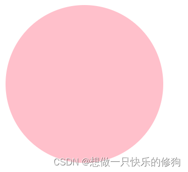
1. 圆形
思路: 先准备一个正方形,让border-radius(半径)为高度/宽度的一半即可。
1.1 代码
<!DOCTYPE html>
<html lang="en">
  <head>
    <meta charset="UTF-8" />
    <meta http-equiv="X-UA-Compatible" content="IE=edge" />
    <meta name="viewport" content="width=device-width, initial-scale=1.0" />
    <title>Document</title>
    <style>
      .circle {
        background-color: pink;
        width: 200px;
        height: 200px;
        /* 设置为高度/宽度的一半 */
        border-radius: 100px;
      }
    </style>
  </head>
  <body>
    <div class="circle"></div>
  </body>
</html>
1.2 结果
2. 圆角矩形
思路: 让border-radius为高度的一半即可
2.1 代码
<!DOCTYPE html>
<html lang="en">
<head>
  <meta charset="UTF-8">
  <meta http-equiv="X-UA-Compatible" content="IE=edge">
  <meta name="viewport" content="width=device-width, initial-scale=1.0">
  <title>Document</title>
  <style>
    .juxing {
      width: 200px;
      height: 50px;
      background-color: yellowgreen;
      /* 设置为高度的一半 */
      border-radius: 25px;
    }
  </style>
</head>
<body>
  <div class="juxing"></div>
</body>
</html>
1.2 结果

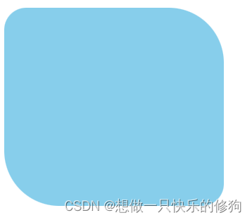
3. 不同圆角的设置
border-radius顺序:左上角、右上角、右下角、左下角
3.1 代码
<!DOCTYPE html>
<html lang="en">
<head>
  <meta charset="UTF-8">
  <meta http-equiv="X-UA-Compatible" content="IE=edge">
  <meta name="viewport" content="width=device-width, initial-scale=1.0">
  <title>Document</title>
  <style>
    .radius {
      background-color: skyblue;
      width: 200px;
      height: 180px;
      border-radius: 20px 50px 20px 50px;
    }
  </style>
</head>
<body>
  <div class="radius"></div>
</body>
</html>
3.2 结果


 扫一扫
扫一扫


 1703
1703

 被折叠的 条评论
为什么被折叠?
被折叠的 条评论
为什么被折叠?
 到【灌水乐园】发言


