


实现效果:
自动轮播效果请见:自动轮播函数封装
option = {
tooltip: {
trigger: "item",
formatter: "{a} <br/>{b}: {c}",
},
series: [
{
name: "",
type: "pie",
tooltip: {
trigger: "item",
formatter: "{b}: {c}",
},
radius: ["30%", "45%"],
avoidLabelOverlap: false,
color: ["#EBFF00", "#00FFB4"],
labelLine: {
show: false,
length: 10,
length2: 5,
lineStyle: {
color: "#FFFFFF", // 改变标示线的颜色
},
},
label: {
normal: {
show: false,
formatter: "{per|{d}%}\n{hr|}\n{a|}\n{b|{b}}", //这里最后另一行设置了一个空数据是为了能让延长线与hr线对接起来
padding: [-5, 0, 0, 0], //取消hr线跟延长线之间的间隙
rich: {
a: {
color: "#FFFFFF",
lineHeight: 20, //设置最后一行空数据高度,为了能让延长线与hr线对接起来
align: "center",
},
hr: {
//设置hr是为了让中间线能够自适应长度
borderColor: "#ffffff", //hr的颜色为auto时候会主动显示颜色的
width: "100%",
borderWidth: 0.5,
height: 0.5,
},
d: {
fontSize: 15,
padding: [-10, 0, 10, 0],
},
b: {
color: "#FFFFFF",
fontSize: 15,
},
per: {
//用百分比数据来调整下数字位置,显的好看些。如果不设置,formatter最后一行的空数据就不需要
padding: [11, 0],
fontSize: 20,
},
},
},
},
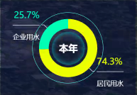
data: [
{
value: 25.7,
name: "居民用水",
label: { show: true, fontSize: "8", fontWeight: "bold" },
labelLine: { show: true },
},
{
value: 74.3,
name: "企业用水",
label: { show: true, fontSize: "8", fontWeight: "bold" },
labelLine: { show: true },
},
],
},
],
};


 2748
2748


 被折叠的 条评论
为什么被折叠?
被折叠的 条评论
为什么被折叠?
 到【灌水乐园】发言


