此文章专门用来跟踪记录vue+highCharts在使用过程中的一些常见的需求设置。本人每次开发图表的时候,看官方文档脑壳都大了,属性太多,密密麻麻的,根本记不住。所以整理一些常见的功能实现方式,方便自己今后查阅。(后续会根据实际情况不断更新)
1、隐藏右下角logo

xAxis:{...},
yAxis:{...},
credits: {
enabled: false
}
2、隐藏横线网格

yAxis:{
gridLineColor: 'transparent'
}
3、显示y轴线

yAxis:{
		lineWidth: 1
	}
4、自定义轴线颜色和文字颜色

xAxis:{
		  lineColor: 'red',
          labels: {
            style: {
              color: 'red'
            }
          }
	}
5、自定义线条颜色

yAxis:{...},
series: [{
		data: [...],
		color:'red'
	}]
6、隐藏数据点marker

yAxis:{...},
series: [{
		data: [...],
		marker: {
            enabled: false
        }
	}]
7、指定分区显示不同的颜色或者线条样式 官网在线例子

yAxis:{...},
series: [{
data: [...],
zoneAxis: 'x',
zones: [{
value: 8
}, {
dashStyle: 'dot',
color: {
linearGradient: {
x1: 0,
y1: 0,
x2: 0,
y2: 1
},
stops: [
[0, 'red'],
[0.9, '#303642']
]
}
}]
}]
8、自定义图表背景颜色
chart: {
backgroundColor: '#303642',
type: 'spline'
}
9、去掉导出图表按钮
yAxis: {},
exporting: { enabled:false }
10、改变柱状图柱子颜色

方法一:
    plotOptions: {
		series: {
			colorByPoint: true,
			colors: ['red', 'blue']
		}
	}

方法二:
xAxis: {...},
series: [{
		data: [29.9, 71.5, 106.4, 129.2, 144.0, 176.0, 135.6, 148.5, 216.4, 194.1, 95.6, 54.4],
		colorByPoint: true,
		colors: ['red', 'blue']
}]
11、更改数据点大小
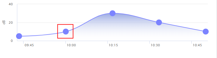
xAxis:{},
plotOptions: {
series: {
animation: false,
turboThreshold: 0,
marker: {
enabled: true,
symbol: 'circle',
radius: 10,
states: {
hover: {
enabled: true
}
}
}
}
}
12、曲线面积图
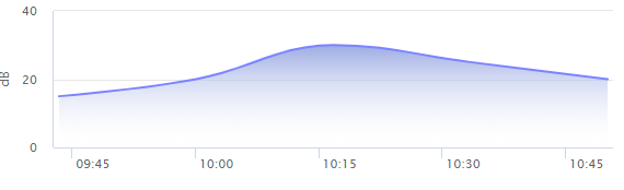
chart:{
type: 'areaspline',
marginRight: 10
},
xAxis:{},
plotOptions: {
series: {
animation: false,
turboThreshold: 0,
fillColor: {
linearGradient: {
x1: 0,
y1: 0,
x2: 0,
y2: 1
},
stops: [
[0, '#9CABE2'],
[1, HighCharts.Color('white').setOpacity(0).get('rgba')]
]
}
}
}
13、更改数据点颜色
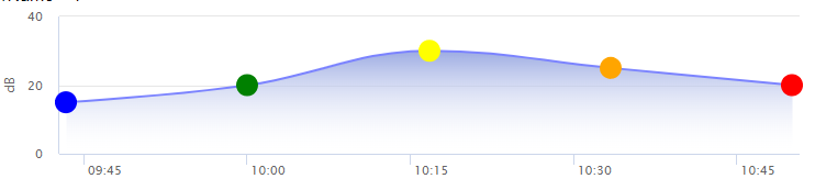
xAxis:{},
series: [{
name: '噪声',
data: [{
x: 1637117403000,
y: 20,
marker: { fillColor: 'red' }
}]
}]
14、添加合格基准线(假设为60分)

yAxis: {
plotLines: [{
color: 'red',
dashStyle: 'Dash',
width: 1,
value: 60,
zIndex: 5
}]
}
15、时间标签格式化

		xAxis: {
          type: 'datetime',
          dateTimeLabelFormats: {
            day: '%m月%e号'
          }
        }


 6366
6366


 被折叠的 条评论
为什么被折叠?
被折叠的 条评论
为什么被折叠?
 到【灌水乐园】发言


