


效果图: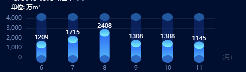
代码:
var xData3 = ["6", "7", "8", "9","10","11"];
    var data3 = [1209, 1715, 2408, 1308, 1308, 1145];
    var data5 = [4000, 4000, 4000, 4000, 4000,4000];
    var option = {
      tooltip: {
        trigger: "axis",
        show: false,
      },
      grid: {
        left: 50,
        bottom: 25,
        top: 30,
        right: 40,
      },
      xAxis: {
        data: xData3,
        name: "(月)",
        // 坐标轴刻度相关设置
        axisTick: {
          show: false,
        },
        // 坐标轴线的相关设置
        axisLine: {
          show: true,
          lineStyle: {
            color: "#414965",
          },
        },
        // 坐标轴刻度标签的相关设置
        axisLabel: {
          // 可以设置成 0 强制显示所有标签
          interval: 0,
          textStyle: {
            color: "#7089ba",
            fontSize: 12,
          },
          margin: 15, //刻度标签与轴线之间的距离。
        },
      },
      yAxis: {
        name: "单位: 万m³",
        nameTextStyle: {
          color: "#fff",
        },
        // 坐标轴在grid区域中的分隔线
        splitLine: {
          show: true,
          lineStyle: {
            color: "#414965",
            opacity: 0.3,
          },
        },
        axisTick: {
          show: false,
        },
        axisLine: {
          show: false,
        },
        axisLabel: {
          textStyle: {
            color: "#7089ba",
            fontSize: 12,
          },
        },
      },
      series: [
        {
          //三个最低下的圆片
          // 系列名称,用于tooltip的显示,legend 的图例筛选,在 setOption 更新数据和配置项时用于指定对应的系列
          name: "",
          type: "pictorialBar",
          symbolSize: [20, 15],
          symbolOffset: [0, 10],
          z: 12,
          // 图形样式
          itemStyle: {
            opacity: 1,
            normal: {
              show: true,
              color: new echarts.graphic.LinearGradient(0, 0, 0, 1, [
                {
                  offset: 0,
                  color: "#2d6ac5",//0%处的颜色
                },
                {
                  offset: 1,
                  color: "#2d6ac5",//100%处的颜色
                },
              ]),
              barBorderRadius: 0,
              borderWidth: 0,
            },
          },
          // 显示最底下的圆片
          data: [1, 1, 1, 1, 1,1],
        },

        //下半截柱状图
        {
          name: "2020",
          type: "bar",
          barWidth: 20,
          barGap: "100%",
          itemStyle: {
            //lenged文本
            opacity: 0.1,
            normal: {
              show: true,
              color: new echarts.graphic.LinearGradient(0, 1, 0, 0, [
                {
                  offset: 0,
                  color: "#51b1f9",
                },
                {
                  offset: 1,
                  color: "#2f6ef6",
                },
              ]),
              barBorderRadius: 0,
              borderWidth: 0,
            },
          },
          label: {
            show: true,
            position: "top",
            distance: 10,
            color: "#fff",
          },

          data: data3,
        },
        {
          name: "", //头部
          type: "pictorialBar",
          symbolSize: [20, 15],
          symbolOffset: [0, -10],
          z: 12,
          symbolPosition: "end",
          itemStyle: {
            color: "#22589f",
            opacity: 1,
          },
          data: data5,
        },

        {
          name: "",
          type: "pictorialBar",
          // 图形的大小
          symbolSize: [20, 15],
          // 图形相对于原本位置的偏移
          symbolOffset: [0, -10],
          z: 12,
          itemStyle: {
            opacity: 1,
            normal: {
              show: true,
              color: new echarts.graphic.LinearGradient(0, 0, 0, 1, [
                {
                  offset: 0,
                  color: "#48a4f8",
                },
                {
                  offset: 1,
                  color: "#7df4f9",
                },
              ]),
              barBorderRadius: 0,
              borderWidth: 0,
            },
          },
          // 图形的定位位置
          symbolPosition: "end",
          data: data3,
        },

        {
          name: "2019",
          type: "bar",
          barWidth: 20,
          // 如果想要两个系列的柱子重叠,可以设置 barGap 为 '-100%'。这在用柱子做背景的时候有用。
          barGap: "-100%",
          z: 0,
          itemStyle: {
            color: "#102a6f",
            opacity: 0.7,
          },
          data: data5,
        },
      ],
    };

    //this.Chart_init = echarts.init(this.Chart_dom.current);
    //this.Chart_init.setOption(option);
上面的代码就是实现效果图的配置。


 6772
6772


 被折叠的 条评论
为什么被折叠?
被折叠的 条评论
为什么被折叠?
 到【灌水乐园】发言


