


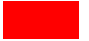
正方形
实时渲染效果如下:

代码如下:
<style>
    .box {
        width: 100px;
        height: 100px;
        background-color: red;
    }
</style>
长方形
实时渲染效果如下:
代码如下:
<style>
    .box {
        width: 200px;
        height: 100px;
        background-color: red;
    }
</style>
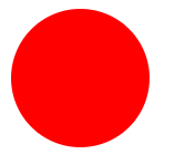
圆
实时渲染效果如下:
代码如下:
<style>
    .box {
        width: 100px;
        height: 100px;
        border-radius: 50%;
        background-color: red;
    }
</style>
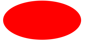
椭圆
实时渲染效果如下:
代码如下:
<style>
    .box {
        width: 200px;
        height: 100px;
        border-radius: 50%;
        background-color: red;
    }
</style>
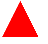
向上三角形
实时渲染效果如下:
代码如下:
<style>
    .box {
        width: 0;
        border-left: 50px solid transparent;
        border-right: 50px solid transparent;
        border-bottom: 100px solid red;
    }
</style>
向下三角形
实时渲染效果如下:
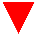
代码如下:
<style>
   .box {
       width: 0;
       border-left: 50px solid transparent;
       border-right: 50px solid transparent;
       border-top: 100px solid red;
   }
</style>
方向朝左的三角
实时渲染效果如下:
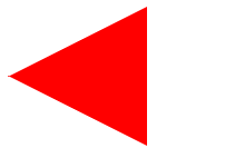
代码如下:
<style>
    .box {
        width: 0;
        border-top: 50px solid transparent;
        border-right: 100px solid red;
        border-bottom: 50px solid transparent;
    }
</style>
方向朝右的三角形
实时渲染效果如下:

代码如下:
<style>
    .box {
        width: 0;
        border-top: 50px solid transparent;
        border-left: 100px solid red;
        border-bottom: 50px solid transparent;
    }
</style>
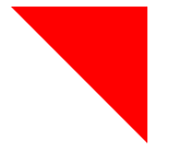
左上三角

代码如下:
<style>
     .box {
         width: 0;
         border-top: 100px solid red;
         border-right: 100px solid transparent;
     }
 </style>
右上三角
实时渲染效果如下:
代码如下:
<style>
    .box {
        width: 0;
        border-top: 100px solid red;
        border-left: 100px solid transparent;
    }
</style>
右下角三角图形
实时渲染效果如下:
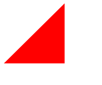
代码如下:
<style>
    .box {
        width: 0;
        height: 0;
        border-bottom: 100px solid red;
        border-left: 100px solid transparent;
    }
</style>
六角星
实时渲染效果如下:

代码如下:
<style>
    .box {
        width: 0;
        border-left: 50px solid transparent;
        border-right: 50px solid transparent;
        border-bottom: 100px solid red;
        position: relative;
    }

    .box::after {
        border-left: 50px solid transparent;
        border-right: 50px solid transparent;
        border-top: 100px solid red;
        position: absolute;
        content: "";
        top: 30px;
        left: -50px;
    }
</style>
爱心
实时渲染效果如下:

代码如下:
<style>
     .box {
         position: relative;
         width: 100px;
         height: 90px;
     }

     .box:before,
     .box:after {
         position: absolute;
         content: "";
         left: 50px;
         top: 0;
         width: 50px;
         height: 80px;
         background: red;
         border-radius: 50px 50px 0 0;
         transform: rotate(-45deg);
         transform-origin: 0 100%;
     }

     .box:after {
         left: 0;
         transform: rotate(45deg);
         transform-origin: 100% 100%;
     }
 </style>
月儿弯弯
实时效果渲染如下:

代码如下:
<style>
    .box {
        width: 80px;
        height: 80px;
        border-radius: 50%;
        box-shadow: 15px 15px 0 0 red;
    }
</style>


 937
937


 被折叠的 条评论
为什么被折叠?
被折叠的 条评论
为什么被折叠?
 到【灌水乐园】发言


