


以下示例演示在 MATLAB® 中以可视方式呈现四维 (4-D) 数据的几种方法。
1.以可视化形式呈现具有离散变量的四维数据
有时数据含有一个离散变量,即该变量仅有几个可能的值。您可以对每个离散组中的数据创建多个具有相同类型的绘图。例如,使用 stem3 函数查看三个变量之间的关系,第四个变量则将总体数据划分为若干个离散组。
load patients Smoker Age Weight Systolic                           % load data

nsIdx = Smoker == 0;
smIdx = Smoker == 1;

figure
stem3(Age(nsIdx), Weight(nsIdx), Systolic(nsIdx), 'Color', 'b')    % stem plot for non-smokers
hold on
stem3(Age(smIdx), Weight(smIdx), Systolic(smIdx), 'Color', 'r')    % stem plot for smokers
hold off

view(-60,15)
zlim([100 140])

xlabel('Age')                                                      % add labels and a legend
ylabel('Weight')
zlabel('Systolic Blood Pressure')
legend('Non-Smoker', 'Smoker', 'Location', 'NorthWest')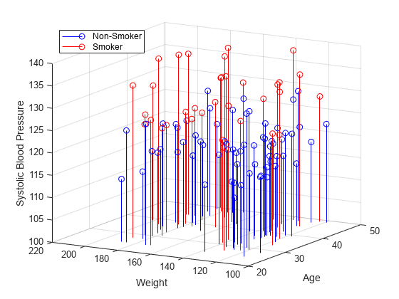
2.用多个绘图可视化四维数据
有了大型数据集,您可能想要查看各个变量是否相互关联。您可以使用 plotmatrix 函数创建绘图的 n x n 矩阵,以查看变量之间的成对关系。plotmatrix 函数返回两个输出。第一个输出是散点图中使用的线条对象的矩阵。第二个输出是所创建的坐标区对象的矩阵。
plotmatrix 函数还可用于更高阶数据集。
load patients Height Weight Diastolic Systolic    % load data

labels = {'Height' 'Weight' 'Diastolic' 'Systolic'};
data = [Height Weight Systolic Diastolic];

[h,ax] = plotmatrix(data);                        % create a 4 x 4 matrix of plots
for i = 1:4                                       % label the plots
  xlabel(ax(4,i), labels{i})
  ylabel(ax(i,1), labels{i})
end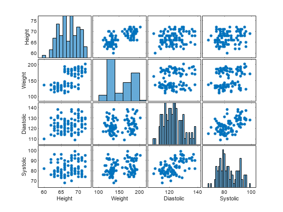
3.以可视化形式呈现包含三个变量的函数
对于许多类型的四维数据,您可以使用颜色来表示第四维度。如果您有一个三变量函数,这通常会很有效。
例如,将美国高速公路死亡数据表示为经度、纬度以及位置是在农村还是城市的函数。绘图中的 x、y 和 z 值表示这三个变量。颜色表示高速公路死亡人数。
cla
load accidents hwydata                             % load data

long = -hwydata(:,2);                              % longitude data
lat = hwydata(:,3);                                % latitude data
rural = 100 - hwydata(:,17);                       % percent rural data
fatalities = hwydata(:,11);                        % fatalities data

scatter3(long,lat,rural,40,fatalities,'filled')    % draw the scatter plot
ax = gca;
ax.XDir = 'reverse';
view(-31,14)
xlabel('W. Longitude')
ylabel('N. Latitude')
zlabel('% Rural Population')

cb = colorbar;                                     % create and label the colorbar
cb.Label.String = 'Fatalities per 100M vehicle-miles';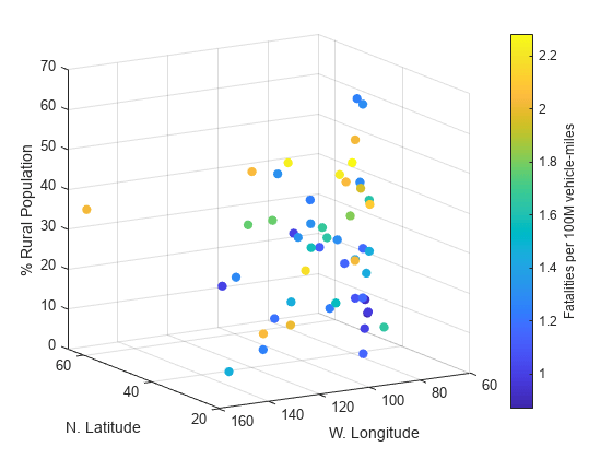
4.可视化空间体中的数据
您的数据可能包含测量物理对象所得的值,如管道内的温度。在此情况下,物理维度可以表示为一个空间体,用颜色表示测量的幅值。例如,使用 slice 函数显示在空间体横截面处所测得的变量的值。
load fluidtemp x y z temp                       % load data

xslice = [5 9.9];                               % define the cross sections to view
yslice = 3;
zslice = ([-3 0]);

slice(x, y, z, temp, xslice, yslice, zslice)    % display the slices
ylim([-3 3])
view(-34,24)

cb = colorbar;                                  % create and label the colorbar
cb.Label.String = 'Temperature, C';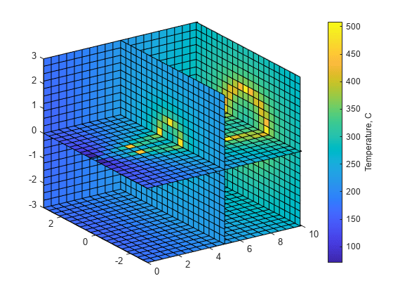
5.绘制包含复变量的函数
复函数的输入和输出都含有实部和虚部。您可以使用带有颜色的三维绘图表示复函数。在此情况下,x 和 y 轴表示输入的实部和虚部。z 轴表示输出的实部,颜色表示输出的虚部。
r = (0:0.025:1)';                        % create a matrix of complex inputs
theta = pi*(-1:0.05:1);
z = r*exp(1i*theta);
w = z.^3;                                % calculate the complex outputs

surf(real(z),imag(z),real(w),imag(w))    % visualize the complex function using surf
xlabel('Real(z)')
ylabel('Imag(z)')
zlabel('Real(w)')
cb = colorbar;
cb.Label.String = 'Imag(w)';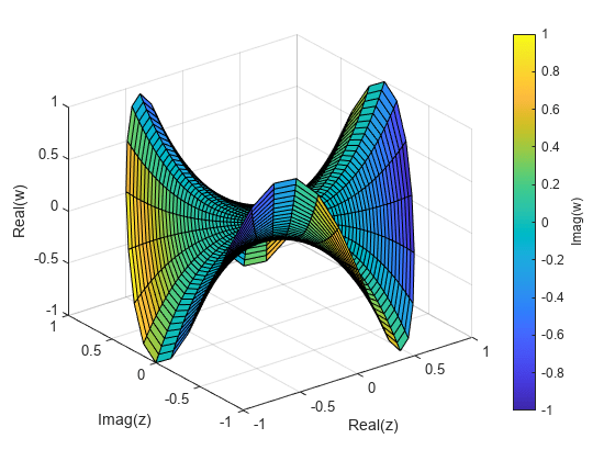


 721
721

 被折叠的 条评论
为什么被折叠?
被折叠的 条评论
为什么被折叠?
 到【灌水乐园】发言


