


.NET Multi-platform App UI (.NET MAUI) 应用的用户界面 (UI) 由映射到每个目标平台的本机控件的对象构成。
用于创建 .NET MAUI 应用的用户界面的主控件组包括页面、布局和视图。 .NET MAUI 页面通常占据整个屏幕或窗口。 页面通常包含布局,其中包含视图以及可能的其他布局。 页面、布局和视图派生自 VisualElement 类。 此类提供可在派生类中发挥帮助作用的各种属性、方法和事件。
目前(.net8)对ios兼容不好的控件,新写的尽量用其它的代替:
1、Frame(Border)
2、Button(Border+GestureRecognizers)
遇到圆角异常也可以尝试使用OnPlatform分别设置平台的圆角值
3、BoxView(Border\Grid)
遇到背景色失效也可以尝试同时设置BackgroundColor、Background、Color
4、ImageButton (Image+GestureRecognizers)
遇到宽高设置无效也可以设置 MinimumHeightRequest、MaximumHeightRequest、MinimumWidthRequest、 MaximumWidthRequest任意一项
5、CollectionView也不太行 不过listview又不太灵活只能垂直的(listview如果遇到渲染异常也可以尝试添加BackgroundColor=“Transparent” SeparatorVisibility=“None” HasUnevenRows=“True”)
6、Lable lineheight属性在ios不能正确渲染 设置高度用HeightRequest
页面
.NET MAUI 应用由一个或多个页面组成。 页面通常占据整个屏幕或窗口,并且每个页面通常包含至少一个布局。
.NET MAUI 包含以下页面:
| 页面 | 说明 |
|---|---|
| ContentPage | ContentPage 显示单个视图,也是最常见的页面类型。 |
| FlyoutPage | FlyoutPage 页面用于管理两个相关信息页,一个为显示项的浮出控件页,另一个为详细信息页,显示浮出控件页上各项的详细信息。 |
| NavigationPage | NavigationPage 提供分层导航体验,用户可以根据需要向前或向后导航页面。 |
| TabbedPage | TabbedPage 由一系列页面组成,可通过页面顶部或底部的选项卡导航,每个选项卡都会加载页面内容。 |

ContentPage
<ContentPage xmlns="http://schemas.microsoft.com/dotnet/2021/maui"
             xmlns:x="http://schemas.microsoft.com/winfx/2009/xaml"
             x:Class="MyMauiApp.MyPage"
             Title="MyPage"
             BackgroundColor="White">
    <StackLayout>
        <Label Text="Welcome to .NET MAUI!"
                VerticalOptions="Center"
                HorizontalOptions="Center" />
        <!-- Other views go here -->
    </StackLayout>
</ContentPage>
FlyoutPage
<FlyoutPage xmlns="http://schemas.microsoft.com/dotnet/2021/maui"
            xmlns:x="http://schemas.microsoft.com/winfx/2009/xaml"
            xmlns:local="clr-namespace:FlyoutPageNavigation"
            x:Class="FlyoutPageNavigation.MainPage">
    <FlyoutPage.Flyout>
        <local:FlyoutMenuPage x:Name="flyoutPage" />
    </FlyoutPage.Flyout>
    <FlyoutPage.Detail>
        <NavigationPage>
            <x:Arguments>
                <local:ContactsPage />
            </x:Arguments>
        </NavigationPage>
    </FlyoutPage.Detail>
</FlyoutPage>
NavigationPage
<ContentPage xmlns="http://schemas.microsoft.com/dotnet/2021/maui"
             xmlns:x="http://schemas.microsoft.com/winfx/2009/xaml"
             x:Class="NavigationPageTitleView.TitleViewPage">
    <NavigationPage.TitleView>
        <Slider HeightRequest="44"
                WidthRequest="300" />
    </NavigationPage.TitleView>
    ...
</ContentPage>
TabbedPage
<TabbedPage xmlns="http://schemas.microsoft.com/dotnet/2021/maui"
            xmlns:x="http://schemas.microsoft.com/winfx/2009/xaml"
            xmlns:local="clr-namespace:TabbedPageWithNavigationPage"
            x:Class="TabbedPageWithNavigationPage.MainPage">
    <local:TodayPage />
    <local:SchedulePage />
    <local:SettingsPage />
</TabbedPage>
布局
.NET MAUI 布局用于将用户界面控件组合到视觉结构中,每个布局通常包含多个视图。 布局类通常包含用于设置子元素位置和大小的逻辑。
.NET MAUI 包含以下布局:
| Layout | 说明 |
|---|---|
| AbsoluteLayout | AbsoluteLayout 将子元素放置在相对于其父元素的特定位置。 |
| BindableLayout | BindableLayout 允许任何布局类通过绑定到项集合来生成其内容,并可以选择设置每个项的外观。 |
| FlexLayout | FlexLayout 允许使用不同的对齐方式和方向选项堆叠或包裹其子元素。 FlexLayout 基于 CSS 灵活框布局模块,称为弹性布局或弹性框。 |
| Grid | Grid 将其子元素放置在行和列网格中。 |
| HorizontalStackLayout | HorizontalStackLayout 将子元素放置在水平堆栈中。 |
| StackLayout | StackLayout 将子元素放置在垂直或水平堆栈中。 |
| VerticalStackLayout | VerticalStackLayout 将子元素放置在垂直堆栈中。 |

AbsoluteLayout
<ContentPage xmlns="http://schemas.microsoft.com/dotnet/2021/maui"
             xmlns:x="http://schemas.microsoft.com/winfx/2009/xaml"
             x:Class="AbsoluteLayoutDemos.Views.XAML.StylishHeaderDemoPage"
             Title="Stylish header demo">
    <AbsoluteLayout Margin="20">
        <BoxView Color="Silver"
                 AbsoluteLayout.LayoutBounds="0, 10, 200, 5" />
        <BoxView Color="Silver"
                 AbsoluteLayout.LayoutBounds="0, 20, 200, 5" />
        <BoxView Color="Silver"
                 AbsoluteLayout.LayoutBounds="10, 0, 5, 65" />
        <BoxView Color="Silver"
                 AbsoluteLayout.LayoutBounds="20, 0, 5, 65" />
        <Label Text="Stylish Header"
               FontSize="24"
               AbsoluteLayout.LayoutBounds="30, 25" />
    </AbsoluteLayout>
</ContentPage>
BindableLayout
<StackLayout BindableLayout.ItemsSource="{Binding User.TopFollowers}"
             Orientation="Horizontal"
             ...>
    <BindableLayout.ItemTemplate>
        <DataTemplate>
            <Image Source="{Binding}"
                   Aspect="AspectFill"
                   WidthRequest="44"
                   HeightRequest="44"
                   ... />
        </DataTemplate>
    </BindableLayout.ItemTemplate>
</StackLayout>
FlexLayout
<ContentPage xmlns="http://schemas.microsoft.com/dotnet/2021/maui"
             xmlns:x="http://schemas.microsoft.com/winfx/2009/xaml"
             x:Class="FlexLayoutDemos.Views.SimpleStackPage"
             Title="Simple Stack">
    <FlexLayout Direction="Column"
                AlignItems="Center"
                JustifyContent="SpaceEvenly">
        <Label Text="FlexLayout in Action"
               FontSize="18" />
        <Image Source="dotnet_bot_branded.png"
               HeightRequest="300" />
        <Button Text="Do-Nothing Button" />
        <Label Text="Another Label" />
    </FlexLayout>
</ContentPage>
Grid
<ContentPage xmlns="http://schemas.microsoft.com/dotnet/2021/maui"
             xmlns:x="http://schemas.microsoft.com/winfx/2009/xaml"
             x:Class="GridTutorial.MainPage">
    <Grid Margin="20,35,20,20">
        <Label Text="By default, a Grid contains one row and one column." />
    </Grid>
</ContentPage>
HorizontalStackLayout
<ContentPage xmlns="http://schemas.microsoft.com/dotnet/2021/maui"
             xmlns:x="http://schemas.microsoft.com/winfx/2009/xaml"
             x:Class="StackLayoutDemos.Views.HorizontalStackLayoutPage">
    <HorizontalStackLayout Margin="20">
       <Rectangle Fill="Red"
                  HeightRequest="30"
                  WidthRequest="30" />
       <Label Text="Red"
              FontSize="18" />
    </HorizontalStackLayout>
</ContentPage>
StackLayout
<ContentPage xmlns="http://schemas.microsoft.com/dotnet/2021/maui"
             xmlns:x="http://schemas.microsoft.com/winfx/2009/xaml"
             x:Class="StackLayoutDemos.Views.XAML.VerticalStackLayoutPage"
             Title="Vertical StackLayout demo">
    <StackLayout Margin="20">
        <Label Text="Primary colors" />
        <BoxView Color="Red"
                 HeightRequest="40" />
        <BoxView Color="Yellow"
                 HeightRequest="40" />
        <BoxView Color="Blue"
                 HeightRequest="40" />
        <Label Text="Secondary colors" />
        <BoxView Color="Green"
                 HeightRequest="40" />
        <BoxView Color="Orange"
                 HeightRequest="40" />
        <BoxView Color="Purple"
                 HeightRequest="40" />
    </StackLayout>
</ContentPage>
VerticalStackLayout
<ContentPage xmlns="http://schemas.microsoft.com/dotnet/2021/maui"
             xmlns:x="http://schemas.microsoft.com/winfx/2009/xaml"
             x:Class="StackLayoutDemos.Views.VerticalStackLayoutPage">
    <VerticalStackLayout Margin="20">
        <Label Text="Primary colors" />
        <Rectangle Fill="Red"
                   HeightRequest="30"
                   WidthRequest="300" />
        <Rectangle Fill="Yellow"
                   HeightRequest="30"
                   WidthRequest="300" />
        <Rectangle Fill="Blue"
                   HeightRequest="30"
                   WidthRequest="300" />
        <Label Text="Secondary colors" />
        <Rectangle Fill="Green"
                   HeightRequest="30"
                   WidthRequest="300" />
        <Rectangle Fill="Orange"
                   HeightRequest="30"
                   WidthRequest="300" />
        <Rectangle Fill="Purple"
                   HeightRequest="30"
                   WidthRequest="300" />
    </VerticalStackLayout>
</ContentPage>
视图
.NET MAUI 视图是 UI 对象,例如标签、按钮和滑块,在其他环境中通常称为控件或小组件。
.NET MAUI 包含以下视图:
| 试图 | 说明 |
|---|---|
| ActivityIndicator | ActivityIndicator 使用动画来说明应用正在进行耗时较长的活动,而不指示进度。 |
| BlazorWebView | BlazorWebView 可用于在 .NET MAUI 应用中托管 Blazor Web 应用。 |
| Border | Border 是一个容器控件,用于围绕另一个控件绘制边框和/或背景。 |
| BoxView | BoxView 可绘制具有指定宽度、高度和颜色的矩形或正方形。 |
| Button | Button 显示文本并响应点击或单击以指示应用执行任务。 |
| CarouselView | CarouselView 可显示数据项的可滚动列表,用户在其中轻扫便可在集合中移动。 |
| CheckBox | CheckBox 允许使用可以选中或留空的按钮类型选择布尔值。 |
| CollectionView | CollectionView 使用不同的布局规范显示可选择数据项的可滚动列表。 |
| ContentView | ContentView 是一种支持创建自定义可重用控件的控件。 |
| DatePicker | DatePicker 允许使用平台日期选取器选择日期。 |
| Editor | Editor 可用于输入和编辑多行文本。 |
| Ellipse | Ellipse 显示省略号或圆圈。 |
| Entry | Entry 允许输入和编辑单行文本。 |
| Frame | Frame 用于使用可通过颜色、阴影及其他选项配置的边框来包装视图或布局。 |
| GraphicsView | GraphicsView 是一个图形画布,可在上面使用 Microsoft.Maui.Graphics 命名空间中的类型绘制 2D 图形。 |
| Image | Image 显示可从本地文件、URI、嵌入的资源或数据流加载的图像。 |
| ImageButton | ImageButton 显示图像并对指示应用执行任务的点击或单击操作做出响应。 |
| IndicatorView | IndicatorView 显示表示 CarouselView 中的项数的指示器。 |
| Label | Label 显示单行和多行文本。 |
| Line | Line 显示从起点到终点的线条。 ListView ListView 显示可选择数据项的可滚动列表。 |
| Map | Map 显示地图,并且要求在应用中安装 Microsoft.Maui.Controls.Maps NuGet 包。 |
| Path | Path 显示曲线和复杂形状。 |
| Picker | Picker 显示项的简短列表,可从中选择项。 |
| Polygon | Polygon 显示多边形。 |
| Polyline | Polyline 显示一系列相互连接的直线。 |
| ProgressBar | ProgressBar 使用动画来说明应用正在进行耗时较长的活动。 |
| RadioButton | RadioButton 是一种按钮类型,允许从集中选择一个选项。 |
| Rectangle | Rectangle 显示矩形或正方形。 |
| RefreshView | RefreshView 是一种容器控件,为可滚动内容提供下拉以刷新功能。 |
| RoundRectangle | RoundRectangle 显示带圆角的矩形或正方形。 |
| ScrollView | ScrollView 可滚动其内容,这通常是布局。 |
| SearchBar | SearchBar 是用于启动搜索的用户输入控件。 |
| Slider | Slider 允许从连续范围中选择 double 值。 |
| Stepper | Stepper 可以让你从一系列增量值中选择 double 值。 |
| SwipeView | SwipeView 是一种容器控件,可环绕内容项,并提供通过轻扫手势显示的上下文菜单项。 |
| Switch | Switch 允许使用一种可打开或关闭的按钮类型选择布尔值。 |
| TableView | TableView 显示可滚动项的表,这些项可分组到节中。 |
| TimePicker | TimePicker 允许使用平台时间选取器选择时间。 |
| TwoPaneView | TwoPaneView 表示一个带有两个视图的容器,这些视图会调整内容的大小,并在可用空间内以并排方式或从上到下的顺序放置内容。 |
| WebView | WebView 显示网页或本地 HTML 内容。 |
控件的常用样式属性,应该要非常熟悉,这些属性在很多控件上都能通用,如下所示:
1、布局类
背景:Background-背景、BackgroundColor-背景色、HasShadow-是否有阴影
边框:CornerRadius-圆角、BorderColor-边框颜色、BorderWidth-边框宽度外轮廓:Stroke-外轮廓画笔、StrokeShape-形状、StrokeThickness-宽度、StrokeDashArray-长短线样式、StrokeLineCap-起终点样式
宽高:WidthRequest-宽、HeightRequest-高、MaximumWidthRequest、MinimumWidthRequest等
对齐:VerticalOptions-垂直对齐、HorizontalOptions-水平对齐
间距:Margin-外边距,Padding-内边距
2、文本类
内容:Text-文内容
颜色:TextColor-文本颜色
字体:FontFamily-字体
大小:FontSize-字体大小
样式:FontAttributes-加粗斜体、TextDecorations-上划线下划线、TextTransform-大小写、FontAutoScalingEnabled-自动缩放
排列①:VerticalTextAlignment-文本垂直对齐、HorizontalTextAlignment-文本居中对齐排列②:CharacterSpacing-间距、LineHeight-行距、LineBreakMode-跨行、MaxLines-最大行
3、图片类
来源:Source-图片源、ImageSource-图片源
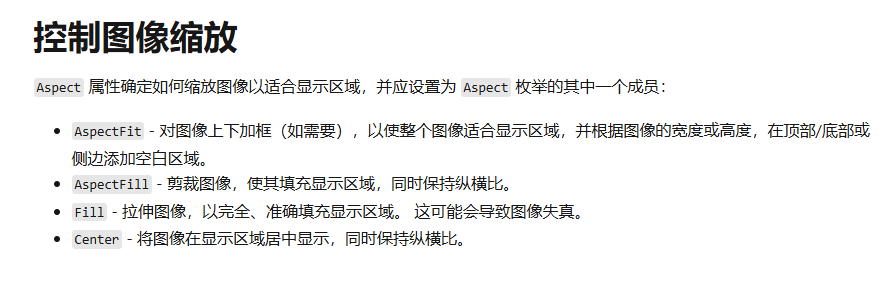
其它:IsLoading-加载、Aspect-缩放、IsAnimationPlaying-gif播放、IsOpaque-不透明


 扫一扫
扫一扫


 1448
1448

 被折叠的 条评论
为什么被折叠?
被折叠的 条评论
为什么被折叠?
 到【灌水乐园】发言


