


目录
前言
Datawhale第49期组队学习,共读《科研论文配图绘制指南–基于Python》,学习周期:8.14-9.1(一共8个Task)
官方文档:Matplotlib、Proplot、
环境配置:Miktex下载、gs下载、pypi官网
conda create --name plotsci python=3.8.13
conda activate plotsci
pip install -r requirements.txt
卡在了Fiona-1.9.4post1,单独下载它的whl文件并安装
pip install Fiona-1.9.4.post1-cp38-cp38-win_amd64.whl
----------------END-----------------
PS.在一个py3.11环境下安装proplot,出现matplotlib版本过高的问题,解决
python force-install-proplot.py
学习路线
Task01——第1章科研论文配图绘制与配色基础(8.13-8.19)
内容:《科研论文配图绘制指南–基于Python》P01-16
任务:掌握科研绘图基础知识,包括绘制规范、原则和科研配图的配色,特别是1.2.2.1.2.3小节需要实操。
PS.《重要,运行代码前一定要看.txt》对于安装环境很有帮助!
1、绘图基础知识
绘制规范——
(1)合理有据地设置科研论文配图元素(X轴、Y轴、X轴标签、Y轴标签、主刻度、次刻度、图例…)
(2)选择配图的格式(像素图、矢量图),考虑配图的尺寸、与上下文的协调
(3)配图字体及字号(同一幅图字体字号一致)
绘制原则——
配图起到补充性说明、直观展示、引出下文的作用→必要性
便于读者理解→易读性
图内容及数据与上下文一致、比例一致、类似图要素一直→一致性
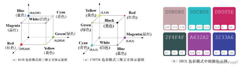
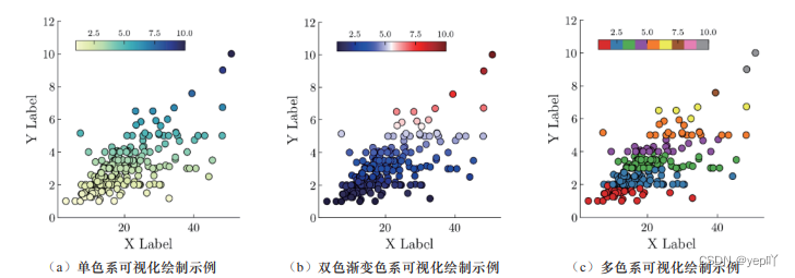
2、配色基础
色彩模式(RGB、CMYK、HEX)
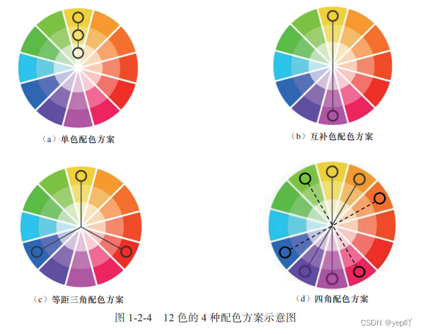
色轮配色原理(单色配色方案、互补色配色方案、等距三角配色方案和四角配色方案 )
颜色主题
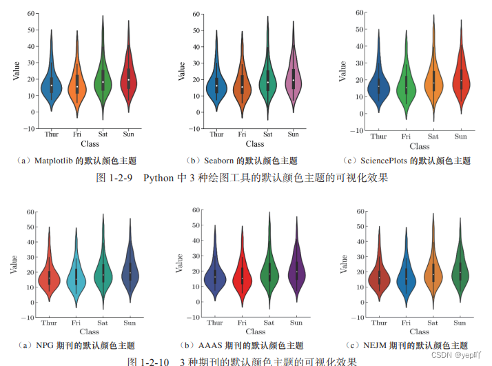
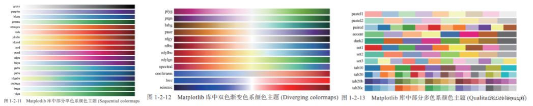
Matplotlib库颜色主题:单色系、双色渐变系、多色系
Seaborn库颜色主题:单色系、双色渐变系、多色系
配色工具
1.Color Scheme Designer 高级在线配色器
2.Adobe Color 免费在线配色
3.ColorBrewer 2.0专业在线配色
图片保存方式:
matplotlib.pyplot:plt.savefig()
proplot:fig.save()
Task02——2.1Matplotlib绘图包介绍(8.20-8.22)
内容:《科研论文配图绘制指南–基于Python》P18-31
任务:掌握matplotlib中基本的图形元素名称,图层顺序和坐标系,多子图绘制方法和常见绘图函数。
1、图形元素
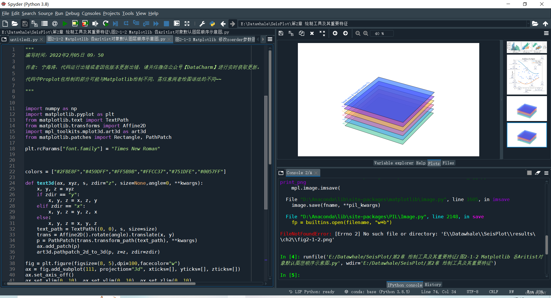
(1)主要图形元素包括画布(figure)、坐标图形(axes)、轴(axis)和艺术对象(aritist)
——坐标图形:图名(title)、刻度(tick)、刻度标签(tick label)、轴标签(axis label)、轴脊(spine)、图例
(legend)、网格(grid)、线(line)和数据标记(marker)等。
(2)Matplotlib包含基础类(primitive)元素和容器类(container)元素,统称为艺术对象 (artist)。
——基础类元素包括常见的点(point)、线(line)、文本(text)、网格(grid)、标题(title)、图例(legend)等;——容器类元素则是指一种或多种基础类元素的合集,主要包括图形、坐标图形(axes)、轴(axis)和刻度(tick)。
2、图层顺序
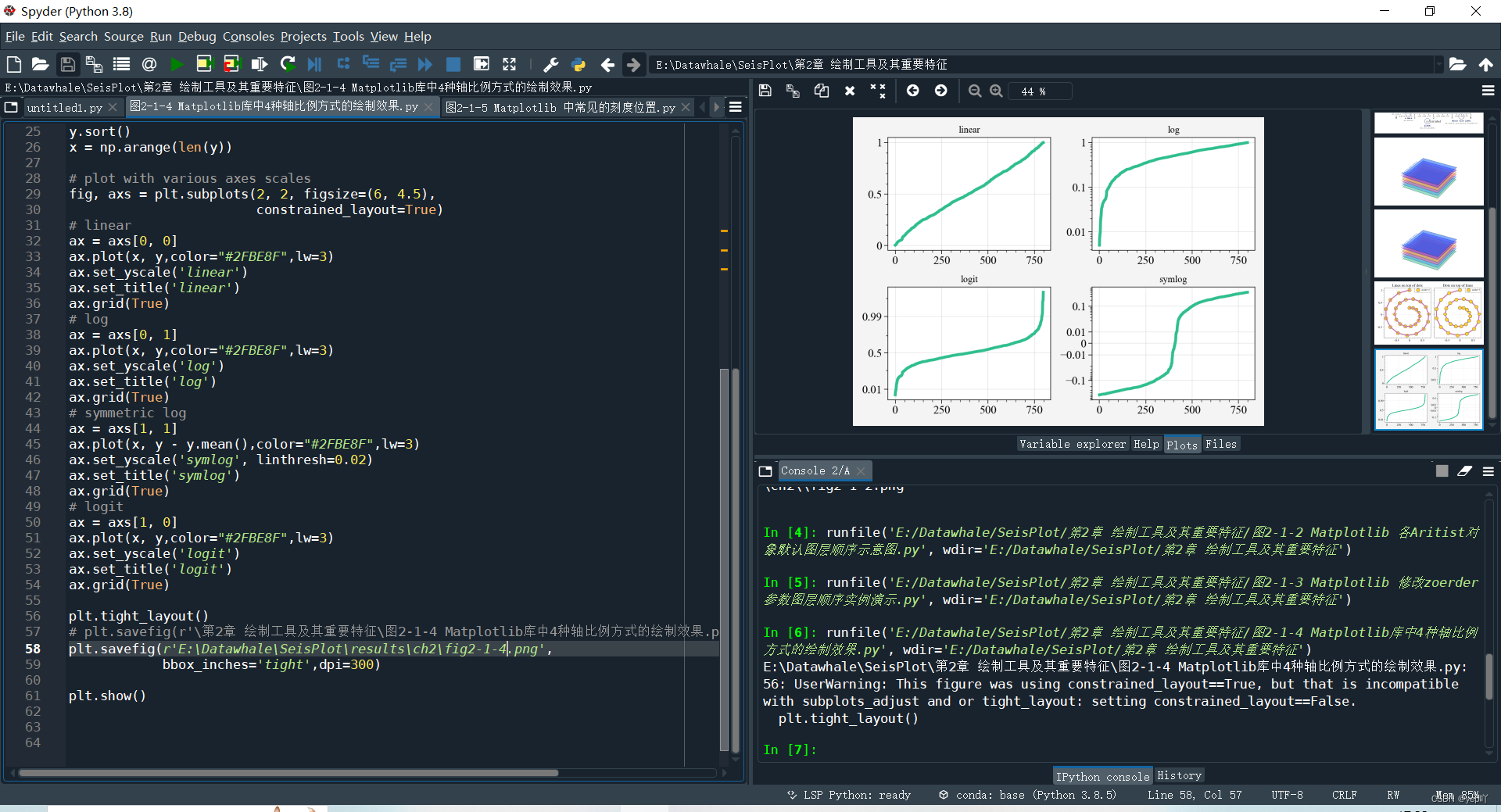
3、轴比例和刻度
4、坐标系(直角坐标系、极坐标、地理坐标系)
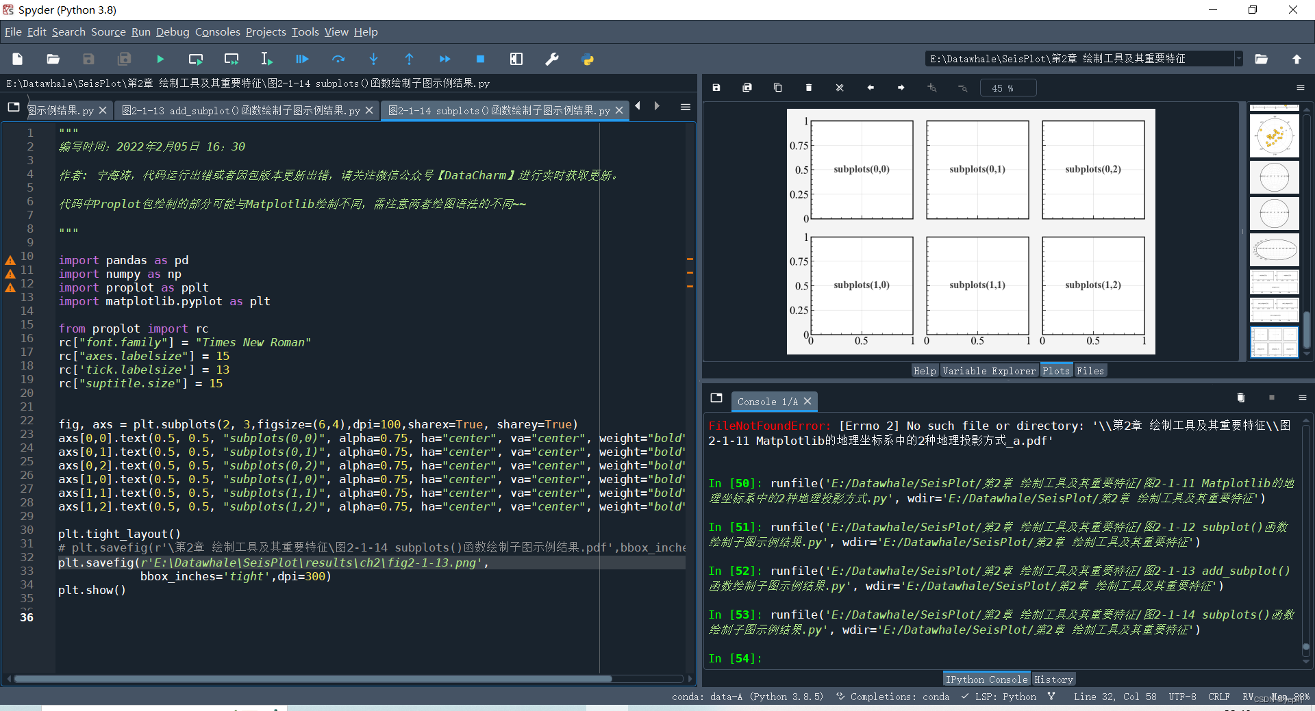
5、多子图绘制
绘制多子图的函数:1.subplot() 函数;2.add_subplot() 函数;3.subplots() 函数;4、subplot() + axes();5.subplot2grid() 函数;6.gridspec.GridSpec() 函数;7.subplot_mosaic() 函数
例: fig, axs = plt.subplots(2, 3, sharex=True, sharey=True)
subplots() 函数的第 1 个参数nrows 表示绘制子图的行数,第 2 个参数ncols表示绘制子图的列数,行数与列数的乘积即绘制的总子图数,第 3 个参数sharex可以用来设定是否共享 X 轴,第 4个参数sharey可以用来设定是否共享 Y 轴。该函数会返回一个坐标数组对象,该对象用于每个子图的单独绘制
6、常见绘图函数
如线图plot()、误差图errorbar()、散点图scatter()、柱形图bar()、饼图pie()、直方图hist()和箱线图boxplot()
Task03——2.2Seaborn绘图包介绍(8.23、8.24)
内容:《科研论文配图绘制指南–基于Python》P31-36
任务:掌握seaborn所能绘制的统计图形类型、绘图函数、多子图绘制方法和绘图主题、风格等。
1、图形类型
Seaborn 提供的可绘制图类型包括统计关系型(statistical relationships)、
数据分布型(distributions of data)、分类数据型(categorical data)、回归模型分析型(regression
models)和多子图网格型(multi-plot grids)
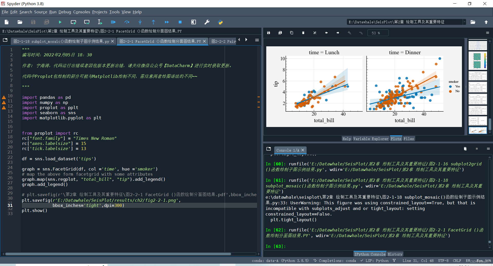
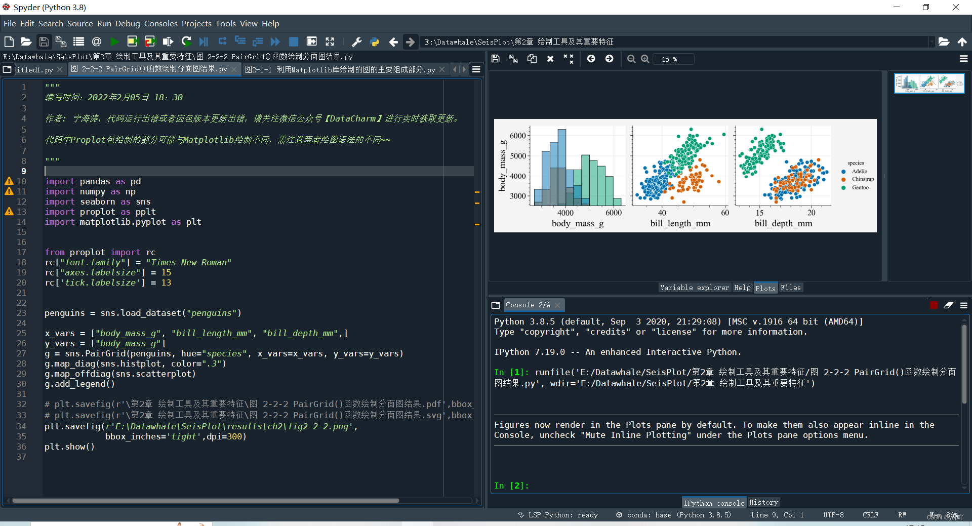
2、多子图网格型图
(1)FacetGrid() 函数:可实现行、列、色调 3 个维度的数值映射
(2)PairGrid() 函数:绘制数据集中具有成对关系
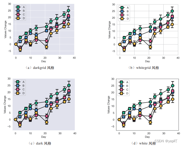
 3、绘图风格、颜色主题、缩放比例
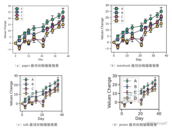
Task04——2.3 Proplot绘图包介绍(8.25、8.26)
内容:《科研论文配图绘制指南–基于Python》P36-42
任务:掌握Proplot与matplotlib的异同点,特别是安装要求和书籍中特有的绘图优点。
Task05——2.4 SciencePlots绘图包介绍(8.27、8.28)
内容:《科研论文配图绘制指南–基于Python》P42-44
任务:掌握SciencePlots的安装方法(重点)
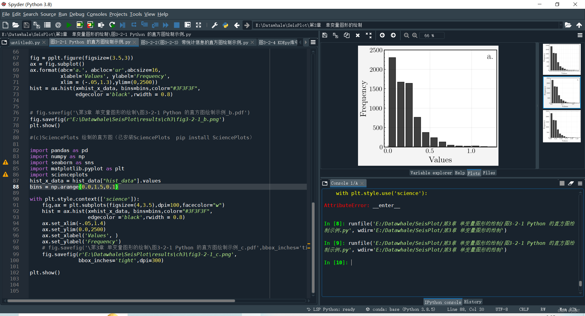
Task06——3.2.1直方图绘制(8.29、8.30)
内容:《科研论文配图绘制指南–基于Python》P47-49
任务:掌握直方图含义、统计指标的添加以及绘制技巧
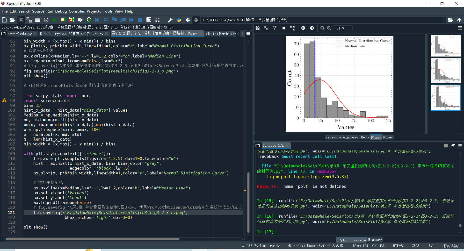
(1)数据变量分为连续变量和离散型变量;基于连续变量绘制的单变量图包括直方图、密度图 、Q-Q 图、P-P 图和经验分布函数图等。
(2)统计指标:如正态分布曲线、均值线和中位数线
正态分布曲线(normal distribution curve)
p = norm.pdf(x, mu, std)
N = len(hist_x_data)
bin_width = (x.max() - x.min()) / bins
ax.plot(x, p*N*bin_width,linewidth=1,color="r",label="Normal Distribution Curve")
均值线(mean line)
Median = np.median(hist_x_data)
ax.axvline(x=Median,ls="--",lw=1.2,color="b",label="Median Line")
Task07——3.2.2密度图(8.31-9.2)
内容:《科研论文配图绘制指南–基于Python》P49-58
任务:掌握密度图含义、绘制关键步骤、多子图绘制以及渐变色填充案例
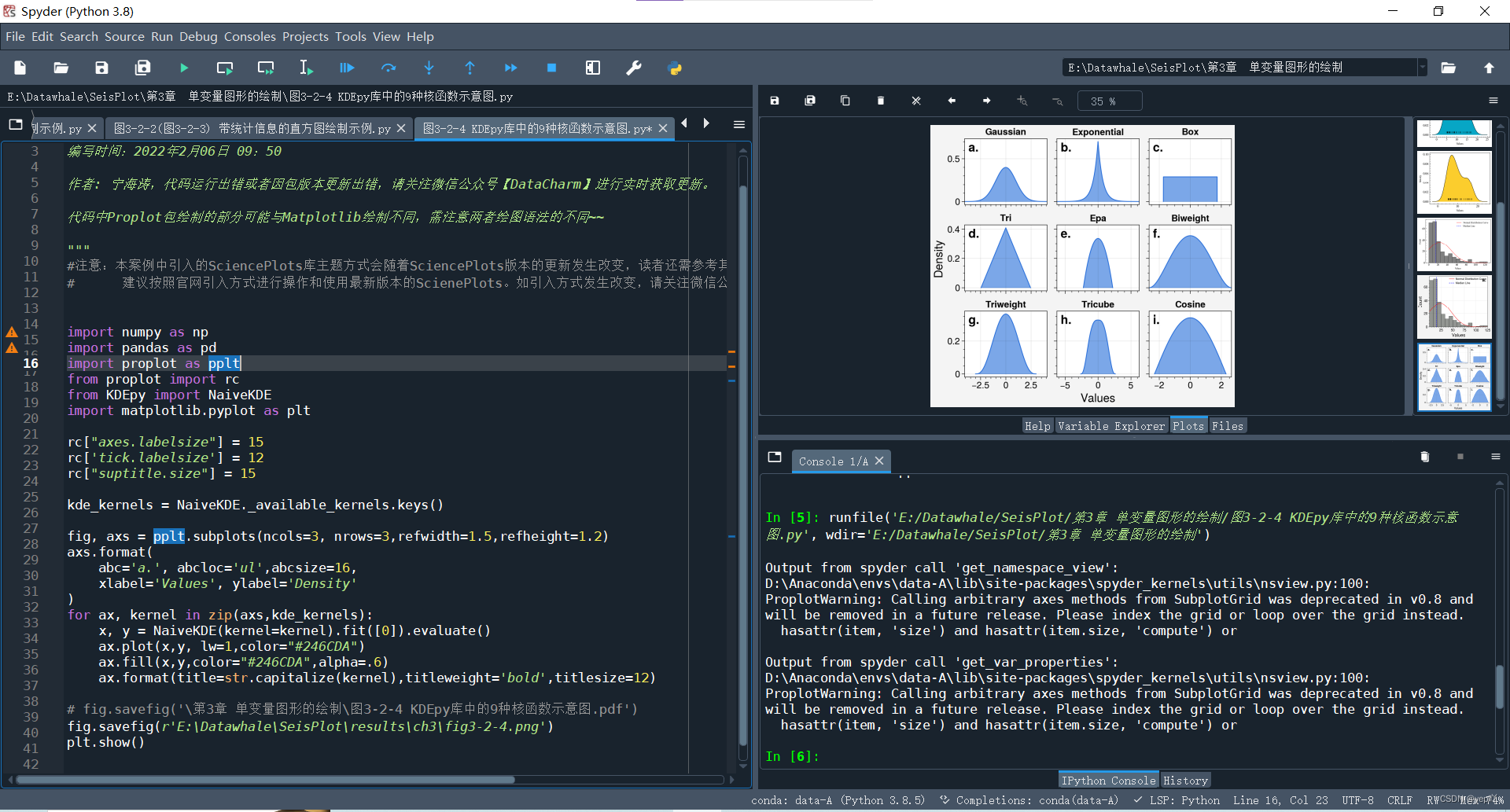
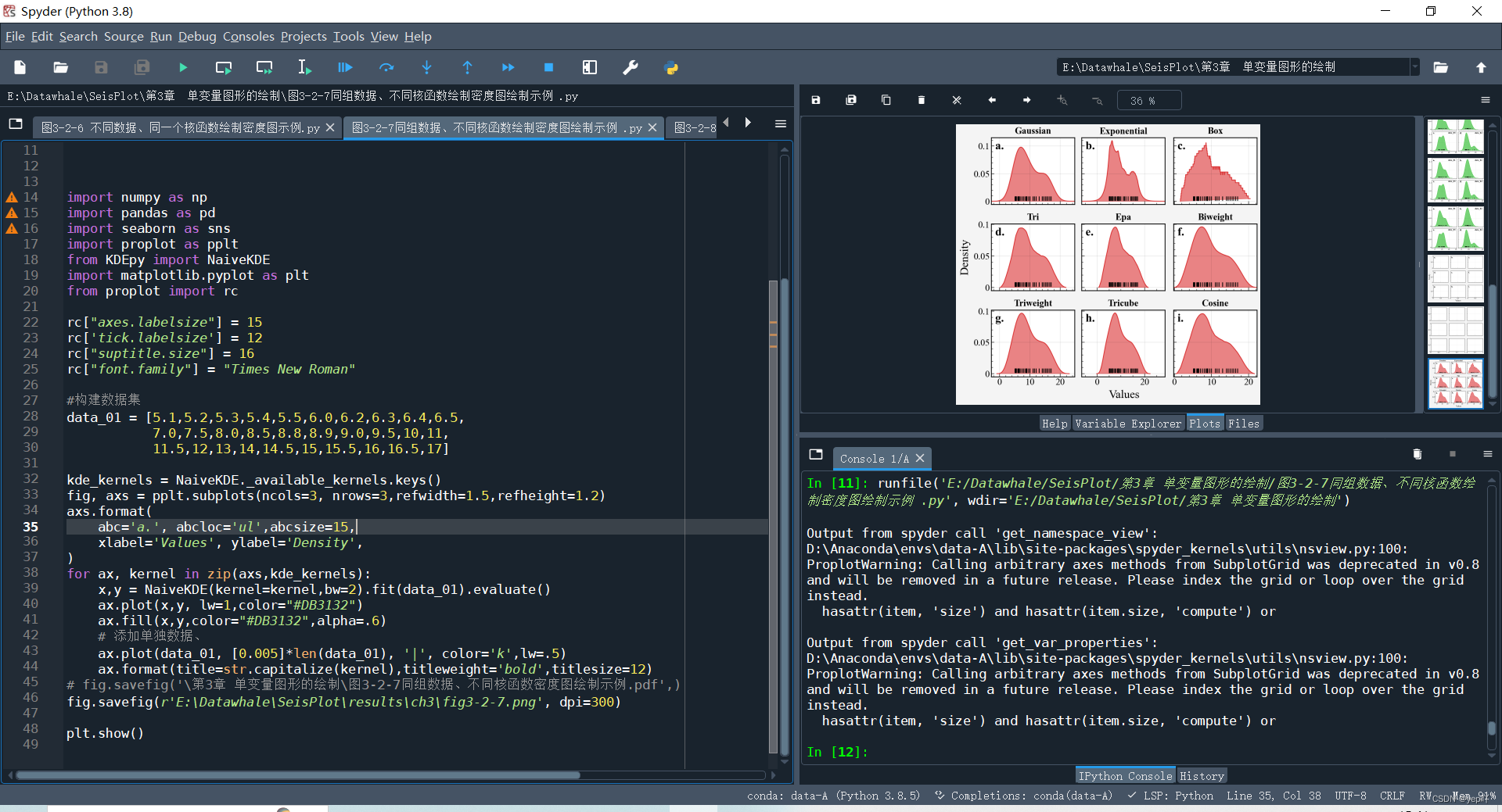
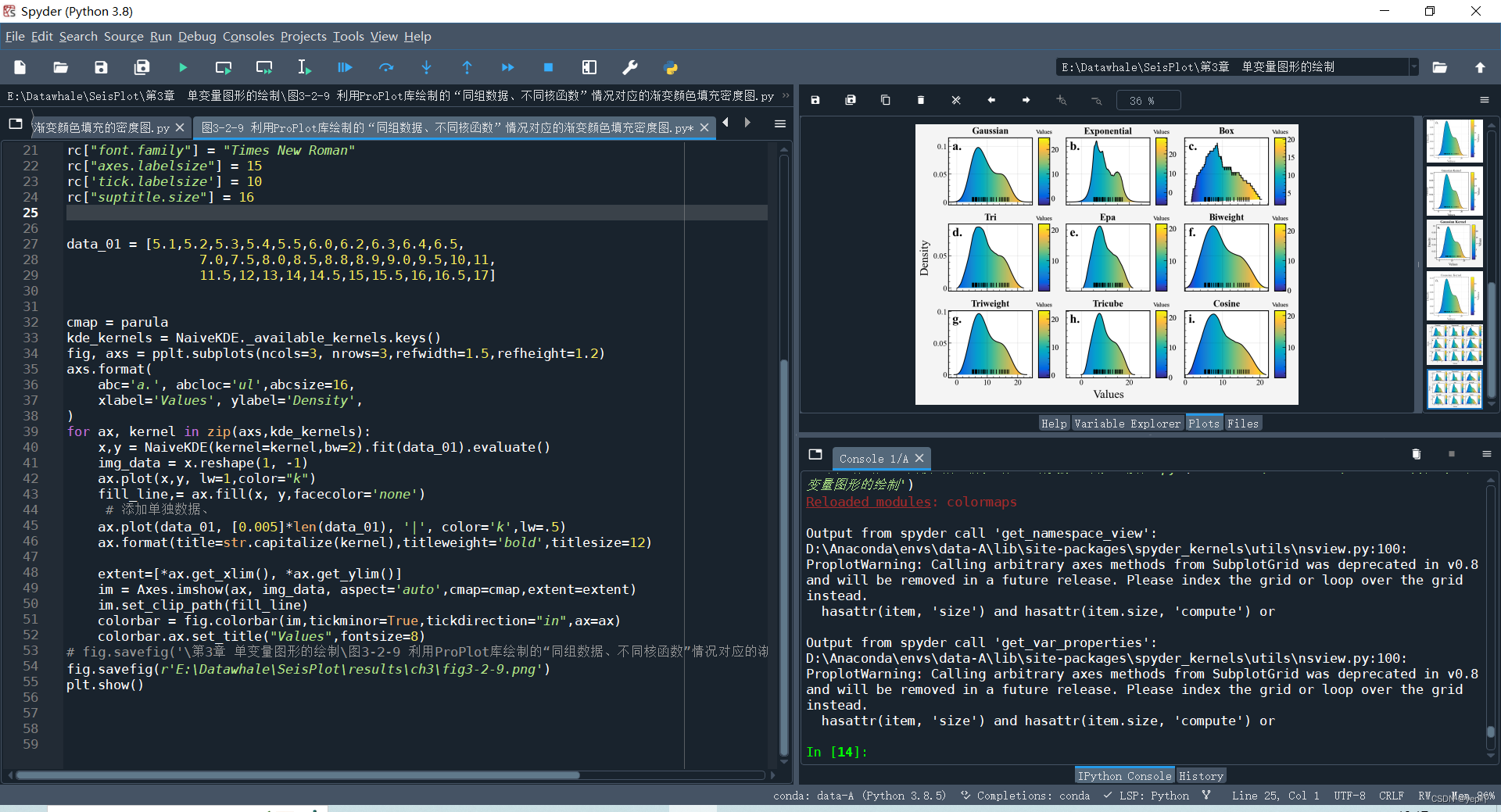
(1)密度图主要功能是体现数据在连续时间段内的分布情况,不同的核函数得到的核密度估计不尽相同(体现的数值水平也不同),密度图的纵轴可以是频数或密度。例如:
①scikit-learn 库中 neighbors.KernelDensity() 模块提供 Gaussian、Tophat、Epanechnikov.Exponential、Linear 和 Cosine 6 种核函数;
②KDEpy 库提供了 Gaussian、Exponential、Box、Tri、 Epa、Biweight、 Triweight、Tricube、Cosine9 种核函数
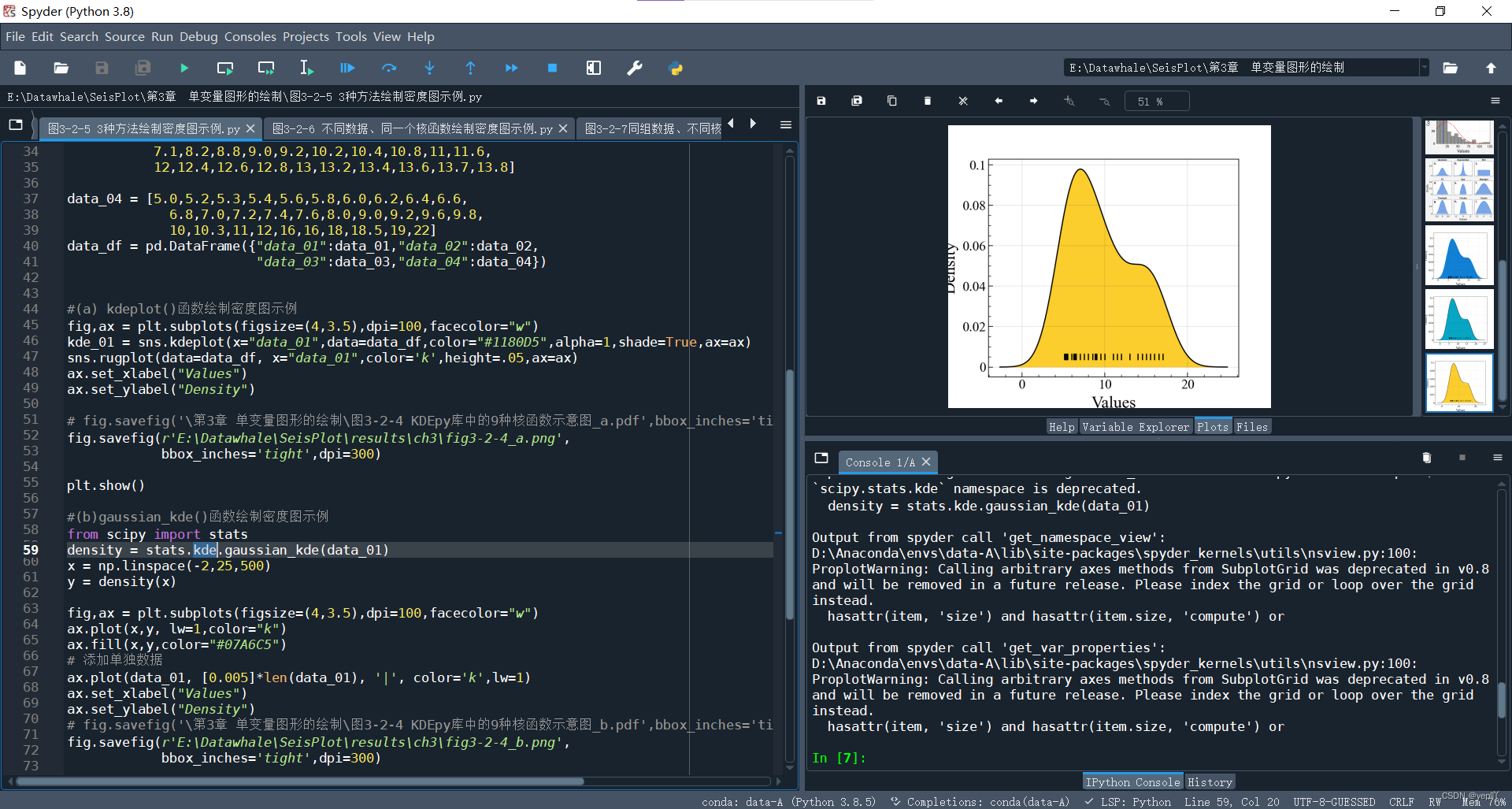
(2)绘制密度图的方式:(以高斯核函数为例)
①Seaborn 中的 kdeplot() 函数
②Scipy 库中的 gaussian_kde() 函数+Matplotlib库的axes.Axes.plot()、axes.Axes.fill() 函数
③KDEpy 库中的Gaussian核函数+Matplotlib库
sns.kdeplot(x="data_01",data=data_df,color="#1180D5",alpha=1,shade=True,ax=ax)
density = stats.kde.gaussian_kde(data_01)
x = np.linspace(-2,25,500)
y = density(x)
fig,ax = plt.subplots(figsize=(4,3.5),dpi=100,facecolor="w")
ax.plot(x,y, lw=1,color="k")
ax.fill(x,y,color="#07A6C5")
x, y = FFTKDE(kernel="gaussian", bw=2).fit(data_01).evaluate()
fig,ax = plt.subplots(figsize=(4,3.5),dpi=100,facecolor="w")
ax.plot(x,y, lw=1,color="k",)
ax.fill(x,y,color="#FBCD2D")
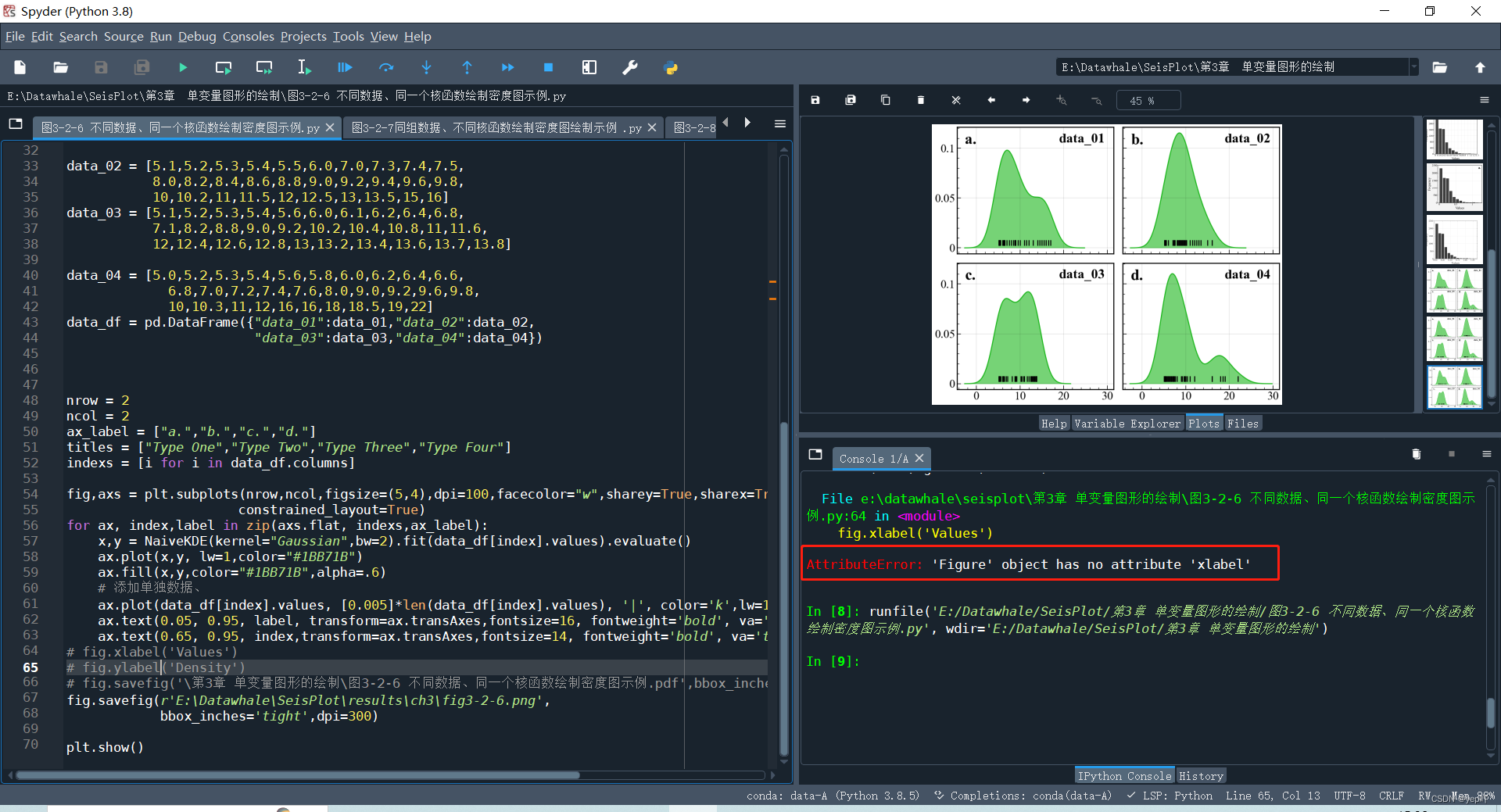
(3)数据探索之多组数据同一核函数
数据探索之一组数据多个核函数
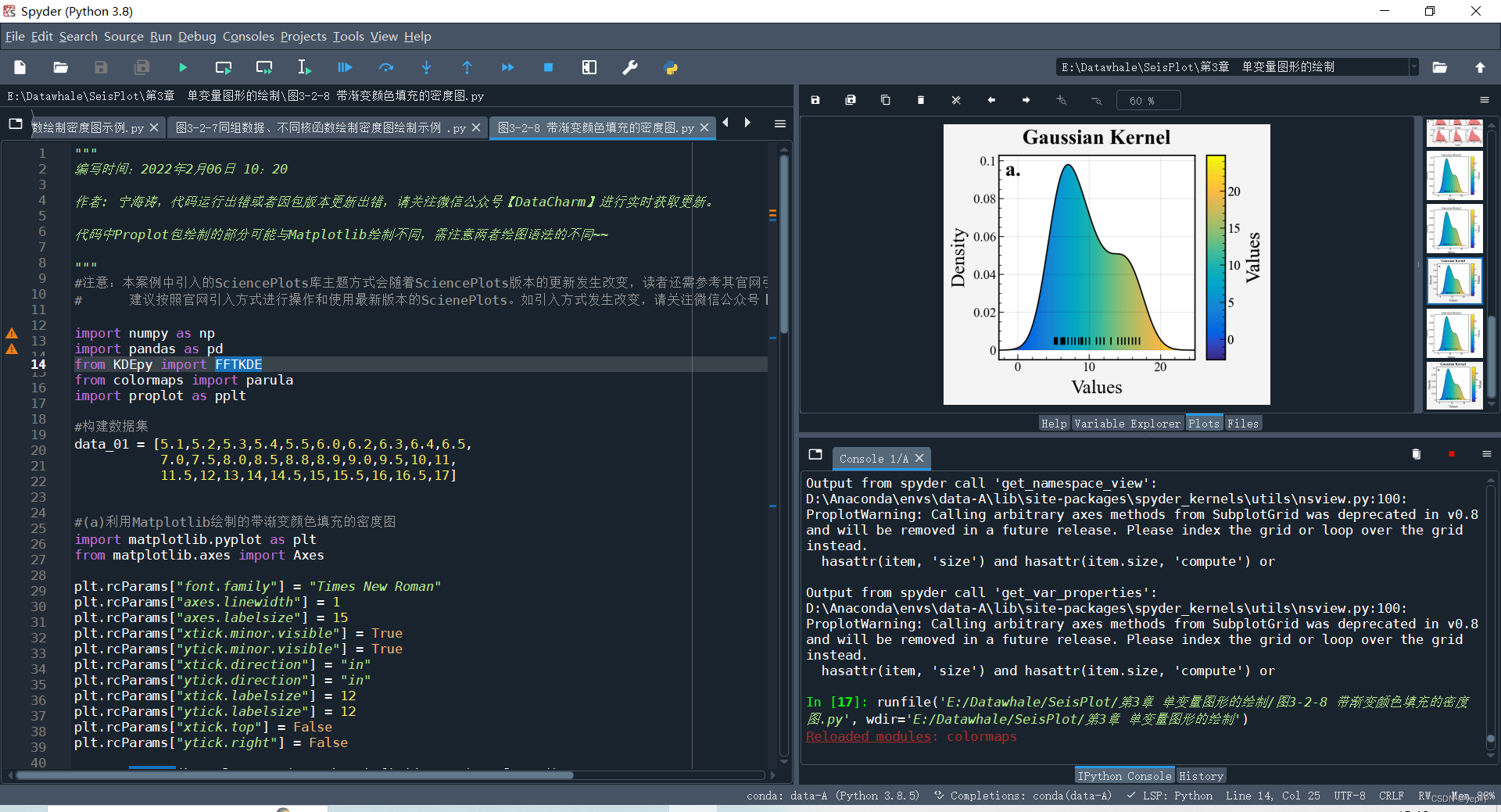
(4)渐变色填充
利用 Matplotlib、ProPlot、SciencePlots 库分别绘制的带渐变颜色(gradient color)填充的密度图(连续填充颜色系为自定义的 parula 颜色系)
Task08——总结与回归(9.3、9.4)
Question
1、matplotlib库(3.3.0版本)
执行:fig.xlabel('Values') -> fig2-1-5
报错:AttributeError: 'Figure' object has no attribute 'xlabel'
查找官方文档plt.subplots()和Figure,暂无果
matplotlib.pyplot.subplots(nrows=1, ncols=1, *, sharex=False, sharey=False, squeeze=True, subplot_kw=None, gridspec_kw=None, **fig_kw)
Return:fig、ax(其中fig: Figure)
class matplotlib.figure.Figure(figsize=None, dpi=None, facecolor=None, edgecolor=None, linewidth=0.0, frameon=None, subplotpars=None, tight_layout=None, constrained_layout=None)
class matplotlib.axes.Axes(fig, rect, facecolor=None, frameon=True, sharex=None, sharey=None, label=‘’, xscale=None, yscale=None, box_aspect=None, **kwargs)
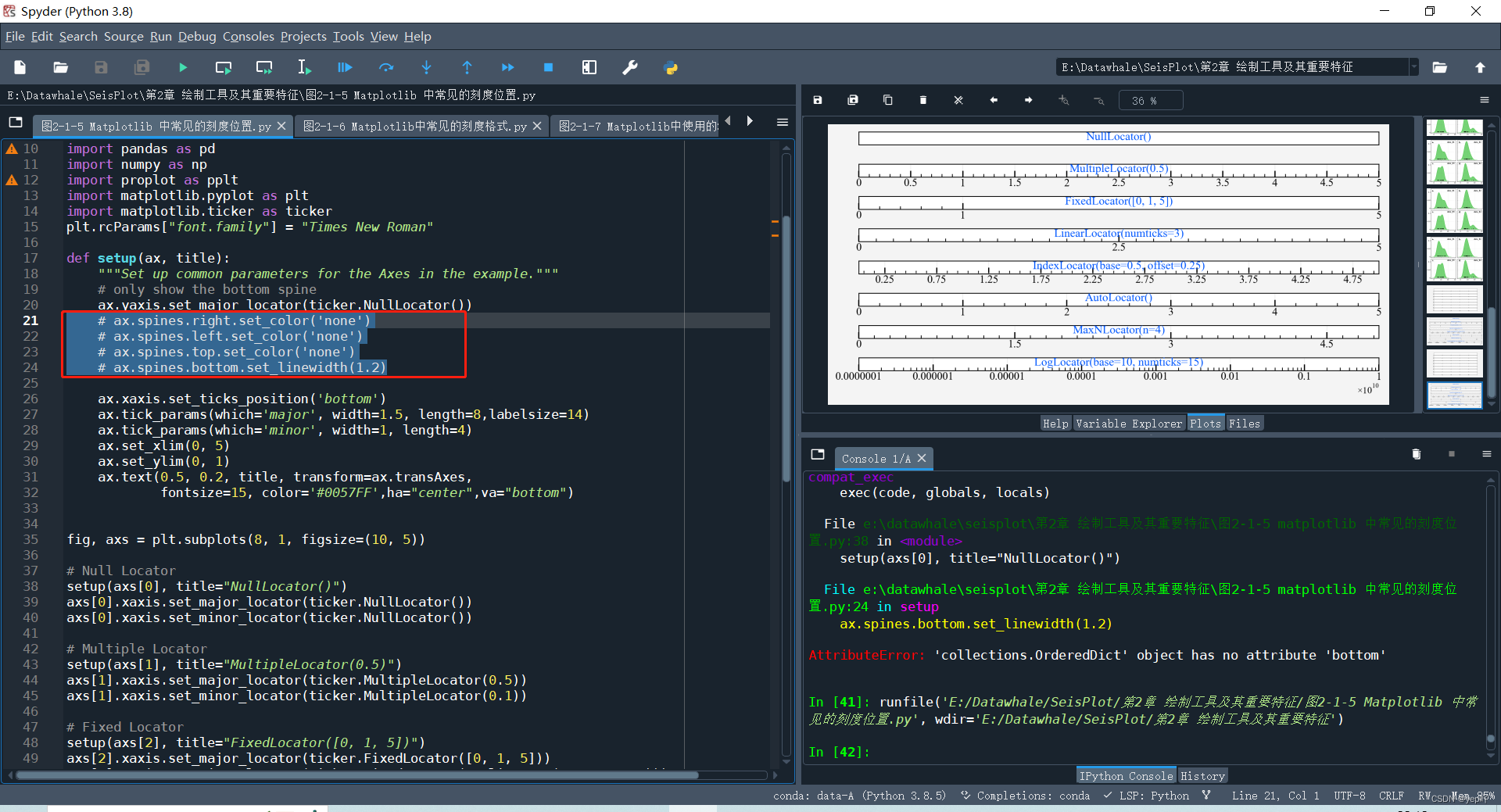
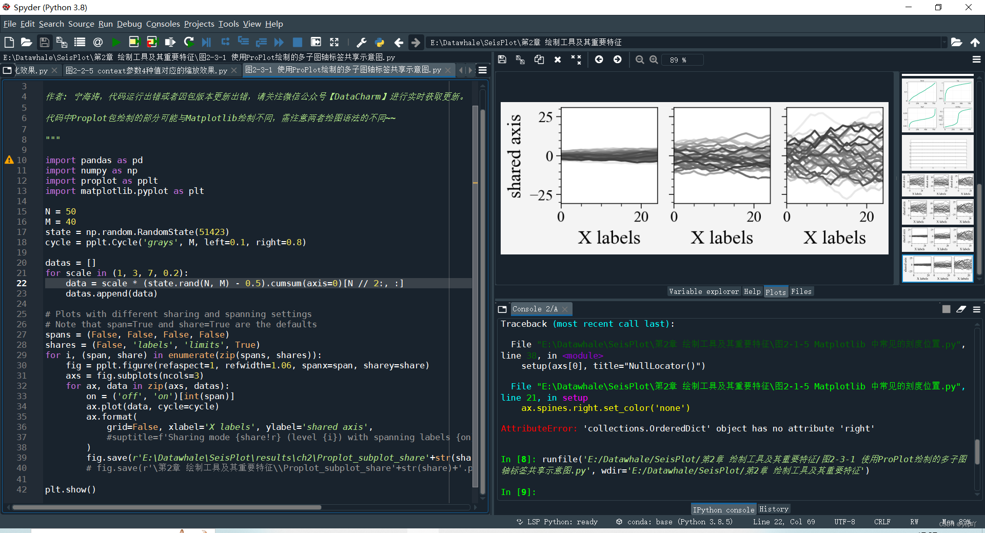
同样地,执行: -> fig3-2-6
ax.spines.right.set_color(‘none’)
ax.spines.left.set_color(‘none’)
ax.spines.top.set_color(‘none’)
ax.spines.bottom.set_linewidth(1.2)
报错:
AttributeError: ‘collections.OrderedDict’ object has no attribute ‘right’
AttributeError: ‘collections.OrderedDict’ object has no attribute ‘left’
AttributeError: ‘collections.OrderedDict’ object has no attribute ‘top’
AttributeError: ‘collections.OrderedDict’ object has no attribute ‘bottom’
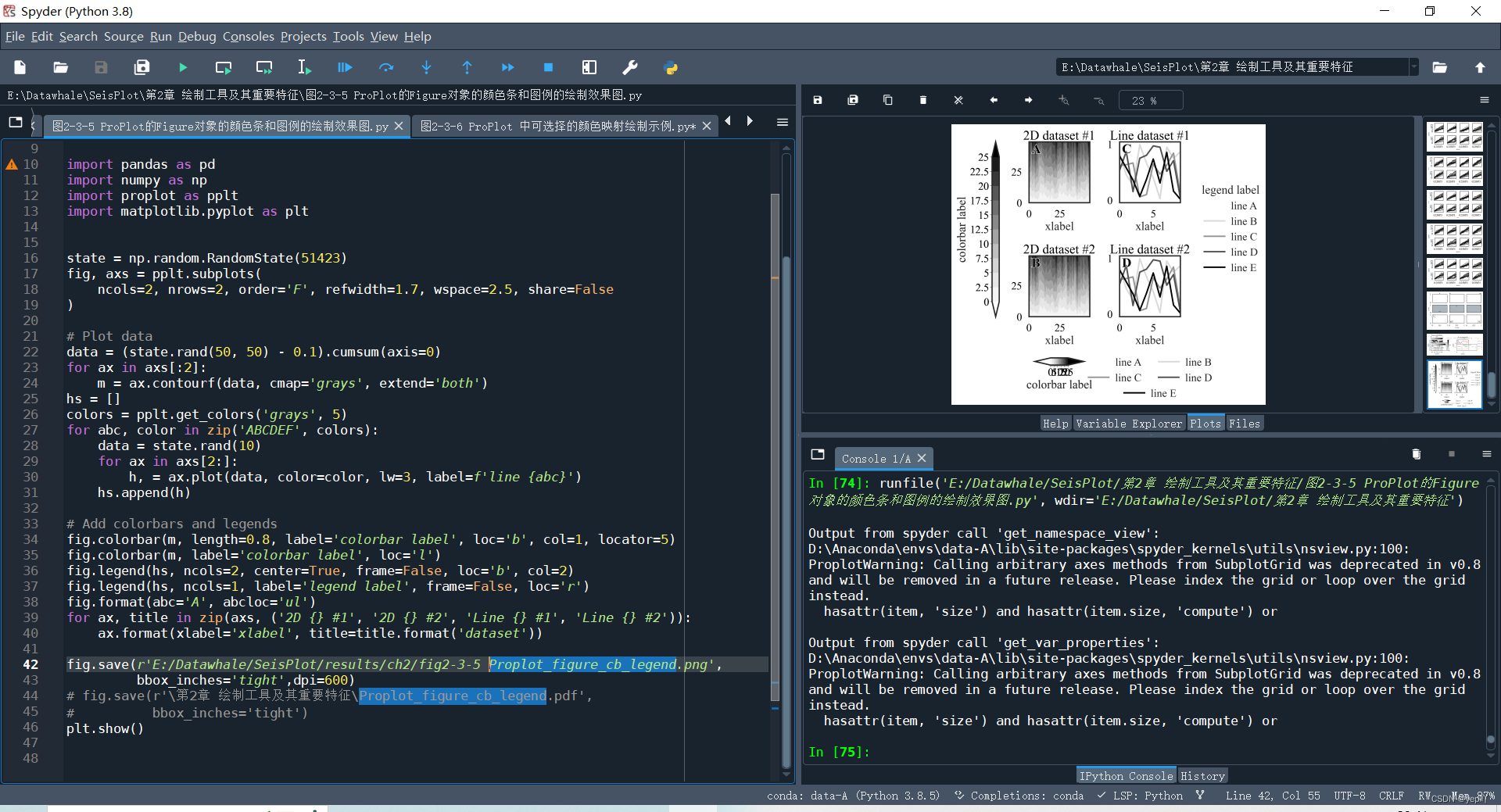
2、运行proplot例子代码时,字体大小、刻度、网格线等代码行无效,报错未解决
e:\datawhale\seisplot\第2章 绘制工具及其重要特征\图2-3-3 不同的子图序号样式和位置效果图.py:16: ProplotWarning: Got conflicting figure size arguments figwidth=8 and refwidth='10em'. Ignoring 'refwidth'.
  fig = pplt.figure(figsize=(8,5.5),space=1, refwidth='10em')

Output from spyder call 'get_namespace_view':
D:\Anaconda\envs\data-A\lib\site-packages\spyder_kernels\utils\nsview.py:100: ProplotWarning: Calling arbitrary axes methods from SubplotGrid was deprecated in v0.8 and will be removed in a future release. Please index the grid or loop over the grid instead.
  hasattr(item, 'size') and hasattr(item.size, 'compute') or

Output from spyder call 'get_var_properties':
D:\Anaconda\envs\data-A\lib\site-packages\spyder_kernels\utils\nsview.py:100: ProplotWarning: Calling arbitrary axes methods from SubplotGrid was deprecated in v0.8 and will be removed in a future release. Please index the grid or loop over the grid instead.
  hasattr(item, 'size') and hasattr(item.size, 'compute') or


 646
646

 被折叠的 条评论
为什么被折叠?
被折叠的 条评论
为什么被折叠?
 到【灌水乐园】发言


