CSS手写一个时间轴组件(Vue)

6 篇文章 1 订阅

效果

在这里插入图片描述

分析

每一个时间轴块为一个整体,如下图:

在这里插入图片描述

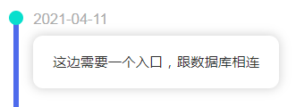
将这个整体分为几部分:左边小圆点node、左边时间线line、右边title、右边内容content。

这样一来,可以将这个整体分成左右两部分。

左边部分的小圆点可以用一个div元素设置border-radis:50%来实现,下面的线实际上是一个空div增加了边框是属性。右边部分从上往下书写就好。

左边的两个部分可以用position:relative进行定位。

为了让组件可以跟随content的内容变化而变化,不设置height属性,直接默认auto就好。

组件参数设置

可以传入一个prop,prop中的item为各个对象,里面含有time和content属性。

代码

TimeLine.vue
<template>
  <div>
    <div class="timeline" v-for="(item, index) in eventData" :key="index">
      <div class="timeline-left">
        <div class="timeline-left-node"></div>
        <div class="timeline-left-line"></div>
      </div>
      <div class="timeline-card">
        <div class="timeline-card-title">{{ item.time }}</div>
        <div class="timeline-card-content">{{ item.event }}</div>
      </div>
    </div>

    <div class="timeline" >
      <div class="timeline-left">
        <div class="timeline-left-node"></div>
        <div class="timeline-left-line"></div>
      </div>
      <div class="timeline-card">
        <div class="timeline-card-title">2021-04-11</div>
        <div class="timeline-card-content">第一次写下这个组件</div>
      </div>
    </div>
    <div></div>
  </div>
</template>

<script>
export default {
  components: {},
  props: ['eventData'],
  data() {
    return {
      
    };
  },
  methods: {},
};
</script>
<style lang="less" scoped>
.timeline {
  padding-left: 20px;
  display: flex;

  &-left {
    margin-right: 5px;

    &-node {
      z-index: 5;
      position: relative;
      bottom: 1px;
      left: -5px;
      width: 15px;
      height: 15px;
      background-color: rgb(8, 223, 205);
      border-radius: 50%;
    }

    &-line {
      position: relative;
      bottom: 15px;
      height: 100%;
      border-left: 6px solid rgb(78, 107, 236);
    }
  }

  &-card {
    height: 100%;

    &-title {
      font-size: 15px;
      color: rgb(0, 0, 0);
      margin-bottom: 10px;
      color: rgb(172, 172, 172);
    }

    &-content {
      padding: 20px;
      border-radius: 10px;
      box-shadow: 0 0 10px 1px lightgray;
      margin-bottom: 20px;

      &:hover{
        cursor: pointer;
        position: relative;
        bottom: 4px;
      }
    }
  }
}

</style>
  • 1
    点赞
  • 6
    收藏
    觉得还不错? 一键收藏
  • 0
    评论
好的,我可以帮你一个基于Vue3的弹窗拖拽组件示例代码。 首先,你需要安装Vue3: ``` npm install vue@next ``` 然后,创建一个Draggable.vue组件,代码如下: ```vue <template> <div class="draggable" :style="{ left: left + 'px', top: top + 'px' }"> <div class="title" @mousedown="dragStart"> {{ title }} </div> <div class="content"> <slot /> </div> </div> </template> <script> import { ref } from 'vue'; export default { props: { title: { type: String, default: '', }, }, setup(props, { emit }) { const left = ref(0); const top = ref(0); let startX, startY, offsetX, offsetY; function dragStart(e) { startX = e.clientX; startY = e.clientY; offsetX = left.value; offsetY = top.value; document.addEventListener('mousemove', drag); document.addEventListener('mouseup', dragEnd); } function drag(e) { const moveX = e.clientX - startX; const moveY = e.clientY - startY; left.value = offsetX + moveX; top.value = offsetY + moveY; } function dragEnd() { document.removeEventListener('mousemove', drag); document.removeEventListener('mouseup', dragEnd); } return { left, top, dragStart, }; }, }; </script> <style scoped> .draggable { position: absolute; width: 300px; height: 200px; background-color: #fff; border: 1px solid #ccc; box-shadow: 1px 1px 5px #ccc; } .title { cursor: move; padding: 10px; background-color: #eee; border-bottom: 1px solid #ccc; } .content { padding: 10px; } </style> ``` 在上面的代码中,我们使用了Vue3的Composition API来实现拖拽功能,使用了ref来定义left和top变量,使用了setup函数来定义组件逻辑。在dragStart函数中,我们记录了鼠标按下时的坐标和弹窗的偏移量,在drag函数中计算出弹窗的新位置,最后在dragEnd函数中移除了鼠标移动事件。 使用这个组件非常简单,只需要在父组件中引入Draggable组件,然后使用类似于普通的HTML标签的方式来使用它,例如: ```vue <template> <div> <button @click="showDialog = true">打开弹窗</button> <draggable v-if="showDialog" title="弹窗标题"> <p>这是弹窗内容</p> <button @click="showDialog = false">关闭弹窗</button> </draggable> </div> </template> <script> import Draggable from './Draggable.vue'; export default { components: { Draggable, }, data() { return { showDialog: false, }; }, }; </script> ``` 在上面的代码中,我们在父组件中引入了Draggable组件,并在父组件的data对象中定义了一个showDialog变量来控制弹窗的显示和隐藏。当点击打开弹窗按钮时,showDialog变量会被设置为true,从而显示弹窗;当点击弹窗内的关闭按钮时,showDialog变量会被设置为false,从而隐藏弹窗。 希望这个示例可以帮助你一个基于Vue3的弹窗拖拽组件

“相关推荐”对你有帮助么?

  • 非常没帮助
  • 没帮助
  • 一般
  • 有帮助
  • 非常有帮助
提交
评论
添加红包

请填写红包祝福语或标题

红包个数最小为10个

红包金额最低5元

当前余额3.43前往充值 >
需支付:10.00
成就一亿技术人!
领取后你会自动成为博主和红包主的粉丝 规则
hope_wisdom
发出的红包
实付
使用余额支付
点击重新获取
扫码支付
钱包余额 0

抵扣说明:

1.余额是钱包充值的虚拟货币,按照1:1的比例进行支付金额的抵扣。
2.余额无法直接购买下载,可以购买VIP、付费专栏及课程。

余额充值