


今天做的小案例是一个纯css的小飞机,能进行简单的交互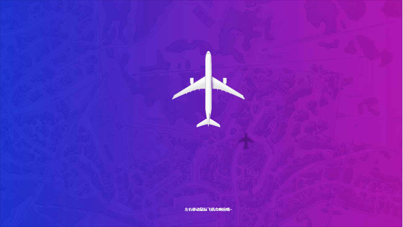
如上gif今天的案例是一架飞行的小飞机
纯css,原理很简单
将有纹理的背景图往后位移然后再将盒子溢出隐藏,这样就制造了飞机在飞的感觉,然后再在飞机的背景图上添加一个小飞机的阴影背景
这样就更显真实了
但是飞机为什么会跟随鼠标移动呢?
css确实没这个功能
首先想让飞机动起来,只能是动画,但是动画是预先写好的,而且一旦触发,光凭css是不能关闭的
而上图中的小飞机是要跟随鼠标,所以排除动画,
那怎么让飞机动起来呢?
我们可以给飞机一个定位,然后再将盒子分成三份左中右并分别放一个透明的盒子标记这三个区域,
再然后就是添加伪类了让飞机过去了
这个时候飞机会出现在你的鼠标所在的区域,效果贼假
但是css有过度属性,
我们为这些味蕾添加一个过度属性之后,飞机就会缓慢的朝着我们鼠标所在的区域“飞”过去了
于是上面的效果就出来了
下面是代码,自取
完整的
<!DOCTYPE html>
<html lang="en">

<head>
    <meta charset="UTF-8">
    <meta http-equiv="X-UA-Compatible" content="IE=edge">
    <meta name="viewport" content="width=device-width, initial-scale=1.0">
    <title>Css小飞机</title>
    <style>
        * {
            /* 定义过度属性 所有属性 0.25秒 以相同的速度开始至结束 */
            transition: all 0.25s linear;
        }

        html {
            width: 100%;
        }

        body {
            width: 100%;
            background: url(images/airplane-back.jpg);
            /* 规定背景尺寸拉升至完全覆盖背景区域 */
            /* background-size: cover; */
            /* 定义动画 back所需花费时间20s并指定动画应该播放无限次(永远)*/
            animation: back 20s infinite;
            -webkit-animation: back 2s infinite;
            /* Safari 与 Chrome */
            -moz-animation: back 20s infinite;
            -o-animation: back 20s infinite;
            /* 指定动画执行速度恒速 */
            animation-timing-function: linear;
            -webkit-animation-timing-function: linear;
            /* The background animation */
            -moz-animation-timing-function: linear;
            -o-animation-timing-function: linear;
            /* 溢出隐藏 */
            overflow: hidden;
        }

        @keyframes back {

            /* 这个动画的意思是让背景先由下对其变为上对齐,给人背景在往后面跑模拟飞机在往前飞 */
            from {
                background-position-y: bottom;
            }

            to {
                background-position-y: top;
            }
        }

        @-webkit-keyframes back {
            from {
                background-position-y: bottom;
            }

            to {
                background-position-y: top;
            }
        }

        body>div:last-of-type {
            width: 35%;
            height: 40%;
            max-width: 300px;
            max-height: 330px;
            position: absolute;
            top: 0;
            bottom: 0;
            left: 0;
            right: 0;
            margin: auto;
            background: url(images/airplane-shadow.png) no-repeat bottom right;
            background-size: 20%;
            transition: all 10s cubic-bezier(0.5, 0.025, 0.005, 2);
            -webkit-transition: all 10s cubic-bezier(0.5, 0.025, 0.005, 2);
            -moz-transition: all 10s cubic-bezier(0.5, 0.025, 0.005, 2);
            -o--transition: all 10s cubic-bezier(0.5, 0.025, 0.005, 2);
        }

        body>div:last-of-type>img:only-child {
            display: block;
            width: 80%;
            height: auto;
            margin: auto;
        }

        body>a {
            position: absolute;
            z-index: 1;
            height: 100%;
        }

        body>a:first-of-type,
        body>a:last-of-type {
            width: 40%;
        }
        body>a:nth-child(3){
            width: 20%;
            /* The direction anchors */

            right: 0;
            left: 0;
            margin: auto;
            cursor: url(images/pointer-center.png), w-resize;
        }
        body>a:first-of-type{
            left: 0;
            cursor: url(images/pointer-left.png), w-resize;
        }
        body>a:last-of-type{
            right: 0;
            cursor: url(images/pointer-right.png), w-resize;
        }
        body>a:last-of-type:hover+div:last-of-type{
            transform: translateX(120%) rotateZ(2deg);
        }
        body>a:first-of-type:hover~div:last-of-type {
            transform: translateX(-120%) rotateZ(-2deg);
        }

        body>div:first-of-type>h3:only-of-type {
            position: fixed;
            z-index: 9;
            bottom: 10%;
            left: 0;
            right: 0;
            width: 100%;
            height: 50px;
            margin: auto;
            font-family: 'Open sans', 'Lato', 'Helvetica', sans-serif;
            font-size: 11px;
            color: white;
            text-align: center;
            line-height: 1;
            font-weight: 100;
            padding: 0px;
            margin: 0px;
        }
        @media all and (max-height: 500px) {
            body>div:first-of-type{
                bottom: 75%;
                line-height: 1;
                font-size: 14px;
            }

            body>div:last-of-type>img:only-of-type {
                height: 70% !important;
                display: block;
                width: auto;
            }
        }
    </style>
</head>

<body>
    <div>
        <h3>左右移动鼠标飞机会响应哦~</h3>
    </div>
    <a></a>
    <a></a>
    <a></a>
    <div>
        <img src="images/airplane.png">
    </div>
</body>

</html>
看完源码有没有一种被欺骗的感觉?嘿嘿


 扫一扫
扫一扫
 2万+
2万+

 被折叠的 条评论
为什么被折叠?
被折叠的 条评论
为什么被折叠?
 到【灌水乐园】发言


