


先看代码
const box = document.querySelector('.box');
const e = echarts.init(box);
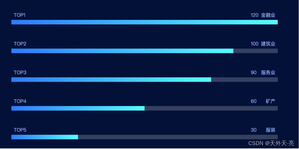
const yAxisDataLeft = ['TOP1', 'TOP2', 'TOP3', 'TOP4', 'TOP5'];
const yAxisDataRight = ['服装', '矿产', '服务业', '建筑业', '金融业'];
const option = {
backgroundColor: '#031038',
grid: {
left: 40,
bottom: -10,
right: 70,
top: 30,
},
yAxis: [
{
inverse: true,
data: yAxisDataLeft,
axisLabel: {
show: true,
inside: true,
textStyle: {
color: '#8db0ff',
fontSize: 16,
align: 'left',
},
formatter: '{value}\n{a|占位}\n{a|占位}',
rich: {
a: {
color: 'transparent',
lineHeight: 24,
}
}
},
//offset: 30,
splitLine: {
show: false
},
axisTick: {
show: false
},
axisLine: {
show: false
}
},
{
inverse: false,
data: yAxisDataRight,
axisLabel: {
inside: true,
textStyle: {
color: '#8db0ff',
fontSize: 16,
align: 'right',
},
formatter: '{value}\n{a|占位}\n{a|占位}',
rich: {
a: {
color: 'transparent',
lineHeight: 24,
fontFamily: 'digital'
}
}
},
offset: 0,
splitLine: {
show: false
},
axisTick: {
show: false
},
axisLine: {
show: false
}
}
],
xAxis: {
max: 120,
show: false,
},
series: [
{
// 辅助系列
type: 'bar',
barGap: '-100%',
silent: true,
itemStyle: {
color: 'rgba(255, 255, 254, 0.2)',
},
barWidth: 15,
data: [120, 120, 120, 120, 120]
},
{
type: 'bar',
data: [120, 100, 90, 60, 30],
barWidth: 15,
label: {
position: [10, 10],
normal: {
position: [800, -24],
show: true,
textStyle: {
color: '#8db0ff',
fontSize: 16,
},
},
},
itemStyle: {
normal: {
color: new echarts.graphic.LinearGradient(0, 0, 1, 0, [
'#007AFF', '#00FFFF'
].map((color, offset) => ({
color,
offset
})))
}
}
}
]
};
e.setOption(option);
这个主要是利用yAxis左右两个 y 轴对应的axisLabel文案实现,当然yAxis右侧也可以放一些其它的数据指标。代码用的是echarts4.0版本,最新的5.0也是兼容的,直接复制粘贴到项目中即可!


 1714
1714


 被折叠的 条评论
为什么被折叠?
被折叠的 条评论
为什么被折叠?
 到【灌水乐园】发言


