


-
写在前面
ConstraintLayout(约束布局)是Google推出的新的布局组件,它出现的目的一是为了减少布局中ViewGroup的层级嵌套,二是为了适应更灵活的布局需求,它有点类似于RelativeLayout但是又比RelativeLayout强大很多,比如RelativeLayout中你可以让一个TextView在中横向居中,但是你很难让它处于横向30%的位置。如果在RelativeLayout中你要做一个首页底部的四个导航按钮,你需要嵌套LinearLayout,LinearLayout通过weight平分四个区域才能实现,这样就增加了嵌套的层级,但是用ConstraintLayout就没有这些问题了。下面通过几个简单Demo快速学会ConstraintLayout。 -
项目配置
要使用ConstraintLayout,首先得在build.gradle中添加依赖dependencies { implementation 'androidx.constraintlayout:constraintlayout:1.1.3' }注意,我这里使用的是androidx包,如果你项目不是用androidx,那你需要使用support包,添加下面的依赖
dependencies { implementation 'com.android.support.constraint:constraint-layout:1.1.3' } -
实例1:边缘约束,居中,比例约束
边缘约束其实和RelativeLayout的相对关系有点像,但是又有点不一样,如果你需要View的上边缘和父布局上边缘对齐,以下属性app:layout_constraintTop_toTopOf="parent"同理,上边缘和其他View的上边缘对齐,只需要把"parent"改成其他View的id就行了,同样的,你一定能想到,下边缘和上边缘对齐是
app:layout_constraintBottom_toTopOf="@id/tv_address"总之,constraint后面跟是你当前View的边缘,to和of中间的是你需要对齐的View的边缘。
ConstraintLayout中,居中的操作就是通过边缘约束实现的,如果一个View同时有以下属性,那就表示在父布局垂直方向居中app:layout_constraintTop_toTopOf="parent" app:layout_constraintBottom_toBottomOf="parent"所以在父布局水平方向居中你一定也能想到了
app:layout_constraintLeft_toLeftOf="parent"
app:layout_constraintRight_toRightOf="parent"
你可能会想,那这个居中有什么用,还不如RelativeLayout来的方便,RelativeLayout的居中只需要一行代码,那他有什么用呢。好,我们先来看一个Demo

这个Demo是上面一个背景图,下面这个小猫图片这样的一种居中方式,那这个怎么实现呢?其实很简单,小猫图片上下边缘都和背景图片的底边缘进行约束就可以了,代码如下:<?xml version="1.0" encoding="utf-8"?> <androidx.constraintlayout.widget.ConstraintLayout xmlns:android="http://schemas.android.com/apk/res/android" xmlns:tools="http://schemas.android.com/tools" xmlns:app="http://schemas.android.com/apk/res-auto" android:layout_width="match_parent" android:layout_height="match_parent" tools:context=".MainActivity"> <!-- 正常情况下每个View都要在水平和垂直两个方向都进行约束, 但是由于我这个宽度是match_parent,所以水平方向无需约束了, 只需要垂直方向约束就行了,所以只添加了layout_constraintTop_toTopOf --> <ImageView android:id="@+id/title_bg" android:layout_width="match_parent" android:layout_height="200dp" app:layout_constraintTop_toTopOf="parent" android:background="@mipmap/bg" /> <!--水平和垂直两个方向都进行约束--> <ImageView android:layout_width="80dp" android:layout_height="80dp" android:src="@mipmap/icon" app:layout_constraintTop_toBottomOf="@id/title_bg" app:layout_constraintBottom_toBottomOf="@id/title_bg" app:layout_constraintStart_toStartOf="parent" android:layout_marginStart="20dp" /> </androidx.constraintlayout.widget.ConstraintLayout>还有一个问题,如果背景图片UI给你的图片宽高比是2:1,但是你要适配很多种屏幕,这时候你的高度就不能写死,因为宽度写了match_parent,高度必须根据宽度来动态改变,这时候可以使用以下属性layout_constraintDimensionRatio,这个表示约束比例,然后你高度就可以写成0dp了,代码如下
<ImageView
        android:id="@+id/title_bg"
        android:layout_width="match_parent"
        android:layout_height="0dp"
        android:background="@mipmap/bg"
        app:layout_constraintDimensionRatio="2"
        app:layout_constraintTop_toTopOf="parent" />
当你修改了title_bg的宽高属性之后,你可以在预览界面发现它高度的变化,但是icon图片相对于title图片的约束完全没有改变,依然是底部居中,这就是约束布局的好处。
-
实例2:文字对齐,Guideline,chain链
学会了上面一个简单小案例你就理解了约束布局的基本约束,那约束布局还有一些功能,通过一个简单demo介绍一下

布局结果就是这样,这你也许会觉得这是什么鬼,用LinearLayout或者GridLayout不是更简单吗?但请注意,这里有一个要求,就是Email和后面的文字中间有一条看不见的线,这条线的位置是屏幕横向的黄金分割线!(据说这样视觉效果会比较好)what?这么奇葩的需求,用常规布局如何实现?但是用ConstraintLayout就很容易了,布局中直接添加一个Guideline虚拟线,并且把它的比例设置在黄金分割点上,代码如下:<android.support.constraint.Guideline android:id="@+id/guideline" android:layout_width="wrap_content" android:layout_height="wrap_content" android:orientation="vertical" app:layout_constraintGuide_percent="0.32" />android:orientation表示虚拟线是垂直方向,app:layout_constraintGuide_percent表示在屏幕的比例0.32的位置,就是黄金分割的位置。
那么我们的TextView就可以根据这个Guideline进行约束了。
不知道你们还发现一个问题没有,就是左边的文字比右边的文字要大,但是他们底部是对齐的,但文字底部对齐不能使用bottom约束,这是因为如果使用bottom约束的话,较小的文字就会整体偏下,很不美观,如下图所示。

这是因为文字的尺寸不一样,默认的padding也不一样,如果你了解文字盒子模型的话,应该能理解。
关于文字对齐,应该使用基线约束的方式进行对齐操作app:layout_constraintBaseline_toBaselineOf
还有一个问题,就是这四个View组合起来是垂直方向居中的,这个要 怎么实现呢,单个View的居中我们可以用约束实现,组合居中呢,难道要套一层RelativeLayout?前面说了,ConstraintLayout的目的就是为了减少嵌套层级,对于这种需求,我们使用chain来实现,chain就是能把View之间进行双向链接,而不是单向约束,如何建立一个chain呢,很简单,就是把单向约束变成双向约束,就会自动建立了chain链。可能说起来还是云里雾里,talk is weak,show me the code!为了解释这个问题,先看另一个demo
<?xml version="1.0" encoding="utf-8"?>
<androidx.constraintlayout.widget.ConstraintLayout xmlns:android="http://schemas.android.com/apk/res/android"
android:layout_width="match_parent"
android:layout_height="match_parent"
xmlns:app="http://schemas.android.com/apk/res-auto">
<Button
android:id="@+id/btn_a"
android:layout_width="wrap_content"
android:layout_height="wrap_content"
app:layout_constraintTop_toTopOf="parent"
app:layout_constraintStart_toStartOf="parent"
app:layout_constraintEnd_toStartOf="@id/btn_b"
android:text="A"
/>
<Button
android:id="@+id/btn_b"
android:layout_width="wrap_content"
android:layout_height="wrap_content"
app:layout_constraintTop_toTopOf="parent"
app:layout_constraintStart_toEndOf="@id/btn_a"
app:layout_constraintEnd_toEndOf="parent"
android:text="B"
/>
</androidx.constraintlayout.widget.ConstraintLayout>
btn_a 的app:layout_constraintEnd_toStartOf="@id/btn_b"
btn_b 的app:layout_constraintStart_toEndOf="@id/btn_a"
这两句是互相建立约束,这样就建立了chain链,这样当A的start被约束在parent的start,B的end被约束在parent的end的时候,就会出现如下效果
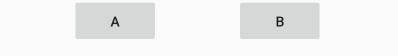
A,B按钮均匀分布在横向的父布局中那这也不是我们想要的呀,别急,我们在btn_a添加下面这个属性
app:layout_constraintHorizontal_chainStyle="packed"
结果就是下面这样
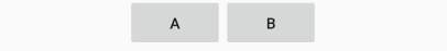
没错,这就是我们想要的,组合在一起并居中
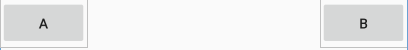
layout_constraintHorizontal_chainStyle表示改变横向的chain风格,默认是spread,就是均匀分布,packed是聚合在一起,还有一个属性是spread_inside,表示分布在两边,如下图
好了,回到之前的demo,有了chain链我们就可以让它整体垂直居中了,好了整体布局代码如下
<?xml version="1.0" encoding="utf-8"?>
<android.support.constraint.ConstraintLayout xmlns:android="http://schemas.android.com/apk/res/android"
xmlns:app="http://schemas.android.com/apk/res-auto"
android:layout_width="match_parent"
android:layout_height="match_parent">
<android.support.constraint.Guideline
        android:id="@+id/guideline"
        android:layout_width="wrap_content"
        android:layout_height="wrap_content"
        android:orientation="vertical"
        app:layout_constraintGuide_percent="0.32" />
<TextView
android:id="@+id/tv_email"
android:layout_width="wrap_content"
android:layout_height="wrap_content"
android:text="Email:"
android:textSize="24sp"
app:layout_constraintEnd_toStartOf="@id/guideline"
app:layout_constraintTop_toTopOf="parent"
app:layout_constraintBottom_toTopOf="@id/tv_address"
app:layout_constraintVertical_chainStyle="packed"
android:layout_marginEnd="5dp"
/>
<TextView
android:layout_width="wrap_content"
android:layout_height="wrap_content"
android:layout_marginStart="5dp"
android:text="137664431@qq.com"
android:textSize="18sp"
app:layout_constraintBaseline_toBaselineOf="@id/tv_email"
app:layout_constraintStart_toEndOf="@id/guideline" />
<TextView
android:id="@+id/tv_address"
android:layout_width="wrap_content"
android:layout_height="wrap_content"
android:layout_marginEnd="5dp"
android:text="Add:"
android:textSize="24sp"
app:layout_constraintEnd_toStartOf="@id/guideline"
app:layout_constraintTop_toBottomOf="@id/tv_email"
android:layout_marginTop="15dp"
app:layout_constraintBottom_toBottomOf="parent"
/>
<TextView
android:layout_width="wrap_content"
android:layout_height="wrap_content"
android:layout_marginStart="5dp"
android:text="广东省深圳市"
android:textSize="18sp"
app:layout_constraintBaseline_toBaselineOf="@id/tv_address"
app:layout_constraintStart_toEndOf="@id/guideline" />
</android.support.constraint.ConstraintLayout>
最后一个问题,为什么水平方向是黄金分割位置,垂直方向是居中,垂直方向能不能也在黄金分割位置,这…这当然也是可以的,在Email的textView中添加如下属性,表示chain链整体在居中的偏移为0.32
app:layout_constraintVertical_bias="0.32"
好了,大功告成,效果如下

虽然这个demo布局很简单,但是你可以看到代码实现只有一个层级,没有多余层级,并且应用了约束,guideline,文字对齐,chain链,居中偏移,多个用法,完全掌握理解此demo,那么那些复杂的布局也完全难不倒你。
本文纯属原创,转载请注明出处。


 3595
3595


 被折叠的 条评论
为什么被折叠?
被折叠的 条评论
为什么被折叠?
 到【灌水乐园】发言


