


自己动手制作QQ登陆界面
自己的第一篇文章,该项目适合初学WPF,希望对读者能够有帮助。
下载地址https://download.csdn.net/download/weixin_44469024/11558628特别适合刚学习界面设计,了解XAML语法,学习之后会懂的一些设计模式。
程序界面如下图:

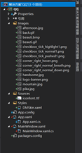
项目结构如下图:
1.提前准备:
1.在项目中右键点击管理解决方案程序包,导入DMSkin资源,之后在项目中就可以进行引用了。DMSkin是一个基于WPF的开源界面库,实现无边框的wpf开发方案。


2.自己喜欢可以在QQ文字后面加载动态图片。
- 根据自己喜好可以设置QQ背景为动态图片(git),在项目右键导入.XamlAnimatedGif包,进行安装。
- 添加引用命名空间:xmlns:gif=“https://github,com/XamlAnimatedGif/XamlAnimatedGif”
- 开始使用
3.Style文件夹定义ResourceDictionary中设计自定义控件的样式,和一些点击事件。
<ResourceDictionary xmlns="http://schemas.microsoft.com/winfx/2006/xaml/presentation"
                    xmlns:x="http://schemas.microsoft.com/winfx/2006/xaml">
    <FontFamily x:Key="IconFont">/Sources/#iconfont</FontFamily>

    <Style x:Key="ButtonStyle1" TargetType="{x:Type Button}">
        <Setter Property="FocusVisualStyle" Value="{x:Null}"/>
        <Setter Property="Background" Value="{x:Null}"/>
        <Setter Property="BorderThickness" Value="0"/>
        <Setter Property="HorizontalContentAlignment" Value="Center"/>
        <Setter Property="VerticalContentAlignment" Value="Center"/>
        <Setter Property="Foreground" Value="#FFCCCCCC"/>
        <Setter Property="Padding" Value="1"/>
        <Setter Property="Template">
            <Setter.Value>
                <ControlTemplate TargetType="{x:Type Button}">
                    <Border x:Name="border" BorderBrush="{TemplateBinding BorderBrush}" BorderThickness="{TemplateBinding BorderThickness}" Background="{TemplateBinding Background}" SnapsToDevicePixels="true">
                        <ContentPresenter x:Name="contentPresenter" Focusable="False" HorizontalAlignment="{TemplateBinding HorizontalContentAlignment}" Margin="{TemplateBinding Padding}" RecognizesAccessKey="True" SnapsToDevicePixels="{TemplateBinding SnapsToDevicePixels}" VerticalAlignment="{TemplateBinding VerticalContentAlignment}"/>
                    </Border>
                    <ControlTemplate.Triggers>
                        <Trigger Property="IsMouseOver" Value="true">
                            <Setter Property="Foreground" Value="#FF62B4F7"/>
                        </Trigger>
                    </ControlTemplate.Triggers>
                </ControlTemplate>
            </Setter.Value>
        </Setter>
    </Style>
    <SolidColorBrush x:Key="text">#FF000000</SolidColorBrush>

    <Style x:Key="ButtonStyle2" TargetType="{x:Type Button}">
        <Setter Property="FocusVisualStyle" Value="{x:Null}"/>
        <Setter Property="Background" Value="{x:Null}"/>
        <Setter Property="BorderThickness" Value="0"/>
        <Setter Property="HorizontalContentAlignment" Value="Center"/>
        <Setter Property="VerticalContentAlignment" Value="Center"/>
        <Setter Property="Foreground" Value="#FF2685E3"/>
        <Setter Property="Padding" Value="1"/>
        <Setter Property="Template">
            <Setter.Value>
                <ControlTemplate TargetType="{x:Type Button}">
                    <Border x:Name="border" Background="{TemplateBinding Background}" SnapsToDevicePixels="true">
                        <ContentPresenter x:Name="contentPresenter" Focusable="False" HorizontalAlignment="{TemplateBinding HorizontalContentAlignment}" Margin="{TemplateBinding Padding}" RecognizesAccessKey="True" SnapsToDevicePixels="{TemplateBinding SnapsToDevicePixels}" VerticalAlignment="{TemplateBinding VerticalContentAlignment}"/>
                    </Border>
                    <ControlTemplate.Triggers>
                        <Trigger Property="IsMouseOver" Value="true">
                            <Setter Property="Foreground" Value="#FF62B4F7"/>
                            <Setter Property="Cursor" Value="Hand"/>
                        </Trigger>
                    </ControlTemplate.Triggers>
                </ControlTemplate>
            </Setter.Value>
        </Setter>
    </Style>


    <Style x:Key="CodeButton" TargetType="{x:Type Button}">
        <Setter Property="Width" Value="24"/>
        <Setter Property="Height" Value="24"/>
        <Setter Property="FocusVisualStyle" Value="{x:Null}"/>
        <Setter Property="Background" Value="{x:Null}"/>
        <Setter Property="BorderThickness" Value="0"/>
        <Setter Property="HorizontalContentAlignment" Value="Center"/>
        <Setter Property="VerticalContentAlignment" Value="Center"/>
        <Setter Property="Foreground" Value="#FF2685E3"/>
        <Setter Property="Padding" Value="1"/>
        <Setter Property="Template">
            <Setter.Value>
                <ControlTemplate TargetType="{x:Type Button}">
                    <Image Name="img"  Source="/Images/corner_right_normal_breath.png"></Image>
                    <ControlTemplate.Triggers>
                        <Trigger Property="IsMouseOver" Value="true">
                            <Setter TargetName="img" Property="Source" Value="/Images/corner_right_hover.png"/>
                        </Trigger>
                        <Trigger Property="IsPressed" Value="true">
                            <Setter TargetName="img" Property="Source" Value="/Images/corner_right_normal_down.png"/>
                        </Trigger>
                    </ControlTemplate.Triggers>
                </ControlTemplate>
            </Setter.Value>
        </Setter>
    </Style>

    <Style x:Key="QQCheckBox" TargetType="{x:Type CheckBox}">
        <Setter Property="FocusVisualStyle" Value="{x:Null}"/>
        <Setter Property="Background" Value="{x:Null}"/>
        <Setter Property="BorderThickness" Value="0"/>
        <Setter Property="Foreground" Value="#FF656565"/>
        <Setter Property="Template">
            <Setter.Value>
                <ControlTemplate TargetType="{x:Type CheckBox}">
                    <StackPanel Orientation="Horizontal">
                        <Grid Width="17" Height="17" Margin="0,0,3,0">
                            <Border Name="bd"  Margin="0,1,0,0"  Width="12" Height="12" BorderThickness="1"
                                    BorderBrush="Gray" HorizontalAlignment="Center" VerticalAlignment="Center"></Border>
                            <Image Name="img" Visibility="Collapsed" Margin="0,1,0,0" Width="17" Height="17" Stretch="Fill"
                                   VerticalAlignment="Center" HorizontalAlignment="Center"></Image>
                        </Grid>
                        <ContentPresenter VerticalAlignment="Center"></ContentPresenter>
                    </StackPanel>
                    <ControlTemplate.Triggers>
                        <MultiTrigger>
                            <MultiTrigger.Conditions>
                                <Condition Property="IsChecked" Value="True" />
                                <Condition Property="IsMouseOver" Value="True" />
                            </MultiTrigger.Conditions>
                            <Setter TargetName="img" Property="Source" Value="/Images/checkbox_tick_highlight1.png" />
                        </MultiTrigger>
                        <Trigger Property="IsChecked" Value="true">
                            <Setter TargetName="img" Property="Visibility" Value="Visible" />
                            <Setter TargetName="img" Property="Source" Value="/Images/checkbox_tick_pushed1.png"/>
                        </Trigger>
                    </ControlTemplate.Triggers>
                </ControlTemplate>
            </Setter.Value>
        </Setter>
    </Style>


    <Style x:Key="FocusVisual">
        <Setter Property="Control.Template">
            <Setter.Value>
                <ControlTemplate>
                    <Rectangle Margin="2" SnapsToDevicePixels="true" Stroke="{DynamicResource {x:Static SystemColors.ControlTextBrushKey}}" StrokeThickness="1" StrokeDashArray="1 2"/>
                </ControlTemplate>
            </Setter.Value>
        </Setter>
    </Style>
    <SolidColorBrush x:Key="Button.Static.Border" Color="#FF707070"/>
    <SolidColorBrush x:Key="Button.MouseOver.Background" Color="#FFBEE6FD"/>
    <SolidColorBrush x:Key="Button.MouseOver.Border" Color="#FF3C7FB1"/>
    <SolidColorBrush x:Key="Button.Pressed.Background" Color="#FFC4E5F6"/>
    <SolidColorBrush x:Key="Button.Pressed.Border" Color="#FF2C628B"/>
    <SolidColorBrush x:Key="Button.Disabled.Background" Color="#FFF4F4F4"/>
    <SolidColorBrush x:Key="Button.Disabled.Border" Color="#FFADB2B5"/>
    <SolidColorBrush x:Key="Button.Disabled.Foreground" Color="#FF838383"/>

    <Style x:Key="ButtonStyle3" TargetType="{x:Type Button}">
        <Setter Property="FocusVisualStyle" Value="{StaticResource FocusVisual}"/>
        <Setter Property="Foreground" Value="White"/>
        <Setter Property="BorderThickness" Value="0"/>
        <Setter Property="HorizontalContentAlignment" Value="Center"/>
        <Setter Property="VerticalContentAlignment" Value="Center"/>
        <Setter Property="Padding" Value="1"/>
        <Setter Property="Template">
            <Setter.Value>
                <ControlTemplate TargetType="{x:Type Button}">
                    <ControlTemplate.Resources>
                        <Storyboard x:Key="OnMouseEnter1">
                            <ColorAnimationUsingKeyFrames Storyboard.TargetProperty="(Panel.Background).(SolidColorBrush.Color)" Storyboard.TargetName="border">
                                <EasingColorKeyFrame KeyTime="0:0:0.6" Value="#FF3CC3F5"/>
                            </ColorAnimationUsingKeyFrames>
                        </Storyboard>
                        <Storyboard x:Key="OnMouseLeave1">
                            <ColorAnimationUsingKeyFrames Storyboard.TargetProperty="(Panel.Background).(SolidColorBrush.Color)" Storyboard.TargetName="border">
                                <EasingColorKeyFrame KeyTime="0:0:0.6" Value="#FF09A3DC"/>
                            </ColorAnimationUsingKeyFrames>
                        </Storyboard>
                    </ControlTemplate.Resources>
                    <Border x:Name="border" BorderBrush="{TemplateBinding BorderBrush}"
                            BorderThickness="{TemplateBinding BorderThickness}"  CornerRadius="5"
                            Background="#FF09A3DC" SnapsToDevicePixels="true">
                        <ContentPresenter x:Name="contentPresenter" Focusable="False" HorizontalAlignment="{TemplateBinding HorizontalContentAlignment}"
                                          Margin="{TemplateBinding Padding}" RecognizesAccessKey="True"
                                          SnapsToDevicePixels="{TemplateBinding SnapsToDevicePixels}"
                                          VerticalAlignment="{TemplateBinding VerticalContentAlignment}"/>
                    </Border>
                    <ControlTemplate.Triggers>
                        <EventTrigger RoutedEvent="UIElement.MouseLeave">
                            <BeginStoryboard Storyboard="{StaticResource OnMouseEnter1}"/>
                            <BeginStoryboard x:Name="OnMouseLeave1_BeginStoryboard" Storyboard="{StaticResource OnMouseLeave1}"/>
                        </EventTrigger>
                        <EventTrigger RoutedEvent="UIElement.MouseEnter">
                            <BeginStoryboard Storyboard="{StaticResource OnMouseEnter1}"/>
                        </EventTrigger>
                        <Trigger Property="IsPressed" Value="true">
                            <Setter Property="Background" TargetName="border" Value="{StaticResource Button.Pressed.Background}"/>
                            <Setter Property="BorderBrush" TargetName="border" Value="{StaticResource Button.Pressed.Border}"/>
                        </Trigger>
                        <Trigger Property="IsEnabled" Value="false">
                            <Setter Property="Background" TargetName="border" Value="{StaticResource Button.Disabled.Background}"/>
                            <Setter Property="BorderBrush" TargetName="border" Value="{StaticResource Button.Disabled.Border}"/>
                            <Setter Property="TextElement.Foreground" TargetName="contentPresenter" Value="{StaticResource Button.Disabled.Foreground}"/>
                        </Trigger>
                    </ControlTemplate.Triggers>
                </ControlTemplate>
            </Setter.Value>
        </Setter>
    </Style>


</ResourceDictionary>
4.在Application类中添加全局声明
 <Application.Resources>
         <ResourceDictionary>
             <ResourceDictionary.MergedDictionaries>
                 <ResourceDictionary Source="Styles/DMSkin.xaml"></ResourceDictionary>
             </ResourceDictionary.MergedDictionaries>
         </ResourceDictionary>
    </Application.Resources>
5.主界面的设计
<DMSkin1:DMSkinSimpleWindow
xmlns:DMSkin1="clr-namespace:DMSkin.WPF;assembly=DMSkin.WPF"
x:Class="QQ.MainWindow"
xmlns="http://schemas.microsoft.com/winfx/2006/xaml/presentation"
xmlns:x="http://schemas.microsoft.com/winfx/2006/xaml"
xmlns:d="http://schemas.microsoft.com/expression/blend/2008"
xmlns:mc="http://schemas.openxmlformats.org/markup-compatibility/2006"
mc:Ignorable="d"
Title="MainWindow"
Width="472"
Height="372"
Background="Transparent"
BorderThickness="20"
Foreground="White"
DMWindowShadowColor="#FF999999"
DMWindowShadowSize="10"
MouseDown="DMSkinSimpleWindow_MouseDown"
ResizeMode="CanMinimize"
WindowStartupLocation="CenterScreen"
WindowStyle="None"
>
<Grid>
<Grid.RowDefinitions>
<RowDefinition Height="182"></RowDefinition>
<RowDefinition></RowDefinition>
</Grid.RowDefinitions>
<Border>
<Grid>
<Border>
<MediaElement x:Name="element" LoadedBehavior="Play" Stretch="Fill" Source="Images/beauti.gif" MediaEnded="Element_OnMediaEnded"></MediaElement>
</Border>
<Image
Margin="0,15,0,0"
HorizontalAlignment="Center"
VerticalAlignment="Center"
Source="Images/logo-banner.png"
Stretch="None" />
<Border Background="#00FFFFFF" />
<Label
Margin="0,9,70,0"
HorizontalAlignment="Right"
VerticalAlignment="Top"
FontFamily="{StaticResource IconFont}"
FontSize="12"
Content=""/>
<Label
Margin="0,9,20,0"
HorizontalAlignment="Right"
VerticalAlignment="Top"
FontSize="12"
FontFamily="{StaticResource IconFont}"
Content=""></Label>
</Grid>
</Border>
<Border
Grid.Row="1"
Background="#FFEBF2F9"
CornerRadius="0,0,3,3">
<Grid>
<Grid.ColumnDefinitions>
<ColumnDefinition Width="130"/>
<ColumnDefinition/>
<ColumnDefinition Width="100"/>
</Grid.ColumnDefinitions>
<Grid>
<Ellipse Width="80" Height="80" Margin="42,12,0,0" HorizontalAlignment="Left" VerticalAlignment="Top">
<Ellipse.Fill>
<ImageBrush ImageSource="Images/pika.jpg"></ImageBrush>
</Ellipse.Fill>
</Ellipse>
<Button
Margin="5,0,0,5"
HorizontalAlignment="Left"
VerticalAlignment="Bottom"
Content=""
FontFamily="{StaticResource IconFont}"
FontSize="25"
Style="{DynamicResource ButtonStyle1}"/>
</Grid>
<Grid Grid.Column="1">
<Grid.RowDefinitions>
<RowDefinition></RowDefinition>
<RowDefinition Height="20"></RowDefinition>
<RowDefinition Height="55"></RowDefinition>
</Grid.RowDefinitions>
<Border
Grid.Row="0"
Width="195"
Height="60"
VerticalAlignment="Bottom"
Background="White"
BorderBrush="#FFD1D1D1"
BorderThickness="1"
CornerRadius="3">
<Grid>
<Border Height="1"
VerticalAlignment="Center"
Background="#FFD1D1D1"/>
<TextBox
Height="20"
Margin="6,5,16,0"
VerticalAlignment="Top"
VerticalContentAlignment="Center"
BorderThickness="0"
Text="2961560376"/>
<TextBlock Margin="0,9,7,0"
HorizontalAlignment="Right"
VerticalAlignment="Top"
FontFamily="{StaticResource IconFont}"
FontSize="12"
Foreground="#FFB4B4B4"
Text=""></TextBlock>
<PasswordBox Height="20"
Margin="6,0,6,5"
VerticalAlignment="Bottom"
VerticalContentAlignment="Center"
BorderThickness="0"
Password="********" />
<TextBlock Margin="0,0,5,6" HorizontalAlignment="Right" VerticalAlignment="Bottom" FontFamily="{StaticResource IconFont}"
FontSize="16" Foreground="#FFB4B4B4" Text=""></TextBlock>
</Grid>
</Border>
<Grid Grid.Row="1"
Margin="2,2,3,0"
VerticalAlignment="Center">
<CheckBox
HorizontalAlignment="Left"
IsChecked="True"
Content="记住密码"
Style="{StaticResource QQCheckBox}"></CheckBox>
<CheckBox HorizontalAlignment="Right"
Content="自动登陆"
Style="{StaticResource QQCheckBox}"></CheckBox>
</Grid>
<Button Grid.Row="2"
Width="195"
Height="32"
Background="#FF00B2DE"
Content="登 录"
Style="{DynamicResource ButtonStyle3}"></Button>
</Grid>
<Grid Grid.Column="2">
<StackPanel Margin="0,9,35,0">
<Button
Margin="8"
HorizontalAlignment="Left"
VerticalAlignment="Bottom"
Content="注册账号"
Style="{DynamicResource ButtonStyle2}" />
<Button
Margin="8"
HorizontalAlignment="Left"
VerticalAlignment="Bottom"
Content="找回密码"
Style="{DynamicResource ButtonStyle2}" />
</StackPanel>
<Button
Margin="0,0,5,5"
HorizontalAlignment="Right"
VerticalAlignment="Bottom"
Style="{StaticResource CodeButton}" />
</Grid>
</Grid>
</Border>
</Grid>
</DMSkin1:DMSkinSimpleWindow>
这里界面已经书写完成,想要源代码可以对我留言。


 1万+
1万+


 被折叠的 条评论
为什么被折叠?
被折叠的 条评论
为什么被折叠?
 到【灌水乐园】发言


