


1、超出不换行
 white-space: nowrap;
 overflow: hidden; /* 或者使用 scroll 或 auto */
 text-overflow: ellipsis; /* 可选,超出部分显示省略号 */
2、超出换行显示…
  overflow: hidden;
  display: -webkit-box;
  -webkit-box-orient: vertical;
  -webkit-line-clamp: 3;
  word-break: break-all;
overflow: hidden; //超出的文本隐藏
text-overflow: ellipsis; //溢出用省略号显示
3、flex弹性布局应用
常用:
display: flex; //inline-flex:行内 //-webkit-flex; /* Safari */Webkit 内核的浏览器
justify-content: space-between; //space-evenly //center
align-items: center;
margin: 0 auto;
display: flex;
justify-content: center;
align-items: center;
flex-direction: column;
flex-direction: row | row-reverse | column | column-reverse;
主轴为水平方向,起点在左端;主轴为水平方向,起点在右端;主轴为垂直方向,起点在上沿;主轴为垂直方向,起点在下沿
justify-content:x轴对齐
flex-start(默认值):左对齐
flex-end:右对齐
center:居中
space-between:容器间距距离相等,两端对齐
space-evenly: 容器距离相等,容器与左右之间的距离等于容器之间的距离
space-around 容器距离相等,容器与左右之间的距离等于容器之间的距离得一半
align-items:y轴上的对齐方式
normal:在弹性布局中,效果和stretch一样
stretch:前提是items不设置高度,当flex items 在y轴方向的size为auto时,会自动拉伸至填充flex container(或者换句话说:如果项目未设置高度或设为auto,将占满整个容器的高度。)
flex-satrt:与上对齐
flex-end:与下 对齐
center:居中对齐
baseline:与基准线对齐
flex-wrap:nowrap(默认):单行|wrap:换行行|wrap-reverse 倒叙
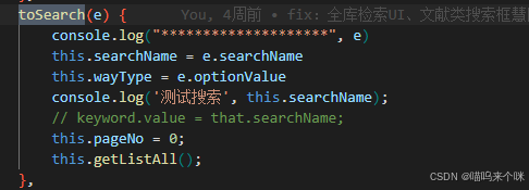
4、组件传值常用:
vue2:
1>
<left11 ref="P2L11"></left11>
> ```import left11 from "../components/P3Left11.vue"
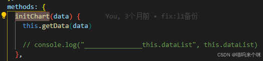

this.$refs.P2L12.initChart(data);
2>
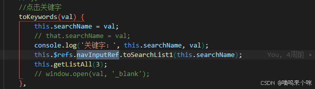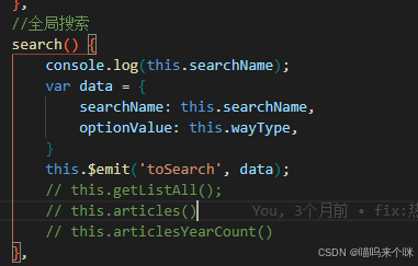
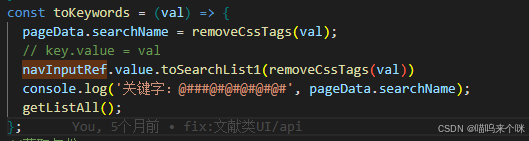
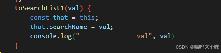
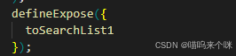
vue3:
const navInputRef = ref(null)
## 5、左右布局
```html
<el-row :gutter="24">
<el-col :span="6">
<div class="card-view left-view">
<div class="left_top">
<div class="top_title">
 最低0.47元/天 解锁文章


 扫一扫
扫一扫
 3292
3292

 被折叠的 条评论
为什么被折叠?
被折叠的 条评论
为什么被折叠?
 到【灌水乐园】发言


