


Odoo Javascript 框架使用称为 Owl 的自定义组件框架。它是一个声明式组件系统,受到 Vue 和 React 的粗略启发。组件使用QWeb 模板定义,并添加了一些 Owl 特定指令。
注:
目前,所有 Odoo 版本(从版本 14 开始)共享相同的 Owl 版本。
1、使用 Owl 组件
const { useState } = owl.hooks;//主要用于局部更新
const { xml } = owl.tags; //模板

class MyComponent extends Component {
    setup() {
        this.state = useState({ value: 1 });
    }

    increment() {
        this.state.value++;
    }
}
MyComponent.template = xml
    `<div t-on-click="increment">
        <t t-esc="state.value">
    </div>`;
*此示例显示 Owl 可作为全局命名空间中的库 owl使用:它可以像 Odoo 中的大多数库一样使用。请注意,我们在这里将模板定义为静态属性,但没有使用static 关键字,这在某些浏览器中不可用(Odoo javascript 代码应符合 Ecmascript 2019),模板只能有一个div的根节点。
*在 javascript 代码中定义了模板xml 。但是,它仅在定义时起作用。在具体开发过程中,Odoo 中的模板应该定义在一个 xml 文件中,这样它们就可以被翻译。也就是说,组件应该只定义模板名称。
*在开发时,大多数组件应该定义 2 或 3 个文件,位于同一位置:一个 javascript 文件 ( my_component.js)、一个模板文件 ( my_component.xml) 和可选的 scss(或 css)文件 ( my_component.scss)。然后应将这些文件添加到某些资产包中。Web 框架将负责加载 javascript/css 文件,并将模板加载到 Owl 中。
以下是上述组件的定义方式:
const { useState } = owl.hooks;

class MyComponent extends Component {
    ...
}
MyComponent.template = 'myaddon.MyComponent';
模板是位于xml中的qweb :
<?xml version="1.0" encoding="UTF-8" ?>
<templates xml:space="preserve">

<t t-name="myaddon.MyComponent" owl="1">
  <div t-on-click="increment">
    <t t-esc="state.value"/>
  </div>
</t>

</templates>
Odoo 代码还没有完全用 Owl 编写,因此它需要一种方法来区分 Owl 模板(新代码)和旧模板(用于组件)之间的区别。为了以向后兼容的方式做到这一点,所有新模板都应该使用owl属性设置为 1 来定义。
注:
*不要忘记owl="1"在您的猫头鹰模板中设置!
*模板名称应遵循约定addon_name.ComponentName。
2、最佳实践
首先,组件是类,所以它们有一个构造函数。但是构造函数是 javascript 中的特殊方法,不能以任何方式覆盖。由于这是 Odoo 中偶尔有用的模式,我们需要确保 Odoo 中没有任何组件直接使用构造函数方法。相反,组件应该使用以下 setup方法:
// 正确:
class MyComponent extends Component {
    setup() {
        // initialize component here
    }
}

//不正确,不要这样作。
class IncorrectComponent extends Component {
    constructor(parent, props) {
        // initialize component here
    }
}
另一个推荐的做法是对模板名称使用一致的约定: addon_name.ComponentName. 这可以防止 odoo 模块之间的名称冲突。
3、参考文档列表
Odoo Web 客户端是使用Owl组件构建的。为了使它更容易,Odoo javascript 框架提供了一套通用组件,可以在一些常见情况下重用,例如下拉菜单、复选框或日期选择器。本页说明如何使用这些通用组件。
*复选框(checkbox)
一个简单的复选框组件,旁边有一个标签
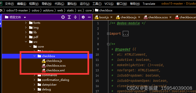
代码位置:
@web/core/checkbox/checkbox
描述
这是一个简单的复选框组件,旁边有一个标签。复选框链接到标签:只要单击标签,复选框就会切换。
<CheckBox value="boolean" disabled="boolean" t-on-change="onValueChange">
  Some Text
</CheckBox>
其中:value如果为真,则选中复选框,否则不选中
disabled如果为 true,则禁用复选框,否则启用
*下拉列表(dropdown)
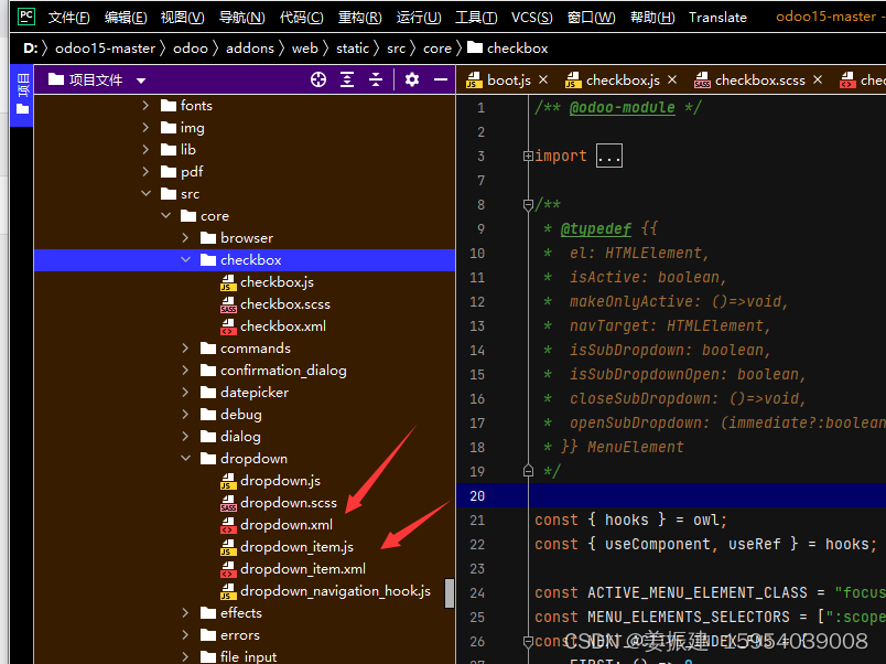
代码位置:
@web/core/dropdown/dropdown和@web/core/dropdown/dropdown_item
drowdown包含两个组件:一个Dropdown组件(实际的下拉菜单)和DropdownItem(用于项目列表中的每个元素)。
<Dropdown>
  <t t-set-slot="toggler">
    <!-- "toggler" slot content is rendered inside a button -->
    Click me to toggle the dropdown menu !
  </t>
  <!-- "default" slot content is rendered inside a div -->
  <DropdownItem t-on-dropdown-item-selected="selectItem1">Menu Item 1</DropdownItem>
  <DropdownItem t-on-dropdown-item-selected="selectItem2">Menu Item 2</DropdownItem>
</Dropdown>
属性:
一个<Dropdown/>组件的组成: 首先是<div class="dropdown"/> ,然后是一个 <button class="dropdown-toggle"/> 最后是MENU (<div class="dropdown-menu"/>). button决定下拉菜单项是否显示.
下拉列表Dropdown | 类型 | 描述 |
|---|---|---|
| startOpen | 布尔值 | 初始下拉菜单打开状态(默认为false) |
| menuClass | 字符 | 应用于下拉菜单的附加 CSS 类<div class="dropdown-menu"/> |
| togglerClass | 字符 | 应用于切换器的附加 CSS 类<button class="dropdown-toggle"/> |
| hotkey | 字符 | 通过键盘切换打开的热键 |
| beforeOpen | function | 在打开之前执行逻辑。可能是异步的。 |
| manualOnly | 布尔值 | 如果为 true,则仅在单击按钮时切换下拉列表(默认为false) |
| title | 字符 | 标题属性内容(默认值:无) |
| position | 字符 | 定义菜单打开位置。自动应用 RTL 方向。应该是一个有效的usePosition钩子位置。(默认bottom-start:) |
| toggler | "parent"或者undefined | 当设置"parent"为不呈现时(此j时插槽(slot)被忽略)并且切换功能由父节点处理。(默认:)<button class="dropdown-toggle"/>togglerundefined |
一个<DropdownItem/>就是一个<span class="dropdown-item"/>标记。当一个<DropdownItem/>被选择,它会触发一个自定义的事件dropdown-item-selected ,为了响应此事件,需要定义一个事件监听。
| 下拉列表项
DropdownItem | 类型 | 描述 |
|---|---|---|
| payload | 对象 | 将事件挂载到 dropdown-item-selected上去 |
| parentClosingMode | none/closest/all | 当某个ITEM被选中,控制哪个父对象将被关闭,分为无,本级的父对象和所有 |
| hotkey | 字符 | 用于选择项目的可选热键 |
| href | 字符 | 如果提供这个关键字, DropdownItem 将变成 来替代 . (默认:fii 未提供) |
| title | 字符 | 可选的标题属性,将传递给 DropdownItem 的根节点。(默认:未提供) |
技术实现:
渲染的 DOM 结构如下:
<div class="dropdown">
    <button class="dropdown-toggle">Click me !</button>
    <!-- following <div/> will or won't appear in the DOM depending on the state controlled by the preceding button -->
    <div class="dropdown-menu">
        <span class="dropdown-item">Menu Item 1</span>
        <span class="dropdown-item">Menu Item 2</span>
    </div>
</div>
要正确使用组件,需要设置两个 OWL 插槽:
toggler slot:它包含下拉列表的菜单切换元素,并在下拉列表中呈现button(除非toggler设置为parent).
default slot:它包含下拉菜单本身的元素,并被渲染在 <div class="dropdown-menu"/>里面. 虽然不是强制性的,但通常插槽至少有一个。
当多个下拉菜单在 DOM 中共享相同的父元素时,它们被视为组的一部分,并将相互通知它们的状态更改。这意味着当其中一个下拉菜单打开时,其他下拉菜单将在鼠标悬停时自动打开,而无需单击。
示例:同组下拉列表
当单击一个下拉toggle(File、Edit或About)时,其他的将在悬停时自行打开。
<div t-on-dropdown-item-selected="onItemSelected">
  <Dropdown>
    <t t-set-slot="toggler">File</t>
    <DropdownItem payload="'file-open'">Open</DropdownItem>
    <DropdownItem payload="'file-new-document'">New Document</DropdownItem>
    <DropdownItem payload="'file-new-spreadsheet'">New Spreadsheet</DropdownItem>
  </Dropdown>
  <Dropdown>
    <t t-set-slot="toggler">Edit</t>
    <DropdownItem payload="'edit-undo'">Undo</DropdownItem>
    <DropdownItem payload="'edit-redo'">Redo</DropdownItem>
    <DropdownItem payload="'edit-find'">Search</DropdownItem>
  </Dropdown>
  <Dropdown>
    <t t-set-slot="toggler">About</t>
    <DropdownItem payload="'about-help'">Help</DropdownItem>
    <DropdownItem payload="'about-update'">Check update</DropdownItem>
  </Dropdown>
</div>
示例:多级下拉菜单(带有t-call)
这个例子展示了如何制作一个File下拉菜单,其中包含新建和保存两个子菜单及其中的子元素.
<t t-name="addon.Dropdown.File" owl="1">
  <Dropdown t-on-dropdown-item-selected="onItemSelected">
    <t t-set-slot="toggler">File</t>
    <DropdownItem payload="'file-open'">Open</DropdownItem>
    <t t-call="addon.Dropdown.File.New"/>
    <DropdownItem payload="'file-save'">Save</DropdownItem>
    <t t-call="addon.Dropdown.File.Save.As"/>
  </Dropdown>
</t>

<t t-name="addon.Dropdown.File.New" owl="1">
  <Dropdown>
    <t t-set-slot="toggler">New</t>
    <DropdownItem payload="'file-new-document'">Document</DropdownItem>
    <DropdownItem payload="'file-new-spreadsheet'">Spreadsheet</DropdownItem>
  </Dropdown>
</t>

<t t-name="addon.Dropdown.File.Save.As" owl="1">
  <Dropdown>
    <t t-set-slot="toggler">Save as...</t>
    <DropdownItem payload="'file-save-as-csv'">CSV</DropdownItem>
    <DropdownItem payload="'file-save-as-pdf'">PDF</DropdownItem>
  </Dropdown>
</t>
示例:多级下拉菜单(嵌套)
<Dropdown t-on-dropdown-item-selected="onItemSelected">
  <t t-set-slot="toggler">File</t>
  <DropdownItem payload="'file-open'">Open</DropdownItem>
  <Dropdown>
    <t t-set-slot="toggler">New</t>
    <DropdownItem payload="'file-new-document'">Document</DropdownItem>
    <DropdownItem payload="'file-new-spreadsheet'">Spreadsheet</DropdownItem>
  </Dropdown>
  <DropdownItem payload="'file-save'">Save</DropdownItem>
  <Dropdown>
    <t t-set-slot="toggler">Save as...</t>
    <DropdownItem payload="'file-save-as-csv'">CSV</DropdownItem>
    <DropdownItem payload="'file-save-as-pdf'">PDF</DropdownItem>
  </Dropdown>
</Dropdown>
猫头鹰组件
Odoo Javascript 框架使用称为 Owl 的自定义组件框架。它是一个声明式组件系统,受到 Vue 和 React 的粗略启发。组件使用QWeb 模板定义,并添加了一些 Owl 特定指令。Owl官方 文档 包含完整的参考资料和教程。
重要的
Although the code can be found in the web module, it is maintained from a separate GitHub repository. Any modification to Owl should therefore be made through a pull request on https://github.com/odoo/owl.
Note
Currently, all Odoo versions (starting in version 14) share the same Owl version.
Using Owl components
The Owl documentation already documents in detail the Owl framework, so this page will only provide Odoo specific information. But first, let us see how we can make a simple component in Odoo.
const { useState } = owl.hooks;
const { xml } = owl.tags;
class MyComponent extends Component {
setup() {
this.state = useState({ value: 1 });
}
increment() {
    this.state.value++;
}
}
MyComponent.template = xml
<div t-on-click="increment"> <t t-esc="state.value"> </div>;
This example shows that Owl is available as a library in the global namespace as owl: it can simply be used like most libraries in Odoo. Note that we defined here the template as a static property, but without using the static keyword, which is not available in some browsers (Odoo javascript code should be Ecmascript 2019 compliant).
We define here the template in the javascript code, with the help of the xml helper. However, it is only useful to get started. In practice, templates in Odoo should be defined in an xml file, so they can be translated. In that case, the component should only define the template name.
In practice, most components should define 2 or 3 files, located at the same place: a javascript file (my_component.js), a template file (my_component.xml) and optionally a scss (or css) file (my_component.scss). These files should then be added to some assets bundle. The web framework will take care of loading the javascript/css files, and loading the templates into Owl.
Here is how the component above should be defined:
const { useState } = owl.hooks;
class MyComponent extends Component {
…
}
MyComponent.template = ‘myaddon.MyComponent’;
And the template is now located in the corresponding xml file:
Note
Do not forget to set owl=“1” in your Owl templates!
Note
Template names should follow the convention addon_name.ComponentName.
See also
Owl Repository
Best practices
First of all, components are classes, so they have a constructor. But constructors are special methods in javascript that are not overridable in any way. Since this is an occasionally useful pattern in Odoo, we need to make sure that no component in Odoo directly uses the constructor method. Instead, components should use the setup method:
// correct:
class MyComponent extends Component {
setup() {
// initialize component here
}
}
// incorrect. Do not do that!
class IncorrectComponent extends Component {
constructor(parent, props) {
// initialize component here
}
}
Another good practice is to use a consistent convention for template names: addon_name.ComponentName. This prevents name collision between odoo addons.
Reference List
The Odoo web client is built with Owl components. To make it easier, the Odoo javascript framework provides a suite of generic components that can be reused in some common situations, such as dropdowns, checkboxes or datepickers. This page explains how to use these generic components.
Technical Name
Short Description
CheckBox
a simple checkbox component with a label next to it
Dropdown
full-featured dropdown
CheckBox
Location
@web/core/checkbox/checkbox
Description
This is a simple checkbox component with a label next to it. The checkbox is linked to the label: the checkbox is toggled whenever the label is clicked.
Type
Description
value
boolean
if true, the checkbox is checked, otherwise it is unchecked
disabled
boolean
if true, the checkbox is disabled, otherwise it is enabled
Dropdown
Location
@web/core/dropdown/dropdown and @web/core/dropdown/dropdown_item
Description
Dropdowns are surprisingly complicated components. They need to provide many features such as:
Toggle the item list on click
Direct siblings dropdowns: when one is open, toggle others on hover
Close on outside click
Optionally close the item list when an item is selected
Emit an event to inform which list item is clicked
Support sub dropdowns, up to any level
SIY: style it yourself
Configurable hotkey to open/close a dropdown or select a dropdown item
Keyboard navigation (arrows, tab, shift+tab, home, end, enter and escape)
Reposition itself whenever the page scrolls or is resized
Smartly chose the direction it should open (right-to-left direction is automatically handled).
To solve these issues once and for all, the Odoo framework provides a set of two components: a Dropdown component (the actual dropdown), and DropdownItem, for each element in the item list.
Click me to toggle the dropdown menu ! Menu Item 1 Menu Item 2 Props A component is simply a


 897
897


 被折叠的 条评论
为什么被折叠?
被折叠的 条评论
为什么被折叠?
 到【灌水乐园】发言


