


弹性盒子的属性分为盒子的属性和子项的属性,先介绍盒子的属性吧,子项的属性下一篇讲
目录
1.dislay
表示盒子为弹性盒子的属性值有flex,inline-flex
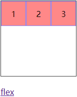
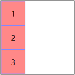
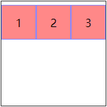
(1)flex:该弹性盒子为块元素,如【例1-1】
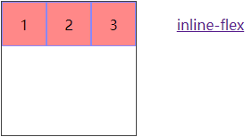
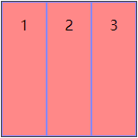
(2)inline-flex:该弹性盒子为行级块元素。如【例1-2】
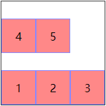
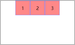
【例1-1】flex
效果
代码
<!DOCTYPE html>
<html lang="en">
<head>
<style>
* {
margin: 0;
padding: 0;
}
.wrapper {
margin: 20px;
width: 150px;
height: 150px;
border: 1px solid #424242;
display: flex;
}
.wrapper .content {
text-align: center;
width: 50px;
height: 50px;
line-height: 50px;
background-color: #f88;
border: 1px solid #88f;
box-sizing: border-box;
}
</style>
</head>
<body>
<div class="wrapper">
<div class="content">1</div>
<div class="content">2</div>
<div class="content">3</div>
</div>
<a href="">flex</a>
</body>
</html>
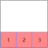
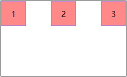
</html>【例1-2】inline-flex:上例代码中display属性值修改为inline-flex,a标签文本内容修改为inline-flex,结果如下
2.flex-direction
该属性可设置主轴的方向,交叉轴与主轴垂直,属性值有row,row-reverse,column,column-reverse
【注】主轴方向确定了子项的排列方向
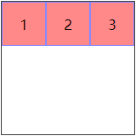
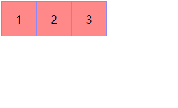
(1)row(默认值):主轴水平,方向从左向右【例2-1】
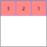
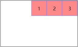
(2)row-reverse:主轴水平,方向从右向左【例2-2】
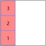
(3)column:主轴垂直,方向从上到下【例2-3】
(4)column-reverse:主轴垂直,方向从下到上【例2-4】
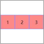
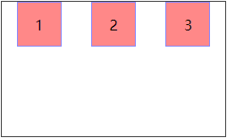
【例2-1】给【例1-1】中wrapper的样式中添加属性flex-direction: row,且删除a标签,CSS代码如下
.wrapper {
    margin: 20px;
    width: 300px;
    height: 150px;
    border: 1px solid #424242;
    display: flex;
    flex-direction: row;
}
结果
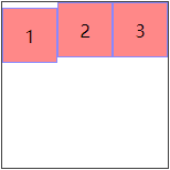
【例2-2】将上例中flex-direction属性值设为row-reverse,结果如下
【例2-3】将上例中flex-direction属性值设为column,结果如下
【例2-4】将上例中flex-direction属性值设为column-reverse,结果如下
3.flex-wrap
该属性可以设置flex盒子是多行还是单行,有三个属性值nowrap,wrap, wrap-reverse
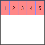
(1)nowrap(默认值):单行,且对子项的宽度进行压缩【例3-1】
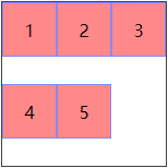
(2)wrap:折成多行【例3-2】
(3)wrap-reverse:反转wrap排列,注意反转的效果【例3-3】
【例3-1】将例【2-1】中wrapper的样式修改如下css代码,并添加两个content如下html代码
html代码
<div class="wrapper">
    <div class="content">1</div>
    <div class="content">2</div>
    <div class="content">3</div>
    <div class="content">4</div>
    <div class="content">5</div>
</div>
css代码
.wrapper {
    margin: 20px;
    width: 150px;
    height: 150px;
    border: 1px solid #424242;
    display: inline-flex;
    flex-wrap: nowrap;
}
结果
【例3-2】将上例中flex-wrap的属性值设置为wrap,结果如下
【例3-3】将上例中flex-wrap的属性值设置为wrap-reverse,结果如下
4.align-items
设置交叉轴上的的对齐方式,五个属性值flex-start,flex-end,center,baseline,stretch
(1)flex-start(默认):子项在弹性盒子交叉轴的起始位置【例4-1】
(2)flex-end:子项在弹性盒子交叉轴的终止位置【例4-2】
(3)center:子项在交叉轴的中间位置【例4-3】
(4)baseline:子项相对于文本对齐【例4-4】
(5)stretch(默认值):当子项没有在交叉轴上设置高 / 宽(主轴水平 / 主轴垂直)时,该属性值可以在使子项的高 / 宽拉伸至充满盒子,如【例4-5】
【例4-1】flex-start
代码
<!DOCTYPE html>
<html lang="en">
<head>
    <style>
.wrapper {
    margin: 20px;
    width: 150px;
    height: 150px;
    border: 1px solid #424242;
    display: flex;
    align-items: flex-start;
}
.wrapper .content {
    text-align: center;
    width: 50px;
    height: 50px;
    line-height: 50px;
    background-color: #f88;
    border: 1px solid #88f;
    box-sizing: border-box;
}
    </style>
</head>
<body>
    <div class="wrapper">
        <div class="content">1</div>
        <div class="content">2</div>
        <div class="content">3</div>
    </div>
</body>
</html>
结果

【例4-2】flex-end:将上例align-items的属性值设置为flex-end,结果如下
【例4-3】center:将上例align-items的属性值设置为center,结果如下
【例4-4】baseline:修改上例html代码中第一个content如下
<div class="content" style="margin-top: 5px;">1</div>删除align-center属性,此时结果如下
然后添加align-items: baseline,此时结果如下
【例4-5】删除【例4-1】中子项content的高度,且将align-items的属性值设置为stretch,结果如下
5. justify-content
当弹性盒里一行上的所有子元素都不能伸缩或已经达到其最大值时,这一属性可协助对多余的空间进行分配。当元素溢出某行时,这一属性同样会在对齐上进行控制,有5个属性值flex-start,flex-end,center,space-between,space-around
(1)flex-start(默认)【例5-1】
(2)flex-end【例5-2】
(3)center【例5-3】
(4)space-between:第一个和最后一个子项分别置于主轴的两头,中间部分自适应分配,相邻子项间隔相等,如【例5-4】
(5)space-around:子项等间隔分布,且子项与子项之间的间隔是第一个或者最后一个子项距离盒子边的二倍,如【例5-5】
【例5-1】flex-start
<!DOCTYPE html>
<html lang="en">
<head>
    <style>
.wrapper {
    margin: 20px;
    width: 250px;
    height: 150px;
    border: 1px solid #424242;
    display: flex;
    justify-content: flex-start;
}
.wrapper .content {
    text-align: center;
    width: 50px;
    height: 50px;
    line-height: 50px;
    background-color: #f88;
    border: 1px solid #88f;
    box-sizing: border-box;
}
    </style>
</head>
<body>
    <div class="wrapper">
        <div class="content">1</div>
        <div class="content">2</div>
        <div class="content">3</div>
    </div>
</body>
</html>
结果
【例5-2】flex-end,修改上例justify-content属性值为flex-end,结果如下
【例5-3】center,修改上例justify-content属性值为center,结果如下
【例5-4】space-between,修改上例justify-content属性值为space-between,结果如下
【例5-5】space-around,修改上例justify-content属性值为space-around,结果如下
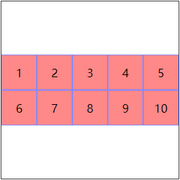
6.align-content
多行沿交叉轴的对其方向,五个属性值flex-start,flex-end,center,space-between,space-around,stretch
【例6-1】center
<!DOCTYPE html>
<html lang="en">
<head>
    <style>
.wrapper {
    margin: 20px;
    width: 250px;
    height: 250px;
    border: 1px solid #424242;
    display: flex;
    flex-wrap: wrap;
    align-content: center;
}
.wrapper .content {
    text-align: center;
    width: 50px;
    height: 50px;
    line-height: 50px;
    background-color: #f88;
    border: 1px solid #88f;
    box-sizing: border-box;
}
    </style>
</head>
<body>
    <div class="wrapper">
        <div class="content">1</div>
        <div class="content">2</div>
        <div class="content">3</div>
        <div class="content">4</div>
        <div class="content">5</div>
        <div class="content">6</div>
        <div class="content">7</div>
        <div class="content">8</div>
        <div class="content">9</div>
        <div class="content">10</div>
    </div>
</body>
</html>
结果
其他属性不做赘述,可以自己试一试


 8343
8343


 被折叠的 条评论
为什么被折叠?
被折叠的 条评论
为什么被折叠?
 到【灌水乐园】发言


