


HTML+CSS美化表格:
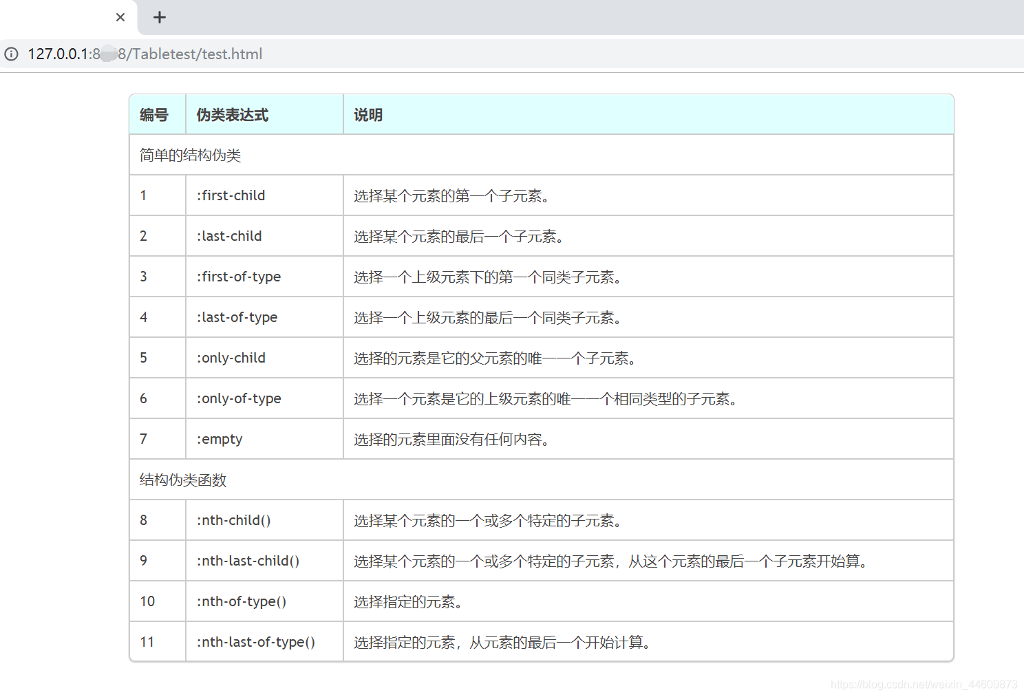
效果如下:
实现代码:
<!doctype html>
<html lang="en">
<head>
<meta charset="utf-8">
<title>Table</title>
<style type="text/css">
* {
    margin: 0;
    padding: 0;
}
body { padding: 10px 100px; }  /* padding定义内边距 */
#wrap {
    width: 800px;
    margin: 10px auto;
    font-family: 'trebuchet MS', 'Lucida sans', Arial;
    font-size: 14px;
    color: #444;
}
table {
    *border-collapse: collapse;  /* 属性设置表格边框合并,而不是像标准HTML表格那样分开 */
    border-spacing: 0;  /* 属性设置相邻单元格的边框间的距离(仅用于“边框分离”模式),在指定的两个长度值中,第一个是水平间隔,第二个是垂直间隔。 */
    width: 100%;
}
/*========bordered table========*/
.bordered {
    border: solid #ccc 1px;
    -moz-border-radius: 6px;
    -webkit-border-radius: 6px;
    border-radius: 6px;
    -webkit-box-shadow: 0 1px 1px #ccc;
    -moz-box-shadow: 0 1px 1px #ccc;
    box-shadow: 0 1px 1px #ccc;  /* box-shadow 属性向框添加一个或多个阴影,水平 垂直 阴影迷糊 阴影颜色 text-shdow像文本添加阴影 */
}
.bordered tr {
    -o-transition: all 0.1s ease-in-out;
    -webkit-transition: all 0.1s ease-in-out;
    -moz-transition: all 0.1s ease-in-out;
    -ms-transition: all 0.1s ease-in-out;
    transition: all 0.1s ease-in-out;  /* all所有属性都将获得过渡效果,完成过渡效果0.1s,ease-in-out规定以慢速开始和结束的过渡效果 */
}
.bordered .highlight,  .bordered tr:hover { background: #fbf8e9; }
.bordered td,  .bordered th {
    border-left: 1px solid #ccc;
    border-top: 1px solid #ccc;
    padding: 10px;
    text-align: left;  /* 文本左对齐 */
}
.bordered th {
    background-color: lightcyan;
   background-image: -webkit-gradient(linear, left top, left bottom, from(#ebf3fc), to(#dce9f9));
    background-image: -webkit-linear-gradient(top, #ebf3fc, #dce9f9);
    background-image: -moz-linear-gradient(top, #ebf3fc, #dce9f9);
    background-image: -ms-linear-gradient(top, #ebf3fc, #dce9f9);
    background-image: -o-linear-gradient(top, #ebf3fc, #dce9f9);
    background-image: linear-gradient(top, #ebf3fc, #dce9f9);
 filter: progid:DXImageTransform.Microsoft.gradient(GradientType=0, startColorstr=#ebf3fc, endColorstr=#dce9f9);
    -ms-filter: "progid:DXImageTransform.Microsoft.gradient (GradientType=0, startColorstr=#ebf3fc, endColorstr=#dce9f9)";
    -webkit-box-shadow: 0 1px 0 rgba(255,255,255,.8) inset;
    -moz-box-shadow: 0 1px 0 rgba(255,255,255,.8) inset;
    box-shadow: 0 1px 0 rgba(255,255,255,.8) inset;
    border-top: none;
    text-shadow: 0 1px 0 rgba(255,255,255,.5);
}
.bordered td:first-child,  .bordered th:first-child { border-left: none; }
.bordered th:first-child {
    -moz-border-radius: 6px 0 0 0;
    -webkit-border-radius: 6px 0 0 0;
    border-radius: 6px 0 0 0;
}
.bordered th:last-child {
    -moz-border-radius: 0 6px 0 0;
    -webkit-border-radius: 0 6px 0 0;
    border-radius: 0 6px 0 0;
}
.bordered tr:last-child td:first-child {
    -moz-border-radius: 0 0 0 6px;
    -webkit-border-radius: 0 0 0 6px;
    border-radius: 0 0 0 6px;
}
.bordered tr:last-child td:last-child {
    -moz-border-radius: 0 0 6px 0;
    -webkit-border-radius: 0 0 6px 0;
    border-radius: 0 0 6px 0;
}
</style>
</head>

<body>
<div id="wrap">
    <table  class="bordered">
		<!-- 表头 -->
        <thead>
            <tr>
                <th>编号</th>
                <th>伪类表达式</th>
                <th>说明</th>
            </tr>
        </thead>
		<!-- 表身 -->
        <tbody>
            <tr>
                <td colspan="3">简单的结构伪类</td>
            </tr>
            <tr>
                <td>1</td>
                <td>:first-child</td>
                <td>选择某个元素的第一个子元素。</td>
            </tr>
            <tr>
                <td>2</td>
                <td>:last-child</td>
                <td>选择某个元素的最后一个子元素。</td>
            </tr>
            <tr>
                <td>3</td>
                <td>:first-of-type</td>
                <td>选择一个上级元素下的第一个同类子元素。</td>
            </tr>
            <tr>
                <td>4</td>
                <td>:last-of-type</td>
                <td>选择一个上级元素的最后一个同类子元素。</td>
            </tr>
            <tr>
                <td>5</td>
                <td>:only-child</td>
                <td>选择的元素是它的父元素的唯一一个子元素。</td>
            </tr>
            <tr>
                <td>6</td>
                <td>:only-of-type</td>
                <td>选择一个元素是它的上级元素的唯一一个相同类型的子元素。</td>
            </tr>
            <tr>
                <td>7</td>
                <td>:empty</td>
                <td>选择的元素里面没有任何内容。</td>
            </tr>
            <tr>
                <td colspan="3">结构伪类函数</td>
            </tr>
            <tr>
                <td>8</td>
                <td>:nth-child()</td>
                <td>选择某个元素的一个或多个特定的子元素。</td>
            </tr>
            <tr>
                <td>9</td>
                <td>:nth-last-child()</td>
                <td>选择某个元素的一个或多个特定的子元素,从这个元素的最后一个子元素开始算。</td>
            </tr>
            <tr>
                <td>10</td>
                <td>:nth-of-type()</td>
                <td>选择指定的元素。</td>
            </tr>
            <tr>
                <td>11</td>
                <td>:nth-last-of-type()</td>
                <td>选择指定的元素,从元素的最后一个开始计算。</td>
            </tr>
        </tbody>
    </table>
</div>
</body>
</html>


 3万+
3万+


 被折叠的 条评论
为什么被折叠?
被折叠的 条评论
为什么被折叠?
 到【灌水乐园】发言


