


#常见的网页布局
0. 注意项。
1. 布局行列用grid, 内容水平/垂直居中用flex。
2. 具有内外边距的标签。
一.h1~h6标签:有默认margin(top,bottom且相同)值,没有默认padding值。
在chrome中:16,15,14,16,17,19;
在firefox中:16,15,14,16,17,20;
在safari中:16,15,14,16,17,19;
在opera中:16,15,14,14,17,21;
在maxthon中:16,14,14,15,16,18;
在IE6.0中:都是19;
在IE7.0中:都是19;
在IE8.0中:16,15,14,16,17,19;
二.dl标签:有默认margin(top,bottom且相同)值,没有默认padding值。
在Chrome,Firefox,Safari,Opera,Maxthon,IE8.0中:margin:12px 0px;
在IE6.0,7.0中:margin:19px 0px;
dd标签有默认margin-left:40px;(在所有上述浏览器中)。
三.ol,ul标签:有默认margin-(top,bottom且相同)值,有默认padding-left值
在Chrome,Firefox,Safari,Opera,Maxthon,IE8.0中:margin:12px 0px;
在IE6.0,7.0中:margin:19px 0px;
默认padding-left值:在Chrome,Firefox,Safari,Opera,Maxthon,IE8.0中都是padding-left:40px;在IE6.0,7.0中没有默认padding值,因为ol,ul标签的边框不包含序号。
四.table标签没有默认的margin,padding值;th,td标签没有默认的margin值,有默认的padding值。
在Chrome,Firefox,Safari,Opera,Maxthon中:padding:1px;
在IE8.0中:padding:0px 1px 1px;
在IE7.0中:padding:0px 1px;
相同内容th的宽度要比td宽,因为th字体有加粗效果。
五.form标签在Chrome,Firefox,Safari,Opera,Maxthon,IE8.0中没有默认的margin,padding值,但在IE6.0,7.0中有默认的margin:19px 0px;
六.p标签有默认margin(top,bottom)值,没有默认padding值。
在Chrome,Firefox,Safari,Opera,Maxthon,IE8.0中:margin:12px 0px;
在IE6.0,7.0中:margin:19px 0px;
七.textarea标签在上述所有浏览器中:margin:2px;padding:2px;
八.select标签在Chrome,Safari,Maxthon中有默认的margin:2px;在Opera,Firefox,IE6.0,7.0,8.0没有默认的margin值。
option标签只有在firefox中有默认的padding-left:3px;
3. border重叠可以用margin的负值抵消。
4. 首行空行,如果不需要
5. 常用的符号 <(< , > (>
1. 三角形
	    .box {
	        /*1. width默认视口宽度  */
            width: 0;
            border: 50px solid yellow;
            border-top: 50px solid red;
        }
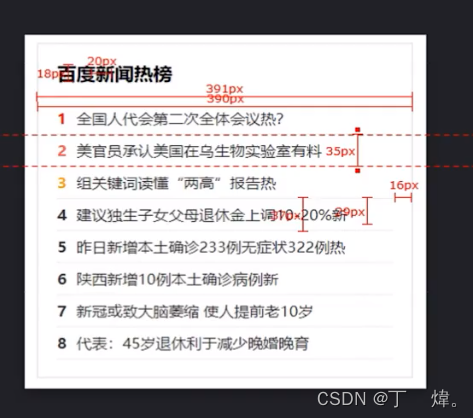
案例2. 热榜
<!DOCTYPE html>
<html lang="en">
<head>
    <meta charset="UTF-8">
    <meta http-equiv="X-UA-Compatible" content="IE=edge">
    <meta name="viewport" content="width=device-width, initial-scale=1.0">
    <title>Document</title>
    <style>
        html,
        body,
        ul {
            padding: 0;
            margin: 0;
        }

        a {
            text-decoration: none;
        }

        li {
            list-style: none;
        }

        .new {
            padding: 15px;
            width: 360px;
            border: 1px solid #ddd;
        }

        .new h3 {
            font-size: 20px;
            margin-bottom: 20px;
        }

        .new ul {
            /* 开启grid容器,设置8列,各列35px */
            display: grid;
            grid-template-rows: repeat(8, 35px);
        }

        .new ul li {
            /* 开启flex容器, 让容器内垂直居中 */
            display: flex;
            align-items: center;
            /* border边框合并 */
            border: 1px dotted #ddd;
            border-left: 0;
            border-right: 0;
            margin-top: -1px;
            font-size: 16px;

        }

        .new ul li a {
            color: #333;
            /* 超过100px就截断并显示... */
            width: 100px;
            text-overflow: ellipsis;
            overflow: hidden;
        }


        .new ul li a:hover{
            color: red;
        }

        .new ul li a span {
            margin-right: 10px;
            font-weight: bold;
            /* 基于父元素基线居中 */
            vertical-align:middle;
        }

        .new ul li:nth-child(1) span{
            color: red;
        }


    </style>
</head>
<body>
    <div class="new">
        <h3>百度新闻热榜</h3>
        <ul>
            <!-- shift+alt+向下 可以复制标签向下插入 -->
            <!-- ctrl + alt + 上下键 可以选择位置,多行同时操作 -->
            <li><a href="#"><span>1</span>xxxxxxxxxxxxxxxxxxxxxxxxxxxxxxxxxxxxxxxxxxxxxxxxxxxxxxxxxxxxxxxxxxxxxxxx</a></li>
            <li><a href="#"><span>2</span>xxxxxxxxx</a></li>
            <li><a href="#"><span>3</span>xxxxxxxxx</a></li>
            <li><a href="#"><span>4</span>xxxxxxxxx</a></li>
            <li><a href="#"><span>5</span>xxxxxxxxx</a></li>
            <li><a href="#"><span>6</span>xxxxxxxxx</a></li>
            <li><a href="#"><span>7</span>xxxxxxxxx</a></li>
            <li><a href="#"><span>8</span>xxxxxxxxx</a></li>
        </ul>
    </div>
</body>
</html>
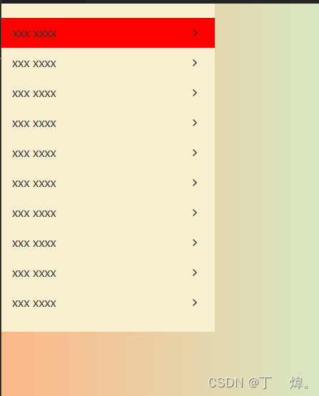
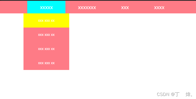
案例4. 侧边栏
<!DOCTYPE html>
<html lang="en">
<head>
    <meta charset="UTF-8">
    <meta http-equiv="X-UA-Compatible" content="IE=edge">
    <meta name="viewport" content="width=device-width, initial-scale=1.0">
    <!-- 本地已unicode方式引入字体图标 -->
    <link rel="stylesheet" href="./font/iconfont.css" />
    <link rel="stylesheet" href="./css/normalize.css" />

    <title>Document</title>
    <style type="text/css">
        /*
            默认     padding.   margin
            body       8px        8px
            ul         40px      16px
        */
        html,
        body,
        ul{
            padding: 0;
            margin: 0;
        }

        body {
            /* 渐变色 */
            background-image: linear-gradient(to right, #fdb787, #c6fddc);
        }

        .menu {
            padding: 20px 0;
            width: 300px;
            background-color: #f7efd0;
        }

        .menu ul {
            display: grid;
            grid-template-rows: repeat(10, 42px);

        }

        .menu ul li a {
            display: block;
            /* 相对于文本字体的2个单位 */
            padding-left: 1em;
            /* 垂直居中 */
            line-height: 42px;
        }

        .menu ul li a::after{
            font-family: "iconfont";
            content: "\e610";
            float: right;
            margin-right: 20px;
        }

        .menu ul li:hover {
            background-color: red;
        }

    </style>
</head>
<body>
    <div class="menu">
        <ul>
            <li><a href="#">xxx xxxx</a></li>
            <li><a href="#">xxx xxxx</a></li>
            <li><a href="#">xxx xxxx</a></li>
            <li><a href="#">xxx xxxx</a></li>
            <li><a href="#">xxx xxxx</a></li>
            <li><a href="#">xxx xxxx</a></li>
            <li><a href="#">xxx xxxx</a></li>
            <li><a href="#">xxx xxxx</a></li>
            <li><a href="#">xxx xxxx</a></li>
            <li><a href="#">xxx xxxx</a></li>
        </ul>
    </div>
</body>
</html>
案例5. 分页

<!DOCTYPE html>
<html lang="en">
<head>
<meta charset="UTF-8">
<meta http-equiv="X-UA-Compatible" content="IE=edge">
<meta name="viewport" content="width=device-width, initial-scale=1.0">
<link rel="stylesheet" href="./css/normalize.css">
<title>Document</title>
<style type="text/css">
.paging {
display: grid;
/* 列, 设置12列, 让子元素决定宽高 */
grid-template-columns: repeat(12, auto);
/* 边距:行 列 */
gap: 0 5px;
/* 容器水平/垂直居中 */
justify-content: center;
align-content: center;
height: 50px;
background-color: rgb(163, 238, 188);
}
.paging a {
border: 1px solid #333;
/* 开启flex,让内容水平/垂直居中 */
display: flex;
justify-content: center;
align-items: center;
/* 子元素撑大盒子,padding达到自适应效果 */
padding: 0px 5px;
}
.paging a:nth-child(2){
border: 0;
background-color: rosybrown;
}
.paging a:hover{
color: red;
}
</style>
</head>
<body>
<div class="paging">
<a href="#"><</a>
<a href="#">1</a>
<a href="#">2</a>
<a href="#">3</a>
<a href="#">4</a>
<a href="#">5</a>
<a href="#">6</a>
<a href="#">7</a>
<a href="#">8</a>
<a href="#">...</a>
<a href="#">100</a>
<a href="#">></a>
</div>
</body>
</html>
总结:
1. 让项目做到自适应,在设置列数时不固定宽度,让内容的padding自行去撑大。
案例6. 选项卡

<!DOCTYPE html>
<html lang="en">
<head>
    <meta charset="UTF-8">
    <meta http-equiv="X-UA-Compatible" content="IE=edge">
    <meta name="viewport" content="width=device-width, initial-scale=1.0">
    <title>Document</title>
    <link rel="stylesheet" href="./css/normalize.css">
    <style type="text/css">
        .menu {
            width: 550px;
            height: 50px;
            background-color: #f8f6f8;
            border-radius: 50px;
            margin: auto;

            /* 开启grid,让项目相对于容器水平/垂直居中 */
            display: grid;
            grid-template-columns: repeat(5, auto);
            justify-content: center;
            align-content: center;

        }

        .menu a{
            padding: 5px 20px;
            font-size: 12px;
            border-radius: 50px;

            /* 开启flex, 内伪类背景图和内容都垂直居中 */
            display: flex;
            align-items: center;
        }

        .menu a i{
            margin-right: 5px;
            width: 26px;
            height: 25px;
            background-image: url('./image/icon.png');
        }

        .menu a:nth-child(1) i{
            background-position: 0 -26px;
        }

        .item-pink {
            background-color: pink;
            color: #f8f6f8;
        }
    </style>
</head>
<body>
    <div class="menu">
        <a href="#" class="menu-item item-pink"><i></i>备孕期间</a>
        <a href="#" class="menu-item"><i></i>怀孕</a>
        <a href="#" class="menu-item"><i></i>0-1岁</a>
        <a href="#" class="menu-item"><i></i>1-2岁</a>
        <a href="#" class="menu-item"><i></i>2-3岁</a>
    </div>
</body>
</html>
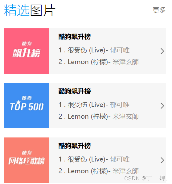
案例8. 精选图片
<!DOCTYPE html>
<html lang="en">

<head>
    <meta charset="UTF-8">
    <meta http-equiv="X-UA-Compatible" content="IE=edge">
    <meta name="viewport" content="width=device-width, initial-scale=1.0">
    <link rel="stylesheet" href="./css/normalize.css">
    <title>Document</title>
    <style type="text/css">
        .container {
            width: 525px;
        }

        .hander {
            display: flex;
            justify-content: space-between;
            align-items: center;
            margin-bottom: 40px;
        }

        .hander-left {
            font-size: 20px;
        }

        .hander-sift {
            color: #00b5f8;
        }

        .hander-right {
            font-size: 14px;
        }

        .content {
            display: grid;
            grid-template-rows: repeat(3, 147px);
            row-gap: 30px;
        }

        .content .content-item {
            display: grid;
            grid-template-columns: 147px 1fr 18px;

        }

        .content-item-left {
            width: 147px;
            height: 147px;
        }

        .content-item-middle {
            padding: 10px 30px;
            display: grid;
        }

        .content-item-middle p:first-child {
            font-weight: 700;
        }

        .content-item-middle span {
            color: #b19999;
        }

        .content-item-right {
            justify-self: center;
            align-self: center;
            width: 18px;
            height: 18px;
        }
    </style>
</head>

<body>
    <div class="container">
        <div class="hander">
            <span class="hander-left"><span class="hander-sift">精选</span>图片</span>
            <span class="hander-right">更多</span>
        </div>
        <div class="content">
            <div class="content-item">
                <img src="./images/nav1.jpg" alt="" class="content-item-left">
                <div class="content-item-middle">
                    <p>酷狗飙升榜</p>
                    <p>1 . 很受伤(Live) - <span>郁可唯</span></p>
                    <p>2 . Lemon(柠檬) - <span>米津玄师</span></p>
                </div>
                <img src="./images/arrow.png" alt="" class="content-item-right">
            </div>
            <div class="content-item">
                <img src="./images/nav2.jpg" alt="" class="content-item-left">
                <div class="content-item-middle">
                    <p>酷狗飙升榜</p>
                    <p>1 . 很受伤(Live) - <span>郁可唯</span></p>
                    <p>2 . Lemon(柠檬) - <span>米津玄师</span></p>
                </div>
                <img src="./images/arrow.png" alt="" class="content-item-right">
            </div>
            <div class="content-item">
                <img src="./images/nav3.jpg" alt="" class="content-item-left">
                <div class="content-item-middle">
                    <p>酷狗飙升榜</p>
                    <p>1 . 很受伤(Live) - <span>郁可唯</span></p>
                    <p>2 . Lemon(柠檬) - <span>米津玄师</span></p>
                </div>
                <img src="./images/arrow.png" alt="" class="content-item-right">
            </div>
        </div>
    </div>

</body>

</html>
案例9. 小米商品展示

<!DOCTYPE html>
<html lang="en">
<head>
<meta charset="UTF-8">
<meta http-equiv="X-UA-Compatible" content="IE=edge">
<meta name="viewport" content="width=device-width, initial-scale=1.0">
<title>Document</title>
<link rel="stylesheet" href="./css/normalize.css">
<style type="text/css">
img {
width: 100%;
}
.img-item {
width: 100px;
}
.container {
width: 830px;
height: 422px;
background-color: #dddddd;
font-size: 10px;
display: grid;
grid-template-columns: repeat(5, 155px);
grid-template-rows: repeat(2, 200px);
justify-content: center;
align-content: center;
gap: 10px;
grid-template-areas:
'a . . . .'
'a . . . .';
}
.content {
background-color: #ffffff;
display: grid;
justify-content: center;
align-content: center;
}
.content p {
justify-self: center;
}
.content p:nth-child(3) {
color: #d3d2d1;
margin: 5px 0 15px 0;
}
.content p:last-child {
color: red;
}
.content p:last-child span {
color: #d3d2d1;
/* 删除线 */
text-decoration: line-through;
}
.container .content:first-child {
grid-area: a;
}
.container .content:last-child {
background-color: #dfdfdf;
display: grid;
grid-template-rows: 95px 95px;
/* grid嵌套,如果内层grid 宽高超过了外层固定的值,使用gap会出现溢出的问题 */
gap: 10px 0;
}
.content-item {
display: grid;
grid-template-columns: 88px 67px;
background-color: #fdfdfd;
}
.content-item div {
justify-self: center;
align-self: center;
display: grid;
gap: 10px 0;
}
.content-item div p:last-child {
color: #ff7e56;
}
.content-item img {
justify-self: center;
align-self: center;
}
</style>
</head>
<body>
<div class="container">
<div class="content">
<img src="./images/mi00.webp" alt="">
</div>
<div class="content">
<img src="./images/mi01.webp" alt="" class="img-item">
<p>Xiaomi Watch S1</p>
<p>腕事具备</p>
<p>1099元起 <span>2099元起</span></p>
</div>
<div class="content">
<img src="./images/mi02.webp" alt="" class="img-item">
<p>Xiaomi Watch S1</p>
<p>腕事具备</p>
<p>1099元起 <span>2099元起</span></p>
</div>
<div class="content">
<img src="./images/mi03.webp" alt="" class="img-item">
<p>Xiaomi Watch S1</p>
<p>腕事具备</p>
<p>1099元起 <span>2099元起</span></p>
</div>
<div class="content">
<img src="./images/mi04.webp" alt="" class="img-item">
<p>Xiaomi Watch S1</p>
<p>腕事具备</p>
<p>1099元起 <span>2099元起</span></p>
</div>
<div class="content">
<img src="./images/mi05.webp" alt="" class="img-item">
<p>Xiaomi Watch S1</p>
<p>腕事具备</p>
<p>1099元起 <span>2099元起</span></p>
</div>
<div class="content">
<img src="./images/mi06.webp" alt="" class="img-item">
<p>Xiaomi Watch S1</p>
<p>腕事具备</p>
<p>1099元起 <span>2099元起</span></p>
</div>
<div class="content">
<img src="./images/mi07.webp" alt="" class="img-item">
<p>Xiaomi Watch S1</p>
<p>腕事具备</p>
<p>1099元起 <span>2099元起</span></p>
</div>
<div class="content">
<div class="content-item">
<div>
<p>Redmi Buds...</p>
<p>99元</p>
</div>
<img src="./images/mi08.webp" alt="" >
</div>
<div class="content-item">
<div>
<p>Redmi Buds...</p>
<p>99元</p>
</div>
<img src="./images/mi08.webp" alt="">
</div>
</div>
</div>
</body>
</html>
总结: 1. 多层嵌套grid, 如果外层行/列固定了值,内层行列+间距超过了外层就会出现溢出的问题。
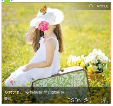
10. 酷狗歌单
<!DOCTYPE html>
<html lang="en">
<head>
<meta charset="UTF-8">
<meta http-equiv="X-UA-Compatible" content="IE=edge">
<meta name="viewport" content="width=device-width, initial-scale=1.0">
<title>Document</title>
<link rel="stylesheet" href="./css/normalize.css">
<style type="text/css">
.music {
position: relative;
width: 480px;
height: 480px;
background: url(./images/kugou-img1.jpg) no-repeat;
/* 已column(列)为主轴方向, 并两端对齐 */
display: grid;
grid-template-rows: 35px 1fr 85px;
grid-template-areas:
'a'
'.'
'c';
}
.music-header {
grid-area: a;
justify-self: end;
height: 35px;
width: 200px;
color: #ffffff;
background-image: linear-gradient(to left, rgba(0,0,0,0.5),rgba(255,255,255,0));
}
.music-header span {
float: right;
margin: 0 15px 0 10px;
height: 35px;
line-height: 35px;
font-size: 14px;
}
/* span和伪类不加浮动,会让span位置向下偏移*/
.music-header span::after {
/* display: inline-block; */
float: right;
margin-right: 10px;
content: '';
width: 35px;
height: 35px;
background: url(./images/earphone.svg) no-repeat center;
background-size: 20px;
}
.music-bottom {
grid-area: c;
padding: 10px 5px;
height: 85px;
background-color: rgba(63, 64, 24, .5);
font-size: 15px;
color: #c5c3a2;
}
.music-bottom p:first-child {
margin-bottom: 5px;
font-size: 18px;
color: #ffffff;
}
.music:hover::before {
position: absolute;
content: '';
top: 0px;
left: 0px;
bottom: 0px;
right: 0px;
/* 让color和image共同使用 */
background-color: rgba(0,0,0, .5);
background-image: url(./images/play-button.svg);
background-repeat: no-repeat;
background-position: 95% 95%;
}
</style>
</head>
<body>
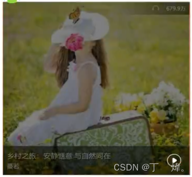
<a href="#" class="music">
<div class="music-header">
<span>679.9万</span>
</div>
<div class="music-bottom">
<p>乡村之旅: 安静x意愿 与自然同在</p>
<p>蔓若</p>
</div>
</a>
</body>
</html>
总结:
1. 可以使用父盒子的伪类充当遮罩层。
2. 子盒子相对于父盒子定位后,top/left/bottom/right 都为0px时, 可以做到全覆盖。
11. 商城右侧浮动菜单效果。
 1fr;
grid-template-columns: 85px;
}
.sidebar a {
/* li内行内元素水平居中 */
text-align: center;
padding: 10px;
display: grid;
font-size: 12px;
background-color: #ffff;
color: black;
}
.sidebar a:nth-child(-n+4){
border-bottom: 1px solid rgba(202, 200, 200,.5);
}
.sidebar a:last-child {
margin-top: 20px;
height: 85px;
}
.iconfont {
font-size: 30px;
}
.sidebar a:hover {
color: red;
}
.sidebar a:first-child {
position: relative;
}
.sidebar a:first-child:hover::before {
position: absolute;
display: block;
content: '';
width: 90px;
height: 90px;
left: -111px;
border-right: 1px solid rgba(202, 200, 200,.5);
padding: 10px;
background-image: url(./images/wx.png);
background-size: 110px;
background-repeat: no-repeat;
background-color: #ffff;
}
</style>
</head>
<body>
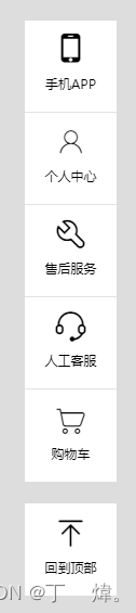
<div class="sidebar">
<a href="#">
<span class="iconfont icon-shouji"></span>
<p>手机APP</p>
</a>
<a href="#">
<span class="iconfont icon-touxiang"></span>
<p>个人中心</p>
</a>
<a href="#">
<span class="iconfont icon-gongju"></span>
<p>售后服务</p>
</a>
<a href="#">
<span class="iconfont icon-kefu"></span>
<p>人工客服</p>
</a>
<a href="#">
<span class="iconfont icon-gouwuche"></span>
<p>购物车</p>
</a>
<a href="#">
<span class="iconfont icon-dingbu"></span>
<p>回到顶部</p>
</a>
</div>
</body>
</html>
12. 轮播图。
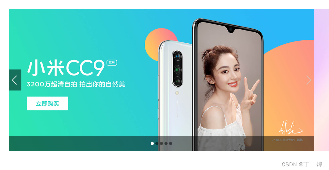
思路:
1. 固定展示banner窗口,并设为position:relative。
2. 图片/左右下icon都相对于banner窗口绝对定位,调节其各自的位置。
3. 左右下icon需要叠在图片上方,所以需要z-index的数值要比图片大。
4. 下icon的5个点,可以用grid进行布局,
5. 最终图片轮播,只需调节banner的ul的left, 让ul所在的框进行左右移动,实现图片轮换。
<!DOCTYPE html>
<html lang="en">
<head>
    <meta charset="UTF-8">
    <meta http-equiv="X-UA-Compatible" content="IE=edge">
    <meta name="viewport" content="width=device-width, initial-scale=1.0">
    <link rel="stylesheet" href="./css/normalize.css">
    <title>Document</title>
    <style type="text/css">
        .banner {
            position: relative;
            width: 1000px;
            height: 466px;
            margin: 50px auto 0px;
        }

        .banner>ul {
            position: absolute;
            width: 10000px;
            display: grid;
            grid-template-columns: repeat(5,1000px);
            grid-template-rows: 466px;
        }

        .banner-left,
        .banner-right
        {
            position: absolute;
            top: 50%;
            width: 41px;
            height: 69px;
            transform: translateY(-50%);
            background: url(./images/icon-slides.png) no-repeat;
            z-index: 999;
            /* 鼠标样式 */
            cursor:pointer
        }

        .banner-left {
            left: 0;
            background-position: -83px 0;
        }

        .banner-left:hover {
            background-position: 0 0;
        }

        .banner-right {
            right: 0;
            background-position: -123px 0;
        }

        .banner-right:hover {
            background-position: -41px 0;
        }

        .banner-bottom {
            position: absolute;
            bottom: 0;
            width: 100%;
            height: 50px;
            background-color: rgba(0,0,0,.5);
        }

        .banner-bottom>ul {
            height: 100%;
            display: grid;
            grid-template-columns: repeat(5, 10px);
            grid-template-rows: 10px;
            gap: 5px;
            justify-content: center;
            align-content: center;
        }

        .banner-bottom>ul>li {
            border-radius: 50%;
            background-color: rgba(0,0,0,.5);
            cursor:pointer
        }

        .banner-bottom>ul>li:first-child {
            background-color: #fff;
        }
    </style>
</head>
<body>
    <div class="banner">
        <ul>
            <li><img src="./images/slide-1.png" alt="#"></li>
            <li><img src="./images/slide-2.png" alt="#"></li>
            <li><img src="./images/slide-3.png" alt="#"></li>
            <li><img src="./images/slide-4.png" alt="#"></li>
            <li><img src="./images/slide-5.png" alt="#"></li>
        </ul>
        <div class="banner-left"></div>
        <div class="banner-right"></div>
        <div class="banner-bottom">
            <ul>
                <li></li>
                <li></li>
                <li></li>
                <li></li>
                <li></li>
            </ul>
        </div>
    </div>
</body>
</html>
13. 时间轴。
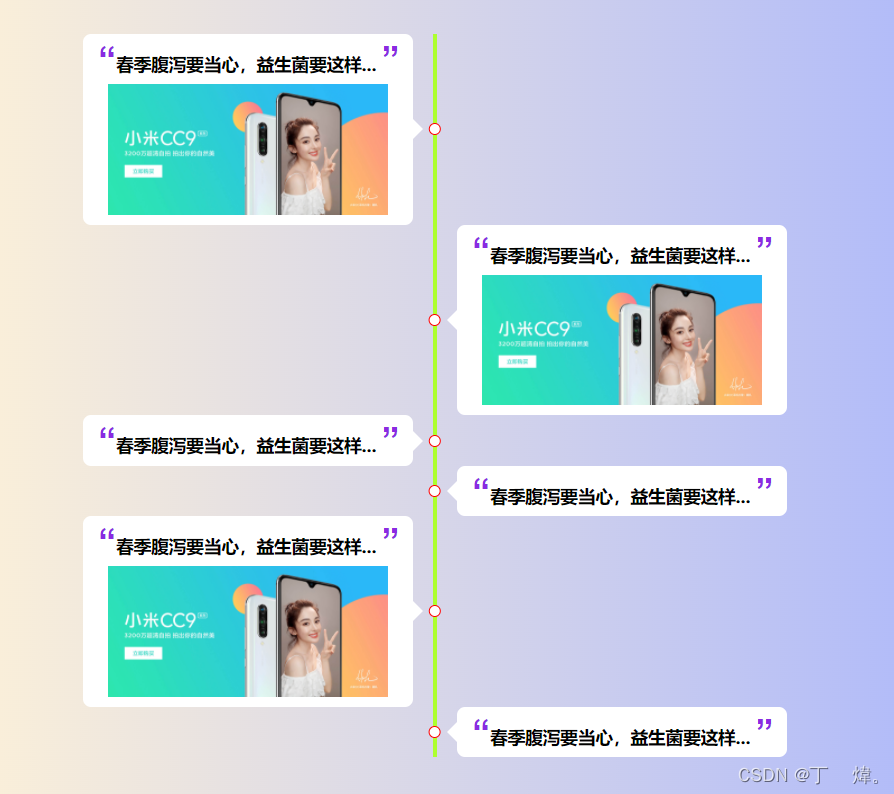
思路:
1. 核心思路是在固定宽的父盒子内,让左右两个子盒子向左右浮动,然后子盒子受挤压掉下来。
<!DOCTYPE html>
<html lang="en">
<head>
<meta charset="UTF-8">
<meta http-equiv="X-UA-Compatible" content="IE=edge">
<meta name="viewport" content="width=device-width, initial-scale=1.0">
<link rel="stylesheet" href="./css/normalize.css">
<title>Document</title>
<style type="text/css">
body {
background-image: linear-gradient(to right,#fdf1d8,#b1bbf9);
}
.container {
margin: 50px auto 0;
width: 800px;
font-size: 15px;
}
.container span {
font-family: Arial, Helvetica, sans-serif;
font-size: 35px;
color: blueviolet;
}
.container img {
display: block;
padding: 5px 20px;
width: 320px;
}
/* 子盒子被挤压掉落后,边框会有偏移, */
.left,
.right {
position: relative;
width: 402px;
}
/* 1. 利用浮动,超过父盒子的宽度,把子盒子挤压下来。 */
.left {
float: left;
border-right: 4px solid greenyellow;
}
.right {
float: right;
border-left: 4px solid greenyellow;
}
/* 利用padding留白做成原点 */
.left::after,
.right::after {
position: absolute;
content: '';
top: 50%;
padding: 5px;
border-radius: 50%;
border: 1px solid red;
background-color: #fff;
}
.left::after {
right: 0;
transform: translateX(65%) translateY(-50%);
}
.right::after {
left: 0;
transform: translateX(-70%) translateY(-50%);
}
/* 内容 */
.leftC,
.rightC {
position: relative;
padding: 5px;
width: 330px;
border-radius: 8px;
background-color: #fff;
}
.leftC {
margin-left: 48px;
}
.rightC {
margin-left: 20px;
}
/* 箭头跟随内容 */
.leftC::after,
.rightC::after {
position: absolute;
content: '';
top: 50%;
transform: translateY(-50%);
border-top: 10px solid transparent;
border-bottom: 10px solid transparent;
}
.leftC::after {
right: -20px;
margin-right: 10px;
border-left: 10px solid #fff;
}
.rightC::after {
left: -20px;
margin-left: 10px;
border-right: 10px solid #fff;
}
</style>
</head>
<body>
<div class="container">
<div class="left">
<div class="leftC">
<h3> <span>“</span>春季腹泻要当心,益生菌要这样... <span>”</span></h3>
<img src="./images/slide-1.png" alt="" class="img">
</div>
</div>
<div class="right">
<div class="rightC">
<h3> <span>“</span>春季腹泻要当心,益生菌要这样... <span>”</span></h3>
<img src="./images/slide-1.png" alt="" class="img">
</div>
</div>
<div class="left">
<div class="leftC">
<h3> <span>“</span>春季腹泻要当心,益生菌要这样... <span>”</span></h3>
</div>
</div>
<div class="right">
<div class="rightC">
<h3> <span>“</span>春季腹泻要当心,益生菌要这样... <span>”</span></h3>
</div>
</div>
<div class="left">
<div class="leftC">
<h3> <span>“</span>春季腹泻要当心,益生菌要这样... <span>”</span></h3>
<img src="./images/slide-1.png" alt="" class="img">
</div>
</div>
<div class="right">
<div class="rightC">
<h3> <span>“</span>春季腹泻要当心,益生菌要这样... <span>”</span></h3>
</div>
</div>
</div>
</body>
</html>
14. 导航条
总结:
1. 二级菜单盒子控制是否展示,
2. 盒子使用padding来留白,
3. 一级和二级始终由内容来撑开决定父盒子大小。
<!DOCTYPE html>
<html lang="en">

<head>
    <meta charset="UTF-8">
    <meta http-equiv="X-UA-Compatible" content="IE=edge">
    <meta name="viewport" content="width=device-width, initial-scale=1.0">
    <title>Document</title>
    <link rel="stylesheet" href="./css/normalize.css">
    <style type="text/css">
        .container {
            height: 50px;
            background-color: #fe7b86;
            display: flex;
            justify-content: center;
        }

        .container>div {
            position: relative;
            display: flex;
            align-items: center;
            padding: 0 50px;
            color: #fff;
            font-size: 20px;
        }

        .container>div:hover {
            background-color: aqua;
        }

        .container>div:hover>.menuContent {
            display: block;
        }

        .container .menuContent {
            position: absolute;
            display: none;
            top: 100%;
            left: 50%;
            margin-left: -60%;
            width: 120%;
            background-color: #fe7b86;
        }

        .container .menuContent>a {
            display: block;
            padding: 20px;
            text-align: center;
            font-size: 14px;
            color: #fff;
        }

        .container .menuContent>a:hover {
            background-color: yellow;
        }
    </style>

</head>

<body>
    <div class="container">
        <div>xxxxx
            <div class="menuContent">
                <a href="#">xxx xxx xx</a>
                <a href="#">xxx xxx xx</a>
                <a href="#">xxx xxx xx</a>
                <a href="#">xxx xxx xx</a>
            </div>
        </div>
        <div>xxxxxxx
            <div class="menuContent">
                <a href="#">xxx xxx xx</a>
                <a href="#">xxx xxx xx</a>
                <a href="#">xxx xxx xx</a>
                <a href="#">xxx xxx xx</a>
            </div>
        </div>
        <div>xxx
            <div class="menuContent">
                <a href="#">xxx xxx xx</a>
                <a href="#">xxx xxx xx</a>
                <a href="#">xxx xxx xx</a>
                <a href="#">xxx xxx xx</a>
            </div>
        </div>
        <div>xxxx
            <div class="menuContent">
                <a href="#">xxx xxx xx</a>
                <a href="#">xxx xxx xx</a>
                <a href="#">xxx xxx xx</a>
                <a href="#">xxx xxx xx</a>
            </div>
        </div>
    </div>
</body>

</html>
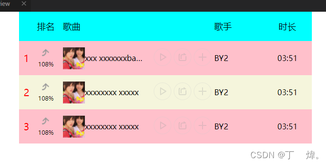
15. 排名榜
<!DOCTYPE html>
<html lang="en">
<head>
    <meta charset="UTF-8">
    <meta http-equiv="X-UA-Compatible" content="IE=edge">
    <meta name="viewport" content="width=device-width, initial-scale=1.0">
    <title>Document</title>
    <link rel="stylesheet" href="./css/normalize.css">
    <style type="text/css">

        .container {
            width: 1000px;
            display: grid;
            grid-template-rows: 60px 1fr;
            grid-template-columns: 600px;
            justify-content: center;
        }

        .hander {
            background-color: aqua;
            display: grid;
            grid-template-columns: 30px 50px 1fr 100px 100px;
            /* justify-items和align-itmes 简写 */
            place-items: center center;
            font-size: 18px;
        }

        .hander span:nth-child(3),
        .content span:nth-child(3),
        .hander span:nth-child(4),
        .content span:nth-child(4){
            justify-self: start;
        }

        .hander span:nth-child(3),
        .content span:nth-child(3){
            margin-left: 10px;
        }

        .content {
            background-color: beige;
        }

        .content span:nth-child(2) {
            gap: 10px 0;
        }

        .content>.item {
            display: grid;
            grid-template-columns: 30px 50px 1fr 100px 100px;
            grid-template-rows: 70px;
            place-items: center center;
        }


        .content .item:nth-child(odd){
            background-color: pink;
        }

        .item>span:first-child {
            font-size: 20px;
            color: red;
        }

        .item>span:nth-child(2){
            display: grid;
            font-size: 12px;
        }

        .item span:nth-child(2) img{
            justify-self: center;
            display: block;
            width: 15px;
            height: 15px;
        }

        .item>span:nth-child(3){
            width: 100%;
            display: grid;
            grid-template-columns: 45px 1fr 150px;
            grid-template-areas:
            'a . c';
            align-items: center;
        }

        .item>span:nth-child(3) span {
            /* 强制不换行并截断用...代替 */
            white-space:nowrap;
            text-overflow: ellipsis;
            overflow: hidden;
        }

        .item>span:nth-child(3)>img{
            grid-area: a;
            display: inline-block;
            width: 45px;
            height: 45px;
        }

        .item-play {
            grid-area: c;
            justify-self: center;
        }

        .item-play>a{
            display: inline-block;
            width: 36px;
            height: 36px;
            background-image: url(./images/icon-music.png);
            background-repeat: no-repeat;
        }

        .item-play>a:first-child {
            background-position: -160px 0;
        }

        .item-play>a:first-child:hover {
            background-position: 0 0;
        }

        .item-play>a:nth-child(2) {
            background-position: -160px -40px;
        }

        .item-play>a:nth-child(2):hover {
            background-position: 0 -40px;
        }


        .item-play>a:last-child {
            background-position: -160px -80px;
        }

        .item-play>a:last-child:hover {
            background-position: 0 -80px;
        }

    </style>
</head>
<body>
    <div class="container">
        <div class="hander">
            <span></span>
            <span>排名</span>
            <span>歌曲</span>
            <span>歌手</span>
            <span>时长</span>
        </div>
        <div class="content">
            <div class="item">
                <span>1</span>
                <span><img src="./images/up-jiantou.png" alt="" />108%</span>
                <span>
                    <img src="./images/music-img1.webp" alt="" />
                    <span>xxx
                        <span>xxxxxxxbadadx</span>
                    </span>
                    <div class="item-play">
                        <a href="#"></a>
                        <a href="#"></a>
                        <a href="#"></a>
                    </div>
                </span>
                <span>BY2</span>
                <span>03:51</span>
            </div>
            <div class="item">
                <span>2</span>
                <span><img src="./images/up-jiantou.png" alt="" />108%</span>
                <span>
                    <img src="./images/music-img1.webp" alt="" />
                    <span>xxxxxxxx
                        <span>xxxxx</span>
                    </span>
                    <div class="item-play">
                        <a href="#"></a>
                        <a href="#"></a>
                        <a href="#"></a>
                    </div>
                </span>
                <span>BY2</span>
                <span>03:51</span>
            </div>
            <div class="item">
                <span>3</span>
                <span><img src="./images/up-jiantou.png" alt="" />108%</span>
                <span>
                    <img src="./images/music-img1.webp" alt="" />
                    <span>xxxxxxxx
                        <span>xxxxx</span>
                    </span>
                    <div class="item-play">
                        <a href="#"></a>
                        <a href="#"></a>
                        <a href="#"></a>
                    </div>
                </span>
                <span>BY2</span>
                <span>03:51</span>
            </div>
        </div>
    </div>
</body>
</html>
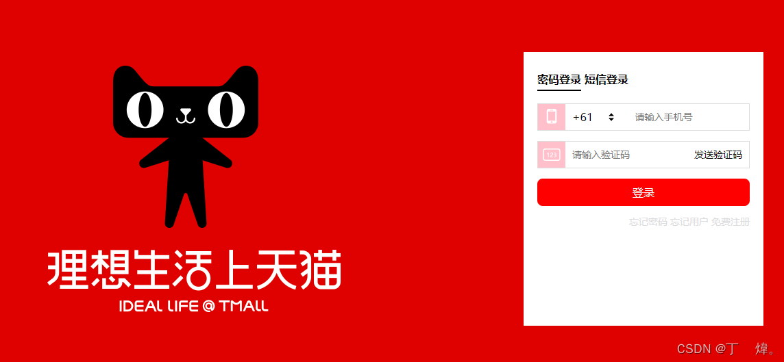
16. 登录页面。
<!DOCTYPE html>
<html lang="en">
<head>
    <meta charset="UTF-8">
    <meta http-equiv="X-UA-Compatible" content="IE=edge">
    <meta name="viewport" content="width=device-width, initial-scale=1.0">
    <link rel="stylesheet" href="./css/normalize.css">
    <title>Document</title>
    <style type="text/css">
        html,body {
            width: 100%;
            height: 100%;
        }
        .container {

            width: 100%;
            height: 600px;
            background-color: #de0100;
        }

        .banner {
            position: relative;
            margin: 0 auto;
            width:1190px;
            height: 100%;
            background: url(./images/tmall.png) no-repeat;
        }

        .login {
            position: absolute;
            margin-right: 50px;
            display: grid;
            grid-template-rows: repeat(4, 40px) 1fr;
            gap: 15px;
            padding: 20px;
            top: 100px;
            right: 0;
            width: 350px;
            height: 400px;
            background-color: #fff;
        }


        .login-header{
            align-self: center;
        }

        .login-header a{
            padding-bottom: 5px;
            font-weight: 700;
            color: black;
        }

        .login-phone,
        .login-code {
            border: 1px solid #deddde;
        }

        .login-phone {
            display: grid;
            grid-template-columns: 40px 50px 30px 1fr;
            align-items: center;
            justify-items: center;
        }

        .login-phone i:first-child,
        .login-code i:first-of-type {
            align-self: stretch;
            justify-self: stretch;
            background-color: pink;
            display: flex;
            justify-content: center;
            align-items: center;
        }

        .login-phone i:first-child::after {
            content: '';
            display: block;
            width: 24px;
            height: 24px;
            background: url(./images/icon-phone.png) no-repeat;
        }

        .login-phone i:last-of-type {
            align-self: center;
            width: 20px;
            height: 24px;
            background: url(./images/icon-select.png) no-repeat;
        }

        .login-phone input,
        .login-code input {
            margin-left: 10px;
            border: none;
            outline: none;
            font-size: 14px;
            color: #dddcde;
        }

        .login-code {
            display: grid;
            grid-template-columns: 40px 1fr 80px;
            align-items: center;
            font-size: 14px;
        }

        .login-code i::after {
            content: '';
            display: block;
            width: 26px;
            height: 19px;
            background: url(./images/icon-number.png) no-repeat;
        }

        .login-bottom {
            width: 100%;
            height: 100%;
            display: flex;
            justify-content: center;
            align-items: center;
            background-color: red;
            border-radius: 8px;
            color: #fff;
        }

        .login-other {
            justify-self: end;
            font-size: 14px;
            color: #dddcde;
        }

        .underline {
            border-bottom: 2px solid black;
        }

    </style>
</head>
<body>
    <div class="container">
        <div class="banner">
            <div class="login">
                <div class="login-header">
                    <a href="#" class="underline">密码登录</a>
                    <a href="#">短信登录</a>
                </div>
                <!-- 短信登录 -->
                <div class="login-phone">
                    <i></i>
                    <span>+61</span>
                    <i></i>
                    <input type="text" placeholder="请输入手机号">
                </div>
                <div class="login-code">
                    <i></i>
                    <input type="text" placeholder="请输入验证码">
                    <span>发送验证码</span>
                </div>


                <div class="login-bottom">登录</div>
                <div class="login-other">
                    <span>忘记密码</span>
                    <span>忘记用户</span>
                    <span>免费注册</span>
                </div>
            </div>
        </div>
    </div>
</body>
</html>
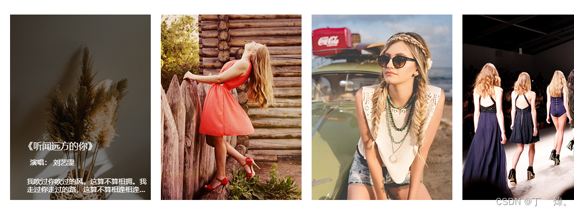
17. 文字动画。
<!DOCTYPE html>
<html lang="en">
<head>
    <meta charset="UTF-8">
    <meta http-equiv="X-UA-Compatible" content="IE=edge">
    <meta name="viewport" content="width=device-width, initial-scale=1.0">
    <title>Document</title>
    <link rel="stylesheet" href="./css/normalize.css">
    <style>
        .container {
            display: grid;
            grid-template-columns: repeat(4, 280px);
            grid-template-rows: 370px;
            gap: 20px;
            justify-items: stretch;
            align-items: stretch;
            margin: 50px;
        }

        .item {
            position: relative;
            /* 超出范围的裁掉,比如文字 */
            overflow: hidden;
        }

        /* 伪类元素transtition会失效,
        .item:hover::before{
            position: absolute;
            content: '';
            top: 0;
            width: 100%;
            height: 100%;
            background-color: rgba(0,0,0,.5);
            transition: background-color ease 1s;
        } */
        .item>.item-mask {
            position: absolute;
            top: 0;
            width: 100%;
            height: 100%;
            background-color: rgba(0,0,0,0);
            transition: background-color ease 1s;
        }

        .item:hover>.item-mask {
            background-color: rgba(0,0,0,.5);
        }

        .item-content {
            color: #fff;
            font-size: 14px;
        }

        .item-title {
            position: absolute;
            top: -10%;
            left: 10%;
            font-size: 18px;
            transition: top ease 1s;

        }

        .item:hover>.item-content>.item-title {
            top:68%;
        }

        .item-singer {
            position: absolute;
            bottom: 18%;
            transform: translateX(-100%);
            transition: transform ease 1s;
        }

        .item:hover .item-singer {
            transform: translateX(45%);
        }

        .item-desctibe {
            position: absolute;
            left: 12%;
            bottom: 0;
            transform: translateY(100%);
            transition: transform ease 1s;

            /* 多行省略 */
            display: -webkit-box;
            overflow: hidden;
            text-overflow: ellipsis;
            -webkit-box-orient: vertical;
            -webkit-line-clamp: 2;
        }

        .item:hover .item-desctibe {
            transform: translateY(-40%);
        }
    </style>
</head>
<body>
    <div class="container">
        <div class="item">
            <img src="./images/hover1.jpg" alt="">
            <div class="item-mask"></div>
            <div class="item-content">
                <div class="item-title">《听闻远方的你》</div>
                <div class="item-singer">  演唱: 刘艺雯</div>
                <div class="item-desctibe">我吹过你吹过的风,这算不算相拥。我走过你走过的路,这算不算相逢相逢相逢相逢...</div>
            </div>
        </div>
        <div class="item">
            <img src="./images/hover2.jpg" alt="">
            <div class="item-mask"></div>
            <div class="item-content">
                <div class="item-title">《听闻远方的你》</div>
                <div class="item-singer">  演唱: 刘艺雯</div>
                <div class="item-desctibe">我吹过你吹过的风,这算不算相拥。我走过你走过的路,这算不算相逢相逢相逢相逢...</div>
            </div>
        </div>
        <div class="item">
            <img src="./images/hover3.jpg" alt="">
            <div class="item-mask"></div>
            <div class="item-content">
                <div class="item-title">《听闻远方的你》</div>
                <div class="item-singer">  演唱: 刘艺雯</div>
                <div class="item-desctibe">我吹过你吹过的风,这算不算相拥。我走过你走过的路,这算不算相逢相逢相逢相逢...</div>
            </div>
        </div>
        <div class="item">
            <img src="./images/hover4.jpg" alt="">
            <div class="item-mask"></div>
            <div class="item-content">
                <div class="item-title">《听闻远方的你》</div>
                <div class="item-singer">  演唱: 刘艺雯</div>
                <div class="item-desctibe">我吹过你吹过的风,这算不算相拥。我走过你走过的路,这算不算相逢相逢相逢相逢...</div>
            </div>
        </div>
    </div>
</body>
</html>


 5497
5497


 被折叠的 条评论
为什么被折叠?
被折叠的 条评论
为什么被折叠?
 到【灌水乐园】发言


