


animation属性
animation-name:设置动画的名字(自定义的)
animation-duration:动画的持续时间
animation-delay:动画的延迟时间
animatio-iteration-count:动画的重复次数,默认值是1,infinite无限次数
animation-timing-function:动画的运动形式
@keyframes name{ //定义关键帧
form{}
to{}
}
@keyframes name{
0%{}
x%{}
100%{}
}
animition注意事项
1.运动结束后,默认情况下会停留在起始位置。
2.@keyframe两种表达方式,它们之间的联系from<=>0%, to<=>100%
3.与transfrom区别在于,animation可以在0%~100%形成多次变化。而transition只能从0%直接过渡到100%效果(也就是只有两种变化)而且animation是自动触发的,不像transition需要手动给触发
animation复合样式
animation:动画持续时间 动画延迟时间 动画运动速度曲线 动画名
复合样式书写顺序没有特别严格要求,但是如果你写了两个时间的话,那么一定是持续时间在延迟时间之前。如果只写一个时间就只是持续时间

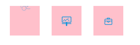
练习(一)动画切换图标
功能:当鼠标移入时,图标会从上面出去,下面进来。中间有一个过渡时间
<!DOCTYPE html>
<html>
	<head>
		<meta charset="utf-8">
		<title></title>
		<style type="text/css">
			li{
				list-style: none;
				width: 100px;
				height: 100px;
				background-color: pink;
				float: left;
				margin: 20px;
				line-height: 100px;
				text-align: center;
				overflow: hidden;
			}
			img{
				vertical-align: middle;
			}
			li:hover img{
				animation-name: logo;
				animation-duration: 5s;
				/* animation-delay: 2s; */
				animation-iteration-count: 1;
				animation-timing-function: ease;
			}
			@keyframes logo{
				25%{
					opacity: 0;
					transform: translateY(-75px) rotate(360deg);
				}
				50%{
					transform: translate(-82px,-75px);

				}
				75%{
					transform: translate(-82px,75px);

				}
				85%{
					transform: translateY(75px);
					opacity: 0;
				}
				100%{
					transform: translate(0px,0px) rotate(360deg);
						opacity: 1;
					}
				}
			}
		</style>
	</head>
	<body>
		<ul>
			<li>
				<img src="../transition过渡/人才服务.png" >
			</li>
			<li>
				<img src="../transition过渡/使用概况.png" >
			</li>
			<li>
				<img src="../transition过渡/就业.png" >
			</li>
		</ul>
	</body>
</html>
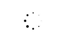
loading加载效果
功能:利用动画实现一个旋转加载效果,并且每个点均匀由小变大变化。
原理:其实加载效果,并不是真正的做旋转,而是利用动画延迟时间,让每个小圆点能够有规律的变化。形成一个旋转效果
<!DOCTYPE html>
<html>
	<head>
		<meta charset="utf-8">
		<title></title>
		<style type="text/css">
			*{
				margin: 0;
			}
			.loading{
				margin: 50px auto;
				width: 50px;
				height: 50px;
				position: relative;
			}

			.box1,.box2{
				left: 0;
				top: 0;
				width: 50px;
				height: 50px;
				position: absolute;
			}
			//旋转让两个正方形的八个角顶点形成一个圆
			.box2{
				transform: rotate(45deg);
			}
			 aside{
				animation:1.5s linear   move2 infinite;
			}
			aside{
				width: 10px;
				height: 10px;
				border-radius: 5px;
				background-color: black;
			}
			//在两个正方盒子的四个角当中放入四个点,通过第二正方体的旋转形成原的效果
			aside:nth-child(1){
				position: absolute;
				top: 0;
				left: 0;
			}
			aside:nth-child(2){
				position: absolute;
				top: 0;
				right: 0;
			}
			aside:nth-child(3){
				position: absolute;
				bottom: 0;
				right: 0;
			}
			aside:nth-child(4){

				position: absolute;
				bottom: 0;
				left: 0;
			}
			//每个点的变化都有相应的延迟时间。主要是为了形成整个圆圈每个圆点从小到大一次。就形成旋转效果了
			.box1 aside:nth-child(1){animation-delay:0s}
			.box2 aside:nth-child(1){animation-delay:0.2s}
			.box1 aside:nth-child(2){animation-delay:0.4s}
			.box2 aside:nth-child(2){animation-delay:0.6s}
			.box1 aside:nth-child(3){animation-delay:0.8s}
			.box2 aside:nth-child(3){animation-delay:1.0s}
			.box1 aside:nth-child(4){animation-delay:1.2s}
			.box2 aside:nth-child(4){animation-delay:1.4s}


			//定义关键帧让原点发生大小变化
			@keyframes move2{
				0%{
					transform: scale(1);
				}
				50%{
					transform: scale(0);
				}
				100%{
					transform: scale(1);
				}
			}

		</style>
	</head>
	<body>
		<div class="loading">
			<div class="box1">
				<aside></aside>
				<aside></aside>
				<aside></aside>
				<aside></aside>
			</div>
			<div class="box2">
				<aside></aside>
				<aside></aside>
				<aside></aside>
				<aside></aside>
			</div>
		</div>

	</body>
</html>
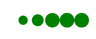
练习(三)loading加载效果2
这个加载效果比上一个简单,也是利用动画延迟,让每一个圆点产生一个规律变化
<!DOCTYPE html>
<html>
	<head>
		<meta charset="utf-8">
		<title></title>
		<style type="text/css">
			*{
				margin: 0;
				list-style: none;
			}
			div{
				width: 500px;
				height: 100px;
				margin: 100px auto;
			}
			li{
				width: 50px;
				height: 50px;
				border-radius: 25px;
				background-color: green;
				float: left;
				animation: 1s ease infinite move;
				}
			li:nth-child(1){animation-delay: 0;}
			li:nth-child(2){animation-delay: 0.1s;}
			li:nth-child(3){animation-delay: 0.2s;}
			li:nth-child(4){animation-delay: 0.3s;}
			li:nth-child(5){animation-delay: 0.4s;}
			@keyframes move{
				0%{
					transform: scale(1);
				}
				50%{
					transform: scale(0.5);
				}
				60%{
					transform: scale(1);
				}
			}
		</style>
	</head>
	<body>
		<div>
			<ul>
				<li></li>
				<li></li>
				<li></li>
				<li></li>
				<li></li>
			</ul>
		</div>
	</body>
</html>
animation扩展语法
默认效果是在运动结束之后,从结束位置回到起始位置
animation-fill-mode:规定动画播放之前或之后,其动画效果是否可见。
none(默认值):在运动结束之后回到初始位置,在延迟的情况下,让0%的效果在延迟后生效
backwards:在延迟的情况下,让0%的效果在延迟前生效

forwards:在运动结束的之后,停到到结束的位置

both:backwards和forward同时生效
延迟之前就生效

与动画结束之后停在结束位置

animation-direction:属性定义是否应该轮流反向播放动画。
alternate:一次正向(0-100%),一次反向(100%-0%)。(条件必须是重复次数超过一次,才能够体现一次正向、一次反向)

reverse:永远都是反向开始,从100%-0%

normal(默认值):永远都是正向,从0%-100%
以上不管是animation-fill-mode的属性值(both、backwards、forwards、none),还是animation-direction的属性值(normal、reverse、alternate)都是可以直接写入animation复合样式当中。
写法:animation: 2s ease move infinite alternate;
animate.css
animate.css:一款强大的预设css3动画库。
官网网址:https://daneden.github.io/animate.css/
基本使用:
1.引用外部CSS文件:npm 安装或者直接link引用外部css文件
2.引入基类(animate__animted) 引入动画类名(基础样式,每个动画效果都要加)
<h1 class="animate__animated animate__bounce">An animated element</h1>
//   animate__animated(基类名) animate__bounce(引用动画效果名)
 <div class="animate__animated animate__bounce animate__delay-1s">Example</div>
 //animate__delay-1s 动画延迟时间 ,其中的1s也是可以随意更改
<div class="animate__animated animate__bounce animate__slow">Example</div>
 //animate__slow:动画速度曲线。可以将slow改成slower、fast和faster等。可以在官网查看更多的功能
<div class="animate__animated animate__bounce animate__repeat-2">Example</div>
//animate__repeat-2:动画循环次数 数字2也是更改的
<div class="animate__animated animate__bounce animate__infinite">Example</div>
//animate__infinite:动画循环次数是无限
除了直接在内联样式修改一些之外,还可以在css内部样式中修改
	.animate__animated.animate__bounce {//直接在相应的类名对其修改
		  	  --animate-duration: 4s;
		  	  //对属性的修改形式:将之前的animation-xxx
		  	  改成 对应的 --animate-xxx就行
		  	}
			:root { 改变所有样式的动画效果
			  --animate-duration: 800ms;
			  --animate-delay: 0.9s;
			  --animate-repeat: 2;
			}
除了上面的对动画属性设置之外,其实官网还有很多,可以多去看看。里面还有很多炫酷的动画效果


 661
661


 被折叠的 条评论
为什么被折叠?
被折叠的 条评论
为什么被折叠?
 到【灌水乐园】发言


