


前端系列文章目录
第一部分:前端一,前端二—— HTML与CSS
第二部分:前端三,前端四—— JavaScript
第三部分:前端五—— Node.js
第四部分:前端六—— Vue
第五部分:前端七—— React
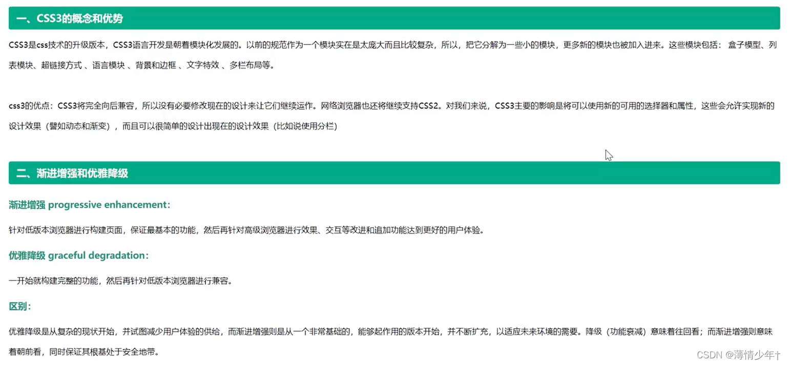
四、CSS3
CSS3基础
选择器
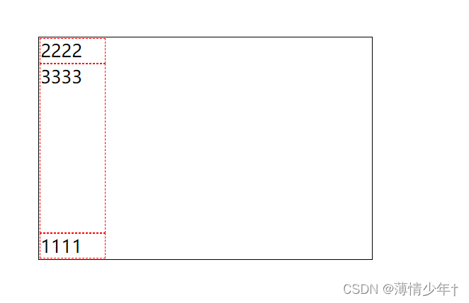
1、层级选择器
<!DOCTYPE html>
<html lang="en">
<head>
    <meta charset="UTF-8">
    <meta http-equiv="X-UA-Compatible" content="IE=edge">
    <meta name="viewport" content="width=device-width, initial-scale=1.0">
    <title>Document</title>
    <style>
        ul>li{
            border: 1px solid red;
        }
        .child+li{
            /* child下面的第一个li 即当前元素后面的第一个兄弟 */
            background: yellow;
        }
        .child~li{
            /*  ~  即当前元素后面的所有兄弟 */
            background: yellow;
        }
        .container+p{
            background: green;
        }
    </style>
</head>
<body>
    <ul>
        <li>111111</li>
        <li>222222</li>
        <li>333333</li>
        <li>444444</li>
        <li>555555</li>
    </ul>
    <ul>
        <li class="child">666</li>
        <li>777</li>
        <li>888</li>
        <li>000</li>
    </ul>
    <div class="container">div1111111</div>
    <p>p123113</p>
    <p>p456456</p>
    <div>
        <p>0000001</p>
        <p>0000002</p>
    </div>
</body>
</html>
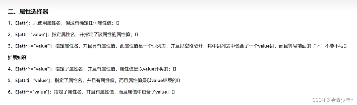
2、属性选择器
<!DOCTYPE html>
<html lang="en">
<head>
    <meta charset="UTF-8">
    <meta http-equiv="X-UA-Compatible" content="IE=edge">
    <meta name="viewport" content="width=device-width, initial-scale=1.0">
    <title>Document</title>
    <style>
        /* 所有class添加样式 */
        [class]{
            background: yellow;
        }
         /* div的class添加样式 */
         div[class]{
            background: red;
        }
        /* div中所有class名为 div1的设置样式(完全匹配)*/
        div[class=div1]{
            background: greenyellow;
        }
         /* div中所有class名为 div1的设置样式(只要包含就可以)*/
         div[class~=div1]{
            background: rgb(210, 221, 194);
            border: 1px solid blue;
        }

        /*
            模糊匹配:
            class~=b  :   class名包含b的设置样式
            class^=b  :   class名为b开头的设置样式
            class$=b  :   class名为b结尾的设置样式
            class*=b  :   class名中包含b的设置样式
        */
         /* div中所有class名为 div1开头的设置样式(只要包含就可以)*/
         div[class^=div1]{
            background: rgb(105, 162, 18);
            border: 1px solid red;
        }
        /* input有name属性的加样式 */
        input[name]{
            background: paleturquoise;
        }
        /* input有type属性的加样式 */
        input[type=email]{
            background: plum;
        }
    </style>
</head>
<body>
    <div class="div1">div11111</div>
    <div class="div2">div22222</div>
    <div>div3333</div>
    <div class="div1">div44444</div>
    <div class="div1 div2">div555</div>
    <p class="p1">p11111</p>
    <p class="p2">p22222</p>
    <p>p3333</p>

    <form action="">
        <div>
            <h2>用户注册页面</h2>
            用户名:<input type="text" name="text" autofocus required pattern="[A-Z][0-9][a-z]">
            <br>
            密码:<input type="password" name="password" required>
            <br>
            邮箱:<input type="email" name="email" required>
            <input type="submit">
        </div>
    </form>
</body>
</html>
3、结构伪类选择器

<!DOCTYPE html>
<html lang="en">
<head>
    <meta charset="UTF-8">
    <meta http-equiv="X-UA-Compatible" content="IE=edge">
    <meta name="viewport" content="width=device-width, initial-scale=1.0">
    <title>Document</title>
    <style>
        /* html,body{
            height: 100%;
        }
         里面的html可以被:root所代替
        */
        :root,body{
            height: 100%;
            background-color: blanchedalmond;
        }
        .box1,.box2{
            background-color: yellow;
            width: 940px;
            height: 100px;
        }
        .box1 div{
            width: 300px;
            height: 100px;
            margin-right: 20px;
            background-color: red;
            float: left;
        }
        /* 伪类选择器:选择了.box下最后一个div设置样式 */
        .box1 div:last-child{
            margin-right: 0;
        }
        .box2 div{
            width: 300px;
            height: 100px;
            margin-right: 20px;
            background-color: green;
            float: right;
        }
        /* 伪类选择器:选择了.box下第一个div设置样式 */
        .box2 div:first-child{
            margin-right: 0;
        }
        li:first-child{
            background-color: aqua;
        }
        li:last-child{
            background-color: rgb(182, 235, 207);
        }
        /* 第几个加样式就写几 */
        li:nth-child(2){
            color: blue;
        }
        /* 偶数个加样式:2n(或even)    奇数:2n-1  或2n+1(或odd)*/
        li:nth-child(2n){
            color: rgb(136, 136, 181);
        }
        /* 选出只有一个孩子的 */
        div:only-child{
            background-color: brown;
        }
        .empty{
            width: 100px;
            height: 100px;
            background-color: aquamarine;
        }
        /* 选出没有孩子的(里面弄啥也没有的) */
        div:empty{
               background-color: rgb(151, 125, 125);
                }
    </style>
</head>
<body>
    <div class="box1">
        <div></div>
        <div></div>
        <div></div>
    </div>
    <br>
    <div class="box2">
        <div></div>
        <div></div>
        <div></div>
    </div>
    <ul>
        <li>aaa</li>
        <li>bbb</li>
        <li>ccc</li>
        <li>ddd</li>
        <li>eee</li>
        <li>fff</li>
    </ul>
    <div class="empty">
        <p></p>
        <p></p>
    </div>
    <div class="empty">
        <p></p>
    </div>
    <div class="empty"></div>
</body>
</html>
4、目标伪类选择器
<!DOCTYPE html>
<html lang="en">
<head>
    <meta charset="UTF-8">
    <meta http-equiv="X-UA-Compatible" content="IE=edge">
    <meta name="viewport" content="width=device-width, initial-scale=1.0">
    <title>Document</title>
    <style>
        *{
            margin: 0;
            padding: 0;
        }
        /* 目标伪类选择器 */
        div:target{
            background-color: orange;
        }
        ul{
            /* width: 200px; */
            float: right;
            list-style: none;
            /* 固定定位 */
            position: fixed;
            right: 0;
            top: 45%;
        }
        li{
            width: 100px;
            text-align: center;
            height: 20px;
            line-height: 20px;
            border: 1px solid rgb(9, 9, 9);

        }
        div{
            width: 95%;
            height: 600px;
            background-color: beige;
            border-top: 1px solid blue;
            font-size: larger;
            text-align: center;
        }
        a{
            text-decoration: none;
        }
    </style>
</head>
<body>
    <ul>
        <li>
            <a href="#a1">京东秒杀</a>
        </li>
        <li>
            <a href="#a2">双11</a>
        </li>
        <li>
            <a href="#a3">9.9特卖</a>
        </li>
        <li>
            <a href="#a4">新品尝鲜</a>
        </li>
        <li>
            <a href="#a5">特价专区</a>
        </li>

    </ul>
    <div id="a1">京东秒杀</div>
    <div id="a2">双11</div>
    <div id="a3">9.9特卖</div>
    <div id="a4">新品尝鲜</div>
    <div id="a5">特价专区</div>
</body>
</html>
练习(手风琴):
<!DOCTYPE html>
<html lang="en">
<head>
    <meta charset="UTF-8">
    <meta http-equiv="X-UA-Compatible" content="IE=edge">
    <meta name="viewport" content="width=device-width, initial-scale=1.0">
    <title>Document</title>
    <style>
        div.content{
            display: none;
        }
        div.content:target{
            display: block;
        }
    </style>
</head>
<body>
    <div>
        <a href="#aaa">aaa</a>
        <div id="aaa" class="content">
            计算机实现包括编制程序、调试、运算和分析结果等一系列步骤。

            软件技术的发展,为科学计算提供了合适的程序语言(如Fortran、ALGOL,Python)和其他软件工具,使工作效率和可靠性大为提高。

            计算机科学计算处理的对象是数据,处理的过程是算法,处理的结果是预测结果。</div>
    </div>
    <div>
        <a href="#bbb">bbb</a>
        <div id="bbb" class="content">
            计算机实现包括编制程序、调试、运算和分析结果等一系列步骤。

            软件技术的发展,为科学计算提供了合适的程序语言(如Fortran、ALGOL,Python)和其他软件工具,使工作效率和可靠性大为提高。

            计算机科学计算处理的对象是数据,处理的过程是算法,处理的结果是预测结果。</div>
    </div>
    <div>
        <a href="#ccc">ccc</a>
        <div id="ccc" class="content">
            计算机实现包括编制程序、调试、运算和分析结果等一系列步骤。

            软件技术的发展,为科学计算提供了合适的程序语言(如Fortran、ALGOL,Python)和其他软件工具,使工作效率和可靠性大为提高。

            计算机科学计算处理的对象是数据,处理的过程是算法,处理的结果是预测结果。</div>
    </div>
</body>
</html>
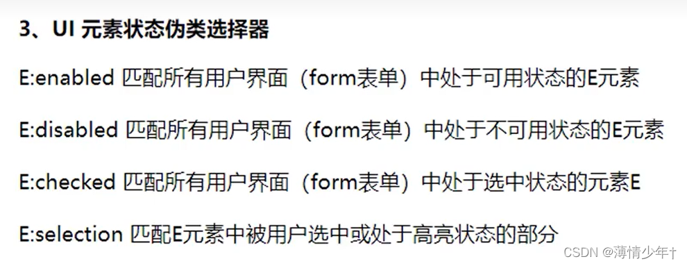
5、UI状态伪类选择器
<!DOCTYPE html>
<html lang="en">
<head>
    <meta charset="UTF-8">
    <meta http-equiv="X-UA-Compatible" content="IE=edge">
    <meta name="viewport" content="width=device-width, initial-scale=1.0">
    <title>Document</title>
    <style>
        input:enabled{
            background-color: greenyellow;
        }
        input:disabled{
            background-color: red;
        }
        /* focus : 手动选择获取焦点就会应用相应的样式 */
        input:focus{
            background-color: orange;
        }
        /* checkbox 和其他的有所不同,他有自己的默认样式 */
        input[type=checkbox]{
            /* 去掉默认样式 */
            appearance: none;
            width: 20px;
            height: 20px;
            border: 1px solid black;
        }

        input:checked{
            background-color: brown;
        }
        /*
        选中文字之后会显示相应的样式(任何标签都能用)
        selection匹配E元素中被用户选中或处于高亮状态的部分
        */
        div::selection{
            color: blue;
            background-color: aquamarine;
        }
    </style>
</head>
<body>
    <form action="">
        <div>
            用户名:<input type="text"><br>
            密码:<input type="password"><br>
            邮箱:<input type="email"><br>
            记住用户名和密码<input type="checkbox">
            <input type="submit" disabled>
            <!-- disabled  :  禁用 -->
        </div>
    </form>
    <div>
        计算机实现包括编制程序、调试、运算和分析结果等一系列步骤。

        软件技术的发展,为科学计算提供了合适的程序语言(如Fortran、ALGOL,Python)和其他软件工具,使工作效率和可靠性大为提高。

        计算机科学计算处理的对象是数据,处理的过程是算法,处理的结果是预测结果。
    </div>
</body>
</html>
6、否定和动态伪类选择器
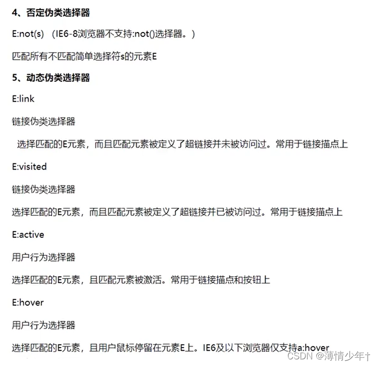
<!DOCTYPE html>
<html lang="en">
<head>
    <meta charset="UTF-8">
    <meta http-equiv="X-UA-Compatible" content="IE=edge">
    <meta name="viewport" content="width=device-width, initial-scale=1.0">
    <title>Document</title>
    <style>
        /* 第一个孩子添加样式 */
        li:first-child{
            background-color: red;
        }
        /* 除了第一个孩子的所有都加对应的样式 */
        li:not(:first-child){
            background-color: yellow;
        }
        /* 所有奇数的li背景色设置紫色 */
        li:nth-child(2n+1){
            background-color: rgb(193, 159, 226);
        }
         /* 所有除了奇数的li背景色设置绿色 */
         li:not(:nth-child(2n+1)){
            background-color: green;
        }
        div:empty{
            width: 500px;
            height: 50px;
            background-color: darksalmon;
        }
    </style>
</head>
<body>
    <ul>
        <li>qqqq</li>
        <li>wwww</li>
        <li>eeee</li>
        <li>rrrr</li>
        <li>tttt</li>
    </ul>
    <div></div>
</body>
</html>
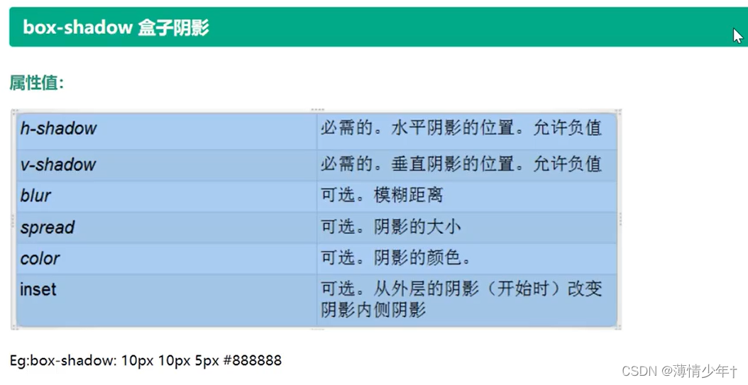
文本阴影与盒子阴影
文本阴影:
<head>
    <meta charset="UTF-8">
    <meta http-equiv="X-UA-Compatible" content="IE=edge">
    <meta name="viewport" content="width=device-width, initial-scale=1.0">
    <title>Document</title>
    <style>
    div{
        text-shadow: 10px 20px 2px black;
        /*
        10px  :  向右的偏移量(可以为负 -----此时向左偏移)
        20px  :  向下的偏移量(可以为负 -----此时向上偏移)
         2px  : 模糊程度,数字越大越模糊
        */
        /* 0px -20px 2px black  : 向上偏移20px   并且向下偏移20px :  0px 20px 2px red*/
        text-shadow: 0px -20px 2px black,0px 20px 2px red;
    }
    </style>
</head>
<body>
    <div>祖国万岁</div>
</body>
盒子阴影:
圆角
border-radius
<!DOCTYPE html>
<html lang="en">
<head>
    <meta charset="UTF-8">
    <meta http-equiv="X-UA-Compatible" content="IE=edge">
    <meta name="viewport" content="width=device-width, initial-scale=1.0">
    <title>Document</title>
    <style>
        .box1{
            width: 200px;
            height: 200px;
            background-color: green;
            margin: 0 auto;
            border-radius: 10px;
            /* 水平方向30px  垂直方向60px */
            border-radius: 30px/60px;
            /* 设置成正方形宽高的一半,如果有内外边距,则边距的数值也要计算进去 */
            border-radius: 100px;
            border-radius: 50%;
        }
        /* 半圆 */
        .box2{
            /* 宽度必须是高度的两倍 */
            width: 200px;
            height: 100px;
            background-color: red;
            margin: 0 auto;
            border-radius: 100px 100px 0px 0px;

        }
        /* 扇形 */
        .box3{
            /* 宽度必须是高度的两倍 */
            width: 200px;
            height: 200px;
            background-color: yellow;
            margin: 0 auto;
            border-radius: 200px 0px 0px 0px;

        }
    </style>
</head>
<body>
    <div class="box1"></div>
    <div class="box2">半圆 </div>
    <div class="box3">扇形</div>
</body>
</html>
练习:
<!DOCTYPE html>
<html lang="en">
<head>
    <meta charset="UTF-8">
    <meta http-equiv="X-UA-Compatible" content="IE=edge">
    <meta name="viewport" content="width=device-width, initial-scale=1.0">
    <title>Document</title>
    <style>
        .wai{
            width: 880px;
            height: 90px;
            background-color: gainsboro;
            box-shadow: 0px 10px 3px grey;
            margin: 0 auto;
            border-radius: 10px;
            /* position: relative; */
            padding: 20px;
        }
        .left{
            width: 650px;
            height: 80px;
            background-color: white;
            border-radius: 6px;
            /* position: relative;
            margin: 10px; */
        }
        .left01{
            width: 650px;
            height: 80px;
            background-color: white;
            border: 1px solid rgb(246, 243, 243);
            line-height: 80px;
            border-radius: 6px;
            font-size: 25px;
            /* 字体向内缩进 */
            text-indent: 21px;
        }
        .right{
            width: 200px;
            height: 80px;
            background-color: rgb(44, 50, 117);
            color: white;
            font-size: 25px;
            line-height: 80px;
            border-radius: 6px;
            float: right;
            text-align: center;
            position: relative;
            margin-top: -80px;
        }
        input{
            outline: none;
        }
    </style>
</head>
<body>
    <form action="">
        <div class="wai">
            <div class="left">
                <input type="text" class="left01" name="text" placeholder="Search for CSS and HTML">
            </div>
            <input type="submit"class="right" value="GO" name="search">
        </div>
    </form>

</body>
</html>
字体引入
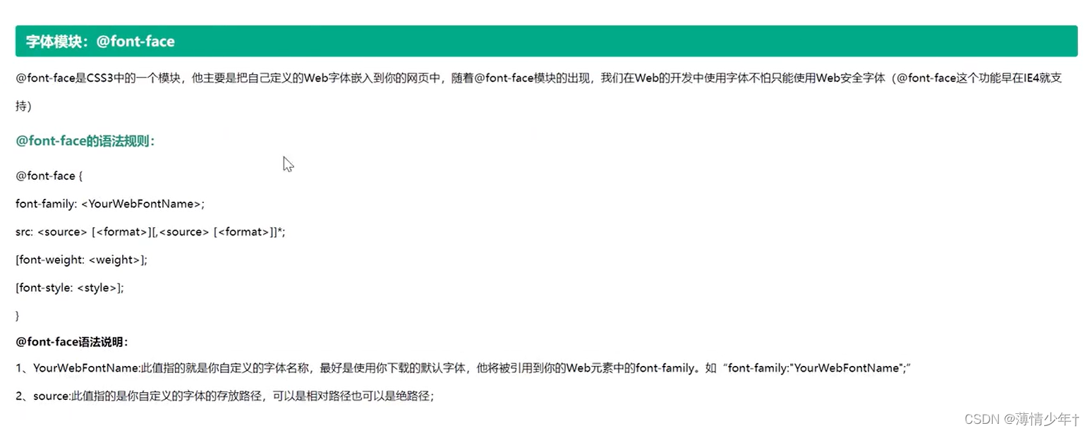
@font-face{
font-family: sxj;
src:url(font/ygyxsziti2.0.ttf);
}
<style>
@font-face{
	font-family: sxj;
	src:url(font/ygyxsziti2.0.ttf);
}
div{
	font-family: sxj;
	font-size: 50px;
	color: red;
	text-shadow: 5px 0px 0px green;
   }
</style>
</head>
<body>
<div>赵钱孙李</div>
</body>
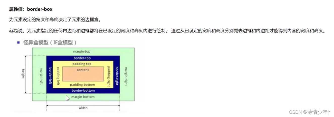
怪异盒模型
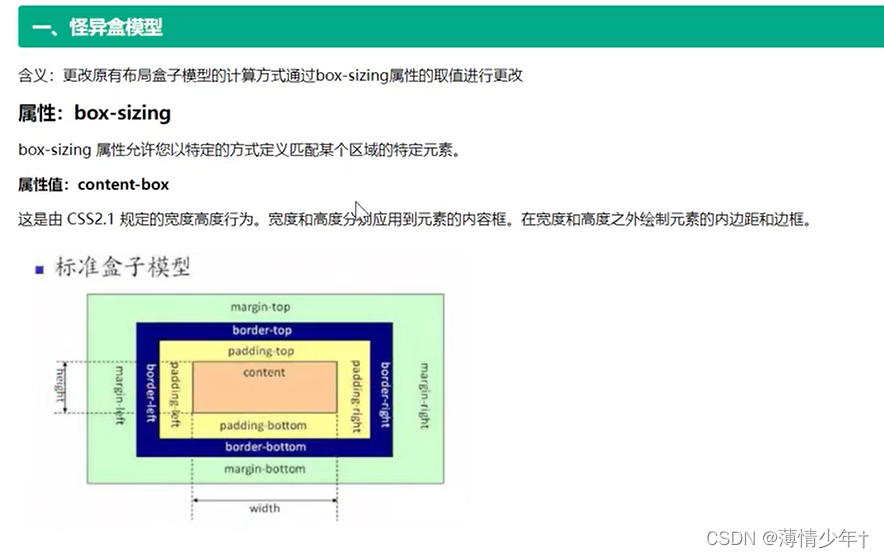
<!DOCTYPE html>
<html lang="en">
<head>
    <meta charset="UTF-8">
    <meta http-equiv="X-UA-Compatible" content="IE=edge">
    <meta name="viewport" content="width=device-width, initial-scale=1.0">
    <title>Document</title>
    <style>
        *{
            padding: 0;
            margin: 0;
        }
        .box1{
            width: 200px;
            height: 200px;
            background: red;
            border:10px solid black;
            padding: 20px;
            box-sizing:content-box;
            /*
             content-box  :  标准盒模型
             border-box   : 怪异盒模型 ——>不管内外边距是多大,始终保持设置宽高的大小,

            */
        }
        .box2{
            width: 200px;
            height: 200px;
            background: green;
            margin: 100px 0 0 0;
            border:10px solid black;
            padding: 20px;
            box-sizing:border-box;
        }
        .bigBox{
            width: 900px;
            height: 300px;
            background-color: yellow;
            margin: 0 auto;
        }
        .small{
            width: 300px;
            height: 300px;
            text-align: center;
            float: left;
            padding: 15px;
            border: 5px solid black;
            box-sizing: border-box;
        }
    </style>
</head>
<body>
    <div class="box1"></div>
    <div class="box2"></div>
    <div class="bigBox">
        <div class="small">Lorem ipsum dolor sit amet consectetur adipisicing elit. Nobis a corrupti est rem sapiente sunt, consequuntur optio, doloremque dolorum quisquam maxime voluptate odio neque alias quidem nostrum magnam consectetur vitae.</div>
        <div class="small">Lorem ipsum dolor sit, amet consectetur adipisicing elit. Hic veniam ipsa obcaecati autem error culpa aliquid expedita nemo. Exercitationem veritatis pariatur, itaque odit fugiat culpa explicabo reprehenderit sed voluptate dolorum.</div>
        <div class="small">Lorem ipsum dolor sit, amet consectetur adipisicing elit. Reiciendis at corrupti ipsum, eveniet, eligendi nemo eum velit, dolore sapiente nisi a modi saepe molestias error iure quidem beatae quos dolorum.</div>
    </div>
</body>
</html>
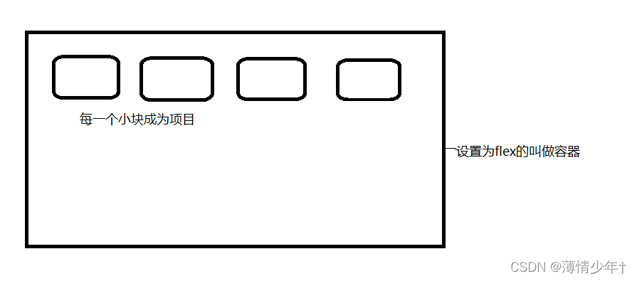
弹性盒
父元素加 display: flex; 子元素自适应
影响:
1、子元素默认横向排列
2、行内元素变成了块元素
<!DOCTYPE html>
<html lang="en">
<head>
    <meta charset="UTF-8">
    <meta http-equiv="X-UA-Compatible" content="IE=edge">
    <meta name="viewport" content="width=device-width, initial-scale=1.0">
    <title>Document</title>
    <style>
        *{
            padding: 0;
            margin: 0;
        }
        .box{
            height: 300px;
            width: 1000px;
            border: 5px solid black;
            margin: 100px auto;
            /* 父元素加 display: flex;*/
            display: flex;
            /*
            影响:
                1、子元素默认横向排列
                2、行内元素变成了块元素
            */
        }
        .box div{
            width: 150px;
            height: 150px;
            border: 2px solid orangered;
        }
        .box span{
            width: 150px;
            height: 150px;
            border: 2px solid green;
        }

    </style>
</head>
<body>
    <div class="box">
        <div></div>
        <div></div>
        <div></div>
        <div></div>
        <div></div>
        <span></span>
        <span></span>
        <span></span>
        <span></span>
        <span></span>
        <span></span>
        <div class="content"></div>
    </div>

</body>
</html>
只有一个子元素时:
父元素设置了 display: flex; 如果要让子元素水平方向和垂直方向都居中,则只需要设置子元素margin: auto;
 <style>
 	 .content{
            /* 父元素设置了 display: flex;    如果要让子元素水平方向和垂直方向都居中,则只需要设置子元素margin: auto;*/
            width: 150px;
            height: 150px;
            border: 2px solid purple;
            margin: auto;
        }
 </style>
 <div class="content"></div>
修改主轴方向
主轴方向默认水平居左
修改主轴方向:
1、水平居右:flex-direction: row-reverse
2、主轴垂直:flex-direction: colum
3、主轴垂直居右:flex-direction: colum-reverse
<style>
     .box{
            height: 300px;
            width: 1000px;
            border: 5px solid black;
            margin: 100px auto;
            /* 父元素加 display: flex;*/
            display: flex;
            /* 主轴垂直居左 */
            flex-direction: column;
            /* 主轴垂直居右 */
            flex-direction: column-reverse;
            /* 主轴水平居右 */
            flex-direction: row-reverse;
            /*
            影响:
                1、子元素默认横向排列
                2、行内元素变成了块元素
            */
        }
</style>
<body>
    <div class="box">
        <div></div>
        <div></div>
        <div></div>
        <div></div>
        <div></div>
        <div class="content"></div>
    </div>

</body>
主轴侧轴对齐方式
/* 调整主轴对齐方向 */
justify-content: space-evenly;
            /*
                flex-end : 紧靠右
                center   :   居中
                space-around: 环绕(最左侧与最右侧的距离是其他子元素之间距离的一半)
                space-between :两端对齐
                space-evenly: (最左侧与最右侧的距离与其他子元素之间距离相等)
            */
/* 调整侧轴对齐方向 */
            align-items:flex-end;
            /*
                flex-start : 靠最上方
                flex-end   :靠最下方
                center     : 居中
            */
折行与行间距
要注意主轴是水平还是垂直

 /* 折行 */
            flex-wrap: wrap;
            /* 控制折行后的 行间距 */

                align-content: space-between;
                /*
                align-content: flex-start;
				flex-start
				flex-end
				center
				space-around
				space-between
				*/
项目
对齐方式
align-self: 取值(1、flex-start 2、flex-end 3、center 4、stretch(拉伸));
<!DOCTYPE html>
<html lang="en">
<head>
<meta charset="UTF-8">
<meta http-equiv="X-UA-Compatible" content="IE=edge">
<meta name="viewport" content="width=device-width, initial-scale=1.0">
<title>Document</title>
<style>
*{
padding: 0;
margin: 0;
}
.box1{
width: 300px;
height: 200px;
/* 弹性盒 */
display: flex;
/* 主轴水平 */
flex-direction: row;
border: 1px solid black;
margin: 100px auto;
}
.box1 div{
width: 60px;
/* 高度自定义 */
border: 1px dashed red;
display: flex;
box-sizing: border-box;
}
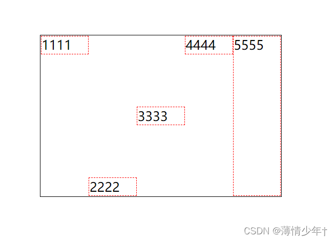
.b1{
/* 主轴水平时靠最左侧 */
align-self: flex-start;
}
.b2{
/* 主轴水平时靠最右侧 */
align-self: flex-end;
}
.b3{
/* 主轴水平时靠居中*/
align-self: center;
}
.b4{
/* 主轴水平时靠最左侧 */
align-self: flex-start;
}
.b5{
/* 主轴水平时竖直方向拉伸*/
align-self: stretch;
}
</style>
</head>
<body>
<div class="box1">
<div class="b1">1111</div>
<div class="b2">2222</div>
<div class="b3">3333</div>
<div class="b4">4444</div>
<div class="b5">5555</div>
</div>
</body>
</html>
效果图:
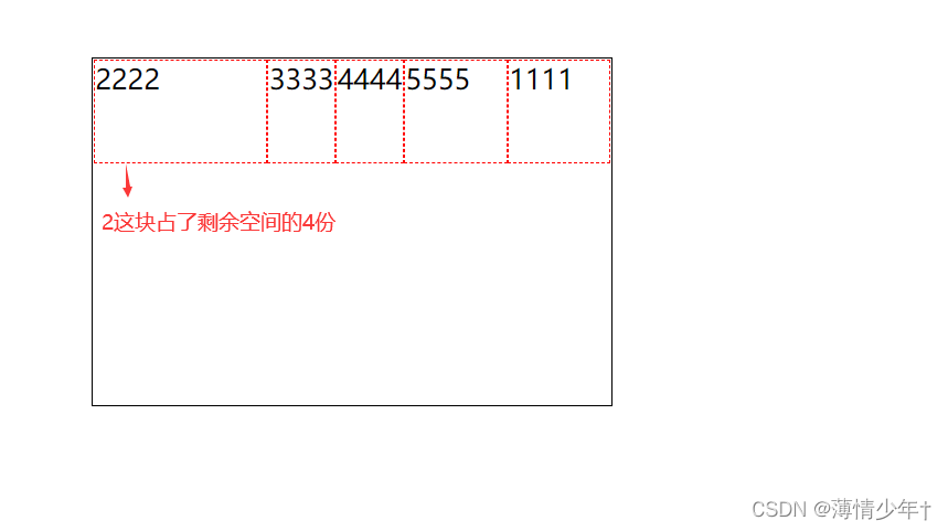
调整顺序
order:数值;
.b1{
/* 主轴水平时靠最左侧 /
align-self: flex-start;
/
调整顺序
主轴:row时 order数值越大越靠右侧显示
主轴:row—-reverse时 order数值越大越靠左侧显示
主轴:colum时 order数值越大越靠底部显示
主轴:colum-reverse时 order数值越大越靠顶部显示
*/
order: 2;
}
剩余宽高
剩余宽度:
flex : 数值;
 		.b1{
            order: 2;
        }
        .b2{
            flex: 4;
        }
        .b3{
            flex: 1;
        }
        .b4{
            flex: 1;
        }
        .b5{

        }
剩余高度:
<!DOCTYPE html>
<html lang="en">
<head>
    <meta charset="UTF-8">
    <meta http-equiv="X-UA-Compatible" content="IE=edge">
    <meta name="viewport" content="width=device-width, initial-scale=1.0">
    <title>Document</title>
    <style>
        *{
            padding: 0;
            margin: 0;
        }
        .box1{
            width: 300px;
            height: 200px;
            /* 弹性盒 */
            display: flex;
            /* 主轴水平 */
            flex-direction: column;
            border:  1px solid black;
            margin: 100px auto;
        }
        .box1 div{
            width: 60px;
            /* 高度自定义 */
            /* height: 60px; */
            border:  1px dashed red;
            display: flex;
            box-sizing: border-box;
        }
        .b1{
            align-self: flex-start;
            order: 2;
        }
        .b3{
           /* 主轴是colum,所以设置 flex: 1;   时b3占满了剩余的高度*/

            flex: 1;
        }
    </style>
</head>
<body>
    <div class="box1">
        <div class="b1">1111</div>
        <div class="b2">2222</div>
        <div class="b3">3333</div>
    </div>
</body>
</html>
效果图:
注意:不管是宽度还是高度,如果flex给定了相同值,则会平分
flex实现三栏布局:
<!DOCTYPE html>
<html lang="en">
<head>
    <meta charset="UTF-8">
    <meta http-equiv="X-UA-Compatible" content="IE=edge">
    <meta name="viewport" content="width=device-width, initial-scale=1.0">
    <title>flex实现三栏布局</title>
    <style>
        *{
            padding: 0;
            margin: 0;
        }
        html,body{
            height: 100%;
        }
        body{
            display: flex;
        }
        .box1,.box3{
            width: 100px;
            height: 100%;
            background-color: rgb(118, 118, 132);
        }
        .box2{
            flex: 1;
            background-color: rgb(231, 231, 244);
        }
    </style>
</head>
<body>
    <div class="box1"></div>
    <div class="box2"></div>
    <div class="box3"></div>
</body>
</html>
支付宝弹性盒布局案例
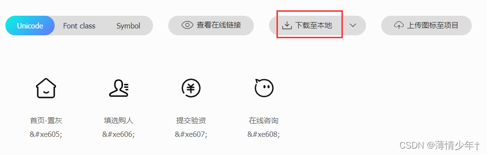
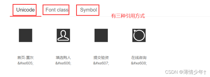
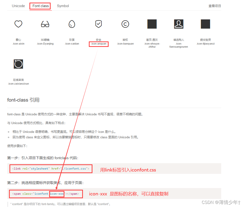
⭐ iconfont中的图标使用
进入iconfont官网,注册账户
1、把要用的图标添加到购物车
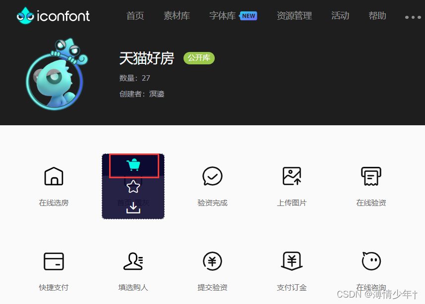
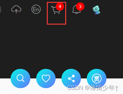
2、点击购物车——>添加至项目
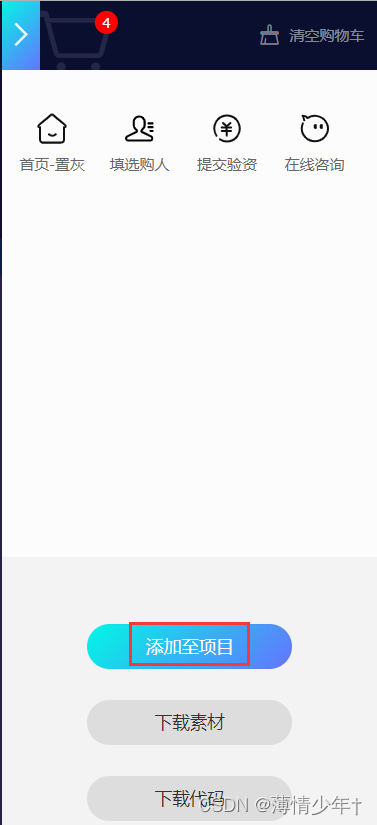
3、新建项目
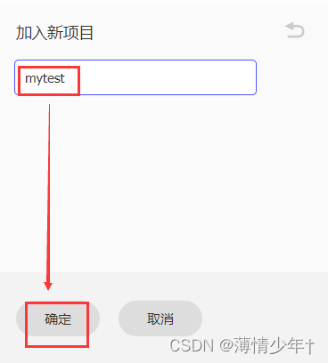
4、下载至本地(将下载后的文件放到自己的项目文件中)
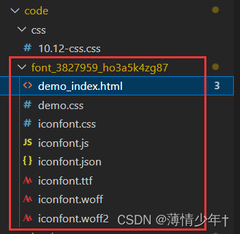
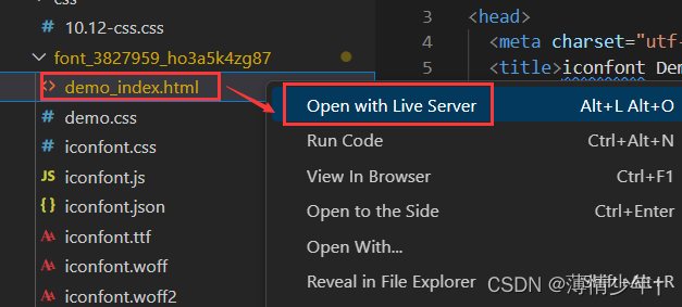
历览器中打开指示引用的文件(还有引用方法,都可以自行查看):
<!DOCTYPE html>
<html lang="en">
<head>
    <meta charset="UTF-8">
    <meta http-equiv="X-UA-Compatible" content="IE=edge">
    <meta name="viewport" content="width=device-width, initial-scale=1.0">
    <title>Document</title>
    <!--引入 iconfont.css -->
    <link rel="stylesheet" href="../font_3827959_heu7uxdjqn/iconfont.css">
    <style>
        /* 还可以设置图标的样式 */
        .icon-aixin{
            color: red;
            font-size: 50px;
            text-align: center;
        }
    </style>
</head>
<body>
    <span class="iconfont icon-aixin"></span>
</body>
</html>
引入图标的效果图:
案例代码(只做了大体框架,里面的对应图标更换即可)
<!DOCTYPE html>
<html lang="en">
<head>
    <meta charset="UTF-8">
    <meta http-equiv="X-UA-Compatible" content="IE=edge">
    <meta name="viewport" content="width=device-width, initial-scale=1.0">
    <title>Document</title>
    <!--引入 iconfont.css -->
    <link rel="stylesheet" href="../font_3827959_heu7uxdjqn/iconfont.css">
    <style>
        *{
            margin: 0;
            padding: 0;
        }
        .box{
            width:955px;
            height: 1420px;
            /* background-color: yellow; */
            display: flex;
            margin: 0 auto;
            flex-direction: column;
        }
        /* header设置 */
        header{
            height: 124px;
            background-color: #232939;
            display: flex;
        }
        /* header i 设置字体大小不显示效果,用.box header i 提高优先级 */
        .box header i{
            width: 118px;
            height: 124px;
            line-height: 124px;
            text-align: center;
            font-size: 48px;
            color: white;
        }
        header span{
            /* 让他的宽度占满剩余的空间 */
            flex: 1;
            height: 124px;
            line-height: 124px;
            font-size: 20px;
            color: white;
        }
        /* section设置 */
        section{
            flex: 1;
        }
        .main{
            height: 278px;
            display: flex;
            background-color: #232939;
            /* 离左右两边有间距,中间的间距是左侧或右侧距离的两倍 */
            justify-content: space-around;
            align-items: center;
        }
        .main div{
            width: 120px;
            height: 168px;
            display: flex;
            flex-direction: column;
            /* space-between  两端对齐 */
            justify-content: space-between;
            color: white;
        }
        .main div i{
            font-size: 110px;
            text-align: center;
            background-color: #232939;

        }
        .main div span{
            font-size: 32px;
            text-align: center;
            background-color: #232939;
        }
        .list{
            display: flex;
            /* 折行显示 */
            flex-wrap: wrap;
            background-color: rgb(247, 244, 244);
        }
        .list div{
            width: 25%;
            height: 208px;
            border: 1px solid gray;
            /* 怪异盒模型 */
            box-sizing: border-box;
            flex-direction: column;
            justify-content: center;
            display: flex;
        }
        .list div i{
            font-size: 100px;
            text-align: center;
            height: 77px;
            line-height: 77px;
            color: orange;
        }
        .list div span{
            height: 61px;
            font-size: 20px;
            text-align: center;
            line-height: 61px;
        }
        .pic img{
            margin-top: 30px;
            width: 100%;
            height: 200px;
        }

        /* footer设置 */
        .box footer{
            height: 128px;
            background-color: #232939;
            /* background-color: gainsboro; */
            display: flex;
            /* 元素位于容器的中心。 */
            align-items: center;
        }
        .box footer div{
            display: flex;
            flex: 1;
            /* 怪异盒模型 */
            box-sizing: border-box;
            flex-direction: column;
            /* border: 1px solid red; */
            justify-content: center;
        }
        .box footer div i{
            text-align: center;
            height: 66px;
            line-height: 66px;
            flex: 1;
            font-size: 58px;
            color: white;
        }
        footer div span{
            line-height: 36px;
            font-size: 28px;
            color: white;
            height: 36px;
            text-align: center;
        }
        footer div:hover{
            color:#06a9ee;
        }

    </style>
</head>
<body>
    <div class="box">
        <header>
            <i class="iconfont icon-zaixianzixun"></i>
            <span>在线咨询</span>
            <i class="iconfont icon-caidan"></i>
            <i class="iconfont icon-anquan"></i>
            <i class="iconfont icon-banquan"></i>
        </header>
        <section>
            <div class="main">
                <div>
                    <i class="iconfont icon-anquan"></i>
                    <span>扫一扫</span>
                </div>
                <div>
                    <i class="iconfont icon-anquan"></i>
                    <span>扫一扫</span>
                </div>
                <div>
                    <i class="iconfont icon-anquan"></i>
                    <span>扫一扫</span>
                </div>
                <div>
                    <i class="iconfont icon-anquan"></i>
                    <span>扫一扫</span>
                </div>
            </div>
            <div class="list">
                <div>
                    <i class="iconfont icon-aixin"></i>
                    <span>记账本</span>
                </div>
                <div>
                    <i class="iconfont icon-aixin"></i>
                    <span>记账本</span>
                </div>
                <div>
                    <i class="iconfont icon-aixin"></i>
                    <span>记账本</span>
                </div>
                <div>
                    <i class="iconfont icon-aixin"></i>
                    <span>记账本</span>
                </div>
                <div>
                    <i class="iconfont icon-aixin"></i>
                    <span>记账本</span>
                </div>
                <div>
                    <i class="iconfont icon-aixin"></i>
                    <span>记账本</span>
                </div>
                <div>
                    <i class="iconfont icon-aixin"></i>
                    <span>记账本</span>
                </div>
                <div>
                    <i class="iconfont icon-aixin"></i>
                    <span>记账本</span>
                </div>
                <div>
                    <i class="iconfont icon-aixin"></i>
                    <span>记账本</span>
                </div>
                <div>
                    <i class="iconfont icon-aixin"></i>
                    <span>记账本</span>
                </div>
                <div>
                    <i class="iconfont icon-aixin"></i>
                    <span>记账本</span>
                </div>
                <div>
                    <i class="iconfont icon-aixin"></i>
                    <span>记账本</span>
                </div>
            </div>
            <div class="pic">
                <img src="../img/002.jpg" alt="">
            </div>
        </section>

        <footer>
            <div class="">
                <i class="iconfont icon-Dyanjing"></i>
                <span>支付宝</span>
            </div>
            <div class="">
                <i class="iconfont icon-Dyanjing"></i>
                <span>支付宝</span>
            </div>
            <div class="">
                <i class="iconfont icon-Dyanjing"></i>
                <span>支付宝</span>
            </div>
            <div class="">
                <i class="iconfont icon-Dyanjing"></i>
                <span>支付宝</span>
            </div>
        </footer>
    </div>
</body>
</html>
移动端布局
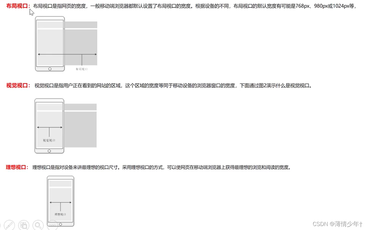
<!DOCTYPE html>
<html lang="en">
<head>
    <meta charset="UTF-8">
    <meta http-equiv="X-UA-Compatible" content="IE=edge">
    <meta name="viewport" content="width=device-width, initial-scale=1.0 ,user-scalable=no">
    <!--
        viewport 视口
        width=device-width  视口宽度 = 设备宽度
        user-scalable=no   不允许用户缩放 -->

    <title>Document</title>
    <style>
        /*
        模拟器上显示分辨率
        css像素:设备的独立像素,
        物理壬辨率:设备像素
        设备像素比(dpr)=物理像素/CSS像素
        ------------------------------------------
        设计稿:
            1.css像素?物理像素?
            2.1份(提供),多份?
                (1)百分比,
                (2)弹性盒布局
                (3)rem布局


        */
        *{
            margin: 0;
            padding: 0;
        }
        .box{
            width: 375px;
            height: 500px;
            background-color: aquamarine;
            margin: 100 auto;
        }
    </style>
</head>
<body>
    <div class="box"></div>
</body>
</html>
足球圈移动端布局案例
<!DOCTYPE html>
<html lang="en">
<head>
    <meta charset="UTF-8">
    <meta http-equiv="X-UA-Compatible" content="IE=edge">
    <meta name="viewport" content="width=device-width, initial-scale=1.0">
    <title>Document</title>
    <link rel="stylesheet" href="../zuqiuquan/iconfont.css">
    <style>
        *{
            margin: 0;
            padding: 0;
        }
        html,body{
            height: 100%;
        }
        ul{
            list-style: none;
        }
        body{
            /* 弹性盒 */
            display: flex;
            /* 垂直方向 */
            flex-direction: column;
        }
        /* header样式 */
        header{
            height: 44px;
            background-color: #0cc440;
            display: flex;
            /* 垂直居中 */
            align-items: center;
            /* 水平居中 */
            justify-content: center;
        }
        header div{
            width: 60px;
            height: 25px;
            color: white;
            text-align: center;
            line-height: 25px;
            /* 怪异盒模型 */
            box-sizing: border-box;
            /* border: 1px solid white; */
            border-radius: 0 ;
            font-size: 12px;
        }
        header div:nth-child(1){
            border-radius: 12px 0 0 12px;
            background-color: #63d985;
        }
        header div:nth-child(2){
            /* 左上角 右上角 右下角 左下角 */
            border-radius: 0px 12px 12px 0px;
            background-color: #3dd066;
            color: #a9e4b4;
        }
        /*
        或者写成下面这种生成圆角:
        .h1{
            border-radius: 12px 0 0 12px;
            background-color: #63d985;
        } */
        /* .h2{
            border-radius: 0px 12px 12px 0px;
            background-color: #63d985;
        } */
        /* ------------------------------------------------------------------- */
        /* section样式 */
        section{
            /* 占满剩余空间,section在footer前面显示 */
            flex: 1;
            /* 溢出产生滚动条 */
            overflow: auto;
            /* display: flex; */

        }
        section ul{
            display: flex;
            /* 粘性定位,固定在屏幕的某一位置 */
            position: sticky;
            top: 0px;
            background-color: white;
            /* flex-direction: row; */

        }
        section ul li{
            height: 35px;
            line-height: 35px;
            flex: 1;
            text-align: center;
            box-sizing: border-box;
            border-bottom: 1px solid rgb(155, 155, 155);
            color: #8c8c8c;
            font-size: 14px;

        }
        section ul li:hover{
            border-bottom: 2.5px solid #63d985;
            color: #0cc440;
        }
        .list{
            display: flex;
            /* background-color: greenyellow; */
            flex-wrap: wrap;
            /* 主轴上两端对齐 */
            justify-content: space-between;
        }
         section .list>div{
            flex-direction: column;
            display: flex;
            /* height: ; */
            width:49% ;
            margin-top:4px;
            border: 1px solid grey;

        }
        section .list>div>img{
            width: 100%;
        }
        section .list>div>p{
            height: 30px;
            line-height: 30px;
            text-align: center;
            font-size: 14px;
            /* 缩进 */
            /* text-indent: 10px; */
        }

        /* footer样式 */
        footer{
            display: flex;
            height: 44px;
            background-color: white;
            align-items: center;
            justify-content: center;
        }
        footer div{
            /* height: 100%; */
            display: flex;
            flex: 1;
            text-align: center;
            flex-direction: column;
            color: #bbbbbb;
            font-size: 12px;
            position: relative;
        }
         body footer>div>i{
            height: 21px;
            line-height: 21px;
            /*我的font-size效果不生效 所以用 !important提升优先级 ,如果生效就不用加了*/
            font-size: 22px!important;
        }
        body footer>div>span{
            height: 17px;
            /* font-size: 20px; */
        }
        footer div:hover{
            color: #0cc440;
        }
        .icon-zhaoxiangji{
            width: 50px;
            height: 50px;
            position: absolute;
            font-size: 30px!important;
            border: 1px solid rgb(196, 196, 196);
            border-radius:  50%;
            top:-30px;
            left: 21%;
            /* 水平垂直居中 */
            line-height: 50px;
            text-align: center;
            background-color: white;
        }
    </style>
</head>
<body>
    <header>
        <div class="h1">热点</div>
        <div class="h2">关注</div>
    </header>
    <section>
        <ul>
            <li>足球现场</li>
            <li>足球生活</li>
            <li>足球美女</li>
        </ul>
        <div class="list">
            <div>
                <img src="../img/足球圈02.jpg" alt="">
                <p>小丸子啊小丸子</p>
            </div>
            <div>
                <img src="../img/足球圈01.jpg" alt="">
                <p>小丸子啊小丸子</p>
            </div>
            <div>
                <img src="../img/足球圈03.jpg" alt="">
                <p>小丸子啊小丸子</p>
            </div>
            <div>
                <img src="../img/足球圈04.jpg" alt="">
                <p>小丸子啊小丸子</p>
            </div>
            <div>
                <img src="../img/足球圈01.jpg" alt="">
                <p>小丸子啊小丸子</p>
            </div>
            <div>
                <img src="../img/足球圈01.jpg" alt="">
                <p>小丸子啊小丸子</p>
            </div>
        </div>
    </section>
    <footer>
        <div>
            <!-- i标签或span标签都可以 -->
            <i class="iconfont icon-shouye"></i>
            <span>首页</span>
        </div>
        <div>
            <i class="iconfont icon-Fangdajing"></i>
            <span>发现</span>
        </div>
        <div>
            <i class="iconfont icon-zhaoxiangji"></i>
            <!-- <span>相机</span> -->
        </div>
        <div>
            <i class="iconfont icon-wode"></i>
            <span>我的</span>
        </div>
        <div>
            <i class="iconfont icon-tuichu"></i>
            <span>退出</span>
        </div>
    </footer>
</body>
</html>
京东分类页
li中内容撑开后,如果header和footer中无内容,则会挤掉header 和 footer,s所以加 overflow: auto;
滚动但不出现滚动条:
::-webkit-scrollbar{
display: none;
}
align-content : flex-start; 折行后控制行间距
<!DOCTYPE html>
<html lang="en">
<head>
    <meta charset="UTF-8">
    <meta http-equiv="X-UA-Compatible" content="IE=edge">
    <meta name="viewport" content="width=device-width, initial-scale=1.0">
    <title>Document</title>
    <style>
        *{
            margin: 0;
            padding: 0;
        }
        ul{
            list-style: none;
        }
        body,html{
            height: 100%;
        }
        body{
            display: flex;
            flex-direction: column;
        }
        /* header设置 */
        header{
            height: 45px;
            background-color: gray;
            text-align: center;
            font-size: 20px;
            color: white;
            line-height: 45px;
        }
        /* section设置 */
        section{
            flex: 1;
            display: flex;
            /* li中内容撑开后,如果header和footer中无内容,则会挤掉header 和 footer,s所以加 overflow: auto; */
            overflow: auto;
        }
        section ul{
            width: 85px;
            overflow: auto;
        }
        section ul li{
            flex: 1;
            text-align: center;
            height: 45px;
            line-height: 45px;
            font-size: 14px;
            background-color: #f8f8f8;
        }
        ::-webkit-scrollbar{
            display: none;
        }
        section ul li:hover{
            color: red;
            background-color: white;
        }
        section .content{
            flex: 1;
            display: flex;
            flex-wrap: wrap;
            /* align-items: center; */
            /* 控制折行后的行间距 */
            align-content: flex-start;
            overflow: auto;

        }
        .section .content>div{
            display: flex;
            flex-direction: column;
            text-align: center;
            height: 101px;
            width: 33.33%;
            /* border: 1px solid black;
            box-sizing: border-box; */
            overflow: auto;
            justify-content: center;
            align-items: center;
        }
        .section .content>div img{
            width: 60px;
            height: 50px;
            margin-top: 11px;

        }
         body .section .content>div p{
            text-align: center;
            font-size: 12px;
            margin-top: 8px;
        }
        /* footer设置 */
        footer{
            height: 50px;
            background-color: gray;
        }
    </style>
</head>
<body>
        <header>京东首页</header>
        <section class="section">
            <ul>
                <li>热门推荐</li>
                <li>热门推荐</li>
                <li>热门推荐</li>
                <li>热门推荐</li>
                <li>热门推荐</li>
                <li>热门推荐</li>
                <li>热门推荐</li>
                <li>热门推荐</li>
                <li>热门推荐</li>
                <li>热门推荐</li>
                <li>热门推荐</li>
                <li>热门推荐</li>
                <li>热门推荐</li>
                <li>热门推荐</li>
                <li>热门推荐</li>
                <li>热门推荐</li>
                <li>热门推荐</li>
            </ul>
            <div class="content">
                <div>
                    <img src="../img/足球圈02.jpg" alt="">
                    <p>电脑</p>
                </div>
                <div>
                    <img src="../img/足球圈02.jpg" alt="">
                    <p>电脑</p>
                </div>
                <div>
                    <img src="../img/足球圈02.jpg" alt="">
                    <p>电脑</p>
                </div>
                <div>
                    <img src="../img/足球圈02.jpg" alt="">
                    <p>电脑</p>
                </div>
                <div>
                    <img src="../img/足球圈02.jpg" alt="">
                    <p>电脑</p>
                </div>
                <div>
                    <img src="../img/足球圈02.jpg" alt="">
                    <p>电脑</p>
                </div>
                <div>
                    <img src="../img/足球圈02.jpg" alt="">
                    <p>电脑</p>
                </div>
                <div>
                    <img src="../img/足球圈02.jpg" alt="">
                    <p>电脑</p>
                </div>
                <div>
                    <img src="../img/足球圈02.jpg" alt="">
                    <p>电脑</p>
                </div>
                <div>
                    <img src="../img/足球圈02.jpg" alt="">
                    <p>电脑</p>
                </div>
                <div>
                    <img src="../img/足球圈02.jpg" alt="">
                    <p>电脑</p>
                </div>
                <div>
                    <img src="../img/足球圈02.jpg" alt="">
                    <p>电脑</p>
                </div>
                <div>
                    <img src="../img/足球圈02.jpg" alt="">
                    <p>电脑</p>
                </div>
                <div>
                    <img src="../img/足球圈02.jpg" alt="">
                    <p>电脑</p>
                </div>
                <div>
                    <img src="../img/足球圈02.jpg" alt="">
                    <p>电脑</p>
                </div>
                <div>
                    <img src="../img/足球圈02.jpg" alt="">
                    <p>电脑</p>
                </div>
                <div>
                    <img src="../img/足球圈02.jpg" alt="">
                    <p>电脑</p>
                </div>
                <div>
                    <img src="../img/足球圈02.jpg" alt="">
                    <p>电脑</p>
                </div>
                <div>
                    <img src="../img/足球圈02.jpg" alt="">
                    <p>电脑</p>
                </div>
                <div>
                    <img src="../img/足球圈02.jpg" alt="">
                    <p>电脑</p>
                </div>
                <div>
                    <img src="../img/足球圈02.jpg" alt="">
                    <p>电脑</p>
                </div>
            </div>
        </section>
        <footer></footer>

</body>
</html>
移动端布局——横向滚动
在京东分类页原有基础上做了一些改动:
flex-shrink: 1; 允许挤压排列
flex-shrink: 0; 不允许挤压排0
横向: overflow: auto;
<style>
        /* header设置 */
        header{
            height: 45px;
            background-color: gray;
            text-align: center;
            /* font-size: 20px; */
            color: white;
            line-height: 45px;
        }
        header ul{
            display: flex;
            overflow: auto;
        }
        header ul li{
            /*
            flex-shrink: 1;   允许挤压排列
            flex-shrink: 0;   不允许挤压排0
            */
            flex-shrink: 0;
            padding: 0 10px;
        }
        header ul li:hover{
            color: red;
            background-color: white;
        }
 </style>
 <header>
            <ul>
                <li>热门推荐</li>
                <li>热门推荐</li>
                <li>热门推荐</li>
                <li>热门推荐</li>
                <li>热门推荐</li>
                <li>热门推荐</li>
                <li>热门推荐</li>
                <li>热门推荐</li>
                <li>热门推荐</li>
                <li>热门推荐</li>
                <li>热门推荐</li>
                <li>热门推荐</li>
                <li>热门推荐</li>
                <li>热门推荐</li>
                <li>热门推荐</li>
                <li>热门推荐</li>
                <li>热门推荐</li>
            </ul>
        </header>
多列布局
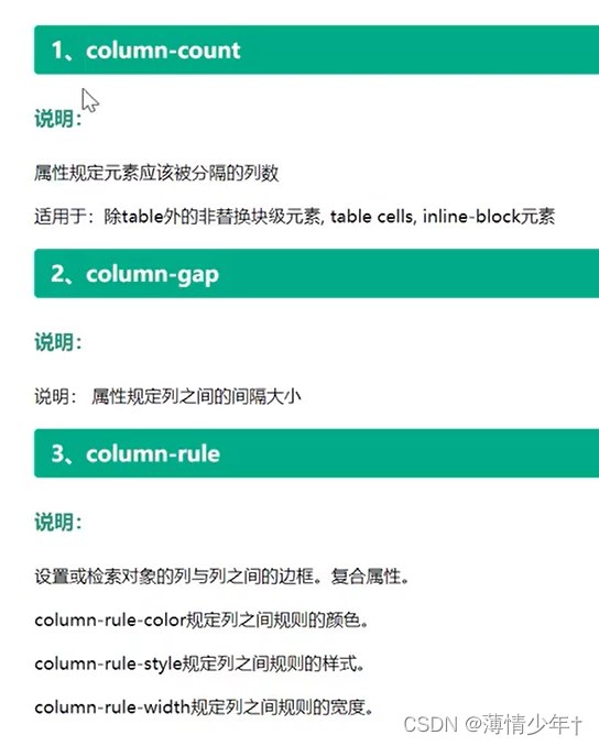
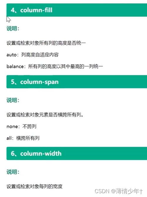
/* 调整列的个数 /
column-count: 7;
/ 调整列间距 /
column-gap: 40px;
/ 列边框*/
column-rule: 3px solid green;
/* 列高度统一 /
column-fill: balance;
/ 把父盒子占满 /
/ column-fill: auto; *//* 调整列宽 */ column-width: 300px; } /* 横跨所有列,该属性加在子元素身上54786124571862 */ column-span: all; 禁止盒子内部折行 break-inside: avoid;
多列布局案例:
<!DOCTYPE html>
<html lang="en">
<head>
    <meta charset="UTF-8">
    <meta http-equiv="X-UA-Compatible" content="IE=edge">
    <meta name="viewport" content="width=device-width, initial-scale=1.0">
    <title>Document</title>
    <style>
        .box{
            column-count: 5;
        }
        .box div{
            border: 2px solid black;
            margin-bottom: 10px;
            break-inside: avoid;
            text-align: center;
        }
        .box div img{
           width: 100%;
        }
    </style>
</head>
<body>
    <div class="box">
        <div>
            <img src="../img/102202.jpg" alt="">
            <p>聚会不符合你不过可能</p>
        </div>
        <div>
            <img src="../img/1020.jpg" alt="">
            <p>聚会不符合你不过可能</p>
        </div>
        <div>
            <img src="../img/102202.jpg" alt="">
            <p>聚会不符合你不过可能</p>
        </div>
        <div>
            <img src="../img/102202.jpg" alt="">
            <p>聚会不符合你不过可能</p>
        </div>
        <div>
            <img src="../img/1020.jpg" alt="">
            <p>聚会不符合你不过可能</p>
        </div>
        <div>
            <img src="../img/1020.jpg" alt="">
            <p>聚会不符合你不过可能</p>
        </div>
        <div>
            <img src="../img/1020.jpg" alt="">
            <p>聚会不符合你不过可能</p>
        </div>
        <div>
            <img src="../img/102202.jpg" alt="">
            <p>聚会不符合你不过可能</p>
        </div>
        <div>
            <img src="../img/1020.jpg" alt="">
            <p>聚会不符合你不过可能</p>
        </div>
        <div>
            <img src="../img/102202.jpg" alt="">
            <p>聚会不符合你不过可能</p>
        </div>
        <div>
            <img src="../img/102202.jpg" alt="">
            <p>聚会不符合你不过可能</p>
        </div>
        <div>
            <img src="../img/102202.jpg" alt="">
            <p>聚会不符合你不过可能</p>
        </div>
        <div>
            <img src="../img/1020.jpg" alt="">
            <p>聚会不符合你不过可能</p>
        </div>
        <div>
            <img src="../img/102202.jpg" alt="">
            <p>聚会不符合你不过可能</p>
        </div>
    </div>
</body>
</html>
响应式布局
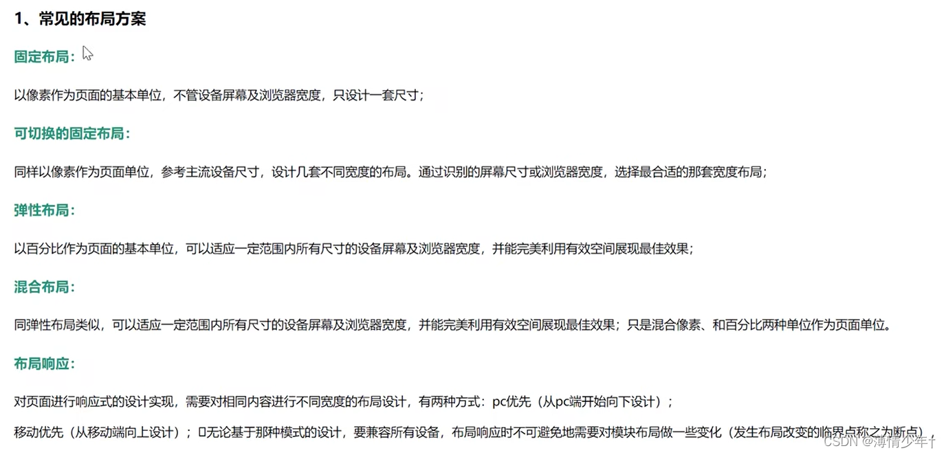
(1)模块中内容:挤压——拉(布局不变)
(2)模块中内容:换行——平铺(布局不变)
(3)模块中内容:删减——增加(布局不变)
(4)模块位置变换(布局改变)
(5)模块展示方式改变:隐藏——展开(布局改变)
3、响应式布局特点
设计特点:
面对不同分辨率设备灵活性强
能够快捷解决多设备显示适应问题
缺点:
兼容各种设备工作量大,效率低下
代码累赘,会出现隐藏无用的元素,加载时间加长
其实这是一种折中性质的设计解决方案,多方面因素影响而达不到最佳效果
一定程度 上改变了网站原有的布局结构,会出现用户混淆的情况
媒体查询
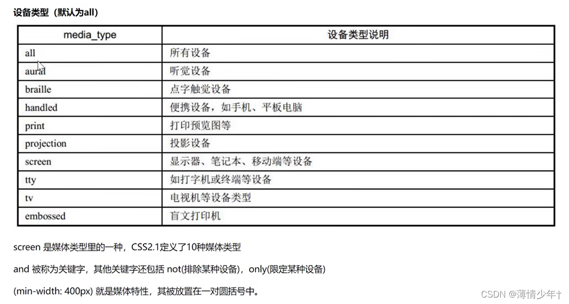
媒体查询的含义:
媒体查询可以让我们根据设备显示器的特性(如视口宽度、屏幕比例、设备方向:横向或纵向)为其设定CSS样式,媒体查询由媒体类型和一个或多个检测媒体特性的条件表达式组成。媒体查询中可用于检测的媒体特性有width、height 和color (等) 。使用媒体查询,可以在不改变页面内容的情况下,为特定的一些输出设备定制显示效果。
1、媒体查询操作方式
实际操作为:对设备提出询问(称作表达式)开始,如果表达式结果为真,媒体查询中的CSS被应用,如果表达式结果为假,媒体查询内的CSS将被忽略。
2、媒体查询结构
@media all and (min-width:320px) {
body {
background-color:blue;
}
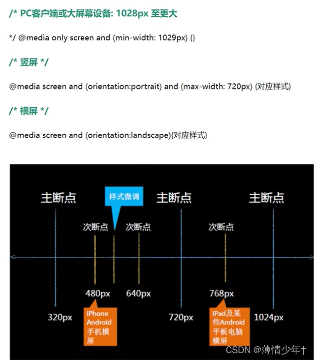
横竖屏检测
orientation:portrait   :   竖屏
orientation:landscape   :   横屏


 @media screen and (orientation:portrait){
            div{
                width: 33.333%;
            }
        }
        @media screen and (orientation:landscape){
            div{
                width: 20%;
            }
        }
<!DOCTYPE html>
<html lang="en">
<head>
    <meta charset="UTF-8">
    <meta http-equiv="X-UA-Compatible" content="IE=edge">
    <meta name="viewport" content="width=device-width, initial-scale=1.0">
    <title>Document</title>
    <style>
         *{
            margin: 0;
            padding: 0;
        }
        html,body{
            height: 100%;
        }
        body{
            display: flex;
            flex-wrap: wrap;
            align-content: flex-start;
        }
        div{
            height: 100px;
            background-color: yellow;
            box-sizing: border-box;
            border: 2px solid black;

            align-content: flex-start;
        }
        @media screen and (orientation:portrait){
            div{
                width: 33.333%;
            }
        }
        @media screen and (orientation:landscape){
            div{
                width: 20%;
            }
        }
    </style>
</head>
<body>
    <div></div>
    <div></div>
    <div></div>
    <div></div>
    <div></div>
    <div></div>
    <div></div>
    <div></div>
    <div></div>
    <div></div>
</body>
</html>
案例
<!DOCTYPE html>
<html lang="en">
<head>
    <meta charset="UTF-8">
    <meta http-equiv="X-UA-Compatible" content="IE=edge">
    <meta name="viewport" content="width=device-width, initial-scale=1.0">
    <title>Document</title>
    <style>
        *{
            margin: 0;
            padding: 0;
        }
        html,body{
            height: 100%;
        }
        .top{
            display: flex;
            flex-wrap: wrap;
            justify-content: space-between;
            margin-bottom: 20px;
            /* border: 1px solid green; */
            margin-top: 20px;
        }
        .top>div{
            width: 49%;
        }
        .top img {
            width: 100%;
        }
        .top .right{
            display: flex;
            justify-content: space-between;
            /* align-items: flex-end; */
        }
        .right>div{
            width: 49%;
        }
        .right>img{
            width: 100%;
        }
        @media screen and (max-width:768px) {
            .top>div{
                width: 100%;
            }
        }
        .bottom{
            display: flex;
            flex-wrap: wrap;
            justify-content: space-between;
        }
        .bottom>div{
            display: flex;
            flex-direction: column;
            justify-content: space-between;
            width: 24%;
            text-align: center;
            margin-bottom: 20px;
            box-sizing: border-box;
            /* border: 1px solid red; */
            padding: 5px;
            box-shadow: 0 0 5px black;
        }
        .bottom>div>p{
            font-size: 14px;
            color: rgb(109, 108, 108);
        }
        .bottom>div>img{
            width: 100%;
            margin-bottom: 6px;
        }
        /* 屏幕大小在768px 到 1024px 之间 */
        @media screen and (min-width:768px) and (max-width:1024px){
            .bottom>div{
                width: 31%;
            }
        }
        /* 屏幕大小在450px 到 1024px 之间 */
        @media screen and (min-width:450px) and (max-width:768px){
            .bottom>div{
                width: 49%;
            }
        }
        @media screen and (max-width:450px){
            .bottom>div{
                width: 100%;
            }
        }
    </style>
</head>
<body>
    <div class="top">
        <div class="left">
            <img src="../img/XYS_swaper.jpg" alt="">
        </div>
        <div class="right">
            <div>
                <img src="../img/XYS02.jpg" alt="">
            </div>
            <div>
                <img src="../img/XYS03.jpg" alt="">
            </div>

        </div>
    </div>
    <div class="bottom">
        <div>
            <img src="../img/XYS04.jpg" alt="">
            <p>迷你微型摄影展</p>

        </div>
        <div>
            <img src="../img/XYS04.jpg" alt="">
            <p>迷你微型摄影展</p>

        </div>
        <div>
            <img src="../img/XYS04.jpg" alt="">
            <p>迷你微型摄影展</p>

        </div>
        <div>
            <img src="../img/XYS04.jpg" alt="">
            <p>迷你微型摄影展</p>

        </div>
        <div>
            <img src="../img/XYS04.jpg" alt="">
            <p>迷你微型摄影展</p>

        </div>
        <div>
            <img src="../img/XYS04.jpg" alt="">
            <p>迷你微型摄影展</p>
        </div>
        <div>
            <img src="../img/XYS04.jpg" alt="">
            <p>迷你微型摄影展</p>
        </div>
        <div>
            <img src="../img/XYS04.jpg" alt="">
            <p>迷你微型摄影展</p>
        </div>
        <div>
            <img src="../img/XYS04.jpg" alt="">
            <p>迷你微型摄影展</p>
        </div>
        <div>
            <img src="../img/XYS04.jpg" alt="">
            <p>迷你微型摄影展</p>
        </div>
        <div>
            <img src="../img/XYS04.jpg" alt="">
            <p>迷你微型摄影展</p>
        </div>
        <div>
            <img src="../img/XYS04.jpg" alt="">
            <p>迷你微型摄影展</p>
        </div>
        <div>
            <img src="../img/XYS04.jpg" alt="">
            <p>迷你微型摄影展</p>
        </div>
        <div>
            <img src="../img/XYS04.jpg" alt="">
            <p>迷你微型摄影展</p>
        </div>
        <div>
            <img src="../img/XYS04.jpg" alt="">
            <p>迷你微型摄影展</p>
        </div>
        <div>
            <img src="../img/XYS04.jpg" alt="">
            <p>迷你微型摄影展</p>
        </div>
    </div>
</body>
</html>
em与rem
px,em,rem之争
px: 50px
em:相对单位, 相对于父元素的字体大小。div width: 10em;
rem:相对单位,相对 于根元素 (html)字体大小, div width:10rem;
<!DOCTYPE html>
<html lang="en">
<head>
    <meta charset="UTF-8">
    <meta http-equiv="X-UA-Compatible" content="IE=edge">
    <meta name="viewport" content="width=device-width, initial-scale=1.0">
    <title>Document</title>
    <style>
        *{
            margin: 0;
            padding: 0;
        }
        html{
            font-size: 100px;
        }
        /* 为了防止页面中字体跟随html的字体变大 */
         body{
            font-size: 16px;
        }
        .box{
            width: 7.5rem;
            height: 100px;
            background-color: yellow;
        }

    </style>
    <script>
            /* fontsize计算 */
            document.documentElement.style.fontSize = document.documentElement.clientWidth/750 * 100 +'px'
			// fontsize =当前设备的css布局宽度/物理分辨率(设计稿的宽度)*基准font-size


        </script>
</head>
<body>
    <div class="box"></div>
</body>
</html>
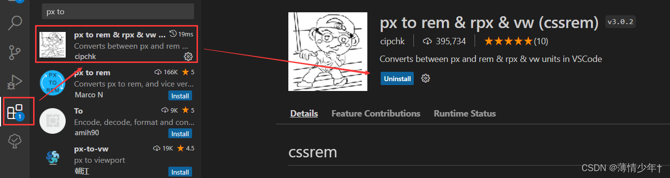
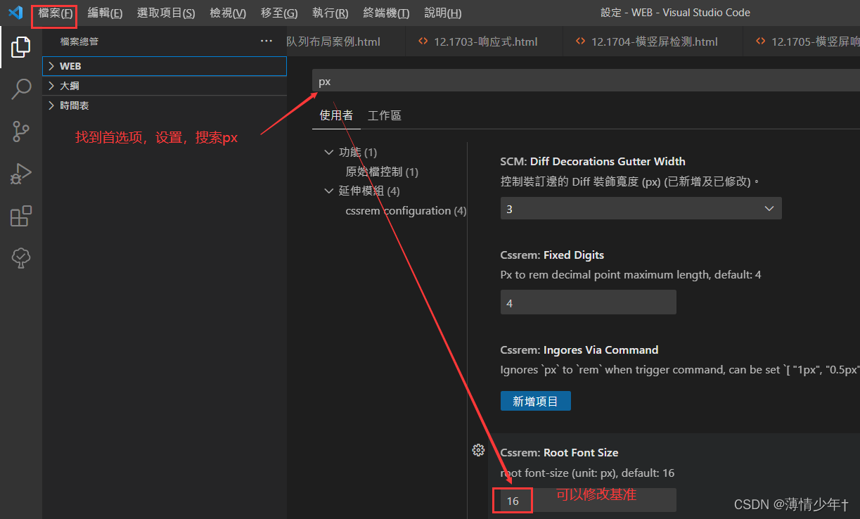
如果html的font-size设置成了16px ,安装如下插件(该插件只能基于16px进行转换),会自动把px单位转换为对应的rem值:
足球圈rem布局
之前写的时候宽高等已经除以2了,所以从设计稿上量取的值也除2,用在document.documentElement.style.fontSize
= document.documentElement.clientWidth/320 * 16 +‘px’ 里面,我的html默认设置的是16px
<!DOCTYPE html>
<html lang="en">
<head>
    <meta charset="UTF-8">
    <meta http-equiv="X-UA-Compatible" content="IE=edge">
    <meta name="viewport" content="width=device-width, initial-scale=1.0">
    <title>Document</title>
    <link rel="stylesheet" href="../zuqiuquan/iconfont.css">
    <style>
        *{
            margin: 0;
            padding: 0;
        }
        html,body{
            height: 100%;
        }
        ul{
            list-style: none;
        }
        html{
            font-size: 16px;
        }
        body{
            /* 弹性盒 */
            display: flex;
            /* 垂直方向 */
            flex-direction: column;
        }
        /* header样式 */
        header{
            height: 2.75rem;
            background-color: #0cc440;
            display: flex;
            /* 垂直居中 */
            align-items: center;
            /* 水平居中 */
            justify-content: center;
        }
        header div{
            width: 3.75rem;
            height: 1.5625rem;
            color: white;
            text-align: center;
            line-height: 1.5625rem;
            /* 怪异盒模型 */
            box-sizing: border-box;
            /* border: .0625rem solid white; */
            border-radius: 0 ;
            font-size: .75rem;
        }
        header div:nth-child(1){
            border-radius: .75rem 0 0 .75rem;
            background-color: #63d985;
        }
        header div:nth-child(2){
            /* 左上角 右上角 右下角 左下角 */
            border-radius: 0rem .75rem .75rem 0rem;
            background-color: #3dd066;
            color: #a9e4b4;
        }
        /*
        或者写成下面这种生成圆角:
        .h1{
            border-radius: .75rem 0 0 .75rem;
            background-color: #63d985;
        } */
        /* .h2{
            border-radius: 0rem .75rem .75rem 0rem;
            background-color: #63d985;
        } */
        /* ------------------------------------------------------------------- */
        /* section样式 */
        section{
            /* 占满剩余空间,section在footer前面显示 */
            flex: 1;
            /* 溢出产生滚动条 */
            overflow: auto;
            /* display: flex; */

        }
        section ul{
            display: flex;
            /* 粘性定位,固定在屏幕的某一位置 */
            position: sticky;
            top: 0rem;
            background-color: white;
            /* flex-direction: row; */

        }
        section ul li{
            height: 2.1875rem;
            line-height: 2.1875rem;
            flex: 1;
            text-align: center;
            box-sizing: border-box;
            border-bottom: .0625rem solid rgb(155, 155, 155);
            color: #8c8c8c;
            font-size: .875rem;

        }
        section ul li:hover{
            border-bottom: .1563rem solid #63d985;
            color: #0cc440;
        }
        .list{
            display: flex;
            /* background-color: greenyellow; */
            flex-wrap: wrap;
            /* 主轴上两端对齐 */
            justify-content: space-between;
        }
         section .list>div{
            flex-direction: column;
            display: flex;
            /* height: ; */
            width:49% ;
            margin-top:.25rem;
            border: .0625rem solid grey;

        }
        section .list>div>img{
            width: 100%;
        }
        section .list>div>p{
            height: 1.875rem;
            line-height: 1.875rem;
            text-align: center;
            font-size: .875rem;
            /* 缩进 */
            /* text-indent: .625rem; */
        }

        /* footer样式 */
        footer{
            display: flex;
            height: 2.75rem;
            background-color: white;
            align-items: center;
            justify-content: center;
        }
        footer div{
            /* height: 100%; */
            display: flex;
            flex: 1;
            text-align: center;
            flex-direction: column;
            color: #bbbbbb;
            font-size: .75rem;
            position: relative;
        }
         body footer>div>i{
            height: 1.3125rem;
            line-height: 1.3125rem;
            /*我的font-size效果不生效 所以用 !important提升优先级 ,如果生效就不用加了*/
            font-size: 1.375rem!important;
        }
        body footer>div>span{
            height: 1.0625rem;
            /* font-size: 1.25rem; */
        }
        footer div:hover{
            color: #0cc440;
        }
        .icon-zhaoxiangji{
            width: 3.125rem;
            height: 3.125rem;
            position: absolute;
            font-size: 1.875rem!important;
            border: .0625rem solid rgb(196, 196, 196);
            border-radius:  50%;
            top:-1.875rem;
            left: 21%;
            /* 水平垂直居中 */
            line-height: 3.125rem;
            text-align: center;
            background-color: white;
        }
        .iconfont{
            font-size: 1rem;
        }
    </style>
     <script>
        //  fontsize计算
         document.documentElement.style.fontSize = document.documentElement.clientWidth/320 * 16 +'px'
</script>
</head>
<body>
    <header>
        <div class="h1">热点</div>
        <div class="h2">关注</div>
    </header>
    <section>
        <ul>
            <li>足球现场</li>
            <li>足球生活</li>
            <li>足球美女</li>
        </ul>
        <div class="list">
            <div>
                <img src="../img/足球圈02.jpg" alt="">
                <p>小丸子啊小丸子</p>
            </div>
            <div>
                <img src="../img/足球圈01.jpg" alt="">
                <p>小丸子啊小丸子</p>
            </div>
            <div>
                <img src="../img/足球圈03.jpg" alt="">
                <p>小丸子啊小丸子</p>
            </div>
            <div>
                <img src="../img/足球圈04.jpg" alt="">
                <p>小丸子啊小丸子</p>
            </div>
            <div>
                <img src="../img/足球圈01.jpg" alt="">
                <p>小丸子啊小丸子</p>
            </div>
            <div>
                <img src="../img/足球圈01.jpg" alt="">
                <p>小丸子啊小丸子</p>
            </div>
        </div>
    </section>
    <footer>
        <div>
            <!-- i标签或span标签都可以 -->
            <i class="iconfont icon-shouye"></i>
            <span>首页</span>
        </div>
        <div>
            <i class="iconfont icon-Fangdajing"></i>
            <span>发现</span>
        </div>
        <div>
            <i class="iconfont icon-zhaoxiangji"></i>
            <!-- <span>相机</span> -->
        </div>
        <div>
            <i class="iconfont icon-wode"></i>
            <span>我的</span>
        </div>
        <div>
            <i class="iconfont icon-tuichu"></i>
            <span>退出</span>
        </div>
    </footer>
</body>
</html>
vm和vh
vh view- height 100vh=口的高度
VW view-width 100vm=视口高度
足球圈案例量得的宽度是320px,
320px = 100vw
16px=??vm
计算可得16px= 5vw
修改处:
html{
font-size: 5vw;
}
去掉之前的js代码,即script部分
<!DOCTYPE html>
<html lang="en">
<head>
    <meta charset="UTF-8">
    <meta http-equiv="X-UA-Compatible" content="IE=edge">
    <meta name="viewport" content="width=device-width, initial-scale=1.0">
    <title>Document</title>
    <link rel="stylesheet" href="../zuqiuquan/iconfont.css">
    <style>
        *{
            margin: 0;
            padding: 0;
        }
        html,body{
            height: 100%;
        }
        ul{
            list-style: none;
        }
        html{
            font-size: 5vw;
        }
        body{
            /* 弹性盒 */
            display: flex;
            /* 垂直方向 */
            flex-direction: column;
        }
        /* header样式 */
        header{
            height: 2.75rem;
            background-color: #0cc440;
            display: flex;
            /* 垂直居中 */
            align-items: center;
            /* 水平居中 */
            justify-content: center;
        }
        header div{
            width: 3.75rem;
            height: 1.5625rem;
            color: white;
            text-align: center;
            line-height: 1.5625rem;
            /* 怪异盒模型 */
            box-sizing: border-box;
            /* border: .0625rem solid white; */
            border-radius: 0 ;
            font-size: .75rem;
        }
        header div:nth-child(1){
            border-radius: .75rem 0 0 .75rem;
            background-color: #63d985;
        }
        header div:nth-child(2){
            /* 左上角 右上角 右下角 左下角 */
            border-radius: 0rem .75rem .75rem 0rem;
            background-color: #3dd066;
            color: #a9e4b4;
        }
        /*
        或者写成下面这种生成圆角:
        .h1{
            border-radius: .75rem 0 0 .75rem;
            background-color: #63d985;
        } */
        /* .h2{
            border-radius: 0rem .75rem .75rem 0rem;
            background-color: #63d985;
        } */
        /* ------------------------------------------------------------------- */
        /* section样式 */
        section{
            /* 占满剩余空间,section在footer前面显示 */
            flex: 1;
            /* 溢出产生滚动条 */
            overflow: auto;
            /* display: flex; */

        }
        section ul{
            display: flex;
            /* 粘性定位,固定在屏幕的某一位置 */
            position: sticky;
            top: 0rem;
            background-color: white;
            /* flex-direction: row; */

        }
        section ul li{
            height: 2.1875rem;
            line-height: 2.1875rem;
            flex: 1;
            text-align: center;
            box-sizing: border-box;
            border-bottom: .0625rem solid rgb(155, 155, 155);
            color: #8c8c8c;
            font-size: .875rem;

        }
        section ul li:hover{
            border-bottom: .1563rem solid #63d985;
            color: #0cc440;
        }
        .list{
            display: flex;
            /* background-color: greenyellow; */
            flex-wrap: wrap;
            /* 主轴上两端对齐 */
            justify-content: space-between;
        }
         section .list>div{
            flex-direction: column;
            display: flex;
            /* height: ; */
            width:49% ;
            margin-top:.25rem;
            border: .0625rem solid grey;

        }
        section .list>div>img{
            width: 100%;
        }
        section .list>div>p{
            height: 1.875rem;
            line-height: 1.875rem;
            text-align: center;
            font-size: .875rem;
            /* 缩进 */
            /* text-indent: .625rem; */
        }

        /* footer样式 */
        footer{
            display: flex;
            height: 2.75rem;
            background-color: white;
            align-items: center;
            justify-content: center;
        }
        footer div{
            /* height: 100%; */
            display: flex;
            flex: 1;
            text-align: center;
            flex-direction: column;
            color: #bbbbbb;
            font-size: .75rem;
            position: relative;
        }
         body footer>div>i{
            height: 1.3125rem;
            line-height: 1.3125rem;
            /*我的font-size效果不生效 所以用 !important提升优先级 ,如果生效就不用加了*/
            font-size: 1.375rem!important;
        }
        body footer>div>span{
            height: 1.0625rem;
            /* font-size: 1.25rem; */
        }
        footer div:hover{
            color: #0cc440;
        }
        .icon-zhaoxiangji{
            width: 3.125rem;
            height: 3.125rem;
            position: absolute;
            font-size: 1.875rem!important;
            border: .0625rem solid rgb(196, 196, 196);
            border-radius:  50%;
            top:-1.875rem;
            left: 21%;
            /* 水平垂直居中 */
            line-height: 3.125rem;
            text-align: center;
            background-color: white;
        }
        .iconfont{
            font-size: 1rem;
        }
    </style>
     <!-- <script>
        //  fontsize计算
         document.documentElement.style.fontSize = document.documentElement.clientWidth/320 * 16 +'px'
</script> -->
</head>
<body>
    <header>
        <div class="h1">热点</div>
        <div class="h2">关注</div>
    </header>
    <section>
        <ul>
            <li>足球现场</li>
            <li>足球生活</li>
            <li>足球美女</li>
        </ul>
        <div class="list">
            <div>
                <img src="../img/足球圈02.jpg" alt="">
                <p>小丸子啊小丸子</p>
            </div>
            <div>
                <img src="../img/足球圈01.jpg" alt="">
                <p>小丸子啊小丸子</p>
            </div>
            <div>
                <img src="../img/足球圈03.jpg" alt="">
                <p>小丸子啊小丸子</p>
            </div>
            <div>
                <img src="../img/足球圈04.jpg" alt="">
                <p>小丸子啊小丸子</p>
            </div>
            <div>
                <img src="../img/足球圈01.jpg" alt="">
                <p>小丸子啊小丸子</p>
            </div>
            <div>
                <img src="../img/足球圈01.jpg" alt="">
                <p>小丸子啊小丸子</p>
            </div>
        </div>
    </section>
    <footer>
        <div>
            <!-- i标签或span标签都可以 -->
            <i class="iconfont icon-shouye"></i>
            <span>首页</span>
        </div>
        <div>
            <i class="iconfont icon-Fangdajing"></i>
            <span>发现</span>
        </div>
        <div>
            <i class="iconfont icon-zhaoxiangji"></i>
            <!-- <span>相机</span> -->
        </div>
        <div>
            <i class="iconfont icon-wode"></i>
            <span>我的</span>
        </div>
        <div>
            <i class="iconfont icon-tuichu"></i>
            <span>退出</span>
        </div>
    </footer>
</body>
</html>
100vm 和100%的区别:
在没有滚动条时:两者相同
在有滚动条时:100vw包含了滚动条的宽度,100%不包含
渐变
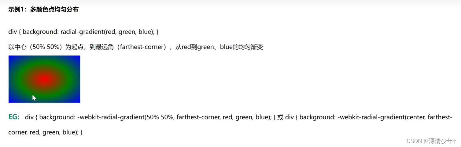
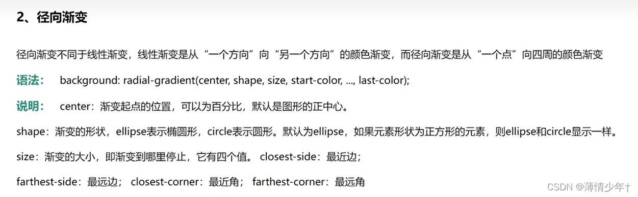
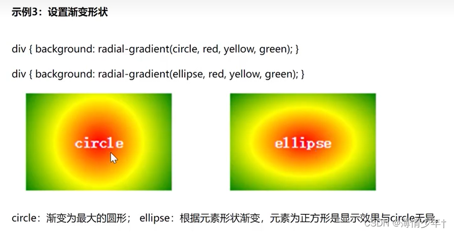
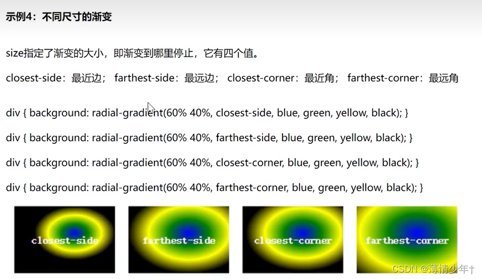
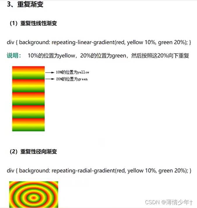
一、CSS3 渐变
CSS3渐变(gradient) 可以让你在两个或多个指定的颜色之间显示平稳的过渡。以前, 你必须使用图像来实现这些效果,现在通过使用CSS3的渐变(gradients) 即.可实现。此外,渐变效果的元素在放大时看起来效果更好,因为渐变(gradient) 是由浏览器生成的。
			/* 从上到下,红到黄渐变 */
            background: linear-gradient(red ,yellow);
            /* 从下到上,红到黄渐变 ,默认是to bottom*/
            background: linear-gradient(to top,red ,yellow);
            /* 左到右,黄到红*/
            background: linear-gradient(to left,red ,yellow);
            /* 右到左,黄到红*/
            background: linear-gradient(to right,red ,yellow);
            /*
            to top left左上角到右下角,黄到红
            to top right
            */
            background: linear-gradient(to top left,red ,yellow);
            /* 右上角到左下角,黄到红*/
            background: linear-gradient(45deg,red ,yellow);
.box1{
            width: 300px;
            height: 300px;
            margin-top: 20px;
            border-radius: 50%;
            /* 从中心到边缘:红到绿 */
            background: radial-gradient(red,yellow);
            /* 0%~10%是红色,10%~80%是黄色,80%以外都是黄色 */
            background: radial-gradient(red 10%,yellow 80%);
            /* 不渐变的 同心圆 */
            background: radial-gradient(red 50%,yellow 50%);
        }
        .box2{
            margin-top: 30px;
            width: 500px;
            height: 300px;
            background: radial-gradient(red,yellow);
            background: radial-gradient(circle,red,yellow);
            background: -webkit-radial-gradient(60% 40%,closest-side,blue,green,yellow,black);
        }
太极图案例
<!DOCTYPE html>
<html lang="en">
<head>
    <meta charset="UTF-8">
    <meta http-equiv="X-UA-Compatible" content="IE=edge">
    <meta name="viewport" content="width=device-width, initial-scale=1.0">
    <title>Document</title>
    <style>
        body{
            background-color: aquamarine;
        }
        .box1{
            width: 300px;
            height: 300px;
            background: linear-gradient(white 50%,black 50%);
            margin: 10px auto;
            display: flex;
            align-items: center;
            border-radius: 50%;
        }
        .box1::before{
            content: "";
            display: block;
            width: 150px;
            height: 150px;
            border-radius: 50%;
            background: radial-gradient(black 20%,white 20%);
        }
        .box1::after{
            content: "";
            display: block;
            width: 150px;
            height: 150px;
            border-radius: 50%;
            background: radial-gradient(white 20%,black 20%);
        }
    </style>
</head>
<body>
    <div class="box1"></div>
</body>
</html>
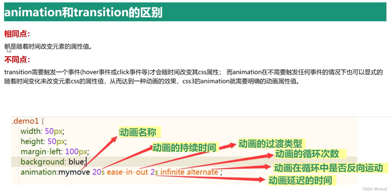
动画过渡
复合属性: transition 取值: all 5s linear 3s
含义: css3的transition允许css的属性值在一 定的时间区间内平滑地过渡。 这种效果可以在鼠标单击、获得焦点被点击或对元素任何改变中触发,并圆滑地以动画效果改变CSS的属性值
all —— 单一属性: transition- property:检索或设置对象中的参与过渡的属性
5s —— 单一属性: transition-duration: 检索或设置对象过渡的持续时间
3s —— 单一属性: transition-delay: 检索或设置对象延迟过渡的时间
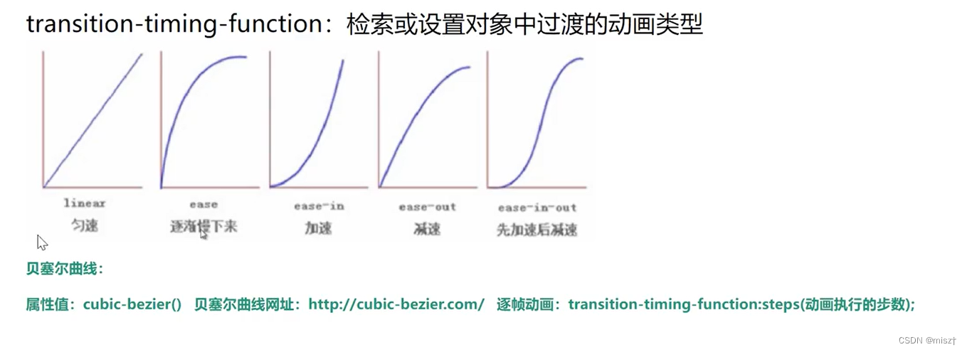
linear——单一属性: transition-timing-function: 检索或设置对象中过渡的动画类型
简写:
transition:all/具体属性值运动时间s/ms延迟时间s/ms动画类型
<!DOCTYPE html>
<html lang="en">
<head>
    <meta charset="UTF-8">
    <meta http-equiv="X-UA-Compatible" content="IE=edge">
    <meta name="viewport" content="width=device-width, initial-scale=1.0">
    <title>Document</title>
    <style>
        div{
            width: 200px;
            height: 200px;
            background-color: yellow;
            /* 高度过渡动画 */
            transition: height 2s;
            /*
            all 所有属性
            2s   动画时间
            linear  匀速
            2s  延迟
            注意:display:none/block;属性不能适配
             */
            transition:  all 2s;
            transition:all 2s linear 2s;
           }
        div:hover{
            height: 600px;
            background-color: aquamarine;
        }
    </style>
</head>
<body>
    <div>

    </div>
</body>
</html>
<!DOCTYPE html>
<html lang="en">
<head>
    <meta charset="UTF-8">
    <meta http-equiv="X-UA-Compatible" content="IE=edge">
    <meta name="viewport" content="width=device-width, initial-scale=1.0">
    <title>Document</title>
    <style>
        div{
            width: 200px;
            height: 200px;
            background-color: yellow;
            /* 高度过渡动画 */
            transition: height 2s;
            /*
            all 所有属性
            2s   动画时间
            linear  匀速
            2s  延迟
            注意:display:none/block;属性不能适配
             */
            transition:  all 2s;
            transition:all 2s linear 2s;
            /* 控制某个单一属性 */
            transition-property: height background-color;
            /* 变化的时间 */
            transition-duration: 2s;
            /* 运动动画 效果 */
            transition-timing-function: linear;
           }
        div:hover{
            height: 600px;
            background-color: aquamarine;
        }
        ul{
            list-style: none;
        }
        li{
            width: 300px;
            height: 50px;

            border: 1px solid black;
        }
        ul:hover li:nth-child(1){
            transition: all linear 2s;
            width: 600px;
        }
        ul:hover li:nth-child(2){
            transition: all ease 2s;
            width: 600px;
        }
        ul:hover li:nth-child(3){
            transition: all ease-in 2s;
            width: 600px;
        }
        ul:hover li:nth-child(4){
            transition: all ease-out 2s;
            width: 600px;
        }
        ul:hover li:nth-child(5){
            transition: all ease-in-out 2s;
            width: 600px;
        }
        ul:hover li:nth-child(6){
            transition: all cubic-bezier(.44,.74,.83,.67) 2s;
            width: 600px;
        }
    </style>
</head>
<body>
    <div>

    </div>
    <ul>
        <li></li>
        <li></li>
        <li></li>
        <li></li>
        <li></li>
        <li></li>
    </ul>
</body>
</html>
2D效果
1、 translate
将元素向指定的方向移动,类似于position中的relative.
水平移动:向右移动translate(tx,0)和向左移动translate(-tx,0);
垂直移动: 向上移动translate(0,-ty)和向下移动translate(0,ty);
对角移动:右 下角移动translate(tx,ty).右上角移动translate(tx,-ty).左上角移动translate(-tx, ty)和左下角移动translate(- tx,ty)。
translateX():水平方向移动一 个对象。 对像只向X轴进行移动,如果值为正值,对像向右移动;如果值为负值,对像向左移动。translateY(: 纵轴方向移动- 个对象。对象只向Y轴进行移动,如果值为正值,对象向下移动;如果值为负值,对像向上移动。
这两个函数和前面介绍的translate()函数不同的是每个方法只接受一个值。
所以
transform:translate(-100px,0)实际上等于transform:translatexX(-100px);
transform:translate(0,- 100px)实际上等于transform:translateY( 100px)。
设置left属性会频繁的造成浏览器回流重排,而transform和opacity属性不会,因为它是作为合
成图层发送到GPU上,由显卡执行的渲染,这样做的优化如下
●可以通过亚像素精度得到一个运行在特殊优化过的单位图形任务上的平滑动画,并且运行非常快。
●动画不再绑定到CPU重排,而是通过GPU合成图像。即使运行一 个非常复杂的JavaScript任务,动画仍然会很快运行。
2、scale()
让元素根据中心原点对对象进行缩放。默认的值1。因此0.01 到0.99之间的任何值,使一个元素缩小; 而任何大于或等于1.01的值,让元素显得更大。
缩放scale0函数和translate()函数的语法非常相似,他可以接受一个值, 也可以同时接受两个值,如果只有一个值时,其第二个值默认与第一个值相等。
例如,
scale(1,1)元素不会有任何变化,而scale(2,2)让元素沿X轴和Y轴放大两倍。
scaleX():相当于scale(sx,1)。 表示元素只在X轴(水平方向)缩放元素,其默认值是1。
scaleY():相当于scale(1,sy)。 表示元素只在Y轴(纵横方向)缩放元素,其默认值是1.
3、rotate()
旋转rotate(函数通过指定的角度参数对元素根据对象原点指定一个2D旋转。 它主要在二维空间内进行操作,接受-个角度值,用来指定旋转的幅度。如果这个值为正值,元素相对原点中心
顺时针旋转;如果这个值为负值,元素相对原点中心逆时针旋转。
rotateX()方法,元素围绕其X轴以给定的度数进行旋转
rotateY() 方法,元素围绕其Y轴以给定的度数进行旋转
<!DOCTYPE html>
<html lang="en">
<head>
    <meta charset="UTF-8">
    <meta http-equiv="X-UA-Compatible" content="IE=edge">
    <meta name="viewport" content="width=device-width, initial-scale=1.0">
    <title>Document</title>
    <style>
        .box1{
            width: 200px;
            /* background-color: aqua; */
            margin: 100px auto;
            transition: all linear 200ms;
            overflow: hidden;
        }
        .box img{
            width: 100%;
            /* 放大时中心点在左上角 */
            transform-origin: left top;

        }
        .box1:hover{
            /* translateX  在X轴的正方向移动100px ,也可以取负值*/
            transform: translateX(100px);
            /* translateX  在Y轴的正方向移动100px */
            transform: translateY(100px);
            /* translateX  在X轴的正方向移动100px 在Y轴的正方向移动100px*/
            transform: translateX(100px) translateY(100px);
            /* 上一个效果可以写成下面这种形式 */
            transform: translate(200px,200px);
            /* 单方向放大 */
            transform: scaleX(4);
            transform: scaleY(4);
            /* 放大 */
            transform: scale(4);
            /* 绕中心点旋转 */
            transform: rotate(0deg);
            transform-origin: center;

        }
    </style>
</head>
<body>
    <div class="box1">
        <img src="../img/sjj.jpg" alt="">
    </div>
</body>
</html>
折扇案例:
<!DOCTYPE html>
<html lang="en">
<head>
    <meta charset="UTF-8">
    <meta http-equiv="X-UA-Compatible" content="IE=edge">
    <meta name="viewport" content="width=device-width, initial-scale=1.0">
    <title>Document</title>
    <style>
        *{
            margin: 0;
            padding: 0;
        }
        ul{
            list-style: none;
            width: 600px;
            height: 400px;
            border: 5px solid gray;
            position: relative;
            margin: 50px auto;
        }
        li{
            width: 60px;
            height: 200px;
            position: absolute;
            /* 左右居中 */
            left: 50%;
            /* 左侧偏移自身的一半 */
            margin-left: -30px;
            text-align: center;
            bottom: 30px;
            transition: all 1.1s;
            transform-origin: bottom center;
            border-radius: 5px;
            box-shadow: 0 0 5px black;

        }
        ul li:not(:nth-child(7)){
            /* 除了7以外的都设置为透明 */
            opacity: 0;
        }
        ul:hover li{
            opacity: 1;
        }
        ul li:nth-child(1),ul li:nth-child(13){
            background-color: purple;
        }

        ul li:nth-child(2),ul li:nth-child(12){
            background-color: pink;
        }
        ul li:nth-child(3),ul li:nth-child(11){
            background-color: orange;
        }
        ul li:nth-child(4),ul li:nth-child(10){
            background-color: green;
        }
        ul li:nth-child(5),ul li:nth-child(9){
            background-color: yellow;
        }
        ul li:nth-child(6),ul li:nth-child(8){
            background-color: olivedrab;
        }
        ul li:nth-child(7){
            background-color: red;
        }
        ul:hover li:nth-child(1){
            transform: rotate(90deg);
        }
        ul:hover li:nth-child(13){
            transform: rotate(-90deg);
        }
        ul:hover li:nth-child(2){
            transform: rotate(75deg);
        }
        ul:hover li:nth-child(12){
            transform: rotate(-75deg);
        }
        ul:hover li:nth-child(3){
            transform: rotate(60deg);
        }
        ul:hover li:nth-child(11){
            transform: rotate(-60deg);
        }
        ul:hover li:nth-child(4){
            transform: rotate(45deg);
        }
        ul:hover li:nth-child(10){
            transform: rotate(-45deg);
        }
        ul:hover li:nth-child(5){
            transform: rotate(30deg);
        }
        ul:hover li:nth-child(9){
            transform: rotate(-30deg);
        }
        ul:hover li:nth-child(6){
            transform: rotate(15deg);
        }
        ul:hover li:nth-child(8){
            transform: rotate(-15deg);
        }
    </style>
</head>
<body>
    <ul>
        <li>1</li>
        <li>2</li>
        <li>3</li>
        <li>4</li>
        <li>5</li>
        <li>6</li>
        <li>7</li>
        <li>8</li>
        <li>9</li>
        <li>10</li>
        <li>11</li>
        <li>12</li>
        <li>13</li>
    </ul>
</body>
</html>
多属性值可以叠加,但是要注意属性值的顺序
transform: translateX(100px) scale(0.5) rotate(45deg);
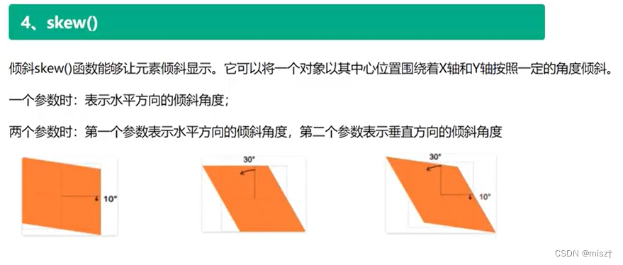
			transform: skew(30deg);
            transform: skewX(45deg);
            数值为正,是拉动右下角,动了设置数值的角度
            transform: skew(-30deg,20deg);
明星资料卡案例
<!DOCTYPE html>
<html lang="en">
<head>
    <meta charset="UTF-8">
    <meta http-equiv="X-UA-Compatible" content="IE=edge">
    <meta name="viewport" content="width=device-width, initial-scale=1.0">
    <title>Document</title>
    <link rel="stylesheet" href="../font_3827959_heu7uxdjqn/iconfont.css">
    <style>
        body{
            display: flex;
        }
        *{
            margin: 0;
            padding: 0;
        }
        /* .box1样式 */
        .box1{
            width: 350px;
            border: 5px solid black;
            /* margin: 10px auto; */
            position: relative;
            overflow: hidden;
        }
        .box1 h2{
            position: absolute;
            color: white;
            top: 10px;
            left: 50px;
        }
        /* img{
            position: absolute;
        } */
        .box1 img{
            width: 100%;
        }
        .box1 p{
            position: absolute;
            left: 90px;
            color: white;
            background-color: blue;
            width: 100px;
            text-align: center;

        }
        /* .box1:hover p{
            opacity: 0.8;
        } */
        .box1:hover h2{
            /* 延时0.5s */
            transition: 1s 0.5s;
            transform: translateX(70px);
        }
        .box1 .p1{
            top: 100px;
            /* 鼠标没有悬停时,让他的位置先偏移,鼠标悬停时再回到原来的位置 */
            transform: translateY(400px);
        }
        .box1 .p2{
            top: 180px;
            transform: translateX(400px);
        }
        .box1 .p3{
            top: 260px;
            transform: translateX(-200px);
        }
        .box1:hover img{
            transform: translate(60px);
            transition: all 1s;
            /* 透明度 */
            opacity: 0.5;
        }
        .box1:hover .p1{
            transition: 1s;
            transform: translateY(0px);

        }
        .box1:hover .p2{
            transition: 1s;
            transform: translateY(0px);

        }
        .box1:hover .p3{
            transition: 1s;
            transform: translateY(0px);

        }
        /* ------------------------------------------------------ */
        /* .box2样式 */
        .box2{
            width: 350px;
            border: 5px solid black;
            /* margin: 10px auto; */
            position: relative;
            overflow: hidden;
        }
        .box2 h2{
            position: absolute;
            color: white;
            top: 50px;
            left: 50px;
            transform: translateY(-200px);
        }
        .box2 img{
            width: 100%;
        }
        .box2:hover img{
            transition: 1.5s;
            transform: translateX(10px);
            opacity: 0.5;
        }
        .box2 p{
            position: absolute;
            left: 40px;
            top: 160px;
            color: black;
            /* background-color: blue; */
            width: 300px;
            transform: translateY(400px);
        }
        .box2:hover h2{
            transition: 1s;
            transform: translate(0px);
        }
        .box2:hover p{
            transition: 1s;
            transform: translate(0px);
        }
         .box2 .music{
            position: absolute;
            top: 10px;
            right: 20px;
            font-size: 30px;
            color: white;
            /* transform-origin: center; */
            animation: sss 1s linear infinite;
        }
        /* .box2:hover .music{
            transition: 1s;
            transform: rotate(720deg);
            transform-origin: center;
            animation: sss linear infinite;
        } */
        /* 声明关键帧动画 */
        @keyframes sss {
            from{
                transform: rotate(0deg);
            }
            to{
                transform: rotate(360deg);
            }
        }
    </style>
</head>
<body>
    <div class="box1">
        <img src="../img/明星01.jpg" alt="">
        <h2>title</h2>
        <p class="p1">1111</p>
        <p class="p2">2222</p>
        <p class="p3">3333</p>
    </div>
    <div class="box2">
        <img src="../img/明星02.jpg" alt="">
        <h2>My Bad Guy!!!!!!!</h2>
        <p class="p1">Lorem, ipsum dolor sit amet consectetur adipisicing elit.
            Harum exercitationem eaque cumque dolores, eligendi eum iusto enim libero.
            Voluptatem soluta numquam
        </p>
        <div class="music">
            <i class="iconfont icon-aixin"></i>
        </div>
    </div>
</body>
</html>
关键帧动画
<!DOCTYPE html>
<html lang="en">
<head>
    <meta charset="UTF-8">
    <meta http-equiv="X-UA-Compatible" content="IE=edge">
    <meta name="viewport" content="width=device-width, initial-scale=1.0">
    <title>Document</title>
    <style>
        *{
            margin: 0;
            padding: 0;
        }
        .box1{
            width: 200px;
            height: 200px;
            background-color: blueviolet;
            animation: sss  2s linear infinite;
            /* infinite : 执行无限次 */
        }
        @keyframes sss {
            from{
                width: 200px;
                height: 200px;
                background-color: blueviolet;
            }
            to{
                width: 400px;
                height: 400px;
                background-color: greenyellow;
            }
            /* from可以用0%代替,to可以用100%代替 ,还可以设置其他的百分比*/
        }
    </style>
</head>
<body>
    <div class="box1"></div>
</body>
</html>
单一属性:
animation
animation复合属性。检索或设置对象所应用的动画特效。
1.animation-name检索或设置对象所应用的动画名称
说明:
必须与规则@keyframes配合使用,eg:@keyframes mymove{} animation-name:mymove
2.animation-duration检索或设置对象动画的持续时间
说明:
animation-duration:3s;动画完成使用的时间为3s
3.animation-timing-function检索或设置对象动画的过渡类型
说明:
linear:线性过渡。等同于贝塞尔曲线(0.0, 0.0, 1.0, 1.0)
ease:平滑过渡。等同于贝塞尔曲线(0.25, 0.1, 0.25, 1.0)
ease-in:由慢到快。等同于贝塞尔曲线(0.42, 0, 1.0, 1.0)
ease- out:由快到慢。等同于贝塞尔曲线(0, 0, 0.58, 1.0)
ease-in-out:由慢到快再到慢。等同于贝塞尔曲线(0.42, 0, 0.58, 1.0)
7.animation-play-state检索或设置对象动画的状态
说明:
animation- play-state:running | paused;
running:运动
paused:暂停
animation-play-state:paused;
当鼠标经过时动画停止,鼠标移开动画继续执行
轮播图
<!DOCTYPE html>
<html lang="en">
<head>
    <meta charset="UTF-8">
    <meta http-equiv="X-UA-Compatible" content="IE=edge">
    <meta name="viewport" content="width=device-width, initial-scale=1.0">
    <title>Document</title>
    <style>
        *{
            margin: 0;
            padding: 0;
        }
        html,body{
            height: 100%;
        }
        .swiper-container{
            width: 640px;
            height: 300px;
            margin: 0 auto;
            overflow: hidden;

        }
        .swiper-slide img{
            width: 640px;
            height: 300px;
        }
        .swiper-wrapper{
            width: 3400px;
            animation:swiperrun 10s linear infinite;
        }
        .swiper-wrapper:hover{
            /* 鼠标悬停时暂停 */
            animation-play-state: paused;
        }
        .swiper-slide{
            float: left;
        }
        @keyframes swiperrun {
            0%{
                transform: translateX(0);
            }
            /* 5%切换 */
            5%{
                transform: translateX(-640px);
            }
             /* 20%停顿 */
            25%{
                transform: translateX(-640px);
            }
            30%{
                transform: translateX(-1280px);
            }
            50%{
                transform: translateX(-1280px);
            }
            55%{
                transform: translateX(-1920px);
            }
            75%{
                transform: translateX(-1920px);
            }
            80%{
                transform: translateX(-2560px);
            }
            100%{
                transform: translateX(-2560px);
            }
        }
    </style>
</head>
<body>
    <div class="swiper-container">
        <div class="swiper-wrapper">
            <div class="swiper-slide">
                <img src="../img/css轮播01.jpg" alt="">
            </div>
            <div class="swiper-slide">
                <img src="../img/css轮播02.png" alt="">
            </div>
            <div class="swiper-slide">
                <img src="../img/css轮播03.jpg" alt="">
            </div>
            <div class="swiper-slide">
                <img src="../img/css轮播04.jpg" alt="">
            </div>
            <!-- 为了实现无缝隙轮播,把第一张在复制一份 -->
            <div class="swiper-slide">
                <img src="../img/css轮播01.jpg" alt="">
            </div>
        </div>
    </div>

</body>
</html>
逐帧动画
animation: run 1s step-end infinite;
/*
step-end : 保留当前帧,看不到最后一帧,动画结束
step-start : 保留下一帧,看不到第一帧,第一帧很快到最后一帧
*/
<!DOCTYPE html>
<html lang="en">
<head>
    <meta charset="UTF-8">
    <meta http-equiv="X-UA-Compatible" content="IE=edge">
    <meta name="viewport" content="width=device-width, initial-scale=1.0">
    <title>Document</title>
    <style>
        *{
            margin: 0;
            padding: 0;
        }
        div{
            width: 180px;
            height: 300px;
            background-image: url(../img/逐帧动画.jpg);
            animation: run 1s step-end infinite;
            background-repeat: no-repeat ;
            margin: 0 auto;
        }
        @keyframes run {
            0%{
               background-position: 0px 0;
            }
            14.3%{
               background-position: -180px 0;
            }
            28.6%{
               background-position: -360px 0;
            }
            42.9%{
               background-position: -540px 0;
            }
            57.2%{
               background-position: -720px 0;
            }
            71.5%{
               background-position: -900px 0;
            }
            85.5%{
               background-position: -1080px 0;
            }
            /* 设置了step-end所以看不到最后一帧,因此最后一帧整张图片要溢出div */
            100%{
               background-position: -1260px 0;
            }
        }
    </style>
</head>
<body>
    <div></div>
</body>
</html>
animate动画库
官网:http://www.animate.net.cn/
下载文件地址(下方是使用方法):https://www.dowebok.com/98.html
查看效果(这个很棒,点击即可复制):https://animate.style/
/*  引入animate.min.css文件*/
<link rel="stylesheet" href="https://cdnjs.cloudflare.com/ajax/libs/animate.css/3.5.1/animate.min.css">

/*   应用样式
		bounce  是动画名称
*/
<div class="animated bounce infinite"></div>
浏览器兼容:当然是只兼容支持 CSS3 animate 属性的浏览器,他们分别是:IE10+、Firefox、Chrome、Opera、Safari。
可以在https://caniuse.com/网站查看是否可用
3D
1、平移
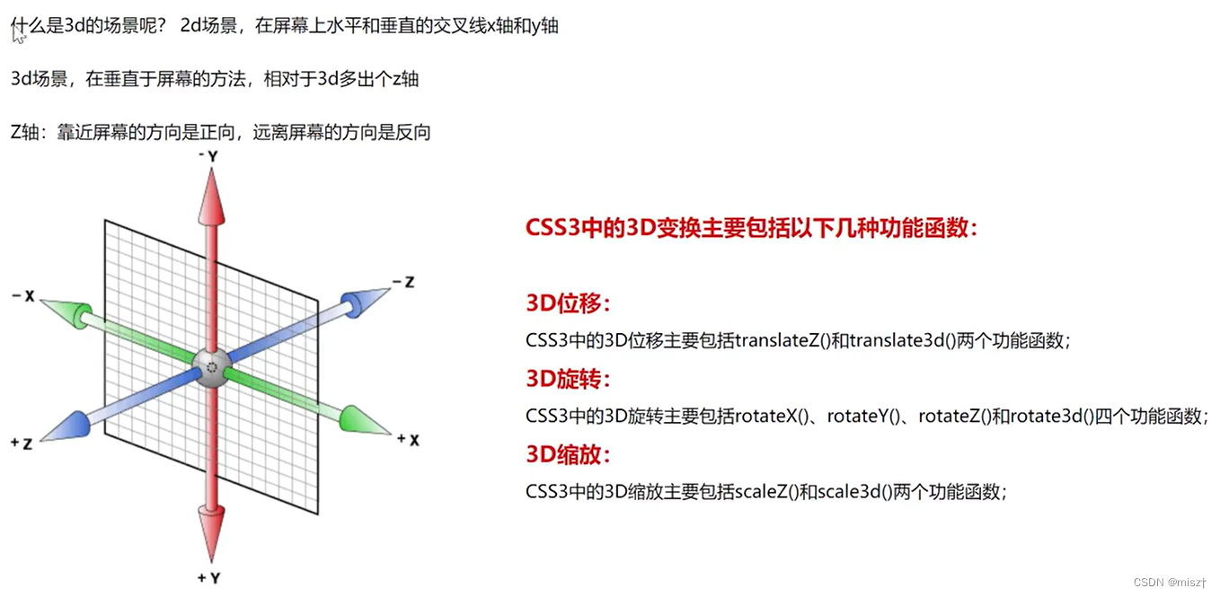
景深
生活中的3d区别于2d的地方
近大远小景深
程序中实现的方法perspective元素距离视线的距离(物体和眼睛的距离越小,近大远小的效果越明显)
perspective: 1200px; (在父元素中使用)
transform:perspective(1200px) (在子元素中使用)
两个都设置会发生冲突,建议只设置父元素,通常的数值在900-1200之间
如果当你的视线距离物体足够远的时候,基本上就不会有近大远小的感觉
perspective-origin;
观察3d元素的(位置)角度perspective-origin: center center (中心)
perspective-origin: lefttop (左 上角)
perspective-origin: 100% 100% (右下角)
<!DOCTYPE html>
<html lang="en">
<head>
    <meta charset="UTF-8">
    <meta http-equiv="X-UA-Compatible" content="IE=edge">
    <meta name="viewport" content="width=device-width, initial-scale=1.0">
    <title>Document</title>
    <style>
        .box{
            width: 500px;
            height: 500px;
            border:  5px solid black;
            position: relative;
            margin: 10px auto;
            /* 景深 */
            perspective: 800px;
            transform-style: preserve-3d;
        }
        .center{
            width: 200px;
            height: 200px;
            position: absolute;
            top: 50%;
            left: 50%;
            margin-top: -100px;
            margin-left: -100px;
            background-color: aquamarine;
            /* 设置为3D */
            /* transform-style: preserve-3d; */
            transition: all 5s;
        }
        .box:hover .center{
            /* 用translateZ   必须设置 transform-style: preserve-3d; */
            transform: translateZ(800px);
        }
    </style>
</head>
<body>
    <div class="box">
        <div class="center"></div>
    </div>
</body>
</html>
2、旋转
<!DOCTYPE html>
<html lang="en">
<head>
    <meta charset="UTF-8">
    <meta http-equiv="X-UA-Compatible" content="IE=edge">
    <meta name="viewport" content="width=device-width, initial-scale=1.0">
    <title>Document</title>
    <style>
        .box{
            width: 500px;
            height: 500px;
            border:  5px solid black;
            display: flex;
            margin: 10px auto;
            /* 景深 */
            /* perspective: 800px; */
            transform-style: preserve-3d;
        }
        .center{
            width: 200px;
            height: 200px;
            margin: auto;
            background-color: aquamarine;
            /* 设置为3D */
            /* transform-style: preserve-3d; */
            transition: all 5s;
            transform: rotateX(30deg);
            transform: rotateY(30deg);
            transform: rotateZ(30deg);
            /* 前面三条语句可以用以下语句代替 */
            transform: rotate3d(1,1,1,30deg);
            /* 前面的取值是0-1 ,上述语句中,如果是1 ,则表示一倍的30度*/
        }
        /* .box:hover .center{
            transform: translateZ(800px);
        } */
    </style>
</head>
<body>
    <div class="box">
        <div class="center"></div>
    </div>
</body>
</html>
3、缩放
3、 3D缩放
CSS3 3D变形中的缩放主要有scaleZ0和scale3d()两种函数,当scale3d(中X轴和Y轴同时为1, 即scale3d(1,1,sz), 效果等同于scaleZ(sz)。 通过使用3D缩放
函数,可以让元素在Z轴上按比例缩放。默认值为1,当值大于1时,元素放大,反之小于1大于0.01时,元素缩小
scale3d(sx,sy,sz)
sx:横向缩放比例;
sy:纵向缩放比例;
sz: Z轴缩放比例;
scaleZ(s)
S:指定元素每个点在Z轴的比例。
注: scaleZ()和scale3d()函数单独使用时没有任何效果,需要配合其他的变形函数- -起使用才会有效果
<!DOCTYPE html>
<html lang="en">
<head>
    <meta charset="UTF-8">
    <meta http-equiv="X-UA-Compatible" content="IE=edge">
    <meta name="viewport" content="width=device-width, initial-scale=1.0">
    <title>Document</title>
    <style>
        /* -----------------------------缩放------------------------------------------------- */
        .box2{
            width: 400px;
            height: 400px;
            border:  5px solid black;
            display: flex;
            margin: 10px auto;
            /* 景深 */
            perspective: 800px;
            transform-style: preserve-3d;
        }
        .center2{
            width: 200px;
            height: 200px;
            margin: auto;
            background-color: brown;
            /* 设置为3D */
            /* transform-style: preserve-3d; */
            transition: all 5s;
            /* scaleZ 必须配合景深perspective: 800px;, transform-style: preserve-3d;  rotate  等进行使用*/
            /* transform: scaleZ(1.5) rotateX(50deg); */
            transform: scale3d(1,1,2.5) rotateX(50deg);
        }
    </style>
</head>
<body>
    <div class="box2">
        <div class="center2"></div>
    </div>
</body>
</html>
4、立方体
<!DOCTYPE html>
<html lang="en">
<head>
    <meta charset="UTF-8">
    <meta http-equiv="X-UA-Compatible" content="IE=edge">
    <meta name="viewport" content="width=device-width, initial-scale=1.0">
    <title>Document</title>
    <style>
        *{
            margin: 0;
            padding: 0;
        }
        .box{
            width: 600px;
            height: 600px;
            /* border:  1px solid gray; */
            transform-style: preserve-3d;
            position: relative;
            transform: rotateY(10deg) rotateX(10deg);
            margin: 20px auto;
            animation: run 5s linear infinite;
        }
        @keyframes run {
            0%{
                transform: rotateY(10deg) rotateX(10deg);
            }
            50%{
                transform: rotateY(360deg) rotateX(360deg);
            }
            100%{
                transform: rotateY(10deg) rotateX(10deg);
            }
        }
        .box div{
            width: 200px;
            height: 200px;
            position:absolute;
            top: 50%;
            left: 50%;
            margin-top: -100px;
            margin-left: -100px;
            text-align: center;
            font-size: 50px;
            color: white;
            line-height: 200px;
        }
        .box>div>img{
            width: 100%;
        }
        .box div:nth-child(1){
            background-color: aqua;
            /* 向前移100px */
            transform: translateZ(100px);
        }
        .box div:nth-child(2){
            background-color: red;
             /* 本来中心点在XYZ轴的交点,先将2号向左沿X轴移动100px,此时2号的中心点向左移动了100px,绕Z轴顺时针转动90度,到左侧(如果绕Z轴逆时针转则2的字体刚好反过来)*/
             transform: translateX(-100px) rotateY(-90deg);
        }
        .box div:nth-child(3){
            background-color: rebeccapurple;
            transform: translateY(-100px) rotateX(90deg);
        }
        .box div:nth-child(4){
            background-color: yellow;
            transform: translateY(100px) rotateX(-90deg);
        }
        .box div:nth-child(5){
            background-color: greenyellow;
            transform: translateX(100px) rotateY(90deg);
        }
        .box div:nth-child(6){
            background-color: blue;
             /* 向后移100px */
             transform: translateZ(-100px) rotateY(-180deg);
        }
    </style>
</head>
<body>
    <div class="box">
        <div>
            <img src="../img/sjj.jpg" alt="">
        </div>
        <div>
            <img src="../img/sjj.jpg" alt="">
        </div>
        <div>
            <img src="../img/sjj.jpg" alt="">
        </div>
        <div>
            <img src="../img/sjj.jpg" alt="">
        </div>
        <div>
            <img src="../img/sjj.jpg" alt="">
        </div>
        <div>
            <img src="../img/sjj.jpg" alt="">
        </div>
    </div>
</body>
</html>
⭐⭐网格布局
一、网格布局的概念,和flex布局的区别
含义:它将网页划分成一个个网格, 可以任意组合不同的网格,做出各种各样的布局
区别: Grid 布局与Flex布局有一定的相似性,都可以指定容器内部多个项目的位置。但是,它们也存在重大区别。
Flex布局是轴线布局,只能指定"项目"针对轴线的位置,可以看作是一维布局。
Grid布局则是将容器划分成"行"和"列",产生单元格,然后指定"项目所在"的单元格,可以看作是二维布局。
网格布局案例:不规则布局页面(win窗口)1、容器和项目 容器:一个案例中最大的盒子,可以理解成父元素 项目: 一个案例中的,最大盒子里面的内容,可以理解成子元素
<section>
	 <div>
		  <p></p>
	 </div>
	 <div>
		  <p></p>
     </div>
     <div>
		  <p></p>
	  </div>
 </section>
  <!--以上代码section为容器、div为项目(项目不包括p标签) -->
2、行和列
行和列:容器里面的水平区域称为"行",垂直区域称为“列"。

三、网格布局中的属性
含义:网格布局中的属性和flex中的布局属性类似,分为了两类, - -类容器属性; -类是项目属性
1、容器属性
1、触发网格布局
给父元素添加display:grid
display关于网格的取值分为两个,grid(块网格)和inline-grid(行内网格, 行内块)
grid——容器从上向下排列
inline-grid——容器从左向右排列
2、行列划分
规定行属性: grid-template-row:
固定列属性: grid-template-column:
后面的取值数量代表的是多少行,多少列
1)绝对大小(根据列数或者行数确定值的个数)例: 200px 200px 200px
gr id-template-columns :200px 200px 200px
grid-template-rows :200px 200px 200px
2)百分比(根据列数或者行数确定值的个数)例: 33.33% 33.33% 33.33%
grid-template-columns :33.33% 33.33% 33.33%
grid-template-rows :33.33% 33.33% 33.33%
3)功能函数:
repeat()
repeat(参数1,参数2)|
/*
参数1 :重复的次数
参数2 :重复 的数值或者重复的模式
eg:
grid-template-columns: repeat(3,33.33%);
等同
grid-template-columns :33.33% 33.33% 33.33%
*/
auto-fill关键字(自动填充)配合功能函数使用
grid-template-columns: repeat (auto-fi11,33.33%);
/* 当项目宽高固定,容器不固定的情况下,自动填充网格列数 */
5)fr关键字(列宽片段)
为了方便表示比例关系,网格布局提供了fr关键字(fraction的缩写,意为"片段")。如果两列的宽度分别为1fr和2fr,就表示后者是前者的两倍。
grid-template-columns:1fr 3fr 1fr;
grid-template-rows :repeat(3, 100px);
<!DOCTYPE html>
<html lang="en">
<head>
    <meta charset="UTF-8">
    <meta http-equiv="X-UA-Compatible" content="IE=edge">
    <meta name="viewport" content="width=device-width, initial-scale=1.0">
    <title>Document</title>
    <style>
        *{
            margin: 0;
            padding: 0;
        }
        .box{
            width: 600px;
            height: 600px;
            border: 5px solid gray;
            /* 网格布局 */
            display: grid;
            /* 1、固定值 */
            /* grid-template-rows: 200px 200px 200px;
            grid-template-columns: 200px 200px 200px; */

            /* 2、百分比 */
            /* grid-template-rows: 20% 20% 10% 50% ;
            grid-template-columns: 25% 25% 25% 25% ; */

            /* 3、repeat函数   4是重复的次数   auto-fill :自动填充次数*/
            /* grid-template-rows: repeat(4,25%) ;
            grid-template-columns: repeat(4,25%); */
            /* grid-template-rows: repeat(auto-fill,25%) ;
            grid-template-columns: repeat(auto-fill,25%); */

            /* 4、fr片段 */
            /* grid-template-rows: 100px 1fr 300px ;
            grid-template-columns: 1fr 1fr 1fr; */

            /* 5、minmax函数 */
            /* grid-template-rows: minmax(100px,200px) 1fr 200px;
            grid-template-columns: repeat(4,25%); */

            /* 6、auto : 自动填充剩余的*/
            grid-template-rows: 100px auto 300px ;
            grid-template-columns: 1fr 1fr 1fr;
        }
    </style>
</head>
<body>
    <div class="box">
        <div>1</div>
        <div>2</div>
        <div>3</div>
        <div>4</div>
        <div>5</div>
        <div>6</div>
        <div>7</div>
    </div>
</body>
</html>
3、列间距(重点:复合属性)
grid-row-gap:20px /* 行间距*/
gr id-column-gap:20px /*列间距*/
/*注:新版本已经省略grid- 前缀     row-gap \ column-gap \ gap*/
4、指定区域命名与合并
display: grid;
grid-template-columns: 100px 100px 100px;
grid-template-rows: 100px 100px 100px;
grid-template-areas: 'a b c'
					 'd e f'
                     'g h i';
/*
将整个网格容器分为9个区域,每个区域对应一个单元格
通过grid-area指定项目名称。
*/
display:grid;
grid-template-columns :repeat(3,100px) ;
grid-template-r ows :repeat(3,100px);
grid-template-areas:'a a a'
合并的时候使用grid-area:网格名字;进行合并
<!DOCTYPE html>
<html lang="en">
<head>
    <meta charset="UTF-8">
    <meta http-equiv="X-UA-Compatible" content="IE=edge">
    <meta name="viewport" content="width=device-width, initial-scale=1.0">
    <title>Document</title>
    <style>
        *{
            margin: 0;
            padding: 0;
        }
        .box{
            width: 600px;
            height: 600px;
            border: 5px solid gray;
            /* 网格布局 */
            display: grid;
            /* 1、固定值 */
            grid-template-rows: 200px 200px 160px;
            grid-template-columns: 200px 200px 160px;

            gap: 20px 20px;
            border:  1px solid rebeccapurple;
            grid-template-areas: 'a a b'
                                 'c d d'
                                 'e f g'
        }
        /* 从1格开始合并  合并区域的名字是a,占了两份 */
        .box div:nth-child(1){
            grid-area: a;
        }
        /*  从5格开始合并 */
        .box div:nth-child(5){
            grid-area: d;
        }
        .box div{
            border:  1px solid rebeccapurple;
        }

    </style>
</head>
<body>
    <div class="box">
        <div>1</div>
        <div>2</div>
        <div>3</div>
        <div>4</div>
        <div>5</div>
        <div>6</div>
        <div>7</div>
    </div>
</body>
</html>
5、项目排列顺序.
grid-auto-flow: column L row;
/*
row dense和column dense。
这两个值主要用于,某些项目指定位置以后,剩下的项目怎么自动放置。
*/
6、单元格内容对其(重点:复合属性)
justify-items: start | end | center| stretch;
align-items: start| end | center| stretch;
place-items: <justify-items> <align-items> /*复合式写法*/
/*
start:对齐单元格的起始边缘。
end:对齐单元格的结束边缘。
center :
单元格内部居中。
stretch:拉伸,占满单元格的整个宽度(默认值)。
*/
7、单元格项目对其(重点:复合属性)
justify-content:start | end | centerI stretch | space-around | space-between | space-
eveny ;
align-content: startI end | center | stretch | space-around| space-between | space-
evenly;
place-content: <justify-content> <align-content> /* 复合式写法*/
/*
start - 对齐容器的起始边框。
end - 对齐容器的结束边框。
center - 容器内部居中。
stretch - 项目大小没有指定时,拉伸占据整个网格容器。
space-around - 每个项目两侧的间隔相等。 所以,项目之间的间隔比项目与容器边框的间隔大- -倍 。
space-between - 项目与项目的间隔相等,项目与容器边框之间没有间隔。
pace-evenly - 项目与项目的间隔相等,项目与容器边框之间也是同样长度的间隔。
*/
<!DOCTYPE html>
<html lang="en">
<head>
    <meta charset="UTF-8">
    <meta http-equiv="X-UA-Compatible" content="IE=edge">
    <meta name="viewport" content="width=device-width, initial-scale=1.0">
    <title>Document</title>
    <style>
        *{
            margin: 0;
            padding: 0;
        }
.box1{
            width: 600px;
            height: 600px;
            border: 5px solid gray;
            margin:  50px auto;
            /* 网格布局 */
            display: grid;
            /* 1、固定值 */
            grid-template-rows: repeat(3,150px);
            grid-template-columns: repeat(3,150px);
            /* 纵向显示 */
            grid-auto-flow:column;
            /* 两端对齐 */
            justify-content: space-between;
            /* 左右间距是元素间距的2倍 */
            justify-content: space-around;

            /* 网格在大盒子中间显示 */
            /* 水平方向居中 */
            justify-content: center;
            /* 垂直方向居中 */
            align-content: center;
            /* 上面两个语句等价于下面这句的效果 */
             place-content: center center;
            /* 让div在划分的网格布局当中居中显示 */
            justify-items: center;
            align-items: center;
            /* 上面两个语句等价于下面这句的效果 */
            place-items: center center;
}
.box1 div{
    border: 1px solid red;
    width: 50px;
    height: 50px;

}
    </style>
</head>
<body>
    <div class="box1">
        <div>1</div>
        <div>2</div>
        <div>3</div>
        <div>4</div>
        <div>5</div>
        <div>6</div>
        <div>7</div>
        <div>8</div>
        <div>9</div>
    </div>
</body>
</html>
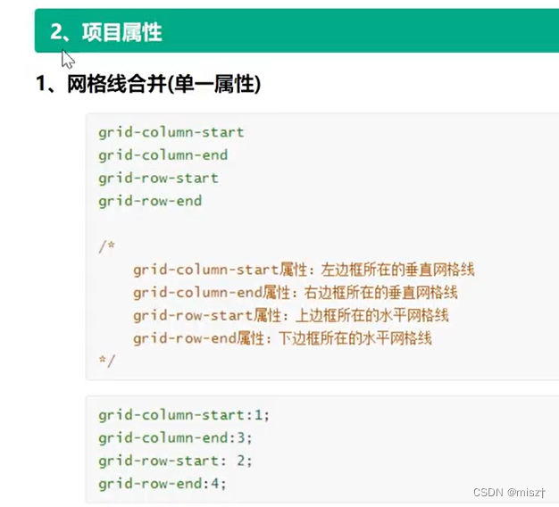
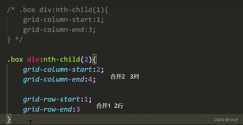
合并列等价于:grid-column: 2/4;
合并行等价于:grid-row: 1/3;
网格布局案例1
<!DOCTYPE html>
<html lang="en">
<head>
    <meta charset="UTF-8">
    <meta http-equiv="X-UA-Compatible" content="IE=edge">
    <meta name="viewport" content="width=device-width, initial-scale=1.0">
    <title>Document</title>
    <style>
        *{
            margin: 0;
            padding: 0;
        }
        .box{
            width: 1200px;
            height: 600px;
            display: grid;
            border: 1px solid gray;
            box-sizing: border-box;
            margin: 20px auto;
            grid-template-rows: repeat(3,200px);
            grid-template-columns: repeat(6,200px);
            grid-template-areas: 'a a a a b b'
                                 'a a a a c c'
                                 'd d e f c c';
        }
        .box img{
            width: 100%;
            height: 100%;
        }
        .box img:nth-child(1){
            grid-area: a;
        }
        .box img:nth-child(2){
            grid-area: d;
        }
        .box img:nth-child(5){
            grid-area: b;
        }
        .box img:nth-child(6){
            grid-area: c;
        }

    </style>
</head>
<body>
    <div class="box">
       <img src="../img/网格布局01.jpg" alt="">
       <img src="../img/网格布局02.jpg" alt="">
       <img src="../img/网格布局03.jpg" alt="">
       <img src="../img/网格布局04.jpg" alt="">
       <img src="../img/网格布局05.jpg" alt="">
       <img src="../img/网格布局06.jpg" alt="">
    </div>
</body>
</html>
网格布局案例2
<!DOCTYPE html>
<html lang="en">
<head>
    <meta charset="UTF-8">
    <meta http-equiv="X-UA-Compatible" content="IE=edge">
    <meta name="viewport" content="width=device-width, initial-scale=1.0">
    <title>Document</title>
    <style>
        *{
            margin: 0;
            padding: 0;
        }
        .box{
            width: 1200px;
            height: 600px;
            display: grid;
            border: 1px solid gray;
            box-sizing: border-box;
            margin: 20px auto;
            grid-template-rows: repeat(3,200px);
            grid-template-columns: repeat(6,200px);
            /* grid-template-areas: 'a a a a b b'
                                 'a a a a c c'
                                 'd d e f c c'; */
        }
        .box img{
            width: 100%;
            height: 100%;
        }
        .box img:nth-child(1){
            /* grid-area: a; */
            grid-column: 1/5;
            grid-row: 1/3;
        }
        .box img:nth-child(2){
            /* grid-area: d; */
            grid-column: 1/3;
            grid-row: 3/4;
        }
        .box img:nth-child(3){
            grid-column: 3/4;
            grid-row: 3/4;
        }
        .box img:nth-child(4){
            grid-column: 4/5;
            grid-row: 3/4;
        }
        .box img:nth-child(5){
            /* grid-area: b; */
            grid-column: 5/7;
            grid-row: 1/2;
        }
        .box img:nth-child(6){
            /* grid-area: c; */
            grid-column: 5/7;
            grid-row: 2/4;
        }

    </style>
</head>
<body>
    <div class="box">
       <img src="../img/网格布局01.jpg" alt="">
       <img src="../img/网格布局02.jpg" alt="">
       <img src="../img/网格布局03.jpg" alt="">
       <img src="../img/网格布局04.jpg" alt="">
       <img src="../img/网格布局05.jpg" alt="">
       <img src="../img/网格布局06.jpg" alt="">
    </div>
</body>
</html>


 4856
4856


 被折叠的 条评论
为什么被折叠?
被折叠的 条评论
为什么被折叠?
 到【灌水乐园】发言


