


一、定位
1、定位的基本介绍
1.1、网页常见布局方式
标准流:
块级元素独占一行——垂直布局;
行内元素/行内块元素一行显示多个——水平布局;
浮动:可以让原本垂直布局的块级元素变成水平布局;
定位:可以让元素自由的摆放在网页的任意位置;一般用于盒子之间的层叠情况;
1.2、定位的常见应用场景
* 可以解决盒子与盒子之间的层叠问题(定位之后的元素层级最高,可以层叠在其他盒子上面);
* 可以让盒子始终固定在屏幕中的某个位置;
2、定位的基本使用
2.1、定位初体验
需求:页面中的两个盒子,要求完成图片效果;
针对盒子与盒子之间的层叠问题,推荐使用定位完成;

    .blue{
        /* 1.设置定位方式 */
        position: absolute;

        /* 2.设置偏移值 */
        top: 150px;
        left: 150px;

        background-color: blue;
    }
2.2、使用定位的步骤
设置定位方式:属性名:position
常见属性值:

设置偏移值:
偏移值设置分为两个方向,水平和垂直方向各选一个即可;
选取的原则一般是就近原则(离哪边近用哪个)

3、静态定位 position:static;
静态定位是默认值,就是之前认识的标准流;
position:static;
注意点:静态定位就是之前的标准流,不能通过方位属性进行移动;
之后说的定位不包括静态定位,一般特指后几种:相对、绝对、固定;
4、相对定位 position:relative;
自恋型定位,相对于自己之前的位置进行移动;
position:relative;
特点:需要配合方位属性进行移动;相对于自己原来位置进行移动;在页面中占位置(没有脱标);
应用场景:配合绝对定位组cp(子绝父相);用于小范围的移动;
5、绝对定位
拼爹型定位,相对于非静态定位的父元素进行定位移动;
position:absolute;
特点:需要配合方位属性实现移动;默认相对于浏览器可视区域进行移动;在页面中不占位置(已经脱标);
应用场景:配合相对定位组cp(子绝父相);
绝对定位相对于谁进行偏移?
祖先元素中没有定位——默认相对于浏览器进行移动;
祖先元素有定位——相对于 最近的 有定位 的祖先元素进行移动;
6、子绝父相
场景:让子元素相对于父元素进行自由移动;
含义:子元素——绝对定位,父元素——相对定位;
好处:父元素是相对定位,则对网页布局影响最小;

    .father{
        width: 600px;
        height: 600px;
        background-color: pink;

        position: relative;
    }

    .son{
        width: 400px;
        height: 400px;
        background-color: blue;

        position: absolute;
        right:100px;
        bottom: 100px;
    }
7、子绝父绝
场景:在使用子绝父相的时候,发现父元素已经有绝对定位了,此时直接子绝即可;
原因:父元素已经有定位已经满足要求,如果盲目修改父元素定位方式,可能会影响之前写好的布局;

   .father{
        width: 600px;
        height: 600px;
        background-color: pink;

        position: relative;
    }

    .son{
        width: 400px;
        height: 400px;
        background-color: blue;

        position: absolute;
        right:0px;
        bottom: 0px;
    }
    .sun{
        width: 200px;
        height: 200px;
        background-color: yellow;

        position: absolute;
        right:0px;

}子绝父相水平居中案例:
需求:使用子绝父相,让子盒子在父盒子中水平居中(父子元素任意宽度下都能实现)
解决方案:1> 子绝父相;
2> 先让子盒子往右移动父盒子的一半;left: 50%;
3> 再让子盒子往左移动自己的一半;
普通做法:margin-left:-100px; 父盒子宽度的一半;
缺点:子盒子宽度变化后需要重新改代码;
优化:transform:translateX(-50%);
优点:表示沿着X轴负方向(往左)始终移动了自己宽度的一半,子盒子宽度变化不需要更改代码;

<style>
    *{
        margin: 0;
        padding: 0;
    }
    .father{
        position: relative;

        width: 600px;
        height: 400px;
        background-color: pink;
    }
    .son{
        position: absolute;
        left: 50%;
        /* margin-left: -100px; */
        transform:translateX(-50%);
        width: 300px;
        height: 100px;
        background-color: blue;
}子绝父相水平垂直都居中
需求:使用子绝父相,让子盒子在父盒子中水平垂直都居中(父子元素任意宽高下都能实现)
操作:1> 子绝父相;
2> left:50%;
3> top:50%;
4> transform:translate(-50%,-50%);
    .father{
        position: relative;

        width: 600px;
        height: 400px;
        background-color: pink;
    }
    .son{
        position: absolute;
        left: 50%;
        top: 50%;

        /* margin-left: -100px; */
        transform:translate(-50%,-50%);

        width: 300px;
        height: 100px;
        background-color: blue;
    }
8、固定定位
死心眼型定位,相对于浏览器进行定位移动;
position:fixed;
特点:需要配合方位属性进行移动;相对于浏览器可视区域进行移动;在页面中不占位置——已经脱标;
应用场景:让盒子固定在屏幕中某个位置;
9、案例:

<style>
    *{
        margin: 0;
        padding: 0;
    }

    body {
      background-color: #f4f5f9;
    }

    .box {
      /* 1、宽高 */
      width: 228px;
      height: 270px;
      /* 2、背景颜色 */
      background-color: #fff;
      margin: 100px auto;
      /* 3、设置相对定位 */
      position: relative;
    }

    .box .product {
      /* width: 228px; */
      width: 100%;
    }

    .box h3 {
      height: 52px;
      padding-left: 24px;
      padding-right: 20px;
      margin-top: 25px;
      font-size: 14px;
      font-weight: 400;
    }

    .box p{
        margin-left: 24px;
        font-size: 12px;
        color: #929292;
    }

    .box p span{
        color: #f77321;
    }

    .box .hot{
        /* 设置绝对定位 */
        position: absolute;
        right:-4px;
        top:4px;
    }

</style>
<body>
    <div class="box">
        <img src="../images/hot.png" alt="" class="hot">
        <img src="../images/product.png" alt="" class="product">
        <h3>Android网络图片加载框架详解</h3>
        <p><span>高级</span> • 1125人在学习</p>
    </div>

</body>
<style>
    *{
        margin: 0;
        padding: 0;
    }
    .nav{
        height: 40px;
        border-bottom: 1px solid #ccc;
    }
    ul {
        list-style: none;
        width: 1200px;
        margin: 0 auto;
    }
    ul li{
        float: left;
        width: 20%;
        height: 40px;
        border-right: 1px solid #ccc;
        box-sizing: border-box;
        text-align: center;
        line-height: 40px;
    }
    ul .last {
     border-right: none;
    }

    ul li a{
        display: block;
        height: 40px;
        text-decoration: none;
        color: black;
        font-size: 14px;
    }
    .nav .app{
        position: relative;
    }
    .nav .app .code{
        position: absolute;
        left:50%;
        transform: translateX(-50%);
        top: 40px;
        border: 1px solid #ccc;
    }


</style>
<body>
   <!-- 导航 -->
  <div class="nav">
    <ul>
      <li><a href="#">我要投资</a></li>
      <li><a href="#">平台介绍</a></li>
      <li><a href="#">新手专区</a></li>
      <li><a href="#" class="app">手机微金所
          <img src="../images/code.jpg" class="code">
      </a></li>
      <li class="last"><a href="#">个人中心</a></li>
    </ul>
  </div>

</body>
底部半透明遮罩

<style>
    *{
        margin:0;
        padding:0;
    }
    .box{
        width: 1226px;
        height: 600px;
        /* background-color: pink; */
        margin: 0 auto;
        background: url(../images/bg.jpg);
        position: relative;
    }
    .mask{
        /* width: 1226px; */
        width: 100%;
        height: 150px;
        background-color: rgba(0, 0, 0, 0.5);
        position: absolute;
        bottom: 0px;
    }
</style>
<body>
    <div class="box">
        <div class="mask"></div>
    </div>
</body>
10、元素层级问题
不同布局方式元素的层级关系:标准流 < 浮动 < 定位
不同定位之间的层级关系:相对、绝对、固定默认层级相同,此时HTML中写在下面的元素层级更高,会覆盖上面的元素;
更改定位元素的层级:
场景:改变定位元素的层级;(非定位元素无效果)
属性名:z-index
属性值:数字,数字越大,层级越高
二、装饰
1、垂直对齐方式
1.1基线
基线:浏览器文字类型元素排版中存在用于对齐的基线(baseline)

1.2、文字对齐问题
场景:解决行内/行内块元素垂直对齐问题
问题:当图片和文字在一行中显示时,其实底部是对不齐的,而是和文字基线对齐。

1.3、垂直对齐方式 vertical-align
属性名:vertical-align
属性值:

   img{
       /* 基线对齐 */
       vertical-align: baseline;

       /* 顶部对齐 */
       vertical-align: top;

       /* 中部对齐 */
       vertical-align: middle;

       /* 底部对齐 */
       vertical-align: bottom;
   }
1.4、vertical-align可以解决的问题
文本框与表单按钮无法对齐
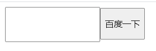
<style>
input{
height: 50px;
box-sizing: border-box;
vertical-align: bottom;
}
</style>
<body>
<input type="text"><input type="button" value="百度一下">
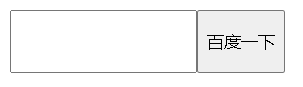
</body>input标签和img标签无法对齐的问题


<style>
   img {
       /* height: 50px; */
       box-sizing: border-box;
       vertical-align: bottom;
   }

</style>
<body>
    <!-- <input type="text"><input type="button" value="百度一下"> -->
    <img src="../images/1.jpg"><input type="text">
div中的文本框,文本框无法贴顶问题
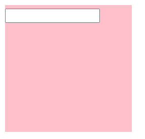
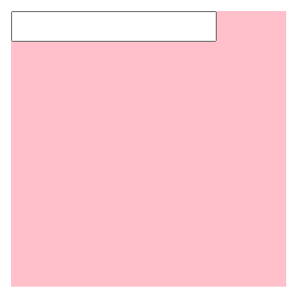
<style>

    .father{
        width: 200px;
        height: 200px;
        background-color: pink;
    }
    input{
        vertical-align: top;
    }

</style>
<body>
    <div class="father">
        <input type="text">
    </div>
</body>
div不设高度由img标签撑开,此时img标签会存在额外间隙问题


<style>
    .father{
        width: 400px;
        /* height: 200px; */
        background-color: pink;

    }
    img{
        /* 方法一:垂直对齐方式 */
         /* vertical-align: bottom; */

         /* 方法二:将图片转换成块级元素 */
         display: block;
    }

</style>
<body>
    <div class="father">
        <img src="../images/1.jpg" alt="">
    </div>
</body>
使用line-height属性让img标签垂直居中问题


<style>
    .father{
        width: 400px;
        height: 400px;
        background-color: pink;
        line-height: 400px;
    }
    img{
         vertical-align: middle;
    }

</style>
<body>
    <div class="father">
        <img src="../images/1.jpg" alt="">
    </div>
</body>
注意点:
浮动之后,不推荐使用行内块元素让div一行中显示,因为可能会出现垂直对齐问题;
推荐优先使用浮动完成效果更加稳定;
2、光标类型 cursor
场景:设置鼠标光标在元素上时显示的样式。
属性名:cursor
常见属性值:

3、边框圆角 border-radius
场景:让盒子四个角变得圆润,增加页面细节,提升用户体验;
属性名:border-radius
常见取值:数字 + px / 百分比
原理:

赋值规则:从左上角开始赋值,然后顺时针赋值,没有赋值的看对角;
.box{
width: 200px;
height:200px;
background-color: pink;
/* border-radius: 30px; */
border-radius: 30px 80px ;
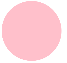
}边框圆角应用:
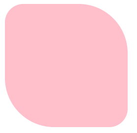
画一个正圆:盒子要求正方形
    .box{
        width: 200px;
        height:200px;
        background-color: pink;
        /* border-radius: 30px; */
        border-radius: 50% ;
}胶囊按钮:盒子要求是长方形,border-radius为盒子高度的一半;

    .box{
        width: 400px;
        height:200px;
        background-color: pink;
        /* border-radius: 30px; */
        border-radius: 100px ;
    }
4、溢出部分显示效果 overflow
溢出部分:盒子内容部分所超出盒子范围的区域
场景:控制内容溢出部分的显示效果,如:显示、隐藏、滚动条.....
属性名:overflow
常见属性值:


    .box{
        width: 400px;
        height:200px;
        background-color: pink;
        overflow: auto;
    }
5、元素本身隐藏
场景:让某元素本身在屏幕中不可见,如鼠标hover之后元素隐藏;
常见属性:visibility:hidden / display:none;
区别:
visibility:hidden 隐藏元素本身,并且在网页中 占位置;
display:none 隐藏元素本身,在网页中 不占位置;
注意点:开发中经常会通过display 属性完成元素的显示隐藏切换;
display:none ——隐藏;/ display:block;——显示;
案例:默认son元素隐藏,当鼠标移入father后让son元素显示
<style>
    .father{
        width: 200px;
        height:200px;
        background-color: pink;

    }
    .son{
        width: 100px;
        height: 100px;
        background-color: blue;
        display: none;

    }
    .father:hover .son{
        display: block;
    }

</style>
<body>
    <div class="father">
    <div class="son"></div>

    </div>
</body>
导航二维码显示隐藏切换

关键代码如下,其余代码同上:
    .nav .app .code{
        position: absolute;
        left:50%;
        transform: translateX(-50%);
        top: 40px;
        border: 1px solid #ccc;
        display: none;
    }
    .nav .app:hover .code{
        display: block;
    }
6、元素整体透明度
场景:让某元素整体(包括内容)一起变透明;
属性名:opacity
属性值:0~1之间的数字;1表示完全不透明;0表示完全透明;
注意点:opacity 会让元素整体透明,包括里面的内容,如:文字,子元素等....


    .box{
        width: 400px;
        height:400px;
        background-color: pink;
        opacity:0.5;
    }
7、边框合并
场景:让相邻表格边框进行合并,得到细线边框效果
border-collapse:collapse;
效果如下:


   table{
       width: 250px;
       height: 150px;
      border: 1px solid #000;
       border-collapse: collapse;
   }
   th,td{
       border: 1px solid #000;
       text-align: center;
   }
8、用CSS画三角形
实现原理:利用盒子边框完成;
实现步骤:设置一个盒子,设置四周不同颜色的边框;将盒子宽高设置为0,仅保留边框。
通过调整不同边框的宽度,可以调整三角形的形态;
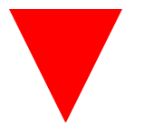
.box{
    width: 200px;
    height: 200px;
    background-color: rgba(0, 0, 0,0);
    border-top:100px solid red;
    border-right:100px solid blue;
    border-bottom:100px solid orange;
    border-left:100px solid yellow;
    width: 0px;
    height: 0px;
    border-right:50px solid rgba(0, 0, 0,0);
    border-bottom:100px solid rgba(0, 0, 0,0);
    border-left:50px solid rgba(0, 0, 0,0);
}
三、选择器拓展
1、链接伪类选择器
常用于选中超链接的不同状态

注意点:
如果需要同时实现以上四种伪类状态效果,需要按照LVHA顺序书写;
:hover伪类选择器使用更为频繁,常用于选择各类元素的悬停状态;
2、焦点伪类选择器
场景:用于选中元素获取焦点时的状态,常用于表单控件;
input:focus{
background-color:sky blue;
}
效果:表单控件获取焦点时默认会显示外部轮廓线;
3、属性选择器
通过元素上的HTML属性来选择元素,常用于选择input 标签

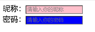
<style>
    input[type="text"]{
        background-color: pink;
    }
    input[type="password"]{
        background-color: blue;
    }


</style>
<body>
    昵称:<input type="text" placeholder="请输入你的昵称"><br>
    密码:<input type="password" placeholder="请输入你的密码"><br>
</body>


 302
302


 被折叠的 条评论
为什么被折叠?
被折叠的 条评论
为什么被折叠?
 到【灌水乐园】发言


