


android material design风格组件TextInputLayout,MaterialButton,SwitchMaterial,MaterialRadio
相关文章:
- MaterialButton,MaterialButtonToggleGroup,Chip,ChipGroup(一) [material环境配置,必看!]
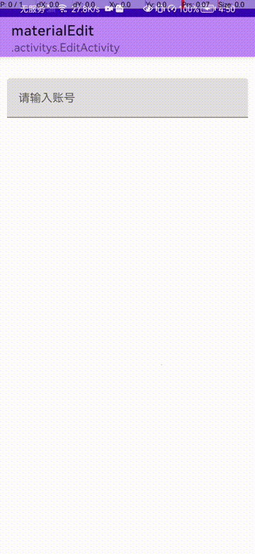
今日完成效果:
| 效果一 | 效果二 | 效果三 |
|---|---|---|
 |  |  |
基本使用
<com.google.android.material.textfield.TextInputLayout
     android:layout_width="match_parent"
     android:layout_height="wrap_content"
     android:layout_marginTop="20dp"
     android:hint="请输入账号">

     <com.google.android.material.textfield.TextInputEditText
         android:layout_width="match_parent"
         android:layout_height="wrap_content" />
 </com.google.android.material.textfield.TextInputLayout>
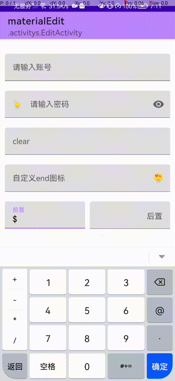
app:endIconMode 模式
<com.google.android.material.textfield.TextInputLayout
    android:layout_width="match_parent"
     android:layout_height="wrap_content"
     android:layout_marginTop="20dp"
     android:hint="请输入密码"
     app:endIconMode="password_toggle"

     app:startIconDrawable="@drawable/ic_emoji_02"
     app:startIconTint="@color/white"
     app:startIconTintMode="multiply"
	>
 <!-- app:endIconDrawable="@drawable/ic_emoji_03"
    app:endIconTint="@color/white"
    app:endIconTintMode="multiply" -->

     <com.google.android.material.textfield.TextInputEditText
         android:layout_width="match_parent"
         android:layout_height="wrap_content"
         android:inputType="numberPassword" />
 </com.google.android.material.textfield.TextInputLayout>
- app:endIconMode end模式
- startIcon 图标
- startIconTint start色调
- endIcon图标
- endIconTint end色调
效果图:
| password | clear | custom(自定义) |
|---|---|---|
| TextInputLayout#endIconMode="password_toggle" TextInputEditText#inputType=“numberPassword” | TextInputEditText#endIconMode=“clear_text” | TextInputEditText#endIconMode=“custom” |
 |  |  |
前置与后置
<com.google.android.material.textfield.TextInputLayout
     android:layout_width="0dp"
     android:layout_height="wrap_content"
     android:layout_marginTop="20dp"
     android:layout_marginRight="5dp"
     android:layout_weight="1"


     app:prefixText="$"

	 app:suffixText="$"
     app:prefixTextColor="@color/black">

     <!--
         android:inputType="numberSigned" 数字
     -->
     <com.google.android.material.textfield.TextInputEditText
         android:layout_width="match_parent"
         android:layout_height="wrap_content"
         android:inputType="numberSigned" />
 </com.google.android.material.textfield.TextInputLayout>
- app:prefixText 前置图标
- app:prefixTextColor 前置图标颜色
- app:suffixText 后置图标
- app:suffixTextColor 后置图标颜色
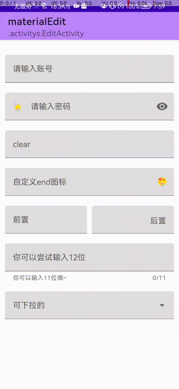
其他常用操作
<com.google.android.material.textfield.TextInputLayout
    android:id="@+id/errorTextInput"
    android:layout_width="match_parent"
    android:layout_height="wrap_content"
    android:layout_marginTop="20dp"
    android:hint="你可以尝试输入12位"
    app:boxStrokeErrorColor="@color/red"
    app:counterEnabled="true"
    app:counterMaxLength="11"
    app:errorEnabled="true"
    app:helperText="你可以输入11位哦~"
    app:helperTextEnabled="true"
    app:placeholderText="更加专业的hint">

    <com.google.android.material.textfield.TextInputEditText
        android:id="@+id/errorEditText"
        android:layout_width="match_parent"
        android:layout_height="wrap_content" />
</com.google.android.material.textfield.TextInputLayout>
- boxStrokeErrorColor 输入错误颜色 [默认红色]
- counterEnabled 计数器是否启动
- counterMaxLength 计数器最大值
- errorEnabled 错误检测启动
- placeholderText 占位符
- helperTextEnabled 帮助文字是否启动
动态代码:
 binding.errorEditText.doOnTextChanged { text, start, count, after ->
            if (text?.length!! >= 11) {
                binding.errorTextInput.error = "动态代码设置.错误信息"
                binding.errorEditText.error = "只能输入11位"
            } else {
                binding.errorTextInput.error = null
            }
            binding.errorTextInput.errorIconDrawable = null
        }
- doOnTextChanged() 监听变化

可下拉选择的
<com.google.android.material.textfield.TextInputLayout
            style="@style/Widget.MaterialComponents.TextInputLayout.OutlinedBox.Dense.ExposedDropdownMenu"
     android:layout_width="match_parent"
     android:layout_height="wrap_content"
     android:layout_marginTop="20dp"
     android:hint="可下拉的">

     <AutoCompleteTextView
         android:id="@+id/autoText"
         android:layout_width="match_parent"
         android:layout_height="wrap_content"
         android:inputType="none"
         tools:ignore="LabelFor" />
 </com.google.android.material.textfield.TextInputLayout>
动态设置数据:
val items =
            listOf(
                "Material",
                "Design",
                "Components",
                "Android",
                "kotlin",
                "java",
                "ios",
                "c",
                "c++",
                "js",
                "python"
            )
        val adapter = ArrayAdapter(this, R.layout.list_item, items)
        binding.autoText.setAdapter(adapter)
list_item.xml:
<TextView
    xmlns:android="http://schemas.android.com/apk/res/android"
    android:layout_width="match_parent"
    android:layout_height="wrap_content"
    android:padding="16dp"
    android:ellipsize="end"
    android:maxLines="1"
    android:textAppearance="?attr/textAppearanceSubtitle1"
    />
其他样式:
- Widget.MaterialComponents.TextInputLayout.OutlinedBox.Dense.ExposedDropdownMenu 弹出输入框
- Widget.MaterialComponents.TextInputLayout.OutlinedBox.ExposedDropdownMenu 不弹出输入框
- Widget.MaterialComponents.TextInputLayout.FilledBox.ExposedDropdownMenu 不弹出输入框2
| 弹出输入框 | 不弹出输入框 | 不弹出输入框2 |
|---|---|---|
 |  |  |
TextInputLayout配合 AutoCompleteTextView使用
tips: AutoCompleteTextView 继承自EditText
<com.google.android.material.textfield.TextInputLayout
            style="@style/Widget.MaterialComponents.TextInputLayout.FilledBox.ExposedDropdownMenu"
            android:layout_width="match_parent"
            android:layout_height="wrap_content"
            android:layout_marginTop="20dp"
            android:hint="可下拉的">
            <!--
                 android:popupBackground 弹出背景【不起作用,需要动态代码!】
            -->
            <AutoCompleteTextView
                android:id="@+id/autoText"
                android:layout_width="match_parent"
                android:layout_height="wrap_content"
                android:completionHint="这是一条提示语。。。"
                android:dropDownWidth="100dp"
                android:dropDownHeight="200dp"
                android:dropDownHorizontalOffset="50dp"
                android:dropDownVerticalOffset="50dp"
                android:dropDownSelector="@drawable/ic_emoji_09"
                android:inputType="text"
                android:popupBackground="@drawable/ic_emoji_05"
                tools:ignore="LabelFor" />
        </com.google.android.material.textfield.TextInputLayout>
动态代码:
val items =
            listOf(
                "Material",
                "Design",
                "Components",
                "Android",
                "kotlin",
                "java",
                "ios",
                "c",
                "c++",
                "js",
                "python"
            )
        val adapter = ArrayAdapter(this, R.layout.list_item, items)
        binding.autoText.setAdapter(adapter)

        // 设置AutoCompleteTextView.pop背景
        binding.autoText.setDropDownBackgroundResource(R.drawable.ic_emoji_06)
-
android:dropDownHeight 设置下拉高度
-
android:completionHint 提示语
-
android:dropDownWidth 弹出pop的宽
-
android:dropDownHeight 弹出pop的高
-
android:inputType 允许输入类型
-
android:dropDownHorizontalOffset 距离水平的位置
-
android:dropDownVerticalOffset 距离垂直侧的位置
-
android:dropDownSelector 选中时候的背景
效果图:
注意:这里设置背景一定要谨慎使用:
android:dropDownSelector="@drawable/ic_emoji_09" // 回收时候展示的图片

android:popupBackground="@drawable/ic_emoji_05" // 不起作用需要动态设置代码
binding.autoText.setDropDownBackgroundResource(R.drawable.ic_emoji_06) // 动态代码替换
bug分析:
当第一次进入的时候,如果弹出的软键盘和pop重叠的时候,会显示不了图片,可能显示图片了只是刷新掉了,众所周知,软键盘和弹出的pop都是一个window,我猜测可能是这里是配没有适配全,来看两张图就懂了!
| bug复现 | 理想状态 |
|---|---|
 |  |
可以看出,只要是人写的代码,或多或少存在一定的毛病(偷笑)
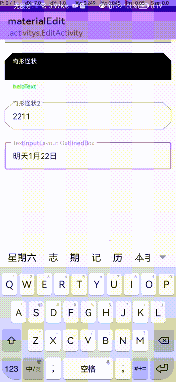
Ohter
还有一些其他主题和风格一起看看吧!
<com.google.android.material.textfield.TextInputLayout
     style="@style/Widget.MaterialComponents.TextInputLayout.OutlinedBox.Dense"
     android:layout_width="match_parent"
     android:layout_height="wrap_content"
     android:layout_marginTop="20dp"

     app:shapeAppearance="@style/CutTheme2"
     android:hint="TextInputLayout.OutlinedBox">

     <com.google.android.material.textfield.TextInputEditText
         android:layout_width="match_parent"
         android:layout_height="wrap_content" />
 </com.google.android.material.textfield.TextInputLayout>
@style/CutTheme2:
<style name="CutTheme2">
    <item name="cornerFamily">cut</item>
    <item name="cornerSize">16dp</item>
</style>
这个上一章说过就不重复提了
materialRadioButton
MaterialRadioButton貌似没有什么变化,目前还没有看出来… 拿常用的方法看看就可以了!
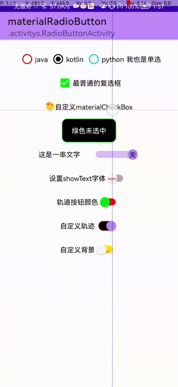
<RadioGroup
     android:id="@+id/radioGroup"
     android:layout_width="wrap_content"
     android:layout_height="wrap_content"
     android:checkedButton="@id/javaRadioButton"
     android:orientation="horizontal">

     <!--
         android:buttonTint 设置 色调颜色
         tips: 单选按钮的颜色默认为 ?attr/colorOnSurface (未选中)和 ?attr/colorSecondary(选中)
     -->
     <com.google.android.material.radiobutton.MaterialRadioButton
         android:id="@+id/javaRadioButton"
         android:layout_width="wrap_content"
         android:layout_height="wrap_content"
         android:layout_marginLeft="5dp"
         android:layout_marginTop="5dp"
         android:buttonTint="@color/red"
         android:text="java" />

     <com.google.android.material.radiobutton.MaterialRadioButton
         android:layout_width="wrap_content"
         android:layout_height="wrap_content"
         android:layout_marginLeft="5dp"
         android:layout_marginTop="5dp"
         android:buttonTint="@color/black"
         android:text="kotlin" />

     <com.google.android.material.radiobutton.MaterialRadioButton
         android:layout_width="wrap_content"
         android:layout_height="wrap_content"
         android:layout_marginLeft="5dp"
         android:layout_marginTop="5dp"
         android:buttonTint="@color/teal_200"
         android:text="python" />

     <com.google.android.material.radiobutton.MaterialRadioButton
         android:layout_width="wrap_content"
         android:layout_height="wrap_content"
         android:layout_marginLeft="5dp"
         android:layout_marginTop="5dp"
         android:button="@null"
         android:buttonTint="@color/teal_200"
         android:text="我也是单选" />
 </RadioGroup>
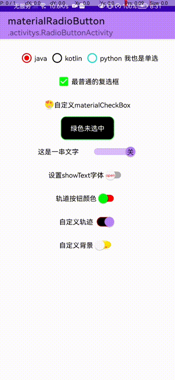
MaterialCheckBox
materialCheckBox和CheckBox好像也是相差无几,那就介绍几种自定义的方法吧
自定义按钮:
<com.google.android.material.checkbox.MaterialCheckBox
        android:id="@+id/materialCheckoutBox2"
        android:layout_width="wrap_content"
        android:layout_height="wrap_content"
        android:button="@drawable/check_box_material_select"
        android:text="自定义materialCheckBox"
        app:useMaterialThemeColors="false" />
- button 设置按钮状态
- app:useMaterialThemeColors=“false” 自定义颜色
自定义选择器:
@drawable/check_box_material_select:
<?xml version="1.0" encoding="utf-8"?>
<selector xmlns:android="http://schemas.android.com/apk/res/android">

    <item android:state_checked="true" android:drawable="@drawable/ic_emoji_04"/>
    <item android:state_checked="false" android:drawable="@drawable/ic_emoji_03"/>
</selector>
效果图:
自定义background
<com.google.android.material.checkbox.MaterialCheckBox
        android:id="@+id/materialCheckoutBox"
        android:layout_width="wrap_content"
        android:layout_height="wrap_content"
        android:background="@drawable/switch_material_select"
        android:button="@null"
        android:paddingLeft="20dp"
        android:paddingRight="20dp"
        android:text="绿色未选中"
        android:textColor="@color/white" />
- android:button="@null" 隐藏按钮
自定义选中效果:
@drawable/switch_material_select:
<selector xmlns:android="http://schemas.android.com/apk/res/android">

    <item android:state_checked="true" android:drawable="@drawable/switch_material_open"/>
    <item android:state_checked="false" android:drawable="@drawable/switch_material_clone"/>
</selector>
打开时,switch_material_open.xml:
<?xml version="1.0" encoding="utf-8"?>
<shape xmlns:android="http://schemas.android.com/apk/res/android">
    <corners android:radius="@dimen/dp_10" />
    <stroke
        android:width="1dp"
        android:color="@color/red" />
    <solid android:color="@color/black"/>
</shape>
关闭时,switch_material_clone.xml:
<?xml version="1.0" encoding="utf-8"?>
<shape xmlns:android="http://schemas.android.com/apk/res/android">
    <corners android:radius="@dimen/dp_10" />
    <stroke
        android:width="1dp"
        android:color="@color/green" />
    <solid android:color="@color/black" />
</shape>
效果:
SwitchMaterial
switchMaterial比较简单,直接看所有属性了!
<com.google.android.material.switchmaterial.SwitchMaterial
        android:id="@+id/materialSwitch"
        android:layout_width="wrap_content"
        android:layout_height="wrap_content"
        android:checked="true"
        android:text="这是一串文字"
        android:textOff="开"
        android:textOn="关"
        app:showText="true"

        app:thumbTint="@color/green"
        app:trackTint="@color/red"

        app:track="@drawable/switch_material_select"
        app:trackTintMode="multiply"

        app:switchMinWidth="100dp"
        app:switchPadding="20dp" />
- android:textOff [checked=false help文字]
- android:textOn [checked=true help文字]
- app:showText [显示help文字]
- app:switchMinWidth [文字宽度]
- app:switchPadding [文字和switch的距离]
- app:switchTextAppearance 自定义样式
- android:typeface 设置字体
- app:thumbTint 按钮颜色
- app:trackTint 轨道颜色[可配合app:trackTintMode]
- app:track 自定义颜色/背景
来看看效果吧:
相关文章:
- MaterialButton,MaterialButtonToggleGroup,Chip,ChipGroup(一) [material环境配置,必看!]
原创不易,您的点赞就是对我最大的支持!


 1万+
1万+

 被折叠的 条评论
为什么被折叠?
被折叠的 条评论
为什么被折叠?
 到【灌水乐园】发言


