


import warnings
warnings.filterwarnings("ignore")
# data
import pandas as pd
import numpy as np
import country_converter as coco
# visualization
import matplotlib as mpl
import matplotlib.pyplot as plt
import seaborn as sns
import missingno as msno
import plotly.express as px
import plotly.figure_factory as ff
import plotly.graph_objects as go
from wordcloud import WordCloud
# nltk
import nltk
# styling
%matplotlib inline
sns.set_theme(style="dark")
mpl.rcParams['axes.unicode_minus'] = False
pd.set_option('display.max_columns',None)
plt.style.use('seaborn-dark-palette')
plt.style.use('dark_background')读取数据,修改表名:
path = f'../Datasciencexxx.csv'
# read dataframe (drop 3 columns)
df = pd.read_csv(path)
df.drop(df[['salary','salary_currency','Unnamed: 0']],axis=1, inplace=True)
df.shape
#(607, 9)
df.tail()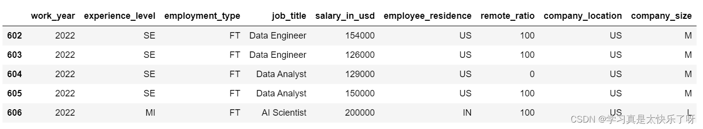
缺失值查看:
msno.matrix(df)
plt.title('Distribution of Missing Values',fontsize=30, fontstyle= 'oblique')
df['experience_level'] = df['experience_level'].replace('EN','Entry-level/Junior')
df['experience_level'] = df['experience_level'].replace('MI','Mid-level/Intermediate')
df['experience_level'] = df['experience_level'].replace('SE','Senior-level/Expert')
df['experience_level'] = df['experience_level'].replace('EX','Executive-level/Director')

'''
There's 4 categorical values in column 'Experience Level', each are:

EN, which refers to Entry-level / Junior
MI, which refers to Mid-level / Intermediate
SE, which refers to Senior-level / Expert
EX, which refers to Executive-level / Director

'''
可视化:
ex_level = df['experience_level'].value_counts()
fig = px.treemap(ex_level,
                 path=[ex_level.index],
                 values=ex_level.values,
                 title = 'Experience Level',
                 color=ex_level.index,
                 color_discrete_sequence=px.colors.sequential.PuBuGn,
                 template='plotly_dark',
#                  textinfo = "label+value+percent parent+percent entry+percent root",
                 width=1000, height=500)

percents = np.round((100*ex_level.values / sum(ex_level.values)).tolist(),2)
fig.data[0].customdata = [35.09, 46.13, 4.28 , 14.5]
fig.data[0].texttemplate = '%{label}<br>%{value}<br>%{customdata}%'

fig.update_layout(
    font=dict(size=17,family="Franklin Gothic"))

fig.show()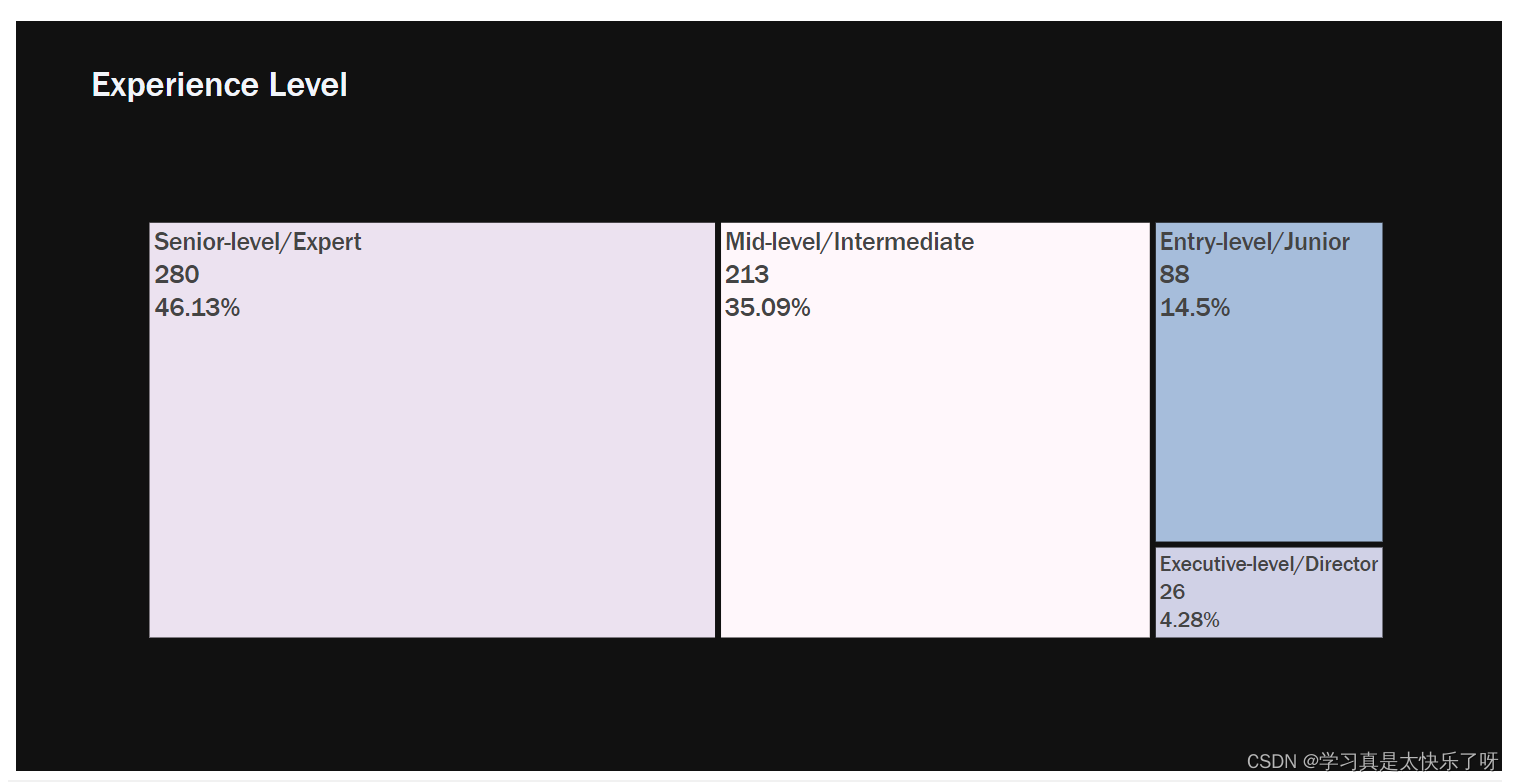
top10_job_title = df['job_title'].value_counts()[:10]
fig = px.bar(y=top10_job_title.values,
             x=top10_job_title.index,
             color = top10_job_title.index,
             color_discrete_sequence=px.colors.sequential.PuBuGn,
             text=top10_job_title.values,
             title= 'Top 10 Job Titles',
             template= 'plotly_dark')
fig.update_layout(
    xaxis_title="Job Titles",
    yaxis_title="count",
    font = dict(size=17,family="Franklin Gothic"))
fig.show() 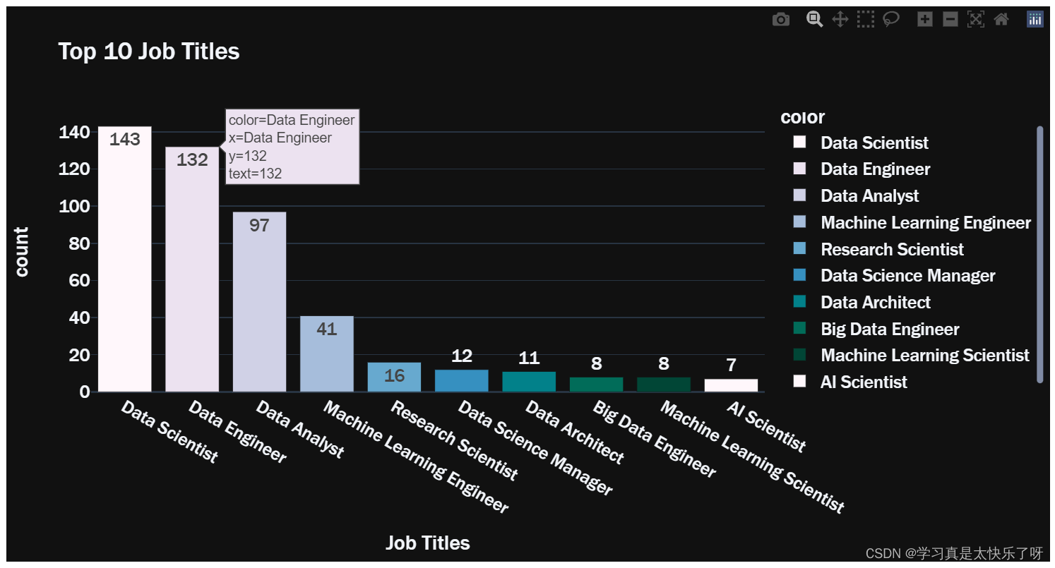
def Freq_df(cleanwordlist):
    Freq_dist_nltk = nltk.FreqDist(cleanwordlist)
    df_freq = pd.DataFrame.from_dict(Freq_dist_nltk, orient='index')
    df_freq.columns = ['Frequency']
    df_freq.index.name = 'Term'
    df_freq = df_freq.sort_values(by=['Frequency'],ascending=False)
    df_freq = df_freq.reset_index()
    return df_freq

def Word_Cloud(data, color_background, colormap, title):
    plt.figure(figsize = (20,15))
    wc = WordCloud(width=1200,
               height=600,
               max_words=50,
               colormap= colormap,
               max_font_size = 150,
               random_state=88,
               background_color=color_background).generate_from_frequencies(data)
    plt.imshow(wc, interpolation='bilinear')
    plt.title(title, fontsize=20)
    plt.axis('off')
    plt.show()

freq_df = Freq_df(df['job_title'].values.tolist())
data = dict(zip(freq_df['Term'].tolist(), freq_df['Frequency'].tolist()))
data = freq_df.set_index('Term').to_dict()['Frequency']

Word_Cloud(data ,'black','RdBu', 'WordCloud of job titles')
type_grouped = df['employment_type'].value_counts()
fig = px.bar(x = type_grouped.index, y = type_grouped.values,
       color = type_grouped.index,
       color_discrete_sequence=px.colors.sequential.BuPu,
       template = 'plotly_dark',
       text = type_grouped.values, title = 'Employment Type Distribution')
fig.update_layout(
    xaxis_title="Employment Type",
    yaxis_title="count",
    font = dict(size=17,family="Franklin Gothic"))
fig.update_traces(width=0.5)
fig.show()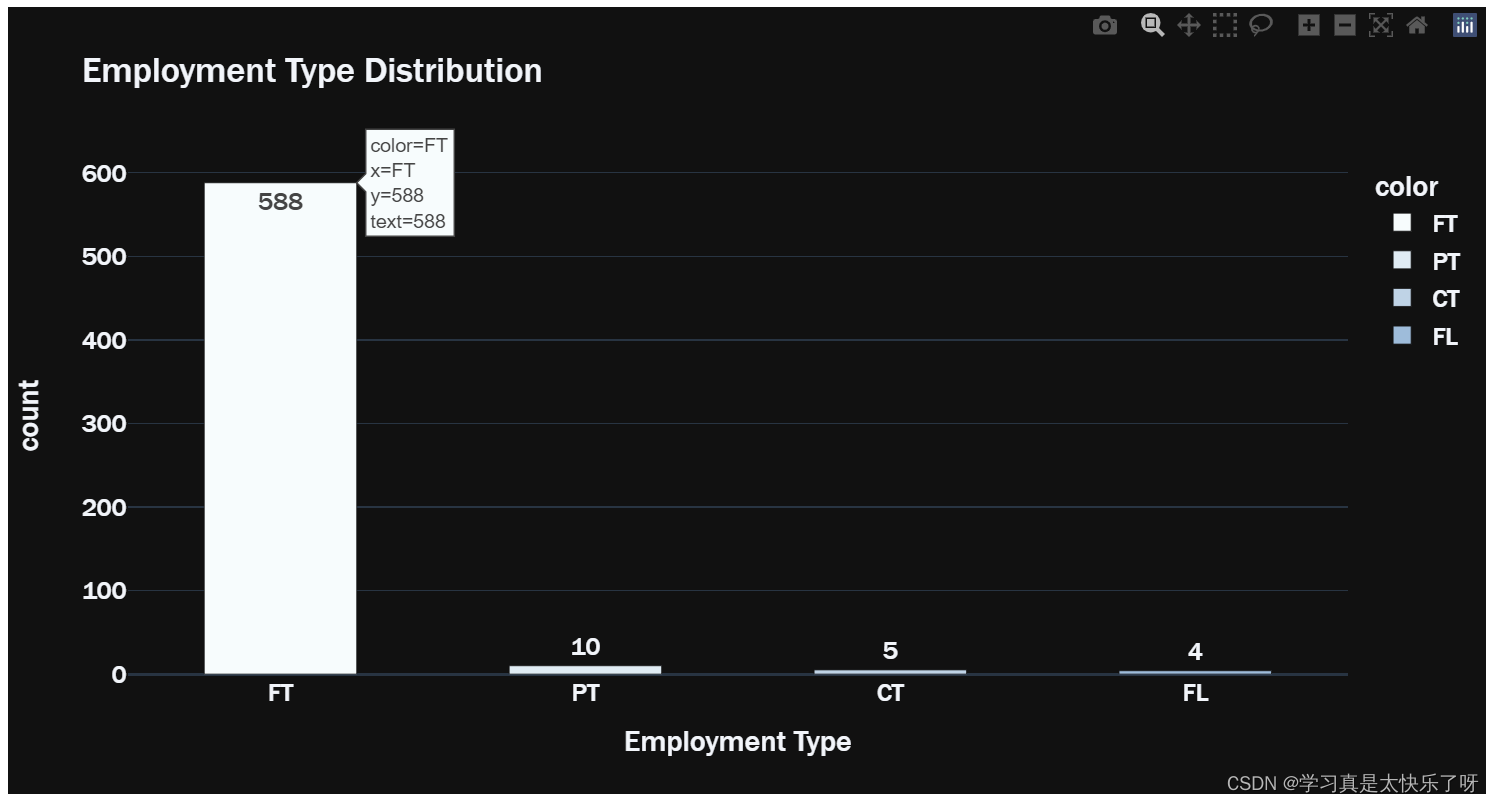
converted_country = coco.convert(names=df['employee_residence'], to="ISO3")
df['employee_residence'] = converted_country
residence = df['employee_residence'].value_counts()
fig = px.choropleth(locations=residence.index,
color=residence.values,
color_continuous_scale=px.colors.sequential.YlGn,
template='plotly_dark',
title = 'Employee Loaction Distribution Map')
fig.update_layout(font = dict(size= 17, family="Franklin Gothic"))
fig.show()
top10_employee_location = residence[:10]
fig = px.bar(y=top10_employee_location.values,
             x=top10_employee_location.index,
             color = top10_employee_location.index,
             color_discrete_sequence=px.colors.sequential.deep,
             text=top10_employee_location.values,
             title= 'Top 10 Location of Employee',
             template= 'plotly_dark')
fig.update_layout(
    xaxis_title="Location of Employee",
    yaxis_title="count",
    font = dict(size=17,family="Franklin Gothic"))
fig.show()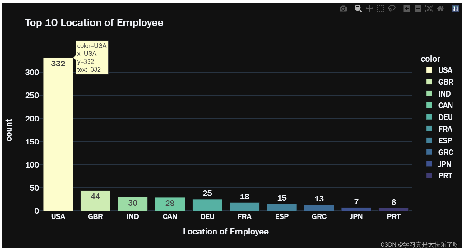
converted_country = coco.convert(names=df['company_location'], to="ISO3")
df['company_location'] = converted_country
c_location = df['company_location'].value_counts()
top_10_company_location = c_location[:10]
fig = go.Figure(data=[
    go.Bar(name='Employee Loaction',
           x=top10_employee_location.index, y=top10_employee_location.values,
           text=top10_employee_location.values,marker_color='crimson'),
    go.Bar(name='Company Location', x=top_10_company_location.index,
           y=top_10_company_location.values,text=top_10_company_location.values,marker_color='white')
])
fig.update_layout(barmode='group', xaxis_tickangle=-45,
                  title='Comparison of Employee Location and Company Location',template='plotly_dark',
                  font = dict(size=17,family="Franklin Gothic"))

fig.show()
grouped_size = df['company_size'].value_counts()

fig = px.bar(y=grouped_size.values,
             x=grouped_size.index,
             color = grouped_size.index,
             color_discrete_sequence=px.colors.sequential.dense,
             text=grouped_size.values,
             title= 'Distribution of Company Size',
             template= 'plotly_dark')

fig.update_traces(width=0.4)
fig.update_layout(
    xaxis_title="Company Size",
    yaxis_title="count",
    font = dict(size=17,family="Franklin Gothic"))
fig.show()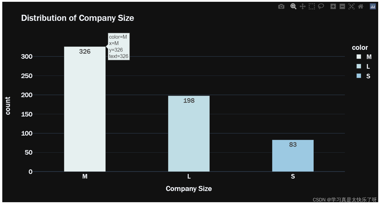
wkyear = df['work_year'].value_counts()
fig = px.pie(values=wkyear.values,
             names=wkyear.index,
             color_discrete_sequence=px.colors.sequential.PuBu,
             title= 'work year distribution',template='plotly_dark')
fig.update_traces(textinfo='label+percent+value', textfont_size=18,
                  marker=dict(line=dict(color='#100000', width=0.2)))

fig.data[0].marker.line.width = 2
fig.data[0].marker.line.color='gray'
fig.update_layout(
    font=dict(size=20,family="Franklin Gothic"))
fig.show()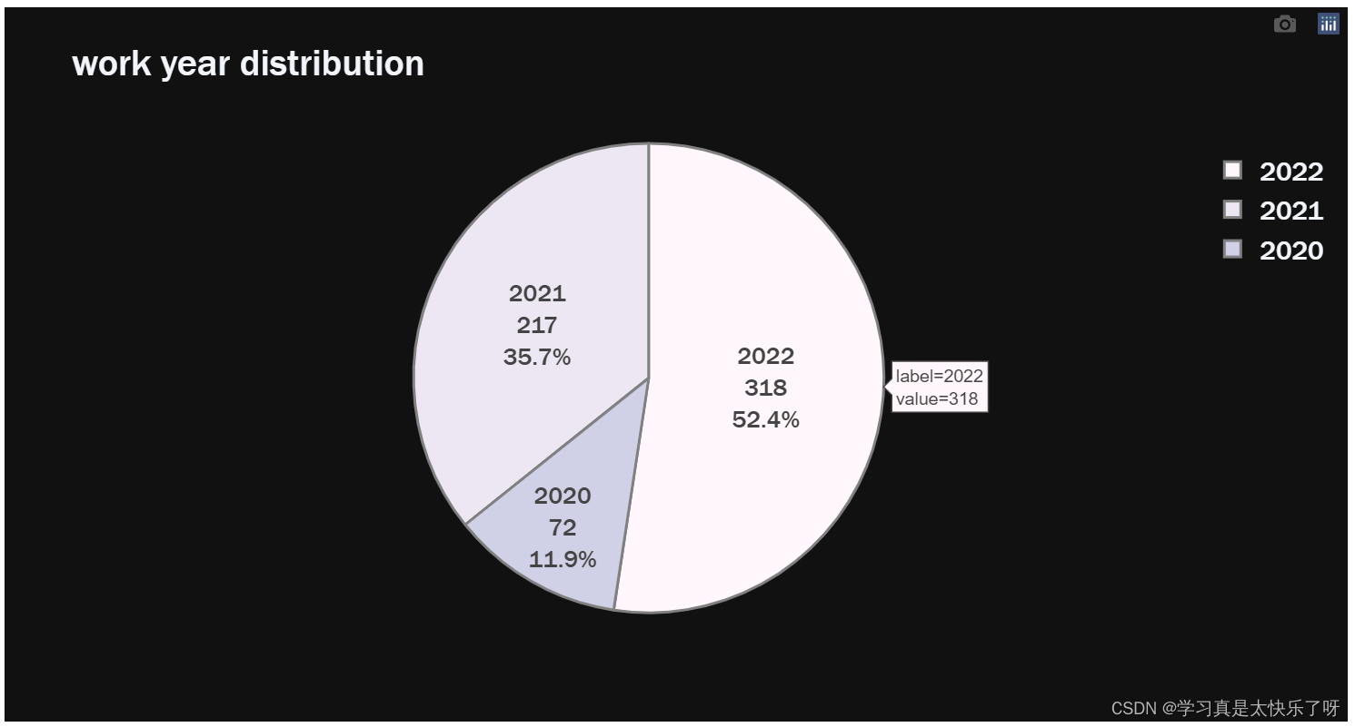
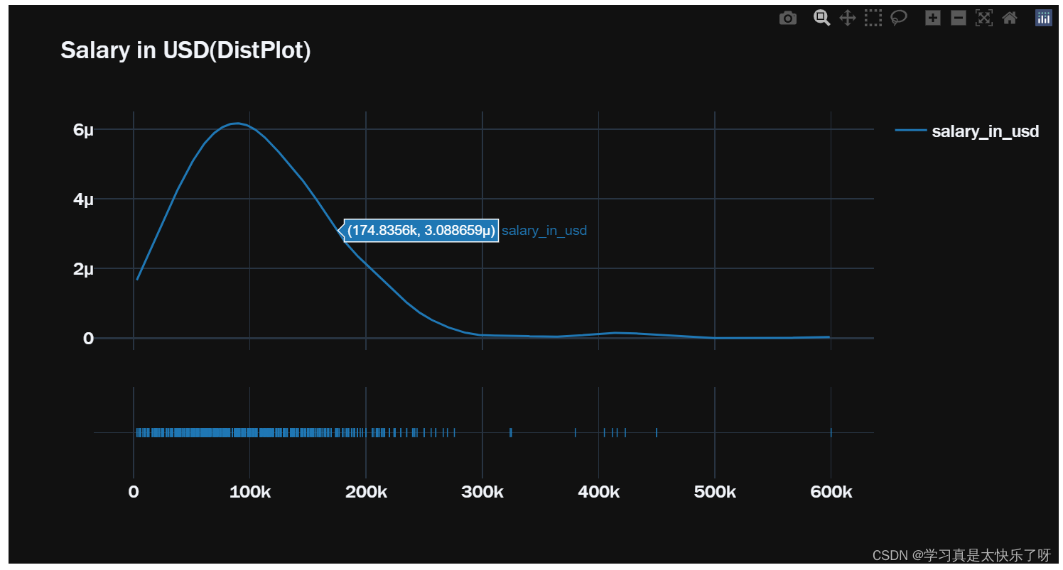
hist_data = [df['salary_in_usd']]
group_labels = ['salary_in_usd']
fig1 = px.box(y=df['salary_in_usd'],template= 'plotly_dark', title = 'Salary in USD (BoxPlot)')
fig2 = ff.create_distplot(hist_data, group_labels, show_hist=False)
fig2.layout.template = 'plotly_dark'
fig1.update_layout(font = dict(size=17,family="Franklin Gothic"))
fig2.update_layout(title='Salary in USD(DistPlot)', font = dict(size=17, family="Franklin Gothic"))
fig1.show()
fig2.show()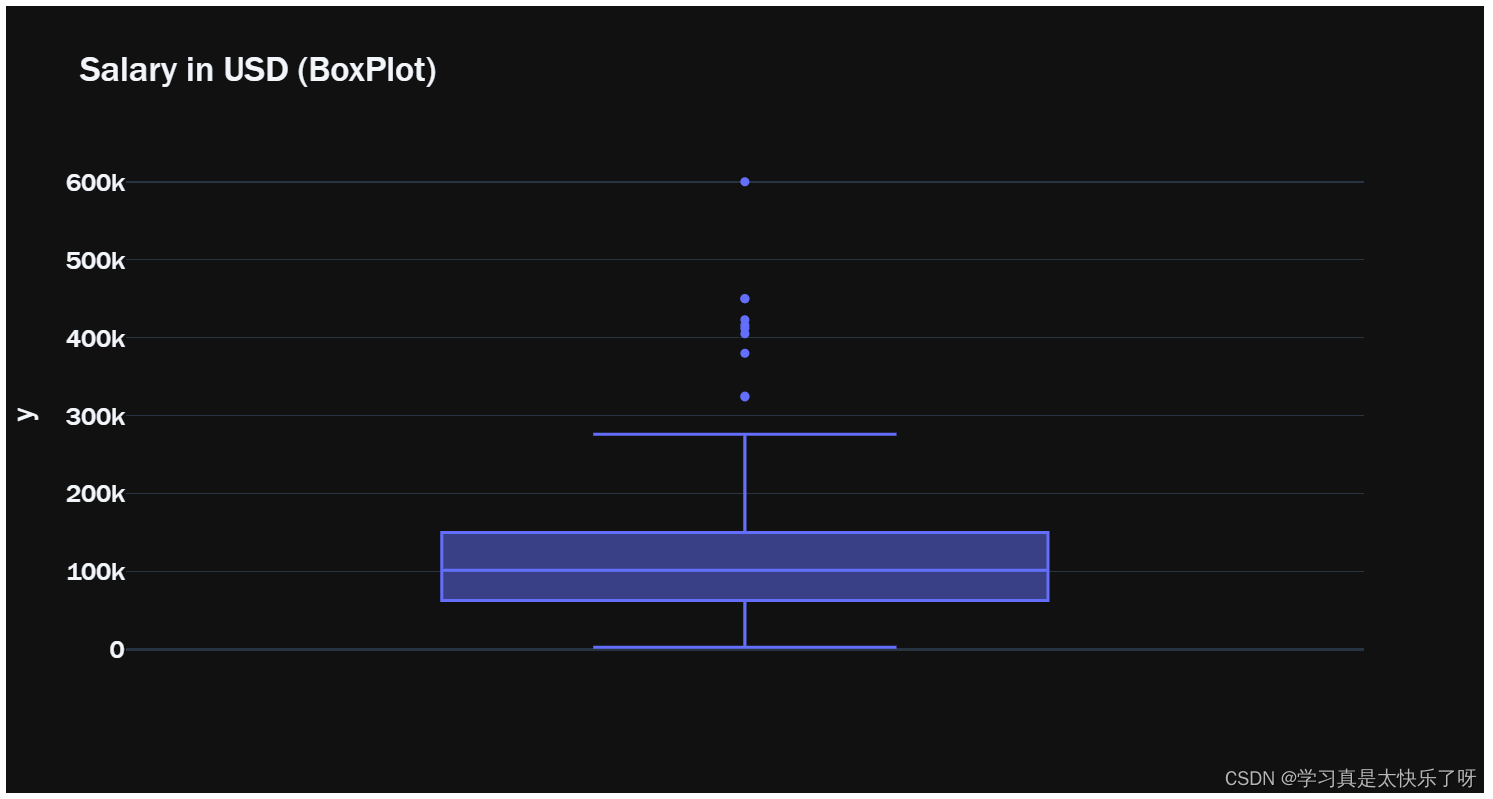
remote_type = ['Fully Remote','Partially Remote','No Remote Work']

plt.figure(figsize=(20,5))
fig = px.bar(x = ['Fully Remote','Partially Remote','No Remote Work'],
       y = df['remote_ratio'].value_counts().values,
       color = remote_type,
       color_discrete_sequence=px.colors.sequential.dense,
       text=df['remote_ratio'].value_counts().values,
       title = 'Remote Ratio Distribution',
       template='plotly_dark')

fig.update_traces(width=0.4)

fig.data[0].marker.line.width = 2


fig.update_layout(
    xaxis_title="Remote Type",
    yaxis_title="count",
    font = dict(size=17,family="Franklin Gothic"))
fig.show()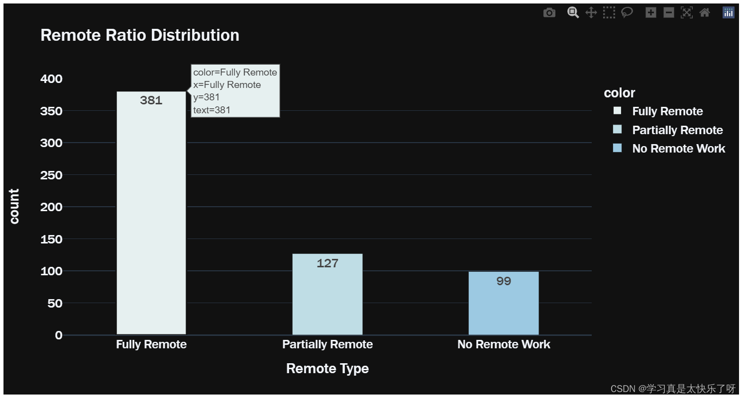
remote_year = df.groupby(['work_year','remote_ratio']).size()
ratio_2020 = np.round(remote_year[2020].values/remote_year[2020].values.sum(),2)
ratio_2021 = np.round(remote_year[2021].values/remote_year[2021].values.sum(),2)
ratio_2022 = np.round(remote_year[2022].values/remote_year[2022].values.sum(),2)
fig = go.Figure()
categories = ['No Remote Work', 'Partially Remote', 'Fully Remote']
fig.add_trace(go.Scatterpolar(
             r = ratio_2020,
             theta = categories,
             fill = 'toself',
             name = '2020 remote ratio'
             ))
fig.add_trace(go.Scatterpolar(
             r = ratio_2021,
             theta = categories,
             fill = 'toself',
             name = '2021 remote ratio'
#              fillcolor = 'lightred'
             ))
fig.add_trace(go.Scatterpolar(
             r = ratio_2022,
             theta = categories,
             fill = 'toself',
             name = '2022 remote ratio'
#              fillcolor = 'lightblue'
             ))

fig.update_layout(
  polar=dict(
    radialaxis=dict(
#       visible=True,
      range=[0, 0.75]
    )),
  font = dict(family="Franklin Gothic", size=17),
  showlegend=True,
  title = 'Remote Ratio by Work Year'
)
fig.layout.template = 'plotly_dark'
fig.show()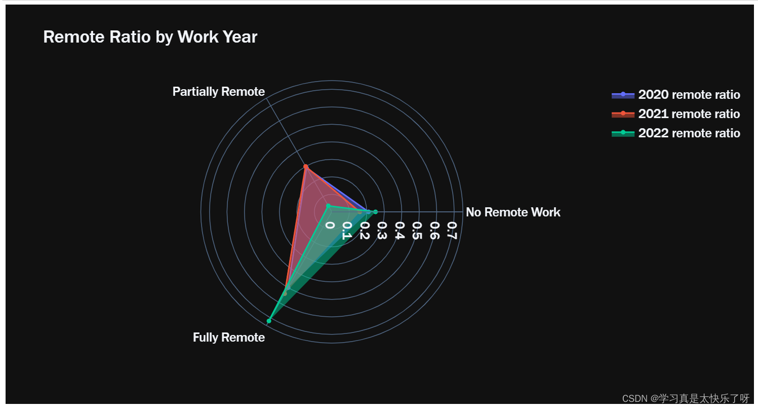
exlevel_type = df.groupby(['experience_level','employment_type']).size()
fig = go.Figure(data=[
    go.Bar(name='Entry-level/Junior', x=exlevel_type['Entry-level/Junior'].index, y=exlevel_type['Entry-level/Junior'].values,
           text=exlevel_type['Entry-level/Junior'].values, marker_color='white'),
    go.Bar(name='Executive-level/Director', x=exlevel_type['Executive-level/Director'].index, y=exlevel_type['Executive-level/Director'].values,
           text=exlevel_type['Executive-level/Director'].values, marker_color='red'),
    go.Bar(name='Mid-level/Intermediate', x=exlevel_type['Mid-level/Intermediate'].index, y=exlevel_type['Mid-level/Intermediate'].values,
           text=exlevel_type['Mid-level/Intermediate'].values, marker_color='yellow'),
    go.Bar(name='Senior-level/Expert', x=exlevel_type['Senior-level/Expert'].index, y=exlevel_type['Senior-level/Expert'].values,
           text=exlevel_type['Senior-level/Expert'].values, marker_color='blue'),
])
fig.update_layout(xaxis_tickangle=-45, title='Experiece Level with Employment Type', font = dict(family="Franklin Gothic", size=17), template='plotly_dark')

fig.show()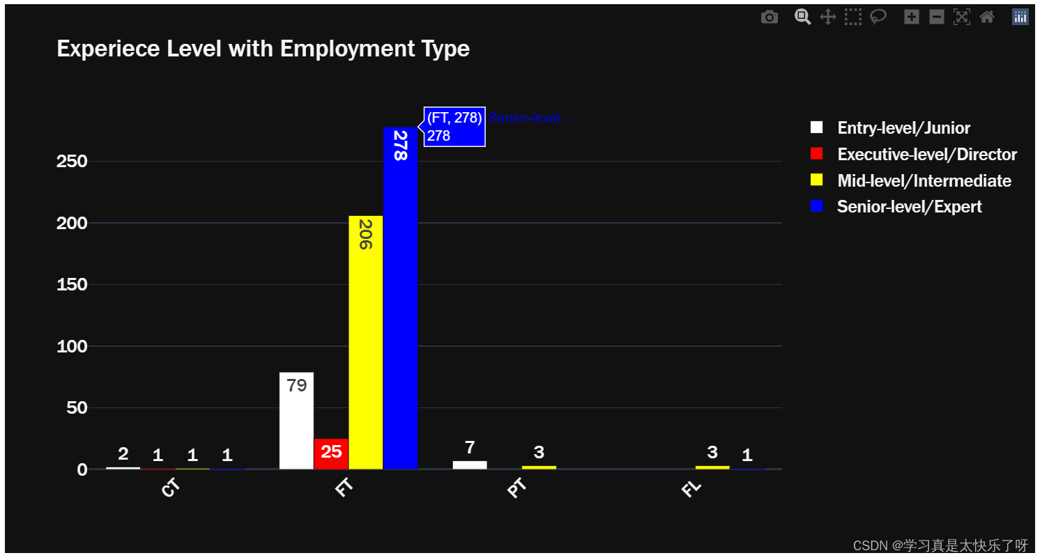
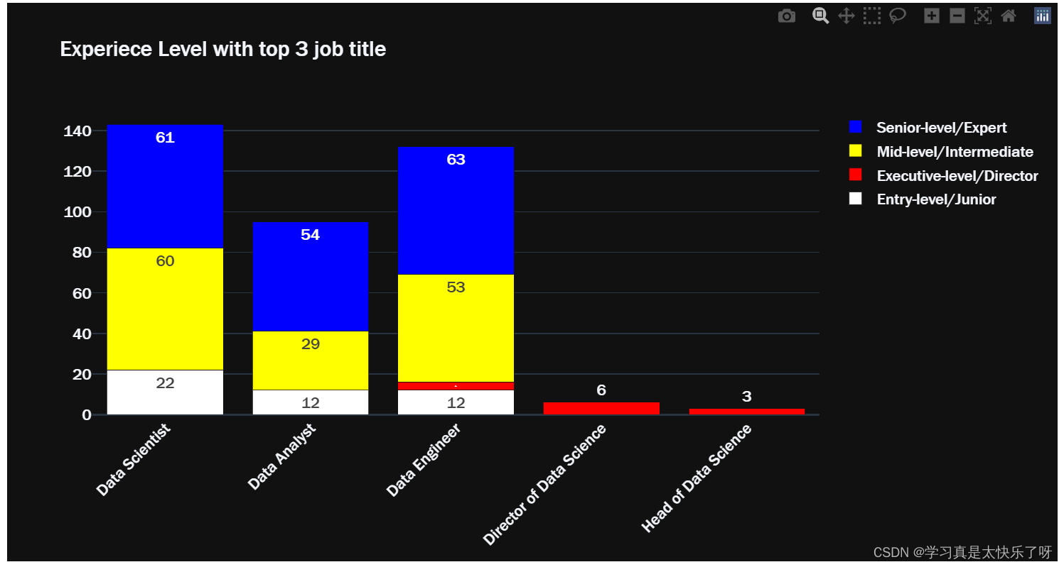
exlevel_job = df.groupby(['experience_level','job_title']).size()

entry_top3 = exlevel_job['Entry-level/Junior'].sort_values(ascending=False)[:3]
executive_top3 = exlevel_job['Executive-level/Director'].sort_values(ascending=False)[:3]
mid_top3 = exlevel_job['Mid-level/Intermediate'].sort_values(ascending=False)[:3]
senior_top3 = exlevel_job['Senior-level/Expert'].sort_values(ascending=False)[:3]

exlevel_type = df.groupby(['experience_level','employment_type']).size()
fig = go.Figure(data=[
    go.Bar(name='Entry-level/Junior', x=entry_top3.index, y=entry_top3.values,
           text=entry_top3.values, marker_color='white'),
    go.Bar(name='Executive-level/Director', x=executive_top3.index, y=executive_top3.values,
           text=executive_top3.values, marker_color='red'),
    go.Bar(name='Mid-level/Intermediate', x=mid_top3.index, y=mid_top3.values,
           text=mid_top3.values, marker_color='yellow'),
    go.Bar(name='Senior-level/Expert', x=senior_top3.index, y=senior_top3.values,
           text=senior_top3.values, marker_color='blue'),
])
fig.update_layout(barmode = 'stack', xaxis_tickangle=-45, title='Experiece Level with top 3 job title', font = dict(family="Franklin Gothic", size=15), template='plotly_dark')

fig.show()
exlevel_size = df.groupby(['experience_level','company_size']).size()
fig = go.Figure(data=[
    go.Bar(name='Entry-level/Junior', x=exlevel_size['Entry-level/Junior'].index, y=exlevel_size['Entry-level/Junior'].values,
           text=exlevel_size['Entry-level/Junior'].values, marker_color='white'),
    go.Bar(name='Executive-level/Director', x=exlevel_size['Executive-level/Director'].index, y=exlevel_size['Executive-level/Director'].values,
           text=exlevel_size['Executive-level/Director'].values, marker_color='red'),
    go.Bar(name='Mid-level/Intermediate', x=exlevel_size['Mid-level/Intermediate'].index, y=exlevel_size['Mid-level/Intermediate'].values,
           text=exlevel_size['Mid-level/Intermediate'].values, marker_color='yellow'),
    go.Bar(name='Senior-level/Expert', x=exlevel_size['Senior-level/Expert'].index, y=exlevel_size['Senior-level/Expert'].values,
           text=exlevel_size['Senior-level/Expert'].values, marker_color='blue'),
])
fig.update_layout(xaxis_tickangle=-45, title='Experience Level with Company Size', font=dict(family="Franklin Gothic", size=17), template='plotly_dark')

fig.show()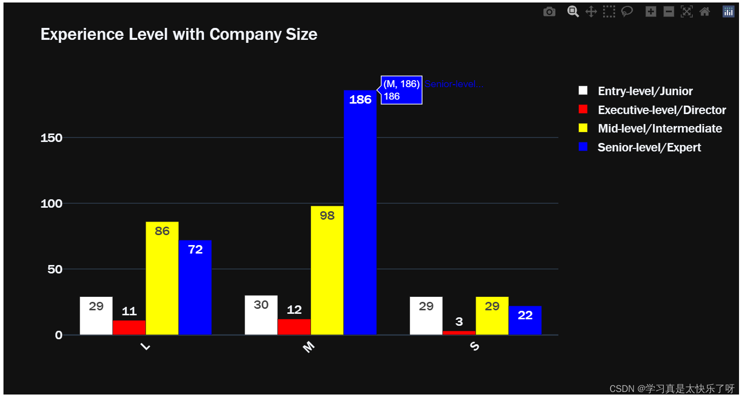
exlevel_location = df.groupby(['experience_level','company_location']).size()

entry_location = exlevel_location['Entry-level/Junior']
executive_location = exlevel_location['Executive-level/Director']
mid_location = exlevel_location['Mid-level/Intermediate']
senior_location = exlevel_location['Senior-level/Expert']

fig1 = px.choropleth(locations=entry_location.index,
                    color=entry_location.values,
                    color_continuous_scale=px.colors.sequential.Peach,
                    template='plotly_dark',
                    title = 'Entry-level/Junior Company Location')

fig2 = px.choropleth(locations=mid_location.index,
                    color=mid_location.values,
                    color_continuous_scale=px.colors.sequential.dense,
                    template='plotly_dark',
                    title = 'Mid-level/Intermediate Company Location')
fig3 = px.choropleth(locations=senior_location.index,
                    color=senior_location.values,
                    color_continuous_scale=px.colors.sequential.GnBu,
                    template='plotly_dark',
                    title = 'Senior-level/Expert Company Location')
fig4 = px.choropleth(locations=executive_location.index,
                    color=executive_location.values,
                    color_continuous_scale=px.colors.sequential.PuRd,
                    template='plotly_dark',
                    title = 'Executive-level/Director Company Location')

fig1.add_scattergeo(
    locations=entry_location.index,
    text= entry_location.values,
    mode='text')

fig2.add_scattergeo(
    locations=mid_location.index,
    text= mid_location.values,
    mode='text')

fig3.add_scattergeo(
    locations=senior_location.index,
    text= senior_location.values,
    mode='text')


fig4.add_scattergeo(
    locations=executive_location.index,
    text= executive_location.values,
    mode='text')

fig1.update_layout(font = dict(size = 17, family="Franklin Gothic"))
fig2.update_layout(font = dict(size = 17, family="Franklin Gothic"))
fig3.update_layout(font = dict(size = 17, family="Franklin Gothic"))
fig4.update_layout(font = dict(size = 17, family="Franklin Gothic"))

fig1.show()
fig2.show()
fig3.show()
fig4.show()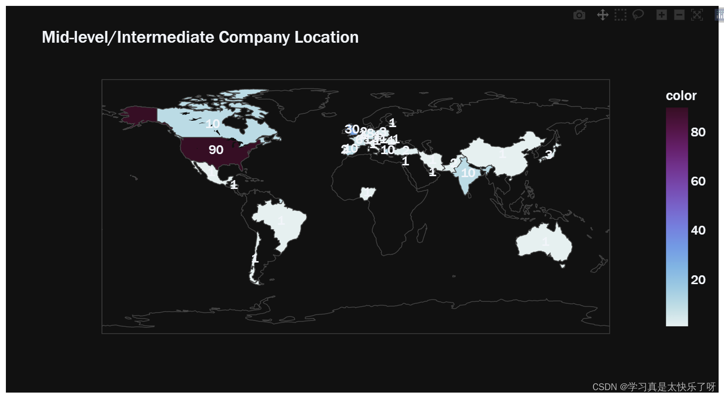
w2020 = df.loc[(df['work_year'] == 2020)]
w2021 = df.loc[(df['work_year'] == 2021)]
w2022 = df.loc[(df['work_year'] == 2022)]
hist_data = [w2020['salary_in_usd'],w2021['salary_in_usd'],w2022['salary_in_usd']]
group_labels = ['2020 salary','2021 salary','2022 salary']
colors = ['white','red','blue']
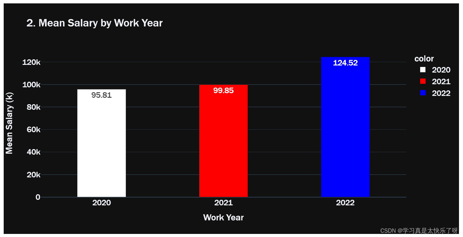
year_salary = pd.DataFrame(columns=['2020','2021','2022'])
year_salary['2020'] = w2020.groupby('work_year').mean('salary_in_usd')['salary_in_usd'].values
year_salary['2021'] = w2021.groupby('work_year').mean('salary_in_usd')['salary_in_usd'].values
year_salary['2022'] = w2022.groupby('work_year').mean('salary_in_usd')['salary_in_usd'].values
fig1 = ff.create_distplot(hist_data, group_labels, show_hist=False,colors=colors)
fig2 = go.Figure(data=px.bar(x= year_salary.columns,
y=year_salary.values.tolist()[0],
color = year_salary.columns,
color_discrete_sequence= colors,
title='2. Mean Salary by Work Year',
text = np.round([num/1000 for num in year_salary.values.tolist()[0]],2),
# width = [year_salary.values.tolist()[0]],
template = 'plotly_dark',
height=500))
fig1.layout.template = 'plotly_dark'
fig1.update_layout(title='1. Salary Distribution by Work Year', font = dict(size=17,family="Franklin Gothic"))
fig2.update_traces(width=0.4)
fig2.update_layout(
xaxis_title="Work Year",
yaxis_title="Mean Salary (k)",
font = dict(size=17,family="Franklin Gothic"))
fig1.show()
fig2.show()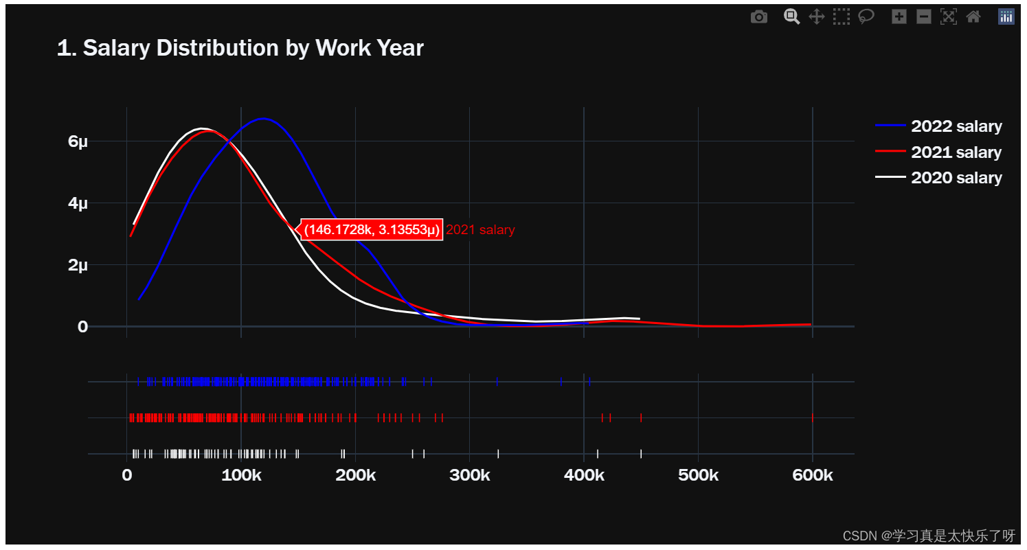
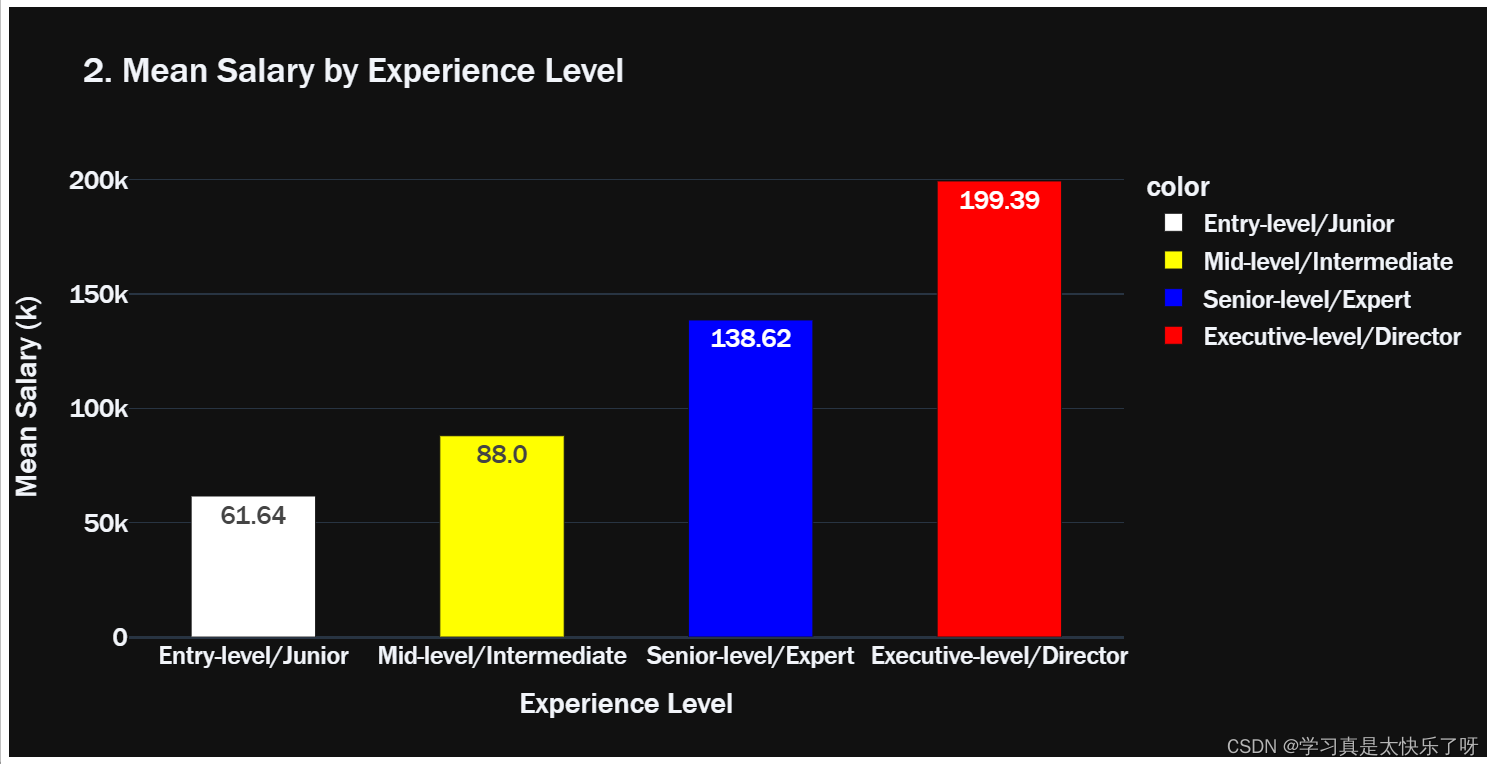
exlevel_salary = df[['experience_level','salary_in_usd']]

entry_salary = exlevel_salary.loc[exlevel_salary['experience_level']=='Entry-level/Junior']
executive_salary = exlevel_salary.loc[exlevel_salary['experience_level']=='Executive-level/Director']
mid_salary = exlevel_salary.loc[exlevel_salary['experience_level']=='Mid-level/Intermediate']
senior_salary = exlevel_salary.loc[exlevel_salary['experience_level']=='Senior-level/Expert']

hist_data = [entry_salary['salary_in_usd'],mid_salary['salary_in_usd'],senior_salary['salary_in_usd'],executive_salary['salary_in_usd']]
group_labels = ['Entry-level/Junior','Mid-level/Intermediate','Senior-level/Expert','Executive-level/Director']
colors = ['white','yellow','blue','red']

lst = [entry_salary['salary_in_usd'].mean(),
       mid_salary['salary_in_usd'].mean(),
       senior_salary['salary_in_usd'].mean(),
       executive_salary['salary_in_usd'].mean(),]

fig1 = ff.create_distplot(hist_data, group_labels, show_hist=False, colors=colors)
fig2 = go.Figure(data=px.bar(x= group_labels,
                            y=lst,
                            color = group_labels,
                            color_discrete_sequence= colors,
                            title='2. Mean Salary by Experience Level',
                            text = np.round([num/1000 for num in lst],2),
                            template = 'plotly_dark',
                            height=500))

fig1.layout.template = 'plotly_dark'
fig1.update_layout(title='1. Salary Distribution by Experience Level',font = dict(size=17,family="Franklin Gothic"))
fig2.update_traces(width=0.5)
fig2.update_layout(
    xaxis_title="Experience Level",
    yaxis_title="Mean Salary (k) ",
    font = dict(size=17,family="Franklin Gothic"))
fig1.show()
fig2.show() 
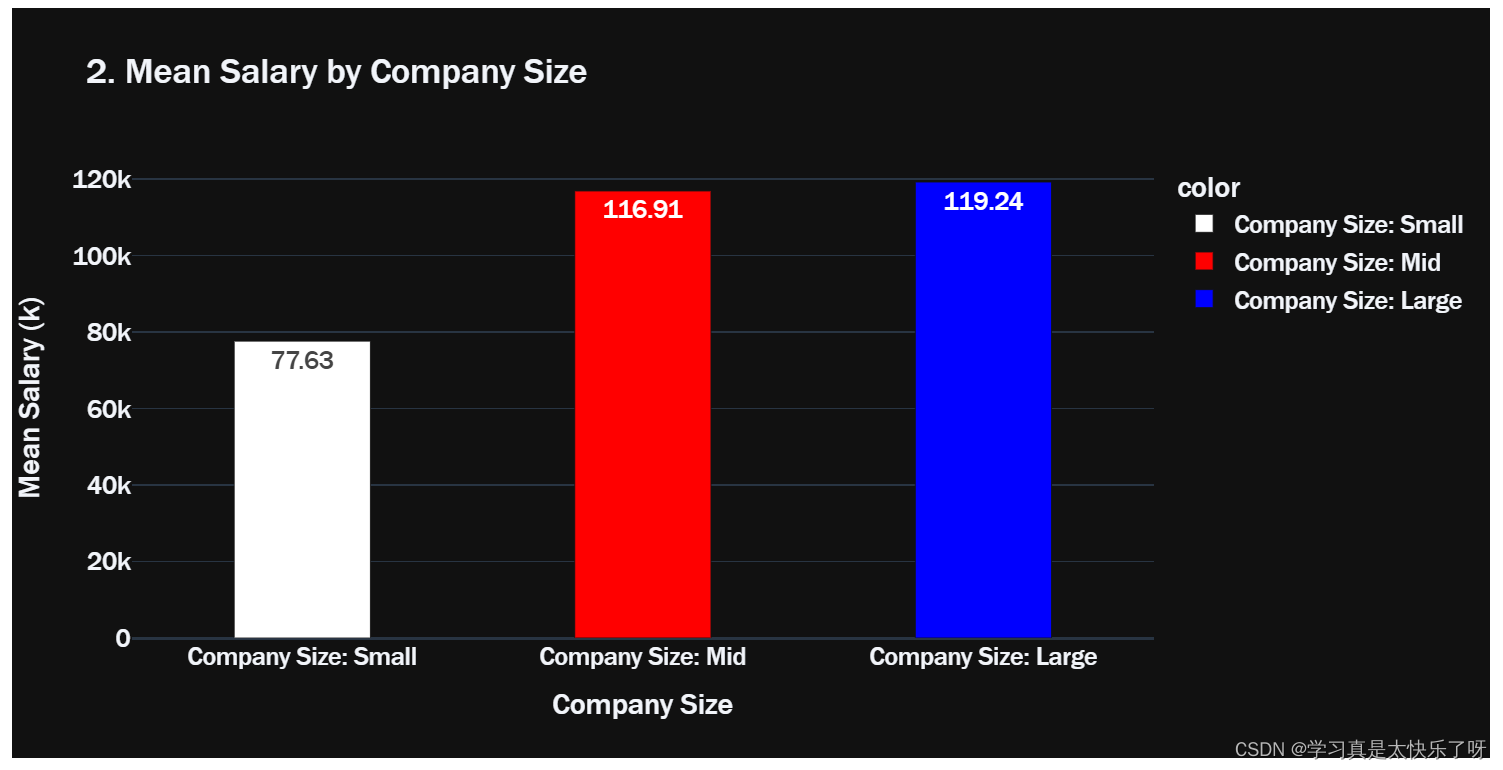
c_size = df[['company_size','salary_in_usd']]
small = exlevel_salary.loc[c_size['company_size']=='S']
mid = exlevel_salary.loc[c_size['company_size']=='M']
large = exlevel_salary.loc[c_size['company_size']=='L']
hist_data = [small['salary_in_usd'],mid['salary_in_usd'],large['salary_in_usd']]
group_labels = ['Company Size: Small','Company Size: Mid','Company Size: Large']
colors = ['white','red','blue']

lst = [small['salary_in_usd'].mean(),
       mid['salary_in_usd'].mean(),
       large['salary_in_usd'].mean()]

plt.figure(figsize=(20,5))
fig1 = ff.create_distplot(hist_data, group_labels, show_hist=False, colors=colors)

fig2 = go.Figure(data=px.bar(x= group_labels,
                            y=lst,
                            color = group_labels,
                            color_discrete_sequence= colors,
                            title='2. Mean Salary by Company Size',
                            text = np.round([num/1000 for num in lst],2),
                            template = 'plotly_dark',
                            height=500))

fig1.layout.template = 'plotly_dark'
fig1.update_layout(title='1. Salary Distribution by Company Size',font = dict(size=17,family="Franklin Gothic"))
fig2.update_traces(width=0.4)
fig2.update_layout(
    xaxis_title="Company Size",
    yaxis_title="Mean Salary (k)",
    font = dict(size=17,family="Franklin Gothic"))
fig1.show()
fig2.show()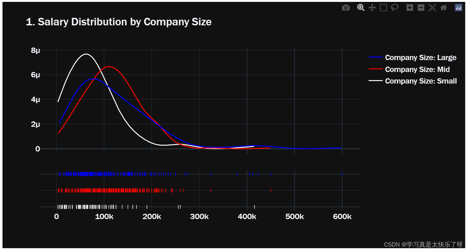
salary_job = df.groupby(['salary_in_usd','job_title']).size().reset_index()
salary_job = salary_job[-20:]
fig = px.bar(x=salary_job['job_title'],y=salary_job['salary_in_usd'],text = salary_job['salary_in_usd'],
                   color = salary_job['salary_in_usd'], color_discrete_sequence=px.colors.sequential.PuBu)

fig.update_layout(
    xaxis_title="Job Title",
    yaxis_title="Mean Salary ")

fig.update_layout(barmode = 'relative',xaxis_tickangle=-45,
                  title='Top 20 Highest Salary by Job Title', template='plotly_dark',font = dict(size=17,family="Franklin Gothic"))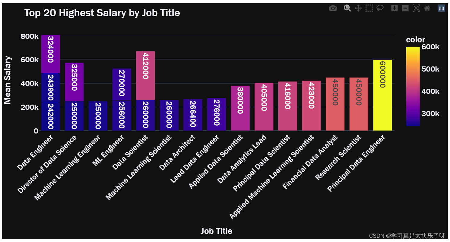
salary_location = df.groupby(['salary_in_usd','company_location']).size().reset_index()
average = salary_location.groupby('company_location').mean().reset_index()

fig = px.choropleth(locations=average['company_location'],
                    color=average['salary_in_usd'],
                    color_continuous_scale=px.colors.sequential.solar,
                    template='plotly_dark',
                    title = 'Average Salary by Company Location')
fig.update_layout(font = dict(size=17,family="Franklin Gothic"))
fig.show()
fig, ax = plt.subplots()
fig.set_size_inches(20,15)
sns.heatmap(df.corr(), vmax =.8, square = True, annot = True)
plt.title('Confusion Matrix',fontsize=20,fontstyle= 'oblique')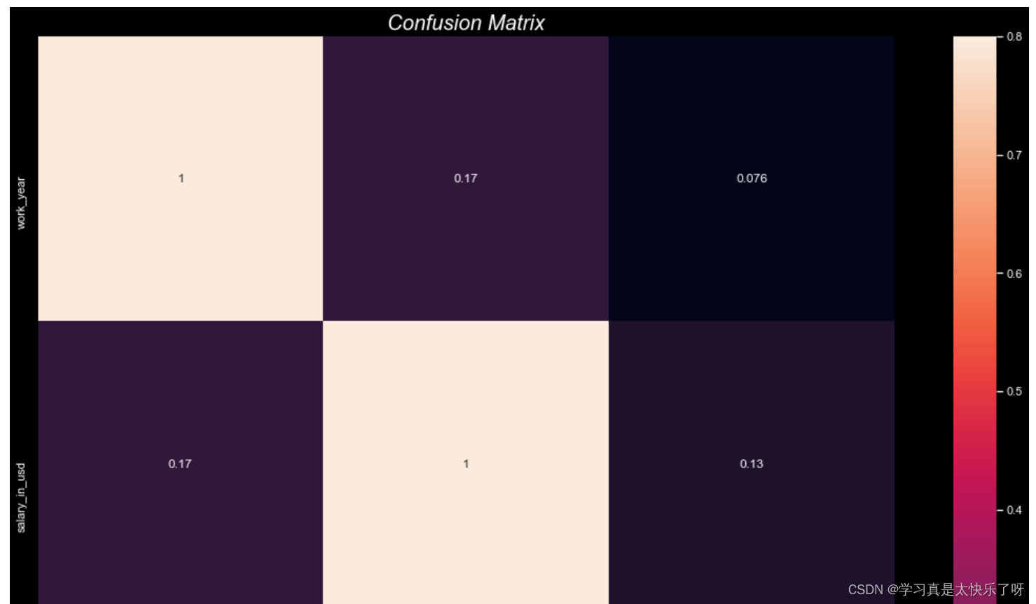


 820
820


 被折叠的 条评论
为什么被折叠?
被折叠的 条评论
为什么被折叠?
 到【灌水乐园】发言


