


一、定义
BFC - Block Formatting Context 块级格式化上下文 BFC的定义,在官方文档到中,是这么介绍BFC的。
重点:
1、每一个BFC区域只包括其子元素,不包括其子元素的子元素;
2、每一个BFC区域都是独立隔绝的,互不影响;
3、通过一些条件触发BFC,从而解决布局上出现的问题;
二、作用
BFC的触发条件
-
浮动元素 ( float 不取值为 none )
-
绝对定位元素 ( position 取值为 absolute 或 fixed )
-
display 取值为 inline-block 、 table-cell 、 table-caption 、 flex 、 inline-flex 之一的元素
-
overflow 不取值为 visible 的元素
-
根元素(body)
BFC的特性
- 属于同一个BFC的两个相邻容器的上下margin会重叠(重点)
- 计算BFC高度时浮动元素也参于计算(重点)
- BFC的区域不会与浮动容器发生重叠(重点)
- BFC内的容器在垂直方向依次排列
- 元素的margin-left与其包含块的border-left相接触
- BFC是独立容器,容器内部元素不会影响容器外部元素
三、代码演示
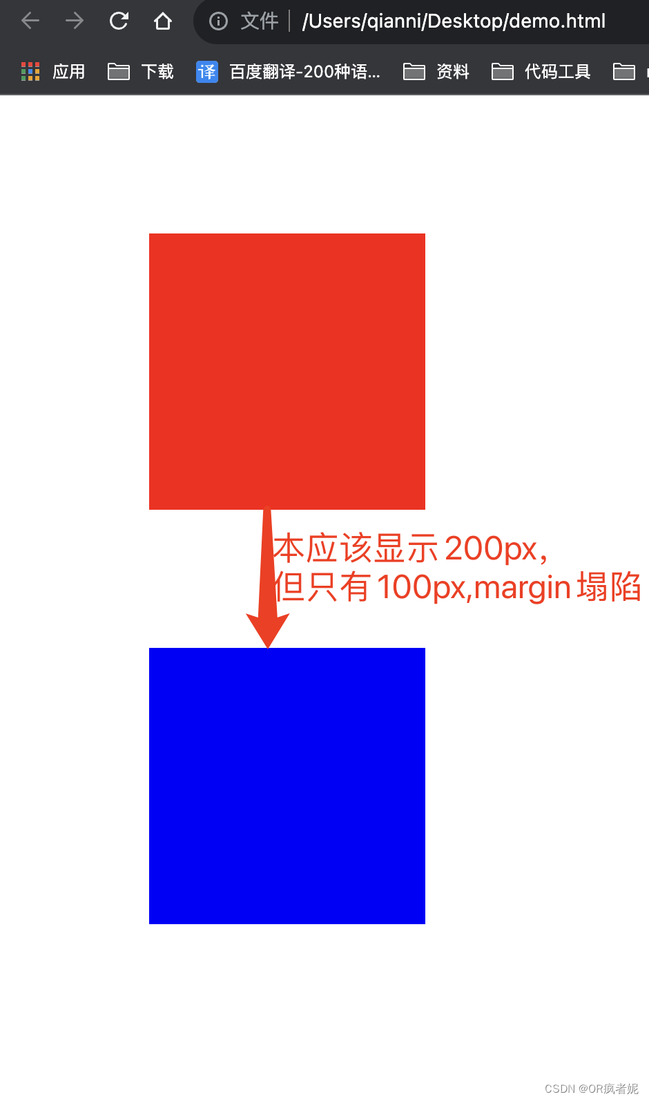
问题一:外边距的塌陷问题(垂直塌陷),两个div盒子的margin重叠到一起。
<!DOCTYPE html>
<html lang="en">
<head>
<meta charset="UTF-8">
<meta http-equiv="X-UA-Compatible" content="IE=edge">
<meta name="viewport" content="width=device-width, initial-scale=1.0">
<title>Document</title>
<style type="text/css">
.box1{
width: 200px;
height: 200px;
background: red;
margin: 100px;
}
.box2{
width: 200px;
height: 200px;
background: blue;
margin: 100px;
}
</style>
</head>
<body>
<div class="box1"></div>
<div class="box2"></div>
</body>
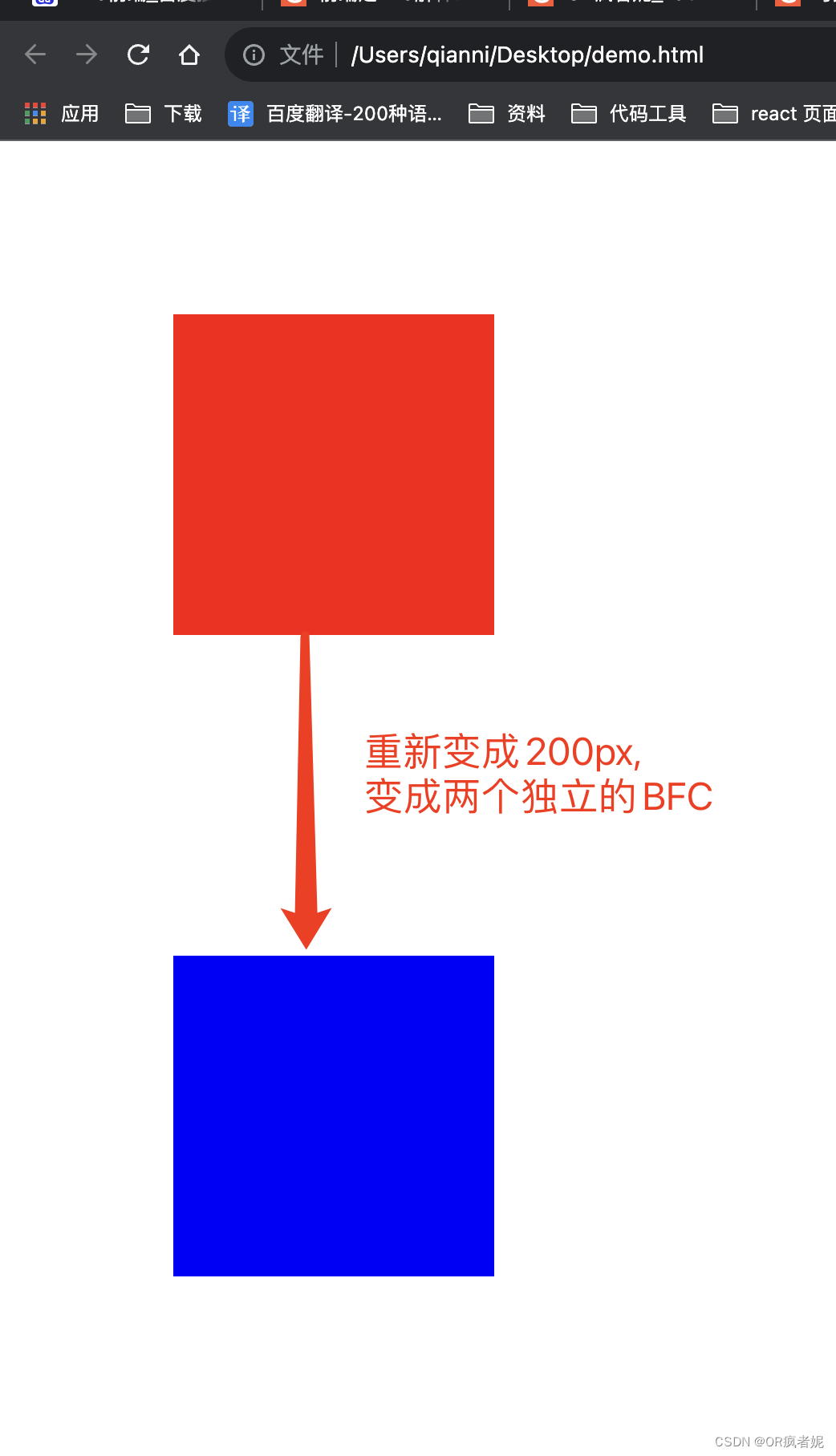
</html>解决方案:BFC,创建与世隔绝的独立区域,不会互相影响,那么,我们可以将这两个盒子,放到两个BFC区域中,即可解决这个问题。
<!DOCTYPE html>
<html lang="en">
<head>
<meta charset="UTF-8">
<meta http-equiv="X-UA-Compatible" content="IE=edge">
<meta name="viewport" content="width=device-width, initial-scale=1.0">
<title>Document</title>
<style type="text/css">
.box1{
width: 200px;
height: 200px;
background: red;
margin: 100px;
}
.box2{
width: 200px;
height: 200px;
background: blue;
margin: 100px;
}
//增加两个单独的BFC区域
.box_bfc{
overflow: hidden;
}
</style>
</head>
<body>
<div class="box_bfc">
<div class="box1"></div>
</div>
<div class="box_bfc">
<div class="box2"></div>
</div>
</body>
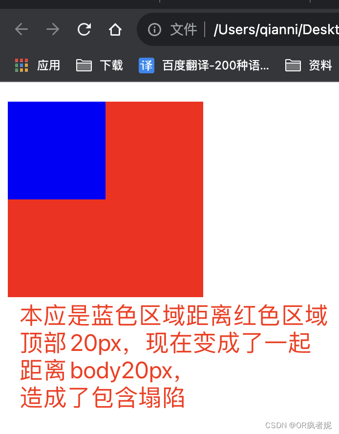
</html>问题二:利用BFC解决包含塌陷
<!DOCTYPE html>
<html lang="en">
<head>
<meta charset="UTF-8">
<meta http-equiv="X-UA-Compatible" content="IE=edge">
<meta name="viewport" content="width=device-width, initial-scale=1.0">
<title>Document</title>
<style type="text/css">
.box_bfc{
width: 200px;
height: 200px;
background: red;
}
.box1{
width: 100px;
height: 100px;
background: blue;
margin-top: 20px;
}
</style>
</head>
<body>
<div class="box_bfc">
<div class="box1"></div>
</div>
</body>
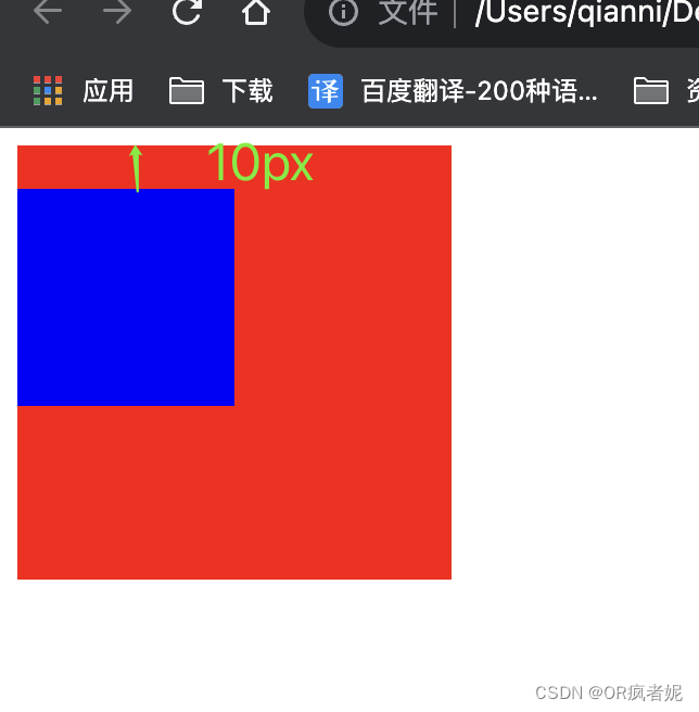
</html>解决方案:将父元素变成一个独立的BFC区域
<!DOCTYPE html>
<html lang="en">
<head>
<meta charset="UTF-8">
<meta http-equiv="X-UA-Compatible" content="IE=edge">
<meta name="viewport" content="width=device-width, initial-scale=1.0">
<title>Document</title>
<style type="text/css">
.box_bfc{
width: 200px;
height: 200px;
background: red;
overflow: hidden;
/* display: flex、inline-block 、 table-cell 、 table-caption 、 flex 、 inline-flex */
/* position: absolute 或 fixed; */
}
.box1{
width: 100px;
height: 100px;
background: blue;
margin-top: 20px;
}
</style>
</head>
<body>
<div class="box_bfc">
<div class="box1"></div>
</div>
</body>
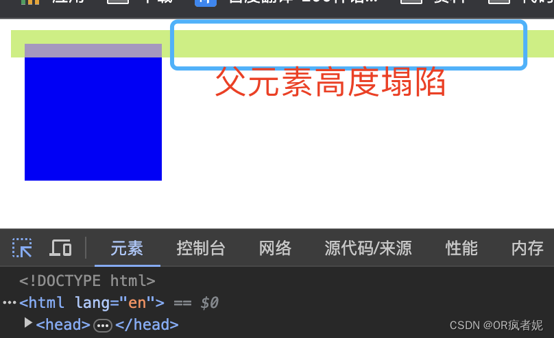
</html>问题三:当子元素浮动是,父元素没有设定高度时,父元素会高度塌陷
<!DOCTYPE html>
<html lang="en">
<head>
  <meta charset="UTF-8">
  <meta http-equiv="X-UA-Compatible" content="IE=edge">
  <meta name="viewport" content="width=device-width, initial-scale=1.0">
  <title>Document</title>
  <style type="text/css">
    .box_bfc{
        /* width: 200px; */
        /* height: 200px; */
        background: red;
        border: 10px solid rgb(30, 255, 0);
        /* overflow: hidden; */
        /* display: flex、inline-block 、 table-cell 、 table-caption 、 flex 、 inline-flex */
        /* position: absolute 或 fixed; */
    }
    .box1{
        width: 100px;
        height: 100px;
        background: blue;
        float: left;
    }

</style>
</head>
<body>
  <div class="box_bfc">
  <div class="box1"></div>
  </div>
</body>
</html>
解决方案:使得父元素触发BFC,计算BFC高度时浮动元素也参于计算,此时子元素虽然设置了浮动,但其高度仍计算至父元素内,从而解决了高度塌陷问题。
<!DOCTYPE html>
<html lang="en">
<head>
<meta charset="UTF-8">
<meta http-equiv="X-UA-Compatible" content="IE=edge">
<meta name="viewport" content="width=device-width, initial-scale=1.0">
<title>Document</title>
<style type="text/css">
.box_bfc{
/* width: 200px; */
/* height: 200px; */
background: red;
border: 10px solid rgb(30, 255, 0);
overflow: hidden;
/* display: flex、inline-block 、 table-cell 、 table-caption 、 flex 、 inline-flex */
/* position: absolute 或 fixed; */
}
.box1{
width: 100px;
height: 100px;
background: blue;
float: left;
}
</style>
</head>
<body>
<div class="box_bfc">
<div class="box1"></div>
</div>
</body>
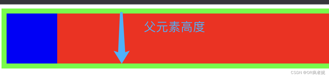
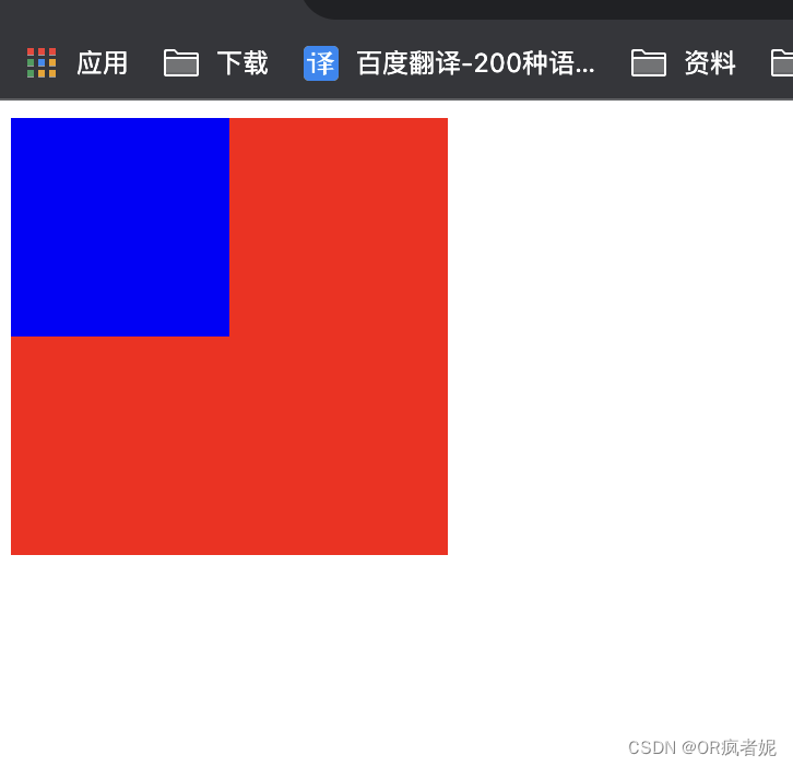
</html>问题四:左侧元素浮动时,会与右侧元素发生重叠。左侧元素浮动,脱离文档流。
<!DOCTYPE html>
<html lang="en">
<head>
<meta charset="UTF-8">
<meta http-equiv="X-UA-Compatible" content="IE=edge">
<meta name="viewport" content="width=device-width, initial-scale=1.0">
<title>Document</title>
<style type="text/css">
.box1{
width: 100px;
height: 100px;
background: blue;
float: left;
}
.box2{
width: 200px;
height: 200px;
background: red;
}
</style>
</head>
<body>
<div class="box1"></div>
<div class="box2"></div>
</body>
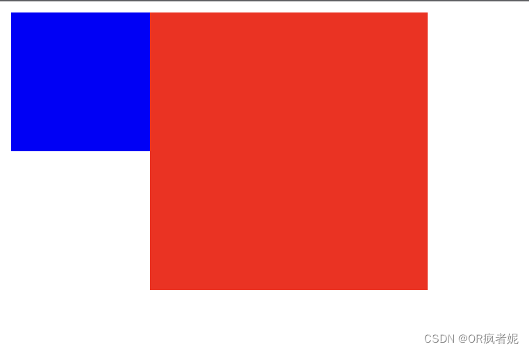
</html>解决方案:红色区域触法BFC,BFC的区域不会与浮动容器发生重叠
<!DOCTYPE html>
<html lang="en">
<head>
  <meta charset="UTF-8">
  <meta http-equiv="X-UA-Compatible" content="IE=edge">
  <meta name="viewport" content="width=device-width, initial-scale=1.0">
  <title>Document</title>
  <style type="text/css">
    .box1{
        width: 100px;
        height: 100px;
        background: blue;
        float: left;
    }
    .box2{
        width: 200px;
        height: 200px;
        background: red;
        float: left;
        /* overflow: hidden; */
    }

</style>
</head>
<body>
  <div class="box1"></div>
  <div class="box2"></div>
</body>
</html>
BFC功能总结
1、可以利用BFC解决两个相邻元素的上下margin重叠问题;
2、可以利用BFC解决高度塌陷问题;
3、可以利用BFC实现多栏布局(两栏、三栏、圣杯、双飞翼等)。
布局
1、两栏布局

<!DOCTYPE html>
<html lang="en">
<head>
  <meta charset="UTF-8">
  <meta http-equiv="X-UA-Compatible" content="IE=edge">
  <meta name="viewport" content="width=device-width, initial-scale=1.0">
  <title>Document</title>
  <style type="text/css">
    * {
        margin: 0px;
        padding: 0px;
    }

    .left {
        width: 200px;
        height: 50px;
        background: aqua;
        float: left;
    }

    .right {
        height: 50px;
        overflow: hidden;
        background: aquamarine;
    }
</style>
</head>
<body>
  <div class="left">固定宽度</div>
    <div class="right">自适应宽度</div>

</body>
</html>
2、三栏布局
定义:圣杯布局和双飞翼布局,两者的功能相同,都是为了实现一个两侧宽度固定,中间宽度自适应的三栏布局。
圣杯布局:渲染——中间在前,左侧在后
<div class="whole-page container">
  <div class="middle">中间</div>
  <div class="left">左侧</div>
  <div class="right">右侧</div>
</div>
<style>
.whole-page {
  height: 100vh;
  min-width:calc(var(--left-value) + var(--right-value) + 200px);
}
.container {
  --left-value: 400px;
  --right-value: 300px;
  padding: 0 var(--right-value) 0 var(--left-value);
  .left {
    float: left;
    position: relative;
    left: calc(-1 * var(--left-value));
    width: var(--left-value);
    background-color: pink;
    height: 100%;
//使用负magrin来实现。在设置了浮动且移动到父元素边框以外时,就会向上浮动。
    margin-left: -100%;
  }
  .right {
    float: left;
    width: var(--right-value);
    background-color: green;
    height: 100%;
    margin-right: calc(-1 * var(--right-value));
  }
  .middle {
    float: left;
    background-color: yellow;
    height: 100%;
    width: 100%;
  }
}
</style>
圣杯布局上下三栏嵌套
<div class="whole-page container">
  <div class="top">上面</div>
  <div class="middle">
    <div class="middle-deep">中间</div>
    <div class="left">左侧</div>
    <div class="right">右侧</div>
  </div>
  <div class="bottom">下面</div>
</div>
<style>
.whole-page {
  height: 100vh;
  min-width:calc(var(--left-value) + var(--right-value) + 200px);
}
.container {
  --top-value: 300px;
  --bottom-value: 200px;
  --left-value: 400px;
  --right-value: 300px;
  .top {
    height: var(--top-value);
    background-color: pink;
  }
  .bottom {
    height: var(--bottom-value);
    background-color: green;
  }
  .middle {
    height: calc(100% - var(--top-value) - var(--bottom-value));
    padding: 0 var(--right-value) 0 var(--left-value);
    .left {
      float: left;
      position: relative;
      left: calc(-1 * var(--left-value));
      width: var(--left-value);
      background-color: grey;
      height: 100%;
      margin-left: -100%;
    }
    .right {
      float: left;
      width: var(--right-value);
      background-color: aqua;
      height: 100%;
      margin-right: calc(-1 * var(--right-value));
    }
    .middle-deep {
      float: left;
      background-color: yellow;
      height: 100%;
      width: 100%;
    }
  }
}
</style>
双翼飞布局:解决了圣杯布局要求中间区域最小宽度的问题
<div class="whole-page container">
  <div class="middle">
    <div class="inner">中间</div>
  </div>
  <div class="left">左侧</div>
  <div class="right">右侧</div>
</div>
<style>
.whole-page {
  height: 100vh;
}
.container {
  --left-value: 400px;
  --right-value: 300px;
  .left {
    background-color: pink;
    height: 100%;
    width: var(--left-value);
    float: left;
    margin-left: -100%;
  }
  .right {
    background-color: green;
    height: 100%;
    width: var(--right-value);
    float: left;
    margin-left: calc(-1 * var(--right-value));
  }
  .middle {
    background-color: yellow;
    height: 100%;
    width: 100%;
    float: left;
    .inner {
      padding-left: var(--left-value);
      padding-right: var(--right-value);
      height: 100%;
    }
  }
}
</style>
双翼飞布局三层嵌套:
<div class="whole-page container">
  <div class="top">上面</div>
  <div class="middle">
    <div class="middle-deep">
      <div class="inner">中间</div>
    </div>
    <div class="left">左侧</div>
    <div class="right">右侧</div>
  </div>
  <div class="bottom">下面</div>
</div>
<style>
.whole-page {
  height: 100vh;
}
.container {
  --top-value: 300px;
  --bottom-value: 200px;
  --left-value: 400px;
  --right-value: 300px;
  .top {
    height: var(--top-value);
    background-color: pink;
  }
  .bottom {
    height: var(--bottom-value);
    background-color: green;
  }
  .middle {
    height: calc(100% - var(--top-value) - var(--bottom-value));
    .left {
      background-color: grey;
      height: 100%;
      width: var(--left-value);
      float: left;
      margin-left: -100%;
    }
    .right {
      background-color: aqua;
      height: 100%;
      width: var(--right-value);
      float: left;
      margin-left: calc(-1 * var(--right-value));
    }
    .middle-deep {
      background-color: yellow;
      float: left;
      height: 100%;
      width: 100%;
      .inner {
        margin-left: var(--left-value);
        margin-right: var(--right-value);
        height: 100%;
      }
    }
  }
}
</style>


 1890
1890


 被折叠的 条评论
为什么被折叠?
被折叠的 条评论
为什么被折叠?
 到【灌水乐园】发言


