


一、Matplotlib简介
Matplotlib是一个Python 2D绘图库,可以在各种平台上以各种硬拷贝格式和交互式环境生成出具有出版品质的图形。Matplotlib可用于Python脚本, Python和IPython shell, Jupyter笔记本, Web应用程序服务器和四个形户面工跑。
Matplotlib试图上简单的事情变得更简单,让无法实现的事情变得可能实现。只需几行代码即可生成绘图, 防图,功率谱,彩图,错误图,散点图等。
为了简单绘图, pyplot模块提供了类似于MATLAB的界面,特别是与IPython结合使用时。对于高级用户, 您可以通过面向对象的界面或MATLAB用户熟悉的一组函数完全控制线条样式,字体属性,轴属性等。
1.Matplotlib画图的简单实现
# 导入模块
import matplotlib.pyplot as plt
# 在jupyter中执行的时候显示图片
%matplotlib inline
# 传入x和y, 通过plot画图
plt.plot([0, 1, 9], [4, 5, 6])
# 在执行程序的时候展示图形
plt.show()

2.设置显示中文
将下面几行代码插入到你的代码中,即可解决中文乱码问题。
#中文显示问题
from pylab import mpl
mpl.rcParams["font.sans-serif"] = ["SimHei"]
mpl.rcParams["axes.unicode_minus"] = False
3.设置的图片的大小和保存
from matplotlib import pyplot as plt
import random
x = range(2,26,2) # x轴的位置
y = [random.randint(15, 30) for i in x]

# 设置图片的大小
'''
figsize:指定figure的宽和高,单位为英寸;
dpi参数指定绘图对象的分辨率,即每英寸多少个像素,缺省值为80      1英寸等于2.5cm,A4纸是 21*30cm的纸张
'''
# 根据画布对象
plt.figure(figsize=(20,8),dpi=80)
plt.plot(x,y)  # 传入x和y, 通过plot画图
plt.show()
# 保存(注意: 要放在绘制的下面,并且plt.show()会释放figure资源,如果在显示图像之后保存图片将只能保存空图片。)
plt.savefig('./t1.png')
# 图片的格式也可以保存为svg这种矢量图格式,这种矢量图放在网页中放大后不会有锯齿
plt.savefig('./t1.svg')

4.一图多线
from pylab import mpl
mpl.rcParams["font.sans-serif"] = ["SimHei"]
mpl.rcParams["axes.unicode_minus"] = False

# 假设大家在30岁的时候,根据自己的实际情况,统计出来你和你同事各自从11岁到30岁每年交的男/女朋友的数量如列表y1和y2,请在一个图中绘制出该数据的折线图,从而分析每年交朋友的数量走势。
y1 = [1,0,1,1,2,4,3,4,4,5,6,5,4,3,3,1,1,1,1,1]
y2 = [1,0,3,1,2,2,3,4,3,2,1,2,1,1,1,1,1,1,1,1]
x = range(11,31)
# 设置图形
plt.figure(figsize=(20,8),dpi=80)
plt.plot(x,y1,color='red',label='自己')
plt.plot(x,y2,color='blue',label='同事')
# 设置x轴刻度
xtick_labels = ['{}岁'.format(i) for i in x]
plt.xticks(x,xtick_labels,rotation=45)
# 绘制网格(网格也是可以设置线的样式)
# 设置透明度alpha=0.4
plt.grid(alpha=0.4)
# 设置位置loc : upper left、 lower left、 center left、 upper center
plt.legend(loc='upper right')
plt.show()

5.一图多个坐标系子图
import matplotlib.pyplot as plt
import numpy as np

# add_subplot方法----给figure新增子图
x = np.arange(1, 100)
#新建figure对象
fig=plt.figure(figsize=(20,10),dpi=80)
#新建子图1
ax1=fig.add_subplot(2,2,1)
ax1.plot(x, x)
ax1.grid(color='r', linestyle='--', linewidth=1,alpha=0.3)
#新建子图2
ax2=fig.add_subplot(2,2,2)
ax2.plot(x, x ** 2)
ax2.grid(color='r', linestyle='--', linewidth=1,alpha=0.3)
#新建子图3
ax3=fig.add_subplot(2,2,3)
ax3.plot(x, np.log(x))
ax3.grid(color='r', linestyle='--', linewidth=1,alpha=0.3)
plt.show()

二、折线图
1.折线图的绘制
from matplotlib import pyplot as plt
x = range(1,8) # x轴的位置
y = [17, 17, 18, 15, 11, 11, 13]
# 传入x和y, 通过plot画折线图
plt.plot(x,y)
plt.show()

2.折线的颜色和形状设置
from matplotlib import pyplot as plt
x = range(1,8) # x轴的位置
y = [17, 17, 18, 15, 11, 11, 13]
# 传入x和y, 通过plot画折线图
plt.plot(x,y,color='red',alpha=0.5,linestyle='--',linewidth=3)
plt.show()
'''基础属性设置
color='red' : 折线的颜色
alpha=0.5   : 折线的透明度(0-1)
linestyle='--' : 折线的样式
linewidth=3  : 折线的宽度
'''

'''线的样式
-      实线(solid)
--     短线(dashed)
-.     短点相间线(dashdot)
:    虚点线(dotted)
'''

3.折点样式
from matplotlib import pyplot as plt
x = range(1,8)
y = [17, 17, 18, 15, 11, 11, 13]

plt.plot(x,y,marker='o')#设置marker参数以选择折点样式
plt.show()

三、条形图
1.纵向条形图
# 假设你获取到了2019年内地电影票房前20的电影(列表a)和电影票房数据(列表b),请展示该数据
from matplotlib import pyplot as plt
from matplotlib import font_manager
from pylab import mpl
mpl.rcParams["font.sans-serif"] = ["SimHei"]
mpl.rcParams["axes.unicode_minus"] = False

a = ['流浪地球','疯狂的外星人','飞驰人生','大黄蜂','熊出没·原始时代','新喜剧之王']
b = ['38.13','19.85','14.89','11.36','6.47','5.93']

plt.figure(figsize=(8,5),dpi=80)
#绘制条形图
rects = plt.bar(range(len(a)),[float(i) for i in b],width=0.3,color= 'red')
plt.xticks(range(len(a)),a)
plt.yticks(range(0,41,5),range(0,41,5))
# 在条形图上加标注(水平居中)
for rect in rects:
    height = rect.get_height()
    plt.text(rect.get_x()+rect.get_width()/2, height+0.3, str(height),ha="center")
plt.show()

2.横向条形图
from matplotlib import pyplot as plt
from matplotlib import font_manager
from pylab import mpl
mpl.rcParams["font.sans-serif"] = ["SimHei"]
mpl.rcParams["axes.unicode_minus"] = False

a = ['流浪地球','疯狂的外星人','飞驰人生','大黄蜂','熊出没·原始时代','新喜剧之王']
b = [38.13,19.85,14.89,11.36,6.47,5.93]
plt.figure(figsize=(20,8),dpi=80)
# 条形的宽度:height=0.3
rects = plt.barh(range(len(a)),b,height=0.5,color='r')
plt.yticks(range(len(a)),a,rotation=45)
# 在条形图上加标注(水平居中)
for rect in rects:
    width = rect.get_width()
    plt.text(width, rect.get_y()+0.3/2, str(width),va="center")
plt.show()

3.并列条形图
import matplotlib.pyplot as plt
import numpy as np
index = np.arange(5)
Dabai = [3000,2000,1000,1000,500]
Lao_S = [1500,1500,1500,1500,1500]
#并列
plt.bar(index,Dabai,width=0.3,color='red')
plt.bar(index+0.3,Lao_S,width=0.3,color='orange')
plt.xticks(index+0.3/2,index)
plt.show()

4.罗列条形图
import matplotlib.pyplot as plt
import numpy as np
index = np.arange(5)
Dabai = [3000,2000,1000,1000,500]
Lao_S = [1500,1500,1500,1500,1500]

plt.bar(index,Dabai,width=0.3,color='red')
#罗列
plt.bar(index,Lao_S,bottom=Dabai,width=0.3,color='orange')
plt.show()

5.堆积条形图
import numpy as np
import matplotlib.pyplot as plt
#中文显示问题
from pylab import mpl
mpl.rcParams["font.sans-serif"] = ["SimHei"]
mpl.rcParams["axes.unicode_minus"] = False

menMeans = (20, 35, 30, 35, 27)
womenMeans = (25, 32, 34, 20, 25)
menStd = (2, 3, 4, 1, 2)
womenStd = (3, 5, 2, 3, 3)
ind = np.arange(5)    # the x locations for the groups
width = 0.35       #条形的宽度

p1 = plt.bar(ind, menMeans, width, yerr=menStd)
p2 = plt.bar(ind, womenMeans, width,
             bottom=menMeans, yerr=womenStd)

plt.ylabel('Scores')
plt.title('分组和性别得分')
plt.xticks(ind, ('G1', 'G2', 'G3', 'G4', 'G5'))
plt.yticks(np.arange(0, 81, 10))
plt.legend((p1[0], p2[0]), ('Men', 'Women'))

plt.show()

四、直方图
# 现有250部电影的时长,希望统计出这些电影时长的分布状态(比如时长为100分钟到120分钟电影的数量,出现的频率)等信息,你应该如何呈现这些数据?
from pylab import mpl
mpl.rcParams["font.sans-serif"] = ["SimHei"]
mpl.rcParams["axes.unicode_minus"] = False

# 1)准备数据
time = [131,  98, 125, 131, 124, 139, 131, 117, 128, 108, 135, 138, 131, 102, 107, 114,
        119, 128, 121, 142, 127, 130, 124, 101, 110, 116, 117, 110, 128, 128, 115,  99,
        136, 126, 134,  95, 138, 117, 111,78, 132, 124, 113, 150, 110, 117,  86,  95, 144,
        105, 126, 130,126, 130, 126, 116, 123, 106, 112, 138, 123,  86, 101,  99, 136,123,
        117, 119, 105, 137, 123, 128, 125, 104, 109, 134, 125, 127,105, 120, 107, 129, 116,
        108, 132, 103, 136, 118, 102, 120, 114,105, 115, 132, 145, 119, 121, 112, 139, 125,
        138, 109, 132, 134,156, 106, 117, 127, 144, 139, 139, 119, 140,  83, 110, 102,123,
        107, 143, 115, 136, 118, 139, 123, 112, 118, 125, 109, 119, 133,112, 114, 122, 109,
        106, 123, 116, 131, 127, 115, 118, 112, 135,115, 146, 137, 116, 103, 144,  83, 123,
        111, 110, 111, 100, 154,136, 100, 118, 119, 133, 134, 106, 129, 126, 110, 111, 109,
        141,120, 117, 106, 149, 122, 122, 110, 118, 127, 121, 114, 125, 126,114, 140, 103,
        130, 141, 117, 106, 114, 121, 114, 133, 137,  92,121, 112, 146,  97, 137, 105,  98,
        117, 112,  81,  97, 139, 113,134, 106, 144, 110, 137, 137, 111, 104, 117, 100, 111,
        101, 110,105, 129, 137, 112, 120, 113, 133, 112,  83,  94, 146, 133, 101,131, 116,
        111,  84, 137, 115, 122, 106, 144, 109, 123, 116, 111,111, 133, 150]

# 2)创建画布
plt.figure(figsize=(20, 8), dpi=100)
# 3)绘制直方图
# 设置组距
distance = 2
# 计算组数
group_num = int((max(time)-min(time))/distance)
# 绘制直方图
plt.hist(time, bins=group_num)
# 修改x轴刻度显示
plt.xticks(range(min(time), max(time))[::2])
# 添加网格显示
plt.grid(linestyle="--", alpha=0.5)
# 添加x, y轴描述信息
plt.xlabel("电影时长大小")
plt.ylabel("电影的数据量")
plt.show()

五、饼图
1.饼状图
import matplotlib.pyplot as plt

# 按顺序排列切片并逆时针绘制:
labels = '猫', '猪', '狗', '马'
sizes = [15, 30, 45, 10]
explode = (0.2, 0.1, 0, 0) #数据裂开的程度,也可权设置为0,则为不分裂的饼状

fig1, ax1 = plt.subplots()
ax1.pie(sizes, explode=explode, labels=labels, autopct='%1.1f%%',
        shadow=True, startangle=90)
ax1.axis('equal')  # equal:等于    相等的长宽比可确保将饼图绘制为圆形。
plt.show()

2.极轴上的饼图
import numpy as np
import matplotlib.pyplot as plt


# 修复随机状态以提高可重复性
np.random.seed(19680801)

# 计算饼图
N = 20
theta = np.linspace(0.0, 2 * np.pi, N, endpoint=False)
radii = 10 * np.random.rand(N)
width = np.pi / 4 * np.random.rand(N)

ax = plt.subplot(111, projection='polar')
bars = ax.bar(theta, radii, width=width, bottom=0.0)

# 使用自定义颜色和不透明度
for r, bar in zip(radii, bars):
    bar.set_facecolor(plt.cm.viridis(r/10))
    bar.set_alpha(0.5)

plt.show()

六、散点图
1.散点图
import matplotlib.pyplot as plt
import numpy as np

n = 50
# 随机产生50个0~2之间的x,y坐标
x = np.random.rand(n)*2
y = np.random.rand(n)*2

# 画散点图
plt.scatter(x, y, marker='o')
plt.show()

2.气泡散点图
import matplotlib.pyplot as plt
import numpy as np

n = 50
# 随机产生50个0~2之间的x,y坐标
x = np.random.rand(n)*2
y = np.random.rand(n)*2
colors = np.random.rand(n) # 随机产生50个0~1之间的颜色值
area = np.pi * (10 * np.random.rand(n))**2  # 点的半径范围:0~10
# 画散点图
plt.scatter(x, y, s=area, c=colors, alpha=0.5, marker=(9, 3, 30))
plt.show()

七、不规则空间数据的等高线
import matplotlib.pyplot as plt
import matplotlib.tri as tri
import numpy as np

np.random.seed(19680801)
npts = 200
ngridx = 100
ngridy = 200
x = np.random.uniform(-2, 2, npts)
y = np.random.uniform(-2, 2, npts)
z = x * np.exp(-x**2 - y**2)

fig, (ax1, ax2) = plt.subplots(nrows=2)

xi = np.linspace(-2.1, 2.1, ngridx)
yi = np.linspace(-2.1, 2.1, ngridy)


triang = tri.Triangulation(x, y)
interpolator = tri.LinearTriInterpolator(triang, z)
Xi, Yi = np.meshgrid(xi, yi)
zi = interpolator(Xi, Yi)

ax1.contour(xi, yi, zi, levels=14, linewidths=0.5, colors='k')
cntr1 = ax1.contourf(xi, yi, zi, levels=14, cmap="RdBu_r")

fig.colorbar(cntr1, ax=ax1)
ax1.plot(x, y, 'ko', ms=3)
ax1.axis((-2, 2, -2, 2))
ax1.set_title('grid and contour (%d points, %d grid points)' %
              (npts, ngridx * ngridy))

ax2.tricontour(x, y, z, levels=14, linewidths=0.5, colors='k')
cntr2 = ax2.tricontourf(x, y, z, levels=14, cmap="RdBu_r")

fig.colorbar(cntr2, ax=ax2)
ax2.plot(x, y, 'ko', ms=3)
ax2.axis((-2, 2, -2, 2))
ax2.set_title('tricontour (%d points)' % npts)

plt.subplots_adjust(hspace=0.5)
plt.show()
八、三维图
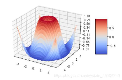
1.三维曲面(颜色贴图)
使用coolwarm颜色贴图着色的3D表面。 使用antialiased = False使表面变得不透明。使用LinearLocator和z轴刻度标签的自定义格式。
from mpl_toolkits.mplot3d import Axes3D  #导入相关库
import matplotlib.pyplot as plt
from matplotlib import cm
from matplotlib.ticker import LinearLocator, FormatStrFormatter
import numpy as np

fig = plt.figure()
ax = fig.gca(projection='3d')

# 数据
X = np.arange(-5, 5, 0.25)
Y = np.arange(-5, 5, 0.25)
X, Y = np.meshgrid(X, Y)
R = np.sqrt(X**2 + Y**2)
Z = np.sin(R)

# 绘制表面
surf = ax.plot_surface(X, Y, Z, cmap=cm.coolwarm,linewidth=0, antialiased=False)

# 自定义z轴
ax.set_zlim(-1.01,1.01)
ax.zaxis.set_major_locator(LinearLocator(10))
ax.zaxis.set_major_formatter(FormatStrFormatter('%.02f'))

# 添加一个颜色栏,将值映射到颜色。
fig.colorbar(surf, shrink=0.5, aspect=3)

plt.show()
2.3D散点图
from mpl_toolkits.mplot3d import Axes3D
import matplotlib.pyplot as plt
import numpy as np

def randrange(n,vmin,vmax):
    return (vmax - vmin)*np.random.rand(n) + vmin

np.random.seed(19680801)
fig = plt.figure()
ax = fig.add_subplot(111, projection='3d')
n = 100

for c, m, zlow, zhigh in [('r', 'o', -50, -25), ('b', '^', -30, -5)]:
    xs = randrange(n, 23, 32)
    ys = randrange(n, 0, 100)
    zs = randrange(n, zlow, zhigh)
    ax.scatter(xs, ys, zs, c=c, marker=m)

ax.set_xlabel('X Label')
ax.set_ylabel('Y Label')
ax.set_zlabel('Z Label')

plt.show()


 124
124


 被折叠的 条评论
为什么被折叠?
被折叠的 条评论
为什么被折叠?
 到【灌水乐园】发言


