


 文章展示了如何在React中封装一个Button组件,包括不同类型的按钮、尺寸、禁用状态、圆角、虚线边框及加载状态等特性,并提供了详细的接口定义和使用示例。此外,还提到了GitHub上的组件库地址。

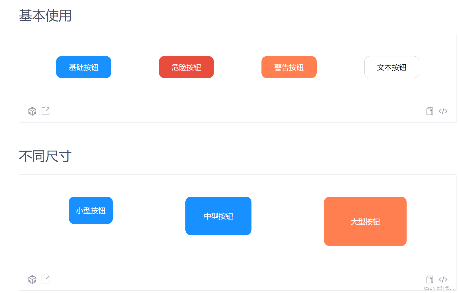
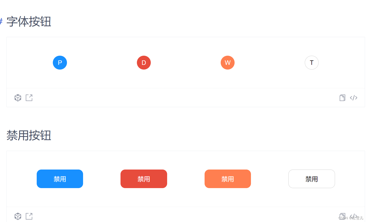
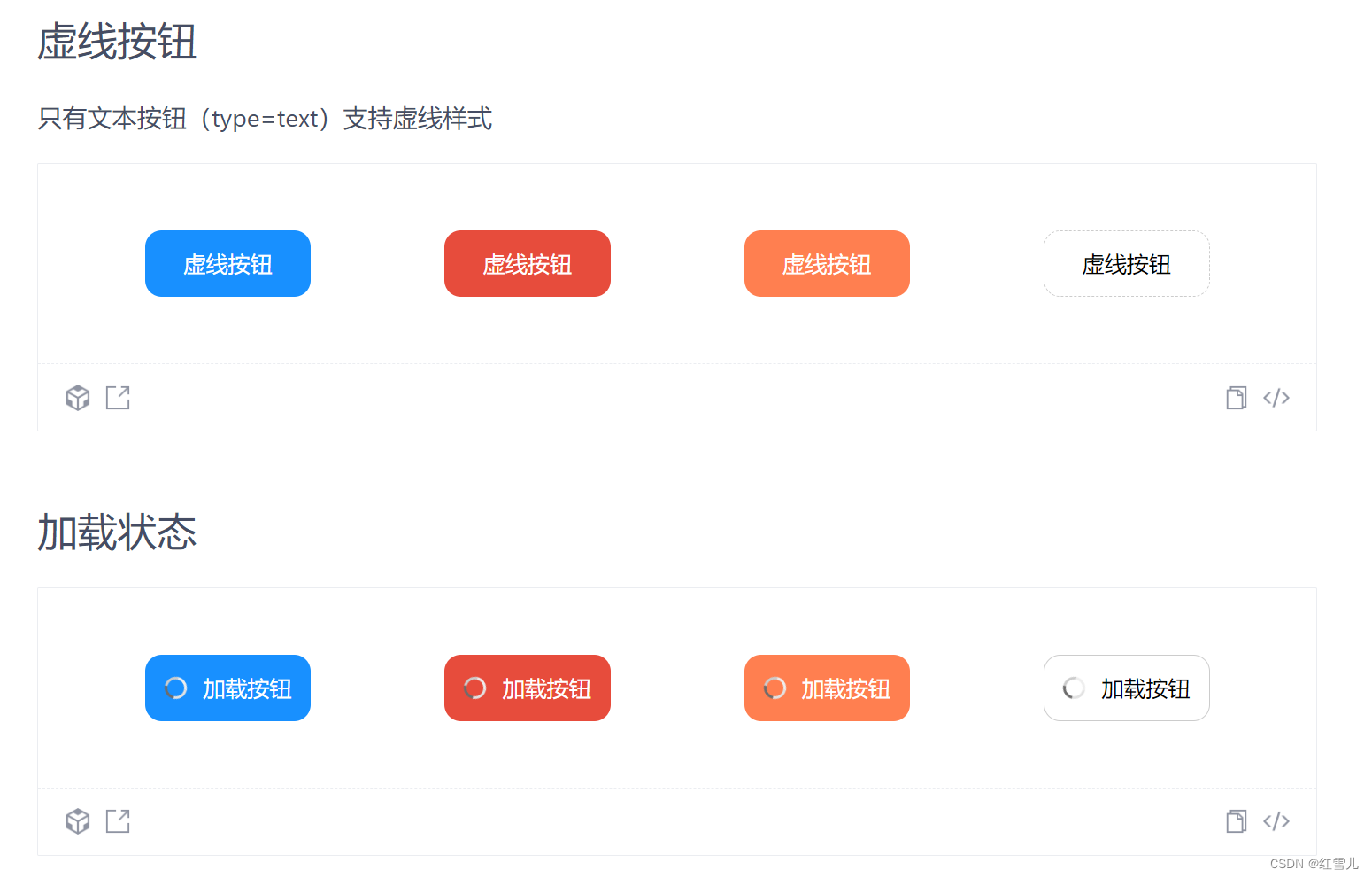
Button 按钮
使用以及文档如图:
封装代码如下所示
import React, {useMemo, FC, memo} from 'react';
import './index.module.less';
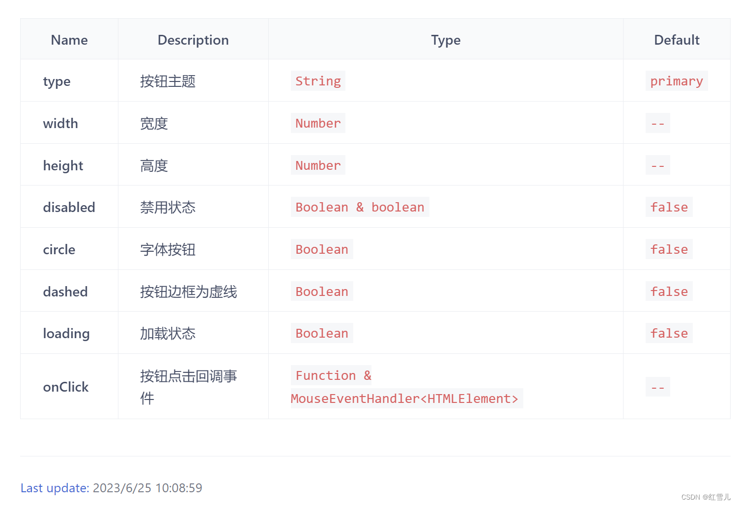
interface ButtonProps {
//自定义button接口
/**
* @description 按钮主题
* @default primary
*/
type?: String;
/**
* @description 宽度
*/
width?: Number;
/**
* @description 高度
*/
height?: Number;
/**
* @description 禁用状态
* @default false
*/
disabled?: Boolean;
/**
* @description 字体按钮
* @default false
*/
circle?: Boolean;
/**
* @description 按钮边框为虚线
* @default false
*/
dashed?: Boolean;
/**
* @description 加载状态
* @default false
*/
loading?: Boolean;
/**
* @description 按钮点击回调事件
*/
onClick?: Function | undefined;
}
interface ButtonStyle {
//button样式接口
width?: String;
height?: String;
borderRadius?: String;
border?: String;
cursor?: String;
}
type NativeButtonProps = Omit<React.ButtonHTMLAttributes<HTMLElement>, 'type'>; //原生button接口
const Button: FC<ButtonProps & NativeButtonProps> = memo((props) => {
const {type, width, height, disabled, circle, dashed, loading, onClick, children} = props;
const buttonStyle = useMemo(() => {
if (!type && type !== 'danger' && type !== 'warning' && type !== 'warning' && type !== 'text') {
return 'primary';
}
return type as any;
}, [type]);
const buttonSize = useMemo(() => {
var size: ButtonStyle = {
width: '100px',
height: '40px',
};
if (width) {
size.width = width + 'px';
}
if (height) {
size.height = height + 'px';
}
if (circle) {
size = {...size, borderRadius: '50%'};
}
if (dashed && type === 'text') {
size = {...size, border: '1px dashed #ccc'};
}
if (disabled) {
size = {...size, cursor: 'not-allowed'};
}
return size;
}, [width, height, circle, dashed]);
return (
<div className="button">
<button
className={buttonStyle}
style={buttonSize as any}
disabled={disabled ? true : false}
onClick={onClick as undefined}
>
{loading && <div className="loading1"/>}
{children}
</button>
</div>
);
});
export default Button;
 https://github.com/username-boy/react-component-library-view/
good luck !


 扫一扫
扫一扫


 2786
2786

 被折叠的 条评论
为什么被折叠?
被折叠的 条评论
为什么被折叠?
 到【灌水乐园】发言


