


功能和设计如图
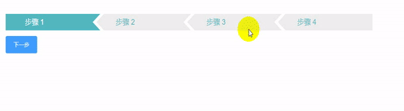
简介
在项目中UI设计的步骤条的组件并不是element组件中已有的,对于步骤条的功能,难点可能就是在于样式而非功能。本节也主要是侧重于样式。
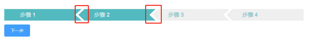
走过的弯路
一开始主要是关注在如图中的三角形的样式的实现。
简述如何实现三角形
使用::before和::after伪元素绘制三角形来实现
template部分
<div class="steps">
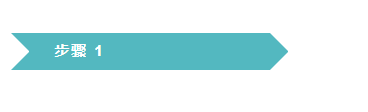
<div class="step-name">步骤 1</div>
</div>CSS部分
.steps{
  background: #53B8C0;
  width: 12vw;
  height: 3.5vh;
  .step-name{
    display: block;
    font-size: 1.4vh;
    font-weight: 600;
    letter-spacing: 0.1vw;
    width: 10vw;
    height: 3.5vh;
    float: left;
    margin-left: 2vw;
    line-height: 3.5vh;
    color: #FFF;
  }
}
.steps::before{
  content:"";
  width: 0px;
  height: 3.5vh;
  position:absolute;
  box-sizing:border-box;
  background:#53B8C0;
  border-top: 1.75vh solid transparent;
  border-left: 1.75vh solid #FFF;
  border-bottom: 1.75vh solid transparent;
}
.steps::after{
  content: "";
  width: 0px;
  height: 3.5vh;
  position: absolute;
  box-sizing: border-box;
  border-top: 1.75vh solid transparent;
  border-left: 1.75vh solid #53B8C0;
  border-bottom: 1.75vh solid transparent;
}
预览效果
缺点分析
左侧和右侧的部分分别使用了::before和::after并使用了不同的样式,此外,首个元素和最后一个元素分别没有::before和::after,并且当步骤发生改变时,需要改变div、::before和::after的背景,因此样式会相当的烦琐并且会具有很强的逻辑性,虽然这种方法肯定可以实现,但我还是弃用了这种方法。
最终采用的方法
使用CSS3的clip-path裁剪路径中的polygon定义多边形
polygon的简介
语法:
polygon( <fill-rule>? , [ <length-percentage> <length-percentage> ]# )
说明:
<fill-rule>可选,表示填充规则用来确定该多边形的内部。可能的值有nonzero和evenodd,默认值是nonzero
后面的每对参数表示多边形的顶点坐标(X,Y),也就是连接点
对于多边形的顶点坐标,从左上角开始,以顺时针的顺序列出所有点的x,y坐标即可。下面这个连点成图是不是很熟悉?

只不过CSS中点的顺序和这个图是不一样的。
template部分
<template>
  <div>
    <div class="steps">
        <div :class="'step ' + (step >= index + 1 ? 'pass' : '')" v-for="(item, index) in steps" :key="index">
          <div class="title">{{ item.title }}</div>
        </div>
    </div>
    <el-col :span="24" style="margin-top:1vh">
      <el-button type="primary" @click="nextStep">下一步</el-button>
    </el-col>
  </div>
</template>
CSS部分
观察(中间部分的)多边形六个顶点的坐标。参考下图:

为中间的部分(也就是.steps部分)添加相应的样式:
.steps{
  width: 100%;
  .step{
    float: left;
    width: 10%;
    line-height: 3vh;
    color: #53B8C0;
    font-size: 18px;
    background: #EEE;
    margin-left: -0.4vw;
    clip-path: polygon(8% 0,100% 0,92% 50%,100% 100%,8% 100%,0 50%);
    .title{
      margin-left: 2vw;
    }
  }
}
当然,首个和末个元素的多边形是不一样的,因此在下面覆盖.step的样式:
  .step:first-child{
    margin-left: 0;
    clip-path: polygon(0 0,100% 0,92% 50%,100% 100%,0 100%);
  }
  .step:last-child{
    clip-path: polygon(8% 0,100% 0, 100% 100%, 8% 100%,0 50%);
  }
对于已经走过的步骤,需要改变其对应的背景图片和字体颜色:
  .pass{
    background: #53B8C0;
    color: #FFF;
  }
如此整个样式部分已经完成,相对于使用伪元素绘制三角形的方式,这种方式更加简单,且不需要因为走过的步骤需要变化颜色而改变太多的内容。
JS部分
JS部分的内容其实就相对简单,代码如下:
<script>
export default {
  data () {
    return {
      step: 1,
      steps: [
        {
          title: '步骤 1'
        },
        {
          title: '步骤 2'
        },
        {
          title: '步骤 3'
        },
        {
          title: '步骤 4'
        }
      ]
    }
  },
  methods: {
    nextStep () {
      this.step === this.steps.length ? this.step = 1 : this.step++
    }
  }
}
我这里是使用了可以循环的步骤,即最后一个步骤的下一步跳到上一个步骤,也可以不这么使用。
---连点成图的图片来源于网络。


 178
178


 被折叠的 条评论
为什么被折叠?
被折叠的 条评论
为什么被折叠?
 到【灌水乐园】发言


