


Alert 警告
用于页面中展示重要的提示信息。
基本用法
页面中的非浮层元素,不会自动消失。
<template>
<el-alert
title="成功提示的文案"
type="success">
</el-alert>
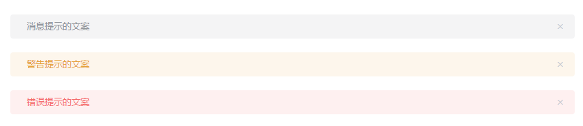
<el-alert
title="消息提示的文案"
type="info">
</el-alert>
<el-alert
title="警告提示的文案"
type="warning">
</el-alert>
<el-alert
title="错误提示的文案"
type="error">
</el-alert>
</template>
主题
Alert 组件提供了两个不同的主题:light和dark。

<template>
  <el-alert
    title="成功提示的文案"
    type="success"
    effect="dark">
  </el-alert>
  <el-alert
    title="消息提示的文案"
    type="info"
    effect="dark">
  </el-alert>
  <el-alert
    title="警告提示的文案"
    type="warning"
    effect="dark">
  </el-alert>
  <el-alert
    title="错误提示的文案"
    type="error"
    effect="dark">
  </el-alert>
</template>
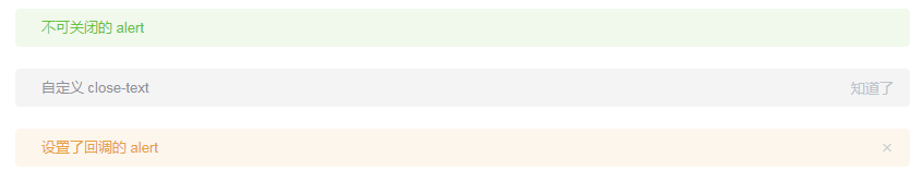
自定义关闭按钮
自定义关闭按钮为文字或其他符号。
<template>
  <el-alert
    title="不可关闭的 alert"
    type="success"
    :closable="false">
  </el-alert>
  <el-alert
    title="自定义 close-text"
    type="info"
    close-text="知道了">
  </el-alert>
  <el-alert
    title="设置了回调的 alert"
    type="warning"
    @close="hello">
  </el-alert>
</template>

<script>
  export default {
    methods: {
      hello() {
        alert('Hello World!');
      }
    }
  }
</script>
带有 icon
表示某种状态时提升可读性。

<template>
  <el-alert
    title="成功提示的文案"
    type="success"
    show-icon>
  </el-alert>
  <el-alert
    title="消息提示的文案"
    type="info"
    show-icon>
  </el-alert>
  <el-alert
    title="警告提示的文案"
    type="warning"
    show-icon>
  </el-alert>
  <el-alert
    title="错误提示的文案"
    type="error"
    show-icon>
  </el-alert>
</template>
文字居中
使用 center 属性让文字水平居中。

<template>
  <el-alert
    title="成功提示的文案"
    type="success"
    center
    show-icon>
  </el-alert>
  <el-alert
    title="消息提示的文案"
    type="info"
    center
    show-icon>
  </el-alert>
  <el-alert
    title="警告提示的文案"
    type="warning"
    center
    show-icon>
  </el-alert>
  <el-alert
    title="错误提示的文案"
    type="error"
    center
    show-icon>
  </el-alert>
</template>
带有辅助性文字介绍
包含标题和内容,解释更详细的警告。

<template>
  <el-alert
    title="带辅助性文字介绍"
    type="success"
    description="这是一句绕口令:黑灰化肥会挥发发灰黑化肥挥发;灰黑化肥会挥发发黑灰化肥发挥。 黑灰化肥会挥发发灰黑化肥黑灰挥发化为灰……">
  </el-alert>
</template>
带有 icon 和辅助性文字介绍

<template>
  <el-alert
    title="成功提示的文案"
    type="success"
    description="文字说明文字说明文字说明文字说明文字说明文字说明"
    show-icon>
  </el-alert>
  <el-alert
    title="消息提示的文案"
    type="info"
    description="文字说明文字说明文字说明文字说明文字说明文字说明"
    show-icon>
  </el-alert>
  <el-alert
    title="警告提示的文案"
    type="warning"
    description="文字说明文字说明文字说明文字说明文字说明文字说明"
    show-icon>
  </el-alert>
  <el-alert
    title="错误提示的文案"
    type="error"
    description="文字说明文字说明文字说明文字说明文字说明文字说明"
    show-icon>
  </el-alert>
</template>
Loading 加载
加载数据时显示动效。
区域加载
在表格等容器中加载数据时显示。

<template>
  <el-table
    v-loading="loading"
    :data="tableData"
    style="width: 100%">
    <el-table-column
      prop="date"
      label="日期"
      width="180">
    </el-table-column>
    <el-table-column
      prop="name"
      label="姓名"
      width="180">
    </el-table-column>
    <el-table-column
      prop="address"
      label="地址">
    </el-table-column>
  </el-table>
</template>

<style>
  body {
    margin: 0;
  }
</style>

<script>
  export default {
    data() {
      return {
        tableData: [{
          date: '2016-05-03',
          name: '王小虎',
          address: '上海市普陀区金沙江路 1518 弄'
        }, {
          date: '2016-05-02',
          name: '王小虎',
          address: '上海市普陀区金沙江路 1518 弄'
        }, {
          date: '2016-05-04',
          name: '王小虎',
          address: '上海市普陀区金沙江路 1518 弄'
        }],
        loading: true
      };
    }
  };
</script>
自定义
可自定义加载文案、图标和背景色。

<template>
  <el-table
    v-loading="loading"
    element-loading-text="拼命加载中"
    element-loading-spinner="el-icon-loading"
    element-loading-background="rgba(0, 0, 0, 0.8)"
    :data="tableData"
    style="width: 100%">
    <el-table-column
      prop="date"
      label="日期"
      width="180">
    </el-table-column>
    <el-table-column
      prop="name"
      label="姓名"
      width="180">
    </el-table-column>
    <el-table-column
      prop="address"
      label="地址">
    </el-table-column>
  </el-table>
</template>

<script>
  export default {
    data() {
      return {
        tableData: [{
          date: '2016-05-03',
          name: '王小虎',
          address: '上海市普陀区金沙江路 1518 弄'
        }, {
          date: '2016-05-02',
          name: '王小虎',
          address: '上海市普陀区金沙江路 1518 弄'
        }, {
          date: '2016-05-04',
          name: '王小虎',
          address: '上海市普陀区金沙江路 1518 弄'
        }],
        loading: true
      };
    }
  };
</script>
整页加载
页面数据加载时显示。
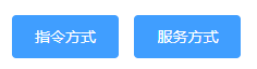
<template>
  <el-button
    type="primary"
    @click="openFullScreen"
    v-loading.fullscreen.lock="fullscreenLoading">
    指令方式
  </el-button>
  <el-button
    type="primary"
    @click="openFullScreen">
    服务方式
  </el-button>
</template>

<script>
  export default {
    data() {
      return {
        fullscreenLoading: false
      }
    },
    methods: {
      openFullScreen() {
        this.fullscreenLoading = true;
        setTimeout(() => {
          this.fullscreenLoading = false;
        }, 2000);
      },
      openFullScreen() {
        const loading = this.$loading({
          lock: true,
          text: 'Loading',
          spinner: 'el-icon-loading',
          background: 'rgba(0, 0, 0, 0.7)'
        });
        setTimeout(() => {
          loading.close();
        }, 2000);
      }
    }
  }
</script>
Message 消息提示
常用于主动操作后的反馈提示。与 Notification 的区别是后者更多用于系统级通知的被动提醒。
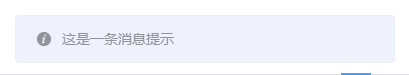
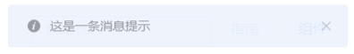
基础用法
从顶部出现,3 秒后自动消失。

<template>
  <el-button :plain="true" @click="open">打开消息提示</el-button>
  <el-button :plain="true" @click="openVn">VNode</el-button>
</template>

<script>
  export default {
    methods: {
      open() {
        this.$message('这是一条消息提示');
      },

      openVn() {
        const h = this.$createElement;
        this.$message({
          message: h('p', null, [
            h('span', null, '内容可以是 '),
            h('i', { style: 'color: teal' }, 'VNode')
          ])
        });
      }
    }
  }
</script>
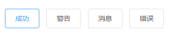
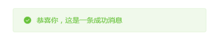
不同状态
用来显示「成功、警告、消息、错误」类的操作反馈。
<template>
  <el-button :plain="true" @click="open2">成功</el-button>
  <el-button :plain="true" @click="open3">警告</el-button>
  <el-button :plain="true" @click="open1">消息</el-button>
  <el-button :plain="true" @click="open4">错误</el-button>
</template>

<script>
  export default {
    methods: {
      open1() {
        this.$message('这是一条消息提示');
      },
      open2() {
        this.$message({
          message: '恭喜你,这是一条成功消息',
          type: 'success'
        });
      },

      open3() {
        this.$message({
          message: '警告哦,这是一条警告消息',
          type: 'warning'
        });
      },

      open4() {
        this.$message.error('错了哦,这是一条错误消息');
      }
    }
  }
</script>
可关闭
可以添加关闭按钮。
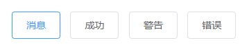
<template>
  <el-button :plain="true" @click="open1">消息</el-button>
  <el-button :plain="true" @click="open2">成功</el-button>
  <el-button :plain="true" @click="open3">警告</el-button>
  <el-button :plain="true" @click="open4">错误</el-button>
</template>

<script>
  export default {
    methods: {
      open1() {
        this.$message({
          showClose: true,
          message: '这是一条消息提示'
        });
      },

      open2() {
        this.$message({
          showClose: true,
          message: '恭喜你,这是一条成功消息',
          type: 'success'
        });
      },

      open3() {
        this.$message({
          showClose: true,
          message: '警告哦,这是一条警告消息',
          type: 'warning'
        });
      },

      open4() {
        this.$message({
          showClose: true,
          message: '错了哦,这是一条错误消息',
          type: 'error'
        });
      }
    }
  }
</script>
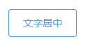
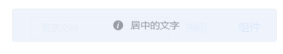
文字居中
使用 center 属性让文字水平居中。
<template>
  <el-button :plain="true" @click="openCenter">文字居中</el-button>
</template>

<script>
  export default {
    methods: {
      openCenter() {
        this.$message({
          message: '居中的文字',
          center: true
        });
      }
    }
  }
</script>
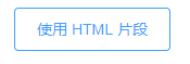
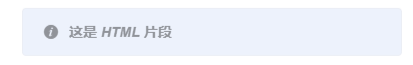
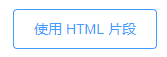
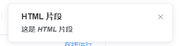
使用 HTML 片段
message 属性支持传入 HTML 片段
<template>
  <el-button :plain="true" @click="openHTML">使用 HTML 片段</el-button>
</template>

<script>
  export default {
    methods: {
      openHTML() {
        this.$message({
          dangerouslyUseHTMLString: true,
          message: '<strong>这是 <i>HTML</i> 片段</strong>'
        });
      }
    }
  }
</script>
MessageBox 弹框
模拟系统的消息提示框而实现的一套模态对话框组件,用于消息提示、确认消息和提交内容。
从场景上说,
MessageBox的作用是美化系统自带的alert、confirm和prompt,因此适合展示较为简单的内容。如果需要弹出较为复杂的内容,请使用Dialog。
消息提示
当用户进行操作时会被触发,该对话框中断用户操作,直到用户确认知晓后才可关闭。

<template>
  <el-button type="text" @click="open">点击打开 Message Box</el-button>
</template>

<script>
  export default {
    methods: {
      open() {
        this.$alert('这是一段内容', '标题名称', {
          confirmButtonText: '确定',
          callback: action => {
            this.$message({
              type: 'info',
              message: `action: ${ action }`
            });
          }
        });
      }
    }
  }
</script>
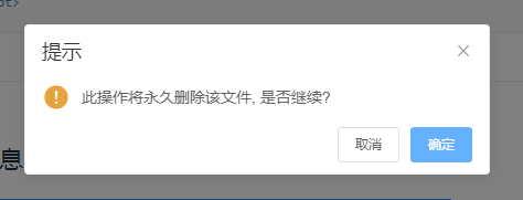
确认消息
提示用户确认其已经触发的动作,并询问是否进行此操作时会用到此对话框。
<template>
  <el-button type="text" @click="open">点击打开 Message Box</el-button>
</template>

<script>
  export default {
    methods: {
      open() {
        this.$confirm('此操作将永久删除该文件, 是否继续?', '提示', {
          confirmButtonText: '确定',
          cancelButtonText: '取消',
          type: 'warning'
        }).then(() => {
          this.$message({
            type: 'success',
            message: '删除成功!'
          });
        }).catch(() => {
          this.$message({
            type: 'info',
            message: '已取消删除'
          });
        });
      }
    }
  }
</script>
提交内容
当用户进行操作时会被触发,中断用户操作,提示用户进行输入的对话框。

<template>
  <el-button type="text" @click="open">点击打开 Message Box</el-button>
</template>

<script>
  export default {
    methods: {
      open() {
        this.$prompt('请输入邮箱', '提示', {
          confirmButtonText: '确定',
          cancelButtonText: '取消',
          inputPattern: /[\w!#$%&'*+/=?^_`{|}~-]+(?:\.[\w!#$%&'*+/=?^_`{|}~-]+)*@(?:[\w](?:[\w-]*[\w])?\.)+[\w](?:[\w-]*[\w])?/,
          inputErrorMessage: '邮箱格式不正确'
        }).then(({ value }) => {
          this.$message({
            type: 'success',
            message: '你的邮箱是: ' + value
          });
        }).catch(() => {
          this.$message({
            type: 'info',
            message: '取消输入'
          });
        });
      }
    }
  }
</script>
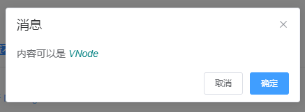
自定义
可自定义配置不同内容。
<template>
  <el-button type="text" @click="open">点击打开 Message Box</el-button>
</template>

<script>
  export default {
    methods: {
      open() {
        const h = this.$createElement;
        this.$msgbox({
          title: '消息',
          message: h('p', null, [
            h('span', null, '内容可以是 '),
            h('i', { style: 'color: teal' }, 'VNode')
          ]),
          showCancelButton: true,
          confirmButtonText: '确定',
          cancelButtonText: '取消',
          beforeClose: (action, instance, done) => {
            if (action === 'confirm') {
              instance.confirmButtonLoading = true;
              instance.confirmButtonText = '执行中...';
              setTimeout(() => {
                done();
                setTimeout(() => {
                  instance.confirmButtonLoading = false;
                }, 300);
              }, 3000);
            } else {
              done();
            }
          }
        }).then(action => {
          this.$message({
            type: 'info',
            message: 'action: ' + action
          });
        });
      }
    }
  }
</script>
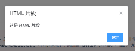
使用 HTML 片段
message 属性支持传入 HTML 片段。
<template>
  <el-button type="text" @click="open">点击打开 Message Box</el-button>
</template>

<script>
  export default {
    methods: {
      open() {
        this.$alert('<strong>这是 <i>HTML</i> 片段</strong>', 'HTML 片段', {
          dangerouslyUseHTMLString: true
        });
      }
    }
  }
</script>
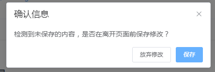
区分取消与关闭
有些场景下,点击取消按钮与点击关闭按钮有着不同的含义。
<template>
  <el-button type="text" @click="open">点击打开 Message Box</el-button>
</template>

<script>
  export default {
    methods: {
      open() {
        this.$confirm('检测到未保存的内容,是否在离开页面前保存修改?', '确认信息', {
          distinguishCancelAndClose: true,
          confirmButtonText: '保存',
          cancelButtonText: '放弃修改'
        })
          .then(() => {
            this.$message({
              type: 'info',
              message: '保存修改'
            });
          })
          .catch(action => {
            this.$message({
              type: 'info',
              message: action === 'cancel'
                ? '放弃保存并离开页面'
                : '停留在当前页面'
            })
          });
      }
    }
  }
</script>
居中布局
内容支持居中布局

<template>
  <el-button type="text" @click="open">点击打开 Message Box</el-button>
</template>

<script>
  export default {
    methods: {
      open() {
        this.$confirm('此操作将永久删除该文件, 是否继续?', '提示', {
          confirmButtonText: '确定',
          cancelButtonText: '取消',
          type: 'warning',
          center: true
        }).then(() => {
          this.$message({
            type: 'success',
            message: '删除成功!'
          });
        }).catch(() => {
          this.$message({
            type: 'info',
            message: '已取消删除'
          });
        });
      }
    }
  }
</script>
Notification 通知
悬浮出现在页面角落,显示全局的通知提醒消息。
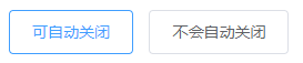
基本用法
适用性广泛的通知栏
<template>
<el-button
plain
@click="open1">
可自动关闭
</el-button>
<el-button
plain
@click="open2">
不会自动关闭
</el-button>
</template>
<script>
export default {
methods: {
open1() {
const h = this.$createElement;
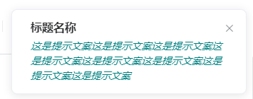
this.$notify({
title: '标题名称',
message: h('i', { style: 'color: teal'}, '这是提示文案这是提示文案这是提示文案这是提示文案这是提示文案这是提示文案这是提示文案这是提示文案')
});
},
open2() {
this.$notify({
title: '提示',
message: '这是一条不会自动关闭的消息',
duration: 0
});
}
}
}
</script>
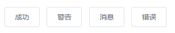
带有倾向性
带有 icon,常用来显示「成功、警告、消息、错误」类的系统消息。
<template>
<el-button
plain
@click="open1">
成功
</el-button>
<el-button
plain
@click="open2">
警告
</el-button>
<el-button
plain
@click="open3">
消息
</el-button>
<el-button
plain
@click="open4">
错误
</el-button>
</template>
<script>
export default {
methods: {
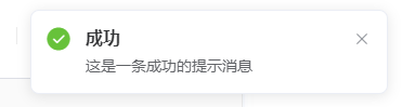
open1() {
this.$notify({
title: '成功',
message: '这是一条成功的提示消息',
type: 'success'
});
},
open2() {
this.$notify({
title: '警告',
message: '这是一条警告的提示消息',
type: 'warning'
});
},
open3() {
this.$notify.info({
title: '消息',
message: '这是一条消息的提示消息'
});
},
open4() {
this.$notify.error({
title: '错误',
message: '这是一条错误的提示消息'
});
}
}
}
</script>
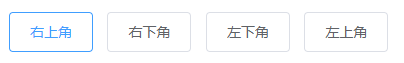
自定义弹出位置
可以让 Notification 从屏幕四角中的任意一角弹出。
<template>
<el-button
plain
@click="open1">
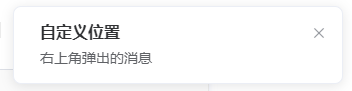
右上角
</el-button>
<el-button
plain
@click="open2">
右下角
</el-button>
<el-button
plain
@click="open3">
左下角
</el-button>
<el-button
plain
@click="open4">
左上角
</el-button>
</template>
<script>
export default {
methods: {
open1() {
this.$notify({
title: '自定义位置',
message: '右上角弹出的消息'
});
},
open2() {
this.$notify({
title: '自定义位置',
message: '右下角弹出的消息',
position: 'bottom-right'
});
},
open3() {
this.$notify({
title: '自定义位置',
message: '左下角弹出的消息',
position: 'bottom-left'
});
},
open4() {
this.$notify({
title: '自定义位置',
message: '左上角弹出的消息',
position: 'top-left'
});
}
}
}
</script>
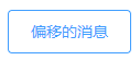
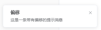
带有偏移
让 Notification 偏移一些位置。
<template>
  <el-button
    plain
    @click="open">
    偏移的消息
  </el-button>
</template>

<script>
  export default {
    methods: {
      open() {
        this.$notify({
          title: '偏移',
          message: '这是一条带有偏移的提示消息',
          offset: 100
        });
      }
    }
  }
</script>
使用 HTML 片段
message 属性支持传入 HTML 片段。
<template>
  <el-button
    plain
    @click="open">
    使用 HTML 片段
  </el-button>
</template>

<script>
  export default {
    methods: {
      open() {
        this.$notify({
          title: 'HTML 片段',
          dangerouslyUseHTMLString: true,
          message: '<strong>这是 <i>HTML</i> 片段</strong>'
        });
      }
    }
  }
</script>
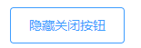
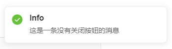
隐藏关闭按钮
可以不显示关闭按钮
<template>
  <el-button
    plain
    @click="open">
    隐藏关闭按钮
  </el-button>
</template>

<script>
  export default {
    methods: {
      open() {
        this.$notify.success({
          title: 'Info',
          message: '这是一条没有关闭按钮的消息',
          showClose: false
        });
      }
    }
  }
</script>


 241
241


 被折叠的 条评论
为什么被折叠?
被折叠的 条评论
为什么被折叠?
 到【灌水乐园】发言


