


Css网站
1.cssfx 精美简单的点击复制 CSS 效果 .CSSFX - Beautifully simple click-to-copy CSS effects
1.space-between(around)最后一行左对齐
flex布局设置space-between(around)最后一行不左对齐问题
参考地址:flex布局——最后一行左对齐的实现方式(css功能实现)
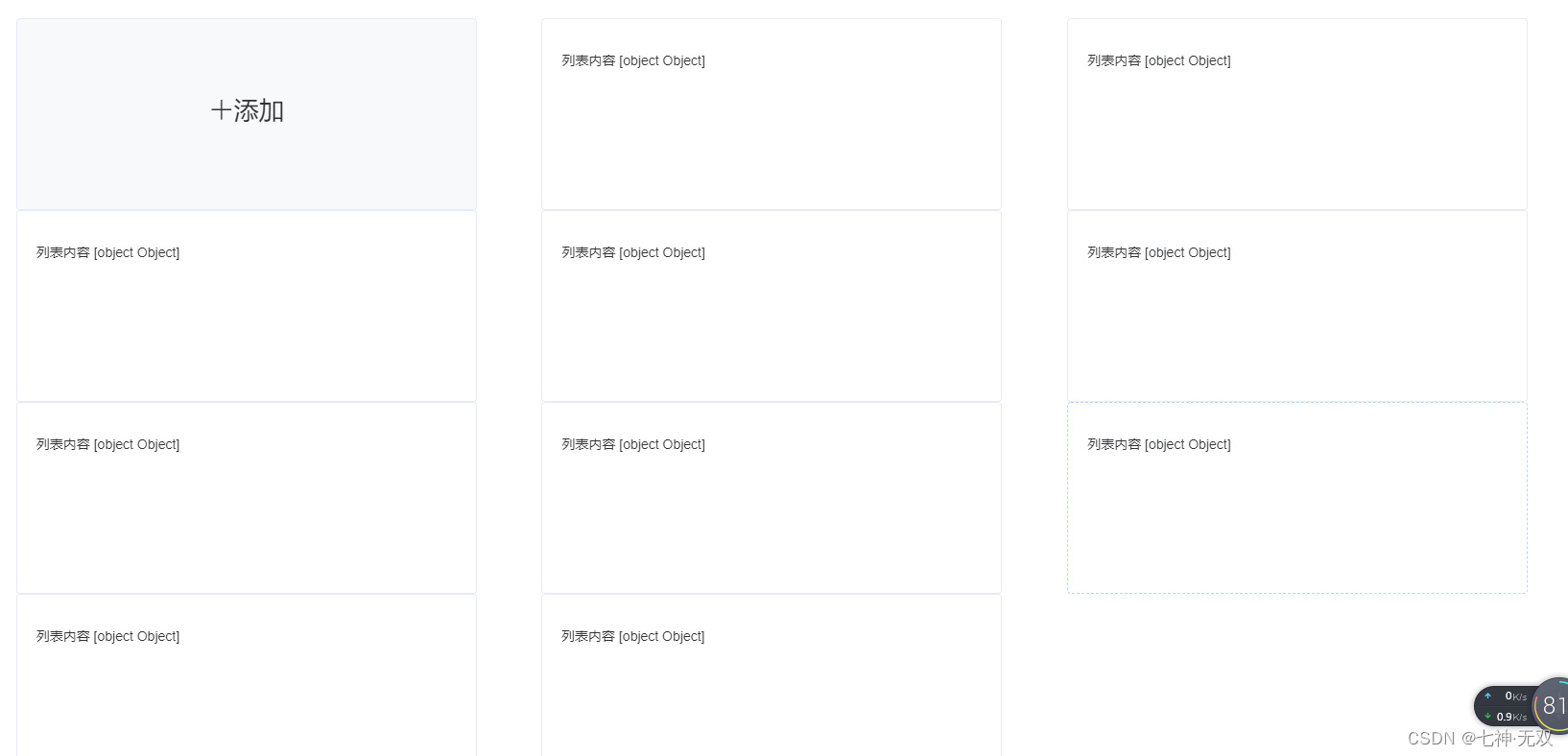
<el-row>
      <el-col :span="24">
        <div class="cardcontent">
            <div class="card-item">
              <el-card class="box-card addItem" shadow="hover" @click.native="handleAdd">
                <div class="addItem-text">
                  <i class="el-icon-plus">添加</i>
                </div>
              </el-card>
            </div>
        <template v-for="(item,index) in datapList" >
          <div class="card-item">
              <el-card class="box-card" shadow="hover">
                <div class="text item">
                  {{'列表内容 ' + item }}
                </div>
            </el-card>
          </div>
        </template>
        </div>
        </el-col>
    </el-row>
.cardcontent{
display: flex;
flex-wrap: wrap;
justify-content: space-around;
align-content: flex-start
}
.text {
font-size: 14px;
}
.item {
padding: 18px 0;
}
/* 添加样式 */
.cardcontent .addItem{
font-size: 26px;
background: #f7f9fa;
text-align:center;
}
.addItem:hover{
color: #5cb6ff;
}
.addItem-text{
line-height: 160px;
}
/*其他item样式*/
.box-card {
min-height: 200px;
min-width: 480px;
}
.box-card:hover{
border: 1px dashed #1890ff;
cursor:pointer;
}
/*当n为1时,5n-2=3,代表多出一个元素,margin-right就是第四个元素的width+第五个元素的width+2个空隙的宽度*/
.card-item:last-child:nth-child(3n - 2) {
margin-right: calc(63.4% + 10% / 3);
}
/*当n为1时,5n-1=4,代表多出两个元素,margin-right就是第五个元素的width+1个空隙的宽度*/
.card-item:last-child:nth-child(3n - 1) {
margin-right: calc(31.7% + 5% / 3);
}
2.div右对齐
#differencediv {
text-align: right;
display: flex;
justify-content: flex-end;
padding-right: 50px;
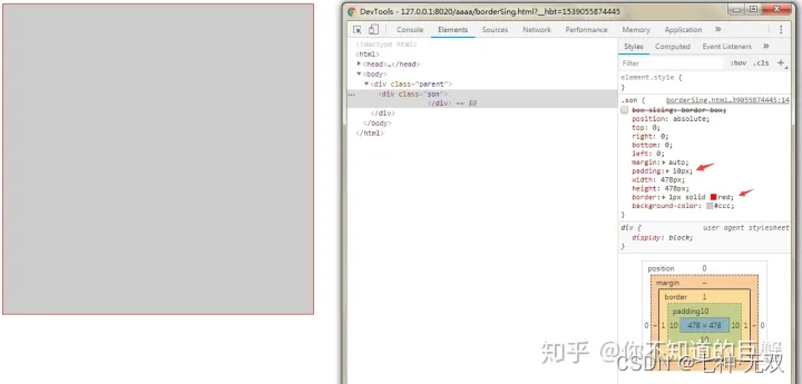
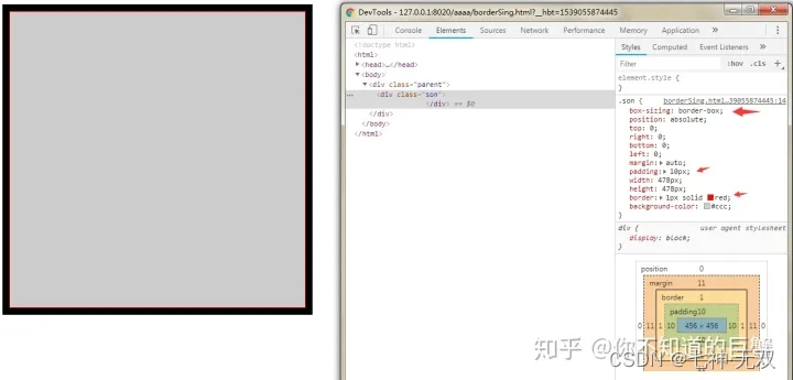
}3.box-sizing:border-box作用
文章地址:https://zhuanlan.zhihu.com/p/163113887
要想清楚这个属性的作用,首先要理解盒子模型,盒子模型是指:外边距(margin)+ border(边框) + 内边距(padding)+ content(内容),可以把每一个容器,比如div,都看做是一个盒子模型
比如你给一个div设置宽高为500px,但实际你设置的只是content,之后你又设置了padding:10px;border:1px solid red;
这时div的宽高就会变为544px(content 500px + padding 40px + border 4px)
相当于一个元素的实际宽高是由: padding + border + content 组成
①:没有设置box-sizing:border-box属性,宽高会加上padding和border的值,需要我们手动去计算,减去padding和border的值,并调整content的值,以免超过给定的宽高
比如下图,我给父元素parent设置宽高为500px,背景色为黑色;然后给子元素设置宽高为478px,并设置内边距10px,红色边框1px,背景颜色为灰色
此时子元素的宽高为500px(content 478px + padding 40px + border 4px)所以就覆盖了父元素的黑色背景,只能看到子元素的灰色背景
加了box-sizing:border-box属性,padding和border的值就不会在影响元素的宽高,相当于把padding和border的值都算在content里,
盒子模型会自动根据padding和border的值来调整content的值,就不需要手动调整
上面示例①是标准盒子模型,一般浏览器默认为标准盒子模型。即:box-sizing:content-box
上面示例②是怪异盒子模型,可根据实际项目需要自行设置。即:box-sizing:border-box
测试代码(上面可能说的不太清楚,下面的示例代码实验一下你就懂了)
<!DOCTYPE html>
<html>
    <head>
        <meta charset="UTF-8">
        <title></title>
        <style>
            .parent {
                position: relative;
                margin: 0 auto;
                width: 500px;
                height: 500px;
                background-color: #000;
            }
            .son {
                box-sizing: border-box;
                position: absolute;
                top: 0;
                right: 0;
                bottom: 0;
                left: 0;
                margin: auto;
                padding: 10px;
                width: 478px;
                height: 478px;
                border: 1px solid red;
                background-color: #ccc;
            }
        </style>
    </head>
    <body>
        <div class="parent">
            <div class="son">
            </div>
        </div>
    </body>
</html>
4.鼠标悬浮阴影

 <div style="margin-left:0px" class="descrt2">
            <div  v-for="(it,index) in form2.fileNames" :key="index+it+1" class="imageStyle1"  @click="handleDownload(it)">
              <a title="下载" href="javascript:;"  :src="it.path" >{{it.name}}</a>
            </div>
          </div>
/**资料样式 */
.descrt2{
display: flex;
justify-content: flex-start;
flex-wrap: wrap;
height:500px;
overflow: auto;
border: 1px solid #e6ebf5;
padding:10px ;
box-sizing: border-box;
}
//隐藏滚动条
.descrt2::-webkit-scrollbar{
display: none;
}
/*里面的div*/
.imageStyle1{
width: 120px;
height: 50px;
line-height: 50px;
vertical-align: middle;
text-align: center;
padding: 0px 10px;
border: 1px solid #1890ff;
margin-right: 15px;
}
.imageStyle1:hover {
border: 1px dashed #1890ff;
cursor: pointer;
box-shadow:3px 3px 5px #81c3ff;
}
.imageStyle1 a{
color: #515a6e;
}


 227
227


 被折叠的 条评论
为什么被折叠?
被折叠的 条评论
为什么被折叠?
 到【灌水乐园】发言


