


绘制固定区域的子图
%matplotlib inline
import numpy as np
import matplotlib.pyplot as plt
plt.rcParams['font.sans-serif'] = ["SimHei"]
x = [x for x in range(1, 13)]
y1 = [20, 28, 23, 16, 29, 36, 39, 33, 31, 19, 21, 25]
y2 = [17, 22, 39, 26, 35, 23, 25, 27, 29, 38, 28, 20]
labels = ['1 月 ', '2 月 ', '3 月 ', '4 月 ', '5 月 ', '6 月 ', '7 月 ', '8 月 ', '9 月 ', '10 月 ', '11 月 ', '12 月 ']
# 将画布规划成等分布局的 2×1 的矩阵区域 , 之后在索引为 1 的区域中绘制子图
ax1 = plt.subplot(211)
ax1.plot(x, y1, 'm--o', lw=2, ms=5, label=' 产品 A')
ax1.plot(x, y2, 'g--o', lw=2, ms=5, label=' 产品 B')
ax1.set_title(" 产品 A 与产品 B 的销售额趋势 ", fontsize=11)
ax1.set_ylim(10, 45)
ax1.set_ylabel(' 销售额 ( 亿元 )')
ax1.set_xlabel(' 月份 ')
for xy1 in zip(x, y1):
    ax1.annotate("%s" % xy1[1], xy=xy1, xytext=(-5, 5), textcoords='offset points')
for xy2 in zip(x, y2):
    ax1.annotate("%s" % xy2[1], xy=xy2, xytext=(-5, 5), textcoords='offset points')
ax1.legend()
# 将画布规划成等分布局的 2×2 的矩阵区域 , 之后在索引为 3 的区域中绘制子图
ax2 = plt.subplot(223)
ax2.pie(y1, radius=1, wedgeprops={'width': 0.5}, labels=labels, autopct='%3.1f%%', pctdistance=0.75)
ax2.set_title(' 产品 A 的销售额 ')
# 将画布规划成等分布局的 2×2 的矩阵区域 , 之后在索引为 4 的区域中绘制子图
ax3 = plt.subplot(224)
ax3.pie(y2, radius=1, wedgeprops={'width': 0.5}, labels=labels,autopct='%3.1f%%', pctdistance=0.75)
ax3.set_title(' 产品 B 的销售额 ')
# 调整子图之间的距离
plt.tight_layout()
plt.show()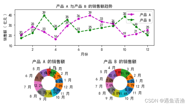
绘制多子图
%matplotlib inline
import matplotlib.pyplot as plt
# 将画布划分为 2×2 的等分区域
fig,ax_arr=plt.subplots(2,2)
#fig, ax_arr = plt.subplots(2, 2)
# 获取 ax_arr 数组第 1 行第 0 列的元素 , 也就是第 3 个区域
ax_thr=ax_arr[1,0]
#ax_thr = ax_arr[1, 0]
ax_thr.plot([1, 2, 3, 4, 5])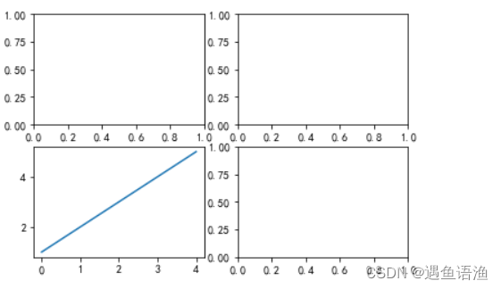
%matplotlib inline
import numpy as np
import matplotlib.pyplot as plt
plt.rcParams['font.sans-serif'] = ["SimHei"]
# 添加无指向型注释文本
def autolabel(ax, rects):
    """ 在每个矩形条的上方附加一个文本标签 , 以显示其高度 """
    for rect in rects:
        width = rect.get_width() # 获取每个矩形条的高度
        ax.text(width + 3, rect.get_y() , s='{}'.format(width),
                ha='center', va='bottom')
y = np.arange(12)
x1 = np.array([19, 33, 28, 29, 14, 24, 57, 6, 26, 15, 27, 39])
x2 = np.array([25, 33, 58, 39, 15, 64, 29, 23, 22, 11, 27, 50])
labels = np.array([' 中国 ', ' 加拿大 ', ' 巴西 ', ' 澳大利亚 ', ' 日本 ', ' 墨西哥 ', ' 俄罗斯 ', ' 韩国 ', ' 瑞士 ', ' 土耳其 ', ' 英国 ', ' 美国 '])
# 将画布规划为 1×2 的矩阵区域 , 依次在每个区域中绘制子图
fig, (ax1, ax2) = plt.subplots(1, 2)
barh1_rects = ax1.barh(y, x1, height=0.5, tick_label=labels, color='#FFA500')
ax1.set_xlabel(' 人群比例 (%)')
ax1.set_title(' 部分国家养猫人群的比例 ')
ax1.set_xlim(0, x1.max()+10)
autolabel(ax1, barh1_rects)
barh2_rects = ax2.barh(y, x2, height=0.5, tick_label=labels, color='#20B2AA')
ax2.set_xlabel(' 人群比例 (%)')
ax2.set_title(' 部分国家养狗人群的比例 ')
ax2.set_xlim(0, x2.max()+10)
autolabel(ax2, barh2_rects)
# 调整子图之间的距离
plt.tight_layout()
plt.show() 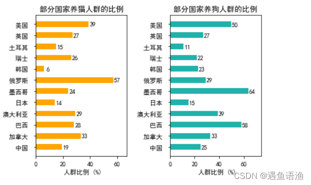
绘制自定义区域的子图
%matplotlib inline
import matplotlib.pyplot as plt
# 画布被规划成 2×3 的矩阵区域 , 之后在第 0 行第 2 列的区域中绘制子图
ax1 = plt.subplot2grid((2, 3), (0, 2))
ax1.plot([1, 2, 3, 4, 5])
# 画布被规划成 2×3 的矩阵区域 , 之后在第 1 行第 1 ~ 2 列的区域中绘制子图
ax2 = plt.subplot2grid((2, 3), (1, 1), colspan=2)
ax2.plot([1, 2, 3, 4, 5])
plt.show()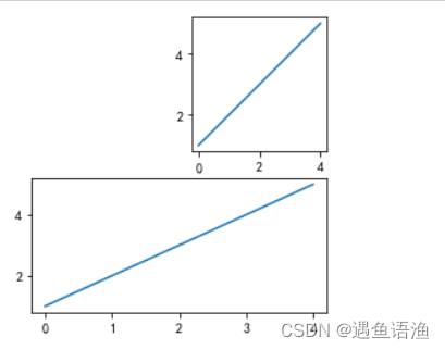
%matplotlib inline
# 03_2017_and_2018_user_analysis_of_douyin
import numpy as np
import matplotlib.pyplot as plt
plt.rcParams["font.sans-serif"] = ["SimHei"]
data_2017 = np.array([21, 35, 22, 19, 3])
data_2018 = np.array([13, 32, 27, 27, 1])
x = np.arange(5)
y = np.array([51, 73, 99, 132, 45])
labels = np.array([' 一线城市 ', ' 二线城市 ', ' 三线城市 ', ' 四线及以外 ', '其他国家及地区 '])
# 平均增长倍数
average = 75
bar_width = 0.5
# 添加无指向型注释文本
def autolabel(ax,rects):
    for rect in rects:
        height=rect.get_height()
        # 获取每个矩形条的高度
        ax.text(rect.get_x() + bar_width/2, height + 3,s='{}'.format(height), ha='center', va='bottom')
# 第 1 个子图
ax_one = plt.subplot2grid((3,2), (0,0), rowspan=2, colspan=2)
bar_rects = ax_one.bar(x, y, tick_label=labels, color='#20B2AA',
 width=bar_width)
ax_one.set_title(' 抖音 2018vs2017 人群增长倍数 ')
ax_one.set_ylabel(' 增长倍数 ')
autolabel(ax_one, bar_rects)
ax_one.set_ylim(0, y.max() + 20)
ax_one.axhline(y=75, linestyle='--', linewidth=1, color='gray')
# 第 2 个子图
ax_two = plt.subplot2grid((3,2), (2,0))
ax_two.pie(data_2017, radius=1.5, labels=labels, autopct='%3.1f%%', colors=['#2F4F4F', '#FF0000', '#A9A9A9', '#FFD700', '#B0C4DE'])
ax_two.set_title('2017 年抖音用户地区分布的比例 ')
# 第 3 个子图
ax_thr = plt.subplot2grid((3,2), (2,1))
ax_thr.pie(data_2018, radius=1.5, labels=labels, autopct='%3.1f%%', colors=['#2F4F4F', '#FF0000', '#A9A9A9', '#FFD700', '#B0C4DE'])
ax_thr.set_title('2018 年抖音用户地区分布的比例 ')
# 调整子图之间的距离
plt.tight_layout()
plt.show()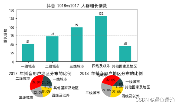
共享相邻子图的坐标轴
%matplotlib inline
import numpy as np
import matplotlib.pyplot as plt
plt.rcParams['axes.unicode_minus'] = False
x1 = np.linspace(0, 2*np.pi, 400)
x2 = np.linspace(0.01, 10, 100)
x3 = np.random.rand(10)
x4 = np.arange(0,6,0.5)
y1 = np.cos(x1**2)
y2 = np.sin(x2)
y3 = np.linspace(0,3,10)
y4 = np.power(x4,3)
# 共享每一列子图之间的 x 轴
fig, ax_arr = plt.subplots(2, 2, sharex='col')
ax1 = ax_arr[0, 0]
ax1.plot(x1, y1)
ax2 = ax_arr[0, 1]
ax2.plot(x2, y2)
ax3 = ax_arr[1, 0]
ax3.scatter(x3, y3)
ax4 = ax_arr[1, 1]
ax4.scatter(x4, y4)
plt.show()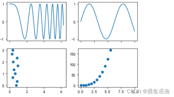
%matplotlib inline
x1 = np.linspace(0, 2*np.pi, 400)
y1 = np.cos(x1**2)
x2 = np.linspace(0.01, 10, 100)
y2 = np.sin(x2)
ax_one = plt.subplot(221)
ax_one.plot(x1, y1)
# 共享子图 ax_one 和 ax_two 的 x 轴
ax_two = plt.subplot(224, sharex=ax_one)
ax_two.plot(x2, y2)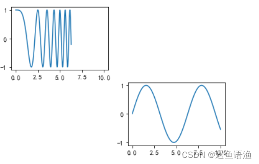
import numpy as np
import matplotlib.pyplot as plt
plt.rcParams["font.sans-serif"] = ["SimHei"]
plt.rcParams["axes.unicode_minus"] = False
month_x = np.arange(1, 13, 1)
# 平均气温
data_tem = np.array([2.0, 2.2, 3.3, 4.5, 6.3, 10.2, 20.3, 33.4, 23.0, 16.5, 12.0, 6.2])
# 降水量
data_precipitation = np.array([2.6, 5.9, 9.0, 26.4, 28.7, 70.7, 175.6, 182.2, 48.7, 18.8, 6.0, 2.3])
# 蒸发量
data_evaporation = np.array([2.0, 4.9, 7.0, 23.2, 25.6, 76.7, 135.6, 162.2, 32.6, 20.0, 6.4, 3.3])
fig, ax = plt.subplots()
bar_ev = ax.bar(month_x, data_evaporation, color='orange', tick_label=['1 月 ', '2 月 ', '3 月 ', '4 月 ', '5 月 ', '6 月 ',
'7 月 ', '8 月 ', '9 月 ', '10 月 ', '11 月 ', '12 月 '])
bar_pre = ax.bar(month_x, data_precipitation, bottom=data_evaporation, color='green')
ax.set_ylabel(' 水量 (ml)')
ax.set_title(' 平均气温与降水量、 蒸发量的关系 ')
ax_right = ax.twinx()
line = ax_right.plot(month_x, data_tem, 'o-m')
ax_right.set_ylabel(' 气温 ($^\circ$C)')
# 添加图例
plt.legend([bar_ev, bar_pre, line[0]], [' 蒸发量 ', ' 降水量 ', ' 平均气温 '],
 shadow=True, fancybox=True)
plt.show() 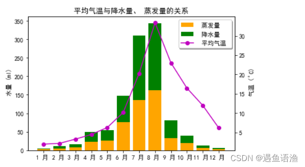
import numpy as np
import matplotlib.pyplot as plt
import matplotlib.gridspec as gridspec
plt.rcParams["font.sans-serif"] = ["SimHei"]
x_month = np.array(['1 月 ', '2 月 ', '3 月 ', '4 月 ', '5 月 ', '6 月 '])
y_sales = np.array([2150, 1050, 1560, 1480, 1530, 1490])
x_citys = np.array([' 北京 ', ' 上海 ', ' 广州 ', ' 深圳 ', ' 浙江 ', ' 山东 '])
y_sale_count = np.array([83775, 62860, 59176, 64205, 48671, 39968])
# 创建画布和布局
fig = plt.figure(constrained_layout=True)
gs = fig.add_gridspec(2, 2)
ax_one = fig.add_subplot(gs[0, :])
ax_two = fig.add_subplot(gs[1, 0])
ax_thr = fig.add_subplot(gs[1, 1])
# 第 1 个子图
ax_one.bar(x_month, y_sales, width=0.5, color='#3299CC')
ax_one.set_title('2018 年上半年某品牌汽车的销售额 ')
ax_one.set_ylabel(' 销售额 ( 亿元 )')
# 第 2 个子图
ax_two.plot(x_citys, y_sale_count, 'm--o', ms=8)
ax_two.set_title(' 分公司某品牌汽车的销量 ')
ax_two.set_ylabel(' 销量 ( 辆 )')
# 第 3 个子图
ax_thr.stackplot(x_citys, y_sale_count, color='#9999FF')
ax_thr.set_title(' 分公司某品牌汽车的销量 ')
ax_thr.set_ylabel(' 销量 ( 辆 )')
plt.show() 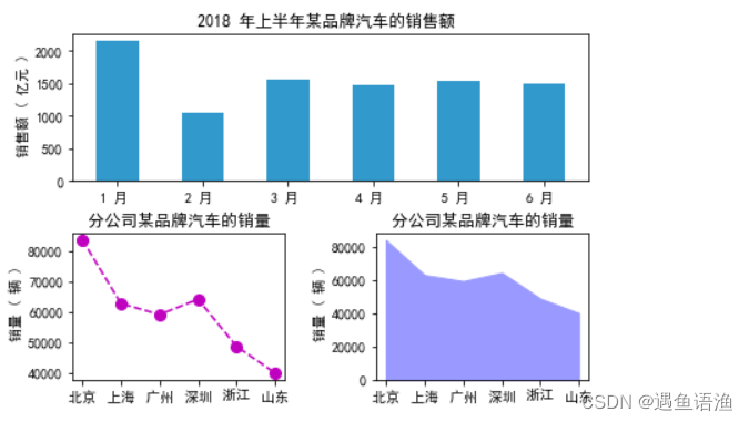


 4898
4898


 被折叠的 条评论
为什么被折叠?
被折叠的 条评论
为什么被折叠?
 到【灌水乐园】发言


