


两栏布局
  <div class="box">
    <div class="left">左边</div>
    <div class="right">右边</div>
</div> 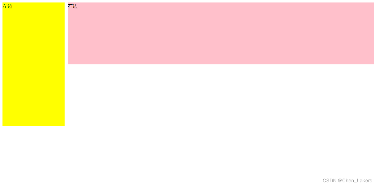
常用的有两种方式
1、flex布局
    .box{
          display: flex;
      }
      .left {
          width: 100px;
          background-color: yellow;
      }
      .right {
            flex: 1;
            background-color: pink;
       }
2、左元素浮动
     .box {
       overflow: hidden;
     }

     .left {
       float: left;
       width: 200px;
       background-color: yellow;
       height: 400px;
     }

     .right {
       margin-left: 210px;
       background-color: pink;
       height: 200px;
     }
三栏布局
  <div class="box">
    <div class="left">左边</div>
    <div class="right">右边</div>
    <div class="middle">中间</div>
  </div>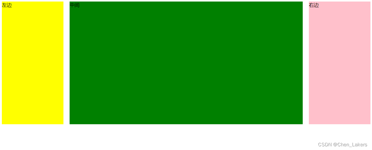
1、两边使用 float,中间使用 margin
     .box {
       overflow: hidden;
     }

     .left {
       float: left;
       width: 200px;
       height: 400px;
       background-color: yellow;
     }

     .right {
      float: right;
       background-color: pink;
       width: 200px;
       height: 400px;

     }
    .middle{
      margin: 0 220px;
      background-color: green;
      height: 400px;
    }
2、两边使用 absolute,中间使用 margin
     .box {
       position: relative;
     }

     .left {
       position: absolute;
       top: 0;
       left: 0;
       width: 200px;
       height: 400px;
       background-color: yellow;
     }

     .right {
       position: absolute;
       top: 0;
       right: 0;
       background-color: pink;
       width: 200px;
       height: 400px;

     }

     .middle {
       margin: 0 220px;
       background-color: green;
       height: 400px;
     }
3、使用flex实现
     .box {
       display: flex;
       justify-content: space-between;
     }

     .left {
       width: 200px;
       height: 400px;
       background-color: yellow;
     }

     .right {
       background-color: pink;
       width: 200px;
       height: 400px;

     }

     .middle {
       flex: 1;
       /* width: 100%; */
       margin: 0 10px;
       background-color: green;
       height: 400px;
     }


 1111
1111


 被折叠的 条评论
为什么被折叠?
被折叠的 条评论
为什么被折叠?
 到【灌水乐园】发言


