


<!DOCTYPE html>
<html lang="en">
<head>
<meta charset="UTF-8">
<title>ydsungan</title>
<style>
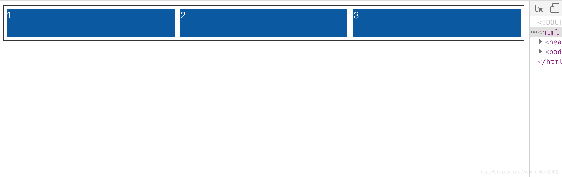
.container {
/*容器设置为flex布局*/
display: flex;
flex-wrap: wrap;/*可换行*/
justify-content: center;/*内容居中*/
border: 1px solid #333333;
}
.item{
flex: 1 1 150px;
/*flex属性是flex-grow,flex-shrink,flex-basis三个属性的简写
flex-basis:item的初始宽度;
flex-grow:如果有多余宽度,项目是否可以扩大
flex-shrink:如果宽度不足,项目是否可以缩小;
flex:1 1 150px,项目始终沾满所有宽度
*/
margin: 5px;
background-color: #0058a3;
height: 50px;
color: white;
}
</style>
</head>
<body>
<div class="container">
<div class="item">1</div>
<div class="item">2</div>
<div class="item">3</div>
</div>
</body>


 扫一扫
扫一扫


 2491
2491

 被折叠的 条评论
为什么被折叠?
被折叠的 条评论
为什么被折叠?
 到【灌水乐园】发言


