


如何将给定的数据以动画的形式展现出来呢?
** 笔者经过花费半天的时间终于实现了它。即有了动态效果也有了无线循环的效果。 **下面与大家一起分享,有用,请留下你的小心心也可以收藏下
该难点所用到的技术有:echarts插件、push()、splice()、reverse()、for循环、if判断语句
假设下面是你所拥有的的案例数据:
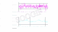
这里笔者就用一个图型的案例来说明:数据为模拟数据
var list1 = ['2020/7/1 6:20','2020/7/1 12:20','2020/7/1 18:20','2020/7/2 6:20','2020/7/2 12:20','2020/7/2 18:20',  ......  ,'2021/8/17','2021/8/17','2021/8/17']
var list2 = ['12.32','10.23','8.05','9.36','8.54','7.89', ...... ,'8.35','6.25','8.89']
该案例用不到 reverse(),用将数组倒序排列。
data中需定义
data(){
	return {
			s: 0, //看做下标取值
			H_list:[], //该数组赋值给图标
			H_list1:[],
			H_list2:[],

			H1_list1:[],
			H2_list2:[],
			H0_list:[],  //该数组赋值给图标
		}
}

getll(){
	this.s = this.s + 1
},
getT(){
		、、list1做处理
	//var H = list1.reverse()   //该案例用不到这行代码
                 for(var v = 0; v < list1.length; v++){
                     if(v < (list1.length / 2) ){     //这里是将list1数组分为两个数组 H_list1 和 H_list2 ,H_list1第一次加载时就存在,H_list2是作为动态数组     //这里if除了分为两个数组外,另外一个目的是保持图标中有数(把把第一个数组先赋给图标,然后控制第二个数组来,加入到第一个数组中,进而达到动画的效果)
                         this.H_list1.push(list1[v])
                         this.H_list.push(this.H_list1[v])
                     }else{
                         this.H_list2.push(sorH[v])
                     }
                 }
                 if(this.s < this.H_list2.length){   //进入if中就是this.H_list尾部加一个,头部去掉一个
                      this.H_list.push(this.H_list2[this.s])  //尾部加入一个
                      this.H_list.splice(0,1)    //去掉头部第一个   splice(去掉数值的下标,去掉几个的数字)
                 }else{
                      this.s = 0
                      this.getT()
                 }

	、、list2做处理
	for(var v = 0; v < list2.length; v++){
                     if(v < (list2.length / 2) ){     //这里是将list2数组分为两个数组 H1_list1 和 H2_list2 ,H_list1第一次加载时就存在,H_list2是作为动态数组
                         this.H1_list1.push(list1[v])
                         this.H0_list.push(this.H_list1[v])
                     }else{
                         this.H2_list2.push(sorH[v])
                     }
                 }
                 if(this.s < this.H2_list2.length){
                      this.H0_list.push(this.H2_list2[this.s])
                 }else{
                      this.s = 0
                      this.getT()
                 }
}
  最后在mounted中写入一下代码:
  this.getT()
  this.getll()
  window.setInterval( () => {
  	this.getT()
  	this.getll()  //控制s的变化
  }, 1000 * 10)   //10秒请求一次
算了,还是把图型代码附上吧,如下:
这里echarts的导入和使用笔者这里就不讲解了,不会的可以去看官方资料
getstress(){   //应力
            var myChart = echarts.init(document.getElementById("stress"));

            let label = this.H_list   //这两个来自上面对数据的处理的结果,再赋值给它
            let value = this.H0_list   //

            let option = {
                backgroundColor:"",
                grid: {
                    top:' 5%',
                    right:'5%',
                    left:'5%',
                    bottom:'15%',
                    // containLabel: true
                },
                tooltip: {
                        trigger: 'axis',
                        axisPointer: {
                        lineStyle: {
                            color: {
                            type: 'linear',
                            x: 0,
                            y: 0,
                            x2: 0,
                            y2: 1,
                            colorStops: [{
                                offset: 0,
                                color: 'rgba(255,255,255,0)' // 0% 处的颜色
                            }, {
                                offset: 0.5,
                                color: 'rgba(255,255,255,1)' // 100% 处的颜色
                            }, {
                                offset: 1,
                                color: 'rgba(255,255,255,0)' // 100% 处的颜色
                            }],
                            global: false // 缺省为 false
                            }
                        },
                        },
                    },
                xAxis: [{
                    // name:'不不不',
                    type: "category",
                    boundaryGap: false,
                    axisLabel: {
                        show:true,
                        color:'red',
                        // interval:,
                        formatter: '{value}',
                        fontSize:12,
                        margin:5,
                        textStyle: {
                            color: "#F076F0"
                        }
                    },
                    axisLine: {
                        lineStyle: {
                            color: "#243753"
                        }
                    },
                    splitLine: {
                        show:true,
                        lineStyle: {
                            color: "#243753"
                        }
                    },
                    axisTick:{
                        show:true
                    },
                    data: label
                }],
                yAxis: [
                    {
                        name:"/Mpa",
                        boundaryGap:false,
                        type: "value",
                        // min:'-80',
                        axisLabel: {
                            textStyle: {
                                color: "#7ec7ff"
                            }
                        },
                        nameTextStyle: {
                            color: "white",
                            fontSize: 12,
                            lineHeight: 40
                        },
                        splitLine: {
                            lineStyle: {
                                color: "#243753"
                            }
                        },
                        axisLine: {
                            show: true,
                            lineStyle:{
                                color:"#243753"
                            }
                        },
                        axisTick: {
                            show: true
                        }
                    }
                ],
                series: [{
                    name: "",
                    type: "line",
                    smooth: true,
                    showSymbol: true,
                    symbolSize: 5,
                    zlevel: 2,
                    itemStyle:{
                        color:'#19a3df',
                        borderColor:"#a3c8d8"
                    },
                    lineStyle: {
                        normal: {
                            width:2,
                            color: "#FF00FF",
                        }
                    },
                    areaStyle: {
                        normal: {
                            color: new echarts.graphic.LinearGradient( 0, 0, 0, 1,
                                [{
                                        offset: 0,
                                        color: "rgba(88,255,255,0.1)"
                                    },
                                    {
                                        offset: 0.8,
                                        color: "rgba(255,0,255,0.2)"
                                    }
                                ],
                                true
                            ),
                        }
                    },
                    data: value
                }]
            };
            myChart.setOption(option)
        },
按照笔者这个处理完还有问题,评论区留言,笔者解答


 1192
1192


 被折叠的 条评论
为什么被折叠?
被折叠的 条评论
为什么被折叠?
 到【灌水乐园】发言


