


文章目录
一、构建布局
1.线性布局 (Row/Column)
通过线性容器Row和Column构建
Column容器内子元素按照垂直方向排列
Row容器内子元素按照水平方向排列
这里主要采用弹性布局方式主轴交叉轴对齐,这里不做赘述,有点前端基础看文档就懂了
1.1 Blank空白填充组件
这里讲 Blank,作为空白填充组件,Text和 Toggle 两侧对齐,
可以用弹性布局写,也可以使用blank空白填充组件 也能实现自适应布局
@Entry
@Component
struct BlankExample {
  build() {
    Column() {
      Row() {
        Text('Bluetooth').fontSize(18)
        Blank()
        Toggle({ type: ToggleType.Switch, isOn: true })
      }.backgroundColor(0xFFFFFF).borderRadius(15).padding({ left: 12 }).width('100%')
    }.backgroundColor(0xEFEFEF).padding(20).width('100%')
  }
}
1.2 layoutWeight 自适应缩放
父容器尺寸确定时,使用layoutWeight属性设置子元素和兄弟元素在主轴上的权重,忽略元素本身尺寸设置,使它们在任意尺寸的设备下自适应占满剩余空间
简单的理解就是按照比例去自适应宽度 占满空间
 Text('1:2:3').width('100%')
      Row() {
        Column() {
          Text('layoutWeight(1)')
            .textAlign(TextAlign.Center)
        }.layoutWeight(1).backgroundColor(0xF5DEB3).height('100%')

        Column() {
          Text('layoutWeight(2)')
            .textAlign(TextAlign.Center)
        }.layoutWeight(2).backgroundColor(0xD2B48C).height('100%')

        Column() {
          Text('layoutWeight(3)')
            .textAlign(TextAlign.Center)
        }.layoutWeight(3).backgroundColor(0xF5DEB3).height('100%')
      }.backgroundColor(0xffd306).height('30%')
1.3 自适应延伸
简单理解 就是溢出显示滚动条
@Entry
@Component
struct ScrollExample {
  scroller: Scroller = new Scroller();
  private arr: number[] = [0, 1, 2, 3, 4, 5, 6, 7, 8, 9];

  build() {
    Scroll(this.scroller) {
    //这里是垂直方向 如果水平方向将Column 改成Row
      Column() {
        ForEach(this.arr, (item?:number|undefined) => {
          if(item){
            Text(item.toString())
          }
        }, (item:number) => item.toString())
      }.width('100%')
    }
    .backgroundColor(0xDCDCDC)
     //.scrollable(ScrollDirection.Horizontal) // 滚动方向为水平方向
    .scrollable(ScrollDirection.Vertical) // 滚动方向为垂直方向
    .scrollBar(BarState.On) // 滚动条常驻显示
    .scrollBarColor(Color.Gray) // 滚动条颜色
    .scrollBarWidth(10) // 滚动条宽度
    .edgeEffect(EdgeEffect.Spring) // 滚动到边沿后回弹
  }
}
2.弹性布局 (Flex)
这里跟css弹性布局一致,不过写法不同,可以看 官方文档
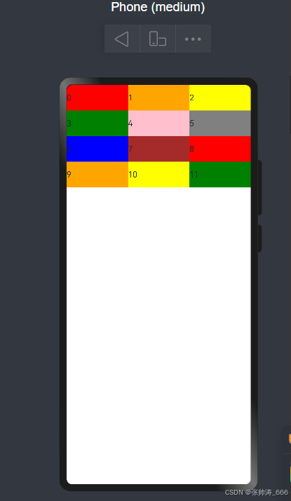
3.栅格布局 (GridRow/GridCol)
使用栅格的默认列数12列,通过断点设置将应用宽度分成六个区间,在各区间中,每个栅格子元素占用的列数均不同。
@Entry
@Component
struct StackSample {
  @State bgColors: Color[] = [Color.Red, Color.Orange, Color.Yellow, Color.Green, Color.Pink, Color.Grey, Color.Blue, Color.Brown,Color.Red, Color.Orange, Color.Yellow, Color.Green];

  build() {
    GridRow({
    //设置排列方向
      direction: GridRowDirection.RowReverse,
      breakpoints: {
        value: ['200vp', '300vp', '400vp', '500vp', '600vp'],
        reference: BreakpointsReference.WindowSize
      }
    }) {
      ForEach(this.bgColors, (color:Color, index?:number|undefined) => {
        GridCol({
          span: {
         //小于200vp 为 xs
            xs: 2, // 在最小宽度类型设备上,栅格子组件占据的栅格容器2列。

            //大于200vp小于300vp 为 sm
            sm: 3, // 在小宽度类型设备上,栅格子组件占据的栅格容器3列。

            //大于300vp小于400vp 为 md
            md: 4, // 在中等宽度类型设备上,栅格子组件占据的栅格容器4列。

            //大于400vp小于500vp 为 lg
            lg: 6, // 在大宽度类型设备上,栅格子组件占据的栅格容器6列。

            //大于500vp小于600vp 为 xl
            xl: 8, // 在特大宽度类型设备上,栅格子组件占据的栅格容器8列。

            //大于600vp 为 xxl
            xxl: 4 // 在超大宽度类型设备上,栅格子组件占据的栅格容器12列。
          }
        }) {
          Row() {
            Text(`${index}`)
          }.width("100%").height('50vp')
        }.backgroundColor(color)
      })
    }
  }
}
3.创建列表 (List)
List的子组件必须是ListItemGroup或ListItem,ListItem和ListItemGroup必须配合List来使用。
List除了提供垂直和水平布局能力、超出屏幕时可以滚动的自适应延伸能力之外,还提供了自适应交叉轴方向上排列个数的布局能力。
官方文档 提供很多的场景


 扫一扫
扫一扫
 1176
1176

 被折叠的 条评论
为什么被折叠?
被折叠的 条评论
为什么被折叠?
 到【灌水乐园】发言


