


渐变包括线性渐变、径向渐变,使用的是background属性或者background-image属性
!!!!!颜色至少两种
1、linear-gradient()函数
(1)语法
background-image: linear-gradient(direction, color-stop1, color-stop2, ...,color-stopn);
background-image: linear-gradient(angle, color-stop1, color-stop2);
参数:
direction::渐变方向,非必填,默认值为从上到下,可选值可为(to left、to right、to top、to left right、to bottom right...)
angle:渐变角度(水平线和渐变线之间的角度,逆时针方向计算,默认为180deg),非必填
color-stop1::起始颜色,可选值为所有颜色,包括rgba()表示的颜色
color-stopn::终止颜色,可选值为所有颜色,包括rgba()表示的颜色
角度:

(2)linear-gradient用于创建一个表示两种及以上颜色线性渐变的图片
(3)可以实现不同方向的渐变效果,指定为一个角度,默认为从上到下
(4)实例
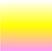
默认:从上到下
<style>
    .box{
        width: 200px;
        height: 200px;
        background-image: linear-gradient(#fff,#ff0,#f9f);
    }
</style>
<body>
    <div class="box">
    </div>
</body>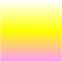
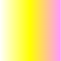
从左到右
.box{
      width: 200px;
      height: 200px;
      background-image: linear-gradient(to right,#fff,#ff0,#f9f);
  }
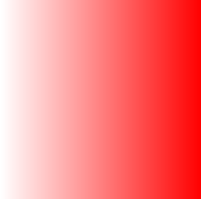
从左到右,完全透明过度到完全不透明的红色
.box{
      width: 200px;
      height: 200px;
      background-image: linear-gradient(to right, rgba(255,0,0,0), rgba(255,0,0,1));
  }
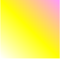
渐变轴设为45度后
.box{
      width: 200px;
      height: 200px;
      background-image: linear-gradient(45deg,#fff,#ff0,#f9f);
}
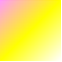
渐变轴从右下到左上
.box{
    width: 200px;
    height: 200px;
    background-image: linear-gradient(to left top,#fff,#ff0,#f9f);
}
从白色#fff开始渐变,到线性渐变方向50%的位置#fff渐变完成#ff0,此时#ff0开始渐变,最后以#f9f结束
.box{
      width: 200px;
      height: 200px;
      background-image: linear-gradient(#fff,#ff0 50%,#f9f);
  }
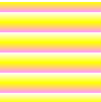
2、repeating-linear-gradient()函数
(1)语法
语法与linear-gradient()一致
(2)repeating-linear-gradient()函数用于创建重复的线性渐变图像
(3)实例
.box{
      width: 200px;
      height: 200px;
      background-image: repeating-linear-gradient( #fff 10%,#ff0 20%,#f9f 30%);
  }
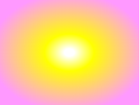
3、radial-gradient()函数
(1)语法
background-image:radial-gradient(shape size at position,start-color,...,last-color);参数: shape:渐变的形状(圆的类型),默认值为:ellipse,椭圆形径向渐变;可选值:circle,圆形的径向渐变 size:渐变的大小,默认值为:farthest-corner,指定径向渐变的半径长度为从圆心到离圆心最远的角; 可选值:closest-side:从圆心到离圆心最近的边;closest-corner:圆心到离圆心最近的角;farthest-side:从圆心到离圆心最远的边 position:渐变的位置,默认值为:center,设置中间为径向渐变圆心的纵坐标值;可选值:top,顶部;bottom,底部; start-color,...,last-color:指定渐变的起止颜色
(2)radial-gradient()函数用于创建径向渐变的图像
(3)实例
三种颜色均匀分布
.box{
width: 200px;
height: 200px;
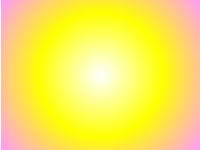
background-image: radial-gradient(#fff,#ff0,#f9f);
}
三种颜色不均匀分布
.box{
      width: 200px;
      height: 150px;
      background-image: radial-gradient(#fff 5%,#ff0 25%,#f9f 80%);
  }
渐变形状为圆形
.box{
      width: 200px;
      height: 150px;
      background-image: radial-gradient(circle,#fff,#ff0,#f9f);
  }
不同尺寸大小的径向渐变
<style>
    .box{
        width: 600px;
        height: 150px;
        background-image: radial-gradient(farthest-side at 80% 55%,#fff,#ff0,#f9f);
    }
    .box1{
        margin-top: 20px;
        width: 600px;
        height: 150px;
        background-image: radial-gradient(#fff,#ff0,#f9f);
    }
</style>
<body>
  <div class="box">
  </div>
  <div class="box1">
  </div>
</body>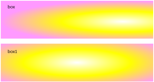
重复的径向渐变
<style>
    .box{
        width: 200px;
        height: 150px;
        background-image: repeating-radial-gradient(#fff,#ff0 10%,#f9f 20%);
    }
</style>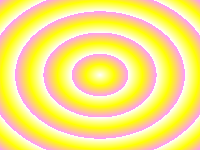


 2699
2699


 被折叠的 条评论
为什么被折叠?
被折叠的 条评论
为什么被折叠?
 到【灌水乐园】发言


