


代码使用:
background-image:linear-gradient
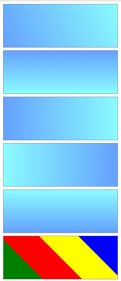
<style>
        div {
            width: 400px;
            height: 150px;
            border: 1px solid #666;
            line-height: 150px;
            text-align: center;
            font-weight: 900;
            font-size: 30px;
            color: #fff;
            margin: 10px auto;
        }
        .gradient {
            background-image:-webkit-linear-gradient(-113deg, #8bfcfe, #64a1ff);
            background-image:linear-gradient(-113deg, #8bfcfe,  #64a1ff);
        }
        .toTop {
            background-image:-webkit-linear-gradient(to top, #8bfcfe, #64a1ff);
            background-image:linear-gradient(to top, #8bfcfe,  #64a1ff);
        }
        .toLeft{
            background-image:-webkit-linear-gradient(to left, #8bfcfe, #64a1ff);
            background-image:linear-gradient(to left, #8bfcfe,  #64a1ff);
        }
        .toRight{
            background-image:-webkit-linear-gradient(to right, #8bfcfe, #64a1ff);
            background-image:linear-gradient(to right, #8bfcfe,  #64a1ff);
        }
        .toBottom{
            background-image:-webkit-linear-gradient(to bottom, #8bfcfe, #64a1ff);
            background-image:linear-gradient(to bottom, #8bfcfe,  #64a1ff);
        }
        .toColors{
            background-image:linear-gradient(45deg,
                green 0%,
                green 25%,
                red  25%,
                red  50%,
                yellow 50%,
                yellow 75%,
                blue 75%,
                blue 100%
            );
        }

    </style>
</head>
<body>
    <div class="gradient"></div>
    <div class="toTop"></div>
    <div class="toLeft"></div>
    <div class="toRight"></div>
    <div class="toBottom"></div>
    <div class="toColors"></div>
</body>
效果如图:


 2063
2063

 被折叠的 条评论
为什么被折叠?
被折叠的 条评论
为什么被折叠?
 到【灌水乐园】发言


