


(1)
<!DOCTYPE html>
<html>
	<head>
		<meta charset="utf-8" name="viewport" content="width=device-width,user-scalable=no,
		initial-scale=1.0,maximum-scale=1.0,minimum-scale=1.0" />
		<title></title>
		<style>
			/*移动端css中padding和margin不改变盒子的大小*/
		</style>
	</head>
	<body>
		<!--  在手机端中使用二倍图,不然会导致模糊-->
		<!-- 缩放后的高度:x=500/300*200 -->
		<!-- background-size: 背景图片宽度 背景图片高度 -->
		<!-- 单位: 长度|百分比|cover|contain
			 cover把背景图像扩展至足够大,以使背景图像完全覆盖背景区域
			 contain把图像图像扩展至最大尺寸,以使其宽度和高度完全适应内容区域
		-->
		<!-- em不固定长度单位 百分比 根据屏幕的大小更改 -->
		<!-- 试用各种设备,使用rem -->
	</body>
</html>
流式布局
<!DOCTYPE html>
<html>
	<head>
		<meta charset="utf-8" />
		<title>流式布局</title>
		<style>
			*{margin: 0;}
			html,body{
				width: 100%;
				height: 100%;
			}/*有这个下面可以打height:100%;*/
			.box{
				width: 100%;
				/*不写也是100%*/
				height: 100%;
				/*直接设置高度为100%是不管用的*/
				max-width: 123%;
				background-color: antiquewhite;
			}
			.box div{
				border: 1px solid;
				border-radius: 30px;
				width: 32%;
				height: 100%;
				float: left;
			}
			.box div:nth-child(1){
				background-color: rgba(255,0,0,0.3);
			}
			.box div:nth-child(2){
				background-color: rgba(0,255,0,0.3);
			}
			.box div:nth-child(3){
				background-color: rgba(0,0,255,0.3);
			}
		</style>
	</head>
	<body>
		<div class="box">
			<div>1</div>
			<div>2</div>
			<div>3</div>
		</div>

	</body>
</html>
代码运行结果:

流式模型(1)
<!DOCTYPE html>
<html>
	<head>
		<meta charset="utf-8">
		<title></title>
		<style>
			.box{
				background-color: #FFC0CB;
			}
			.box>div{
				float: left;
				height: 100px;
				box-sizing: border-box;/*css3盒子模型,边框不影响尺寸*/
				/*margin-right: calc(100% - 50px - );*//*可以利用这个公式来计算
				百分数和像素的差*/
				margin-right: 0.5%;
			}
			.box>div:nth-child(1){
				width: 49.5%;
				background-color: rgba(0,255,0,0.5);
				border: 1px solid #000000;
				padding: 10px;

			}
			.box>div:nth-child(2){
				width: 24.5%;
				background-color: rgba(0,0,0,0.5);
			}
			.box>div:nth-child(3){
				width: 24.5%;
				background-color: rgba(255,0,0,0.5);
			}
		</style>
	</head>
	<body>
		<div class="box">
			<div>1</div>
			<div>2</div>
			<div>3</div>
		</div>
	</body>
</html>
代码的运行结果:
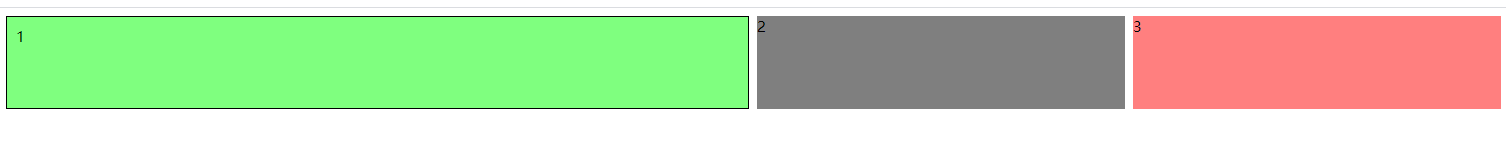
流式模型(2)
<!DOCTYPE html>
<html>
	<head>
		<meta charset="utf-8">
		<title></title>
		<style>
			nav{
				background-color: #FFC0CB;
				overflow: hidden;
			}
			nav>a{
				float: left;
				height: 320px;
				box-sizing: border-box;
				text-align: center;
				margin-right: 1%;
			}
			nav>a:nth-child(1){
				width: 49%;
				background-color: rgba(0,255,0,0.5);
				border: 1px solid;
			}
			nav>a:nth-child(2){
				width: 24%;
				background-color: rgba(0,0,0,0.5);
				/*padding-right: 30px;*/
			}
			nav>a:nth-child(3){
				width: 24%;
				background-color: rgba(255,0,0,0.5);
			}
			nav>a>img{
				width: 200px;
				/*display: block;*/
			}
		</style>
	</head>
	<body>
		<nav>
			<a><img src="img/cat.jpg"></a>
			<a><img src="img/cat.jpg"></a>
			<a><img src="img/cat.jpg"></a>
		</nav><!--导航-->
	</body>
</html>
代码的运行结果:

——The End


 168
168


 被折叠的 条评论
为什么被折叠?
被折叠的 条评论
为什么被折叠?
 到【灌水乐园】发言


