


(1) 弹性布局(弹性盒子)#
- flex-direction 盒子排列方向
- justify-content 水平对齐方式
- align-items 垂直对齐方式
- align-self 垂直方式单独设置
- flex-grow剩余空间分配
- flex-wrap 换行
- 盒子纵向排列注意事项
1. flex-direction 盒子排列方向#
当我们对一个元素设置 display: flex 这个盒子就变成了一个弹性盒子, 它就有如下特点:
- 盒子里面的元素可以横向排列, 也可以纵向排列
- flex-direction: row; 横向排列(默认)
- flex-direction:column; 纵向排列
- 盒子里面的元素可以有更多的排列方式(后面的例子)
<!DOCTYPE html>
<html lang="en">
<head>
  <style>
    .box {
      width: 300px;
      height: 300px;
      border: 1px solid;
      display: flex;
      /* 默认row横向 */
      /* flex-direction: row; */
      /* 默认column纵向 */
      flex-direction: column;
    }
    .box span {
      width: 50px;
      height: 50px;
      background-color: gray;
    }
    .box span:nth-child(2) {
      background-color: green;
    }
  </style>
</head>

<body>
  <div class="box">
    <span>1</span>
    <span>2</span>
    <span>3</span>
  </div>
</body>
</html>
2. justify-content 水平对齐方式#
当盒子的排列方向为横向时, 我们可以使用justify-content来对盒子内的元素进行水平方向的对齐方式, 它的取值常用的有5种:
- flex-start 左对齐(默认)
- center 居中对齐
- flex-end 右对齐
- space-between 两端对齐
- space-around 分散对齐
<!DOCTYPE html>
<html lang="en">
<head>
   <style>
      .box {
         height: 100px;
         width: 250px;
         border: 1px solid;
         display: flex;
         /* justify-content: flex-start; */
         /* justify-content: center; */
         /* justify-content: flex-end; */
         /* justify-content: space-between; */
         justify-content: space-around;
      }
      .box span {
         width: 50px;
         height: 50px;
         background-color: gray;
      }
      .box span:nth-child(2) {
         background-color: green;
      }

   </style>
</head>
<body>
   <div class="box">
      <span>1</span>
      <span>2</span>
      <span>3</span>
   </div>
</body>
</html>
3. align-items 垂直对齐方式#
align-items 取值常用的有三种
- flex-start 顶部对齐(默认)
- center 居中对齐
- flex-end 底部对齐
<!DOCTYPE html>
<html lang="en">
<head>
   <style>
      .box {
         height: 100px;
         width: 250px;
         border: 1px solid;
         display: flex;
         /* justify-content: flex-start; */
         /* justify-content: center; */
         /* justify-content: flex-end; */
         /* justify-content: space-between; */
         justify-content: space-around;
         /* align-items: flex-start; */
         /* align-items: center; */
         align-items: flex-end;

      }
      .box span {
         width: 50px;
         height: 50px;
         background-color: gray;
      }
      .box span:nth-child(2) {
         background-color: green;
      }

   </style>
</head>
<body>
   <div class="box">
      <span>1</span>
      <span>2</span>
      <span>3</span>
   </div>
</body>
</html>
4. align-self 垂直方式单独设置#
align-items是对所有子元素进行设置, align-self允许单独对某一个子元素进行设置, 用来和align-items相似, 但是它对子元素进行设置
<!DOCTYPE html>
<html lang="en">
<head>
   <style>
      .box {
         height: 100px;
         width: 250px;
         border: 1px solid;
         display: flex;
         justify-content: space-around;
         align-items: flex-end;
      }
      .box span {
         width: 50px;
         height: 50px;
         background-color: gray;
      }
      .box span:nth-child(2) {
         background-color: green;
         align-self: flex-start;
      }

   </style>
</head>
<body>
   <div class="box">
      <span>1</span>
      <span>2</span>
      <span>3</span>
   </div>
</body>
</html>
5. flex-grow剩余空间分配#
盒子内如果有剩余的空间, 可以使用flex-grow来进行分配
flex-shink(了解), 空间不足的时候, 子元素会被缩小
<!DOCTYPE html>
<html lang="en">
<head>
   <style>
      .box {
         height: 100px;
         width: 250px;
         border: 1px solid;
         display: flex;
         align-items: center;
      }
      .box span {
         width: 50px;
         height: 50px;
         background-color: gray;
      }

      .box span:nth-child(1) {
         flex-grow: 1;
      }
      .box span:nth-child(2) {
         background-color: green;
         flex-grow: 2;
      }
      .box span:nth-child(3) {
         flex-grow: 2;
      }

   </style>
</head>
<body>
   <div class="box">
      <span>1</span>
      <span>2</span>
      <span>3</span>
   </div>
</body>
</html>
6. flex-wrap 换行#
flex-wrap常用两个取值
-
flex-wrap: nowrap; 不换行
-
flex-wrap: wrap; 换行
-
align-content 子元素的排列方式, 在多行的时候使用
<!DOCTYPE html>
<html lang="en">
<head>
   <style>
      .box {
         height: 400px;
         width: 250px;
         border: 1px solid;
         display: flex;
         /* flex-wrap: nowrap; */
         flex-wrap: wrap;
         justify-content: space-around;
         align-content: flex-start;
      }
      .box span {
         width: 50px;
         height: 50px;
         margin: 5px;
         background-color: gray;
      }

   </style>
</head>
<body>
   <div class="box">
      <span>1</span><span>2</span><span>3</span><span>4</span><span>5</span><span>6</span><span>7</span><span>8</span>
   </div>
</body>
</html>
7. 盒子纵向排列注意事项#
当盒子纵向排列时, 注意:
justify-content 用来设置纵向排列方式, 取值依然是5个
align-items 用来设置横向排列方式, 取值只有三个
<!DOCTYPE html>
<html lang="en">

<head>
   <style>
      .box {
         height: 400px;
         width: 250px;
         border: 1px solid;
         display: flex;
         /* 纵向排列 */
         flex-direction: column;
         /* 纵向排列方式 */
         justify-content: flex-start;
         justify-content: flex-end;
         justify-content: space-between;
         justify-content: space-around;
         /* align-items横向对齐方式 */
         align-items: flex-start;
         align-items: center;
         align-items: flex-end;

      }

      .box span {
         width: 50px;
         height: 50px;
         margin: 5px;
         background-color: gray;
      }
   </style>
</head>

<body>
   <div class="box">
      <span>1</span><span>2</span><span>3</span>
   </div>
</body>
</html>
(2) 浮动#
- 浮动
- 清除浮动
- 通用清除浮动样式
1. 浮动#
浮动会脱离文档流, 跟随其后的元素会塌陷.
- float: left; // 左浮动
- float: right; // 右浮动
<!DOCTYPE html>
<html lang="en">
<head>
  <style>
    div:nth-child(1) {
      height: 80px;
      background-color: gray;
      float: left;
      width: 50%;
    }
    div:nth-child(2) {
      height: 100px;
      background-color: green;
      float: right;
      width: 50%;
      /* 在w3c标准模式下,加边框和padding会撑大元素,所以放不下会换行 */
      border: 1px solid;
    }
  </style>

</head>
<body>
    <div class="box1"> box1 </div>
    <div class="box2"> box2 </div>
</body>
</html>
2. 清除浮动#
- clear: left; // 清除左边浮动
- clear: right; // 清除右边浮动
- clear: both; // 清除全部浮动
<!DOCTYPE html>
<html lang="en">

<head>
  <style>
    .box1 {
      width: 50%;
      height: 100px;
      background-color: green;
      float: left;
    }

    .box2 {
      height: 120px;
      background-color: gray;
      clear: left;
      clear: right;
      clear: both;
    }
  </style>

</head>

<body>
  <div class="box1"> box1 </div>
  <div class="box2"> box2 </div>
</body>
</html>
3. 通用清除浮动样式#
父元素如果不设置高度, 那么父元素的高度会自动根据子元素的高度来获得高度, 但如果子元素设置了浮动, 父元素的高度就为0
<!DOCTYPE html>
<html lang="en">
<head>
  <style>
    .aa {
      border: 2px solid red;
    }

    .bb {
      width: 100px;
      height: 50px;
      background-color: gray;
      float: left;
    }
  </style>

</head>
<body>
  <div class="aa">
    <div class="bb">
      子元素
    </div>
  </div>
</html>
-
清除浮动方法1: 添加一个空div,利用css的clear:both清除浮动,让父级div能自动获取到高度
<!DOCTYPE html> <html lang="en"> <head> <style> .aa { border: 2px solid red; } .bb { width: 100px; height: 50px; background-color: gray; float: left; } .empty {clear: both;} </style> </head> <body> <div class="aa"> <div class="bb"> 子元素 </div> <div class="empty"></div> </div> </html> -
清除浮动方法2: 使用伪类元素
<!DOCTYPE html>
<html lang="en">
<head>
  <style>
    .aa {
      border: 2px solid red;
    }

    .aa .bb {
      width: 100px;
      height: 50px;
      background-color: gray;
      float: left;
    }

    .aa:after {
      /* 把....去掉就实现我们想要的效果 */
      content: '....';
      display: block;
      clear: both;
    }
  </style>

</head>
<body>
  <div class="aa">
    <div class="bb">
      子元素
    </div>
  </div>
</html>
(3) css布局#
- 流式布局
- 浮动布局
- 决定对位布局
- 弹性布局
- 双飞翼布局
- 圣杯布局
(4) 盒子阴影#
使用box-shadow设置盒子阴影, 常用5个选项
- X轴偏移量
- Y轴偏移量
- [阴影模糊半径]
- [阴影扩展]
- [阴影颜色]
- [投影方式] inset:内凹(可选)
<!DOCTYPE html>
<html lang="en">
<head>
  <style>
    .aa {
      width: 100px;
      height: 100px;
      box-shadow: 5px 5px 15px 10px green;
      box-shadow: 5px 5px 15px 10px green inset;
    }
  </style>

</head>
<body>
  <div class="aa">

  </div>
</html>
(5) 2D变换#
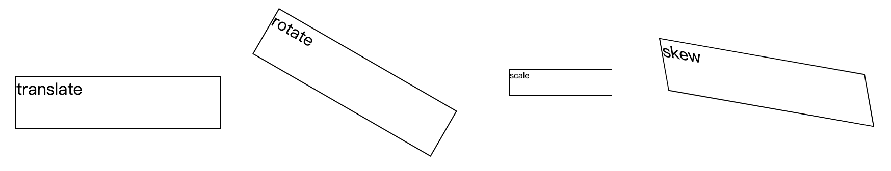
transform
- translate() 定义 2D 转换, 就是平移(横向的,纵向的)
- translate-x: 横向移动
- translate-y: 纵向移动
- translate: 两个选项: 第一个选项横向移动, 第二个选项纵向移动
- rotate() 旋转
- scale() 缩放
- skew() 倾斜
<!DOCTYPE html>
<html lang="en">
<head>
  <style>
    body {
      display: flex;
    }
    p{
      width: 200px;
      height: 50px;
      border: 1px solid;
    }
    p:nth-child(1) {
      transform: translate(20px, 20px);
    }
    p:nth-child(2) {
      margin-left: 50px;
      transform: rotate(30deg);
    }
    p:nth-child(3) {
      transform: scale(.5);
    }
    p:nth-child(4) {
      transform: skew(10deg,10deg);
    }
  </style>

</head>
<body>
  <p>translate</p>
  <p>rotate</p>
  <p>scale</p>
  <p>skew</p>
</html>
(6) 过渡和动画#
- transition过渡
- Keyframes动画
1. transition过渡#
- transition-property 选项1(必须): 规定设置过渡效果的 CSS 属性的名称。
- transition-duration 选项2(必须): 规定完成过渡效果需要多少秒或毫秒。
- transition-timing-function 选项3(可选): 规定速度效果的速度曲线。
- transition-delay 选项4(可选): 定义过渡效果何时开始。
<!DOCTYPE html>
<html>

<head>
  <style>
    div {
      width: 100px;
      height: 100px;
      background: blue;
      transition: width 2s;
      -moz-transition: width 2s;
      /* Firefox 4 浏览器*/
      -webkit-transition: width 2s;
      /* Safari 和 Chrome 浏览器*/
      -o-transition: width 2s;
      /* Opera 浏览器*/
    }

    div:hover {
      width: 300px;
    }
  </style>
</head>

<body>
  <div></div>
</body>
</html>


<!-- 距离应用 -->
2. Keyframes动画#
- @keyframes 定义动画名称和动作
- animation-name 使用的动画名称
- animation-duration:5s 动画时长
- animation-iteration-count 动画次数
<!DOCTYPE html>
<html>
<head>
<meta charset="utf-8">
<title>动画</title>
<style>
div{
	width:100px;
	height:100px;
	background:red;
	position:fixed;
	animation-name:move;
	animation-duration:5s;
  animation-iteration-count:infinite;
}

@keyframes move{
	0%   {background:red; left:0px; top:0px;}
	25%  {background:yellow; left:200px; top:0px;}
	50%  {background:blue; left:200px; top:200px;}
	75%  {background:green; left:0px; top:200px;}
	100% {background:red; left:0px; top:0px;}
}
</style>
</head>
<body>
<div></div>
</body>
</html>
(7) 块级格式化上下文bfc#
- 什么是BFC
- BFC的布局规则(盒子变成BFC后有什么特殊的地方)
- 如何创建一个BFC(一个盒子在什么条件下会变成bfc)
- BFC的应用
1. 什么是BFC#
BFC全称Block Formatting Context,翻译过来就是块级格式化上下文, 也就是常说的BFC, 如同弹性盒子一样, 当一个元素变成了BFC, 它就具备了一些特殊的功能.
2. 如何创建一个BFC(一个盒子在什么条件下会变成bfc)#
- 浮动元素,float 除 none 以外的值;
- 绝对定位元素,position(absolute,fixed);
- overflow 除了 visible 以外的值(hidden,auto,scroll);
- display 为以下其中之一的值 inline-block,table-cell,table-captio1, flex;
- body 根元素
3. BFC的布局规则(盒子变成BFC后有什么特殊的地方)#
- 内部的Box会在垂直方向上一个接一个的放置。
- bfc就是页面上的一个独立容器,容器里面的子元素不会影响外面元素。
- bfc的区域不会与float的元素区域重叠。
- 垂直方向上的距离由margin决定
- 计算bfc的高度时,浮动元素也参与计算
4. BFC的应用#
-
解决margin-top塌陷问题(利用了第2条规则)
bfc就是页面上的一个独立容器,容器里面的子元素不会影响外面元素。
<!DOCTYPE html> <html lang="en"> <head> <style> * {margin: 0;} .aa { width: 200px; height: 200px; background-color: gray; overflow: auto; } .aa .bb { margin-top: 30px; width: 50px; height: 50px; background-color: green; } </style> </head> <body> <div class="aa"> <div class="bb"></div> </div> </body> </html> -
清除浮动(利用第5点)
计算bfc的高度时,浮动元素也参与计算
<!DOCTYPE html> <html lang="en"> <head> <style> * {margin: 0;} .aa { border: 1px solid; width: 200px; overflow: auto; } .aa .bb { height: 50px; background-color: green; float: left; } .cc { height: 100px; width: 200px; background-color: gray; } </style> </head> <body> <div class="aa"> <div class="bb"> 这是aa的子元素bb </div> </div> <div class="cc">cc元素</div> </body> </html> -
使用bfc进行布局(利用了第3点)
bfc的区域不会与float的元素区域重叠。
<!DOCTYPE html>
<html lang="en">
<head>
   <style>
      * {margin: 0;}
      .left {
         height: 300px;
         background-color: gray;
         float: left;
         width: 300px;
         margin-right: 10px;
      }
      .right {
         background-color: green;
         height: 350px;
         overflow: auto;
      }
   </style>
</head>

<body>
   <div class="left">
      左边
   </div>
   <div class="right">
      右边
   </div>
</body>
</html>
(8) 水平垂直居中#
- 弹性盒子
- 决定定位
(9) css兼容性写法#
比如弹性盒子的兼容写法:
<!DOCTYPE html>
<html lang="en">

<head>
   <style>
      .box {
         display: -webkit-box;
         /* 老版本语法: Safari, iOS, Android browser, older WebKit browsers. */
         display: -moz-box;
         /* 老版本语法: Firefox (buggy) */
         display: -ms-flexbox;
         /* 混合版本语法: IE 10 */
         display: -webkit-flex;
         /* 新版本语法: Chrome 21+ */
         display: flex;
         /* 新版本语法: Opera 12.1, Firefox 22+ */
      }
   </style>
</head>

<body>
   <div class="box">

   </div>
</body>
</html>


 406
406


 被折叠的 条评论
为什么被折叠?
被折叠的 条评论
为什么被折叠?
 到【灌水乐园】发言


