


该系列文章是博主学习前端入门课程的笔记,同时也为了方便查阅,有任何错漏或疑问都欢迎在评论区提出。本文介绍CSS3新增的属性选择器、结构伪类选择器、伪元素选择器、盒子模型、其他特性、过渡
第一章 新增选择器
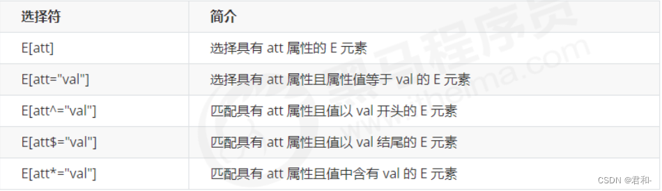
1.1 属性选择器
属性选择器可以根据特定属性来选择元素,不用借助class或id。权重为10
语法格式
示例
<style>
	/* 选取input中有value属性的元素 */
	input[value] {
	    color: pink;
	}

	/* 选取input中type=text的元素 */
	input[type=text] {
	    background-color: skyblue;
	}
</style>

<!-- 1.利用属性选择器可以不借助id或类选择器 -->
<input type="text" value="请输入用户名">
<input type="text">
<!-- 2.属性选择器还可以选择属性=值的某些元素 -->
<input type="text" name="" id="">
<input type="password" name="" id="">
效果图

配合正则表达式可以使属性选择器更强大
不了解正则的小伙伴可以看看这篇文章:一看就懂:正则表达式
<style>
/* 选取div中class属性值以icon开头的元素 */
div[class^=icon] {
color: red;
}
/* 选取section中class属性值以data结尾的元素 */
section[class$=data] {
color: blue;
}
/* 属性选择器的权重为10 */
div.icon1 {
color: purple;
}
</style>
<!-- 3.属性选择器可以选择属性值开头相同的某些元素 -->
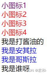
<div class="icon1">小图标1</div>
<div class="icon2">小图标2</div>
<div class="icon3">小图标3</div>
<div class="icon4">小图标4</div>
<div class="test">我是打酱油的</div>
<!-- 4.属性选择器可以选择属性值结尾相同的某些元素 -->
<section class="icon1-data">我是安其拉</section>
<section class="icon2-data">我是哥斯拉</section>
<section class="icon3-ico">我是谁呀</section>
效果图
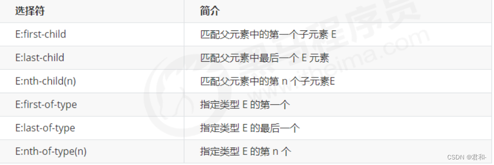
1.2 结构伪类选择器
主要根据文档结构来选择元素,常用于选出父级选择器的子元素。权重为10
语法格式
示例1
<style>
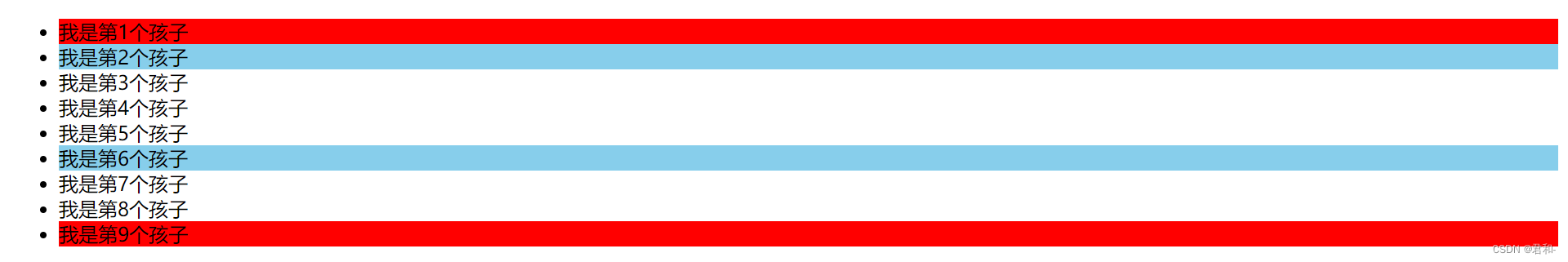
/* 选择ul里面的第一个孩子 */
ul li:first-child {
background-color: red;
}
/* 选择ul里面的最后一个孩子 */
ul li:last-child {
background-color: red;
}
/* 选择ul里面的第2个孩子 */
ul li:nth-child(2) {
background-color: skyblue;
}
/* 选择ul里面的第6个孩子 */
ul li:nth-child(6) {
background-color: skyblue;
}
</style>
<ul>
<li>我是第1个孩子</li>
<li>我是第2个孩子</li>
<li>我是第3个孩子</li>
<li>我是第4个孩子</li>
<li>我是第5个孩子</li>
<li>我是第6个孩子</li>
<li>我是第7个孩子</li>
<li>我是第8个孩子</li>
<li>我是第9个孩子</li>
</ul>
效果图
nth-child(n)的可以是数字、关键字或公式。
配合关键字even和odd可以分别选出偶数和奇数的子元素,配合n+3可以选出第4个开始的子元素。配合函数还有很多其他用法,在实际开发中可以根据需要选择

示例2
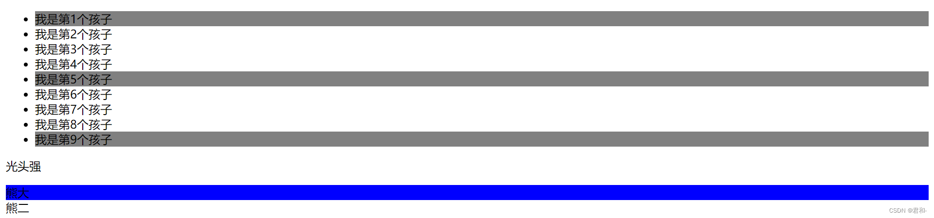
注意观察nth-of-type()与nth-child()的不同之处
<style>
    ul li:first-of-type {
        background-color: gray;
    }

    ul li:last-of-type {
        background-color: gray;
    }

    ul li:nth-of-type(5) {
        background-color: gray;
    }

    /* nth-child会把所有的孩子排序 */
    /* 执行的时候先看 nth-child(1) 之后回去看 div(不匹配则选不出来)*/
    section div:nth-child(1) {
        background-color: red;
    }

    /* nth-of-type会把指定的孩子排序 */
    /* 执行的时候先看 指定的元素div 之后回去看 nth-of-type() 第几个孩子*/
    section div:nth-of-type(1) {
        background-color: blue;
    }
</style>
<ul>
    <li>我是第1个孩子</li>
    <li>我是第2个孩子</li>
    <li>我是第3个孩子</li>
    <li>我是第4个孩子</li>
    <li>我是第5个孩子</li>
    <li>我是第6个孩子</li>
    <li>我是第7个孩子</li>
    <li>我是第8个孩子</li>
    <li>我是第9个孩子</li>
</ul>
<!-- 区别 -->
<section>
    <p>光头强</p>
    <div>熊大</div>
    <div>熊二</div>
</section>
效果图
1.3 伪元素选择器
伪元素选择器利用CSS创建新标签元素,而不需要HTML标签,从而简化HTML结构。这种方法创建的属于行内元素,且在文档树中找不到,所以称为伪元素。权重为1
语法格式
示例
<style>
    div {
        width: 300px;
        height: 200px;
        background-color: pink;
    }

    /* div::before权重是2 */
    div::before {
        /* 默认为行内元素,不能直接设置宽高 */
        display: inline-block;
        width: 30px;
        height: 40px;
        /* content属性是必须要写的,没有内容则写成content:'' */
        content: '我';
    }

    div::after {
        content: '小猪佩奇';
    }
</style>

<div>是</div>
效果图

实际开发伪元素用于显示字体图标、实现遮罩效果、清除浮动等等。
仿土豆网遮罩效果
<style>
    .tudou {
        position: relative;
        width: 444px;
        height: 320px;
        background-color: pink;
        margin: 30px auto;
    }

    .tudou img {
        width: 100%;
        height: 100%;
    }

    .tudou::before {
        display: none;
        position: absolute;
        top: 0;
        left: 0;
        width: 100%;
        height: 100%;
        content: '';
        background: rgba(0, 0, 0, .4) url(images/arr.png) no-repeat center;
    }

    .tudou:hover::before {
        display: block;
    }
</style>

<div class="tudou">
    <img src="images/tudou.jpg" alt="">
</div>
效果图

鼠标移动到图片会出现遮罩效果

清除浮动
<style>
    /* 两种清除浮动的方法是隔墙法的升级版 */
    /* 伪元素清除浮动 */
    .clearfix:after {
        /* 伪元素必须要写的属性 */
        content: '';
        /* 插入的元素必须是块级 */
        display: block;
        /* 清除浮动的核心代码 */
        clear: both;
        /* 不要看见这个元素 */
        height: 0;
        /* 不要看见这个元素 */
        visibility: hidden;
    }

    /* 双伪元素清除浮动 */
    .clearfix:before,
    .clearfix:after {
        content: '';
        /* 把元素转换为块级元素,但是在同一行 */
        display: table;
    }

    .clearfix:after {
        clear: both;
    }
</style>
第二章 盒子模型
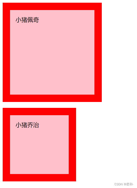
CSS3 中可以通过 box-sizing 来指定盒模型,有2个值: content-box | border-box,这样计算盒子大小的方式就发生了改变。
- content-box:盒子大小为width + padding + border(CSS默认的)
- border-box:盒子大小为width
即盒子模型改为border-box,那么padding和border就不会撑大盒子(前提是padding+border不超过width)
示例
<style>
    div {
        width: 200px;
        height: 200px;
        background-color: pink;
        border: 20px solid red;
        padding: 15px;
        /* 默认值 */
        box-sizing: content-box;
    }

    p {
        width: 200px;
        height: 200px;
        background-color: pink;
        border: 20px solid red;
        padding: 15px;
        box-sizing: border-box;
    }
</style>

<div>小猪佩奇</div>
<p>小猪乔治</p>
效果图
第三章 其他特性(了解)
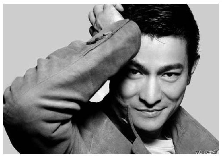
3.1 filter滤镜
filter可以对图片进行滤镜处理(例如模糊效果、透明效果、色彩反差调整等等),还可以对网页元素甚至视频进行滤镜处理。这里只讲解模糊处理,想继续了解可以点击标题链接
语法格式
filter: 函数();
示例
<style>
    img {
        /* blur是一个函数,数值越大越模糊,注意要加单位 */
        filter: blur(5px);
    }

    img:hover {
        filter: blur(0);
    }
</style>

<img src="images/pink.jpg" alt="">
效果图

鼠标移动到图片上
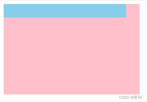
3.2 cal函数
calc() 函数可以在声明CSS属性值时执行一些计算。
示例
<style>
    .father {
        width: 300px;
        height: 200px;
        background-color: pink;
    }

    .son {
        /* 注意:减号-两边必须有空格隔开 */
        width: calc(100% - 30px);
        height: 30px;
        background-color: skyblue;
    }
</style>
<!-- 需要子盒子比父盒子小30px -->
<div class="father">
    <div class="son"></div>
</div>
效果图
第四章 过渡
过渡(transition)是CSS3具有颠覆性的特征之一,可以在不使用JavaScript的情况下,使元素逐渐从一种样式过渡到另一种样式。通常搭配:hover使用
语法格式
transition: 要过渡的属性 花费时间 运动曲线 何时开始;
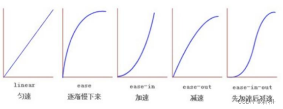
- 属性:想要变化的css属性,宽度高度背景颜色内外边距。如果想要所有的属性都变化过渡, 写all
- 花费时间: 单位是秒(必须写单位)
- 运动曲线: 默认是ease(可以省略)
- 何时开始:单位是秒(必须写单位),可以设置延迟触发时间,默认是0s(可以省略)
示例
<style>
    .box {
        width: 200px;
        height: 100px;
        background-color: pink;
        /* transition:变化的属性 花费时间 运动曲线 何时开始
        后面两个值可以省略*/
        /* 如果想要写多个属性,需要逗号进行分割 */
        transition: width 1s ease 1s, height 1s ease 1s;

        /* 如果想要多个属性变化,可以用all */
        transition: all .5s;
    }

    .box:hover {
        width: 400px;
        height: 300px;
        background-color: skyblue;
    }
</style>

<div class="box"></div>
动态效果不方便展示,请各位小伙伴自行尝试


 547
547


 被折叠的 条评论
为什么被折叠?
被折叠的 条评论
为什么被折叠?
 到【灌水乐园】发言


