


这样就可以了
<div class="pie" :style="{ width: '320px', height: '160px' }"> </div> getIns() {
indexInstrument().then(res => {
this.insList = res.rows.map(({ shu }) => ({
shu: shu
}))
this.$nextTick(() => {
const myEchart = document.getElementsByClassName("pie");
for (let index = 0; index < this.title.length; index++) {
this.insList.forEach((value, index) => {
value['name'] = this.title[index].name
value['color'] = this.title[index].color
})
var myChart = echarts.init(myEchart[index]); //初始化echarts实例要在for循环内
let option = {
title: {
text: '{num|' + this.insList[index].shu + '%}',
x: '50%',
y: '53%',
textAlign: 'center',
textStyle: {
rich: {
num: {
fontWeight: '700',
color: this.insList[index].color,
fontFamily: '微软雅黑',
fontSize: 18,
},
},
},
},
series: [
{
type: 'gauge',
radius: '110%', // 1行3个
center: ['50%', '70%'],
splitNumber: 10,
// min: 0,
max: 100,
startAngle: 180,
endAngle: 0,
z: 99,
// 线
axisLine: {
lineStyle: {
width: 0.5,
color: [[1, 'rgba(255,255,255,0)']],
},
detail: {
formatter: '{value}',
},
data: [
{
value: 50,
name: 'SCORE',
},
],
},
//刻度标签。
axisTick: {
show: true,
splitNumber: 3, //刻度的段落数
lineStyle: {
color: this.insList[index].color,
width: 1, //刻度的宽度
shadowColor: this.insList[index].color,
shadowBlur: 1,
},
length: 1, //刻度的长度
},
splitLine: {
//文字和刻度的偏移量
show: true,
length: -3, //长度
lineStyle: {
color: this.insList[index].color,
width: 1,
},
},
// //刻度线文字
axisLabel: {
show: true,
color: this.insList[index].color,
fontSize: 8,
distance: -15,
},
data: [
{
value: this.insList[index].shu,
name: 'SCORE',
itemStyle: {
color: this.insList[index].color,
},
},
],
pointer: {
show: true,
length: '12%',
radius: '50%',
width: 2.5, //指针粗细
offsetCenter: [0, -62]
},
detail: {
show: false
},
title: {
// 仪表盘标题。
show: false,
},
},
{
name: this.insList[index].name,
type: 'pie',
radius: ['65%', '83%'],
center: ['50%', '70%'],
startAngle: 180,
endAngle: 0,
color: [
{
type: 'linear',
x: 0,
y: 0,
x2: 0,
y2: 1,
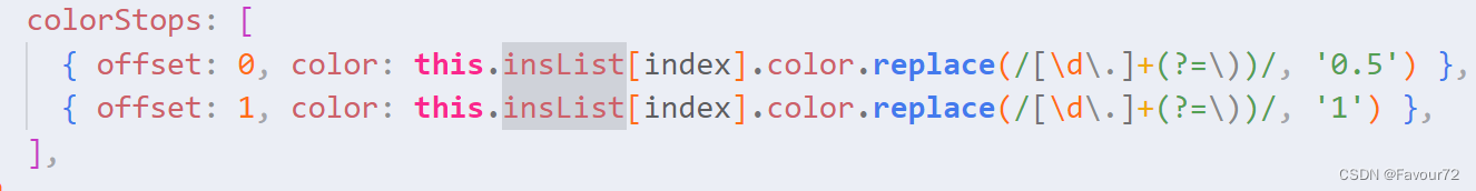
colorStops: [
{
offset: 0,
color: this.insList[index].color.replace(/[\d\.]+(?=\))/, '0.1'), // 0% 处的颜色
},
{
offset: 0.5,
color: this.insList[index].color.replace(/[\d\.]+(?=\))/, '0.5'),
},
{
offset: 1,
color: this.insList[index].color.replace(/[\d\.]+(?=\))/, '1'), // 100% 处的颜色
}
],
},
'transparent',
],
hoverAnimation: true,
legendHoverLink: false,
z: 10,
labelLine: {
normal: {
show: false,
},
},
data: [
{
value: this.insList[index].shu,
},
{
value: 100 - this.insList[index].shu,
},
],
},
{
type: 'pie',
hoverAnimation: false,
label: {
show: false,
},
center: ['50%', '70%'],
radius: ['0%', '60%'],
startAngle: 180,
data: [
{
value: 100,
itemStyle: {
normal: {
color: {
type: 'radial',
x: 0.5,
y: 0.5,
r: 0.5,
colorStops: [
{ offset: 0, color: this.insList[index].color.replace(/[\d\.]+(?=\))/, '0.5') },
{ offset: 1, color: this.insList[index].color.replace(/[\d\.]+(?=\))/, '1') },
],
},
opacity: 0.2,
},
},
},
{
value: 100,
color: 'transparent',
},
],
},
],
};
myChart.setOption(option);
}
})
})
},
每个颜色不一样是之前写好再重构进去的 ,文字,刻度线 ,title,渐变都用的这个颜色
用ragb的原因是方便做渐变的时候更改最后一个透明度的值
      title: [{
        name: "管理仪器总数",
        color: "rgba(52, 112, 244, 1)"
      },
      {
        name: "正在使用数量",
        color: "rgba(46, 203, 236, 1)"
      },
      {
        name: '可以使用数量',
        color: "rgba(57, 219, 93, 1)"
      },
      {
        name: '设备离线数量',
        color: "rgba(250, 142, 46, 1)"
      },
      ],


 1154
1154


 被折叠的 条评论
为什么被折叠?
被折叠的 条评论
为什么被折叠?
 到【灌水乐园】发言


