


vue项目中移动端适配
最近在写vue的移动端项目,踩了很多坑,记录一下,项目使用rem布局,使用px为单位书写,页面在浏览器渲染的时候自动转换为rem
postcss-pxtorem
- 使用插件,用于将
px单位生成rem单位
-
安装依赖
npm il postcss-pxtorem -D
-
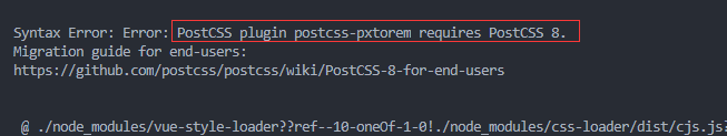
安装成功之后,在运行项目的时候报错
-
阅读报错发现是安装版本的问题…
解决办法 npm i postcss-pxtorem@5.1.1
-
之后在运行项目就可以正常启动啦!
- 然后,在项目根目录创建
postcss.config.js
module.exports = {
    plugins: {
      'postcss-pxtorem': {
        rootValue({file}){
          return file.indexOf('vant')===-1?37.5 : 75
       },
        propList: ['*'],
      },
    },
  };
- 接下来就是配置(以iphone6/7/8为例)
-
在src文件夹下面新建文件
src/rem.js
// 基准大小  已iphone6/7/8为例
const baseSize = 37.5
// 设置 rem 函数
function setRem () {
  // 当前页面宽度相对于 375 宽的缩放比例,可根据自己需要修改。
  const scale = document.documentElement.clientWidth / 375
  // 设置页面根节点字体大小
  document.documentElement.style.fontSize = (baseSize * Math.min(scale, 2)) + 'px'
}
// 初始化
setRem()
// 改变窗口大小时重新设置 rem
window.onresize = function () {
  setRem()
}
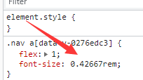
至此,基本的配置已经完成。贴个图,看一下效果!


 265
265


 被折叠的 条评论
为什么被折叠?
被折叠的 条评论
为什么被折叠?
 到【灌水乐园】发言


